Using tree tests to refine an information architecture
After completing the top tasks survey and the card sort as part of the Learn Foundations project, our next step was to create a prototype information architecture and test it.
As described in previous blog posts, those two studies were just the beginning of our programme of research. We still had questions to be answered.
Card sorting has informed a new information architecture for Learn courses — previous blog post
Tree test
Our first step towards answering those questions was to run a tree test. This is a method of testing an information architecture and navigational structure, without having to build out a full blown prototype.
For a tree test, you simply set people a task, show them the navigation menu, and ask them to use the menu to find the section they think will help them complete the task.
We set six tasks. These were a mixture of top tasks that had been identified in our previous survey, and aspects of our draft information architecture that we wanted to find out more about.
High success rates
Two years ago I attended a top tasks masterclass by the pioneer of the technique, Gerry McGovern.
Top tasks management – how to continuously measure your website’s success
During that session, he said:
Typically after a round one of a top tasks information architecture project the success rate tends to be somewhere in the region of 50-60%.
It’s fair to say that this figure is probably most relevant to large, complex websites rather than specific virtual learning environment courses. Nevertheless, we were pleased with the results in comparison to this rule of thumb.
In our tree tests, three of the tasks had a success rate above 90%, which is astonishingly high. One other was above 80%.
This gave the Learn Foundations project team confidence that the new information architecture was a step in the right direction.
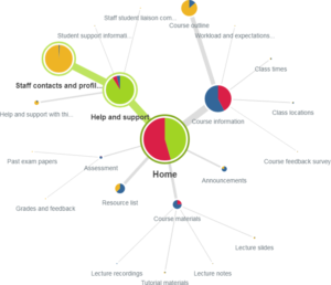
The other two tasks performed rather worse, both with success rates of 67%. This is still good. But for both of these tasks, a majority of respondents didn’t find the right section directly. (Directness refers to whether participants had to click back at any point.)
This gave us a clue that there was some more work to be done on some aspects of the template.
Course information honey trap

Pietree for one of the less successful tasks, showing most people selecting the right path, but a significant number of people taking the wrong route
Those two less successful tasks were:
- “You need to contact a teacher. Where would you find their email address?”
- “Where would you find out when your first exam for this course is?”
In both cases, of the majority of people who went down the wrong path, they overwhelmingly selected ‘Course information’.
If you read my previous post, you’ll remember that we had concerns about including a section with such a generic name as ‘Course information’.
In a sense, the tree test demonstrated that these fears did have some foundation.
But we also hypothesised that participants may have been looking for a course handbook, which would likely contain staff contact details, and would be most likely housed in the Course information section. We had neglected to include the course handbook as an option in our tree, so we were left guessing as to respondents’ true intention when they were selecting Course information.
Co-design with students
Throughout this programme of user research, we have used a mixture of methods to progressively improve our understanding of users of Learn. We used the Learn Foundations student user groups to conduct some more qualitative, face-to-face research into these issues around the information architecture.
We used co-design techniques to directly involve students in designing aspects of the information architecture.
At this stage, we presented students with lists of two groupings that we had given similar names — ‘Course content’ and ‘Course information’. But we didn’t present students with those names. Instead, we asked them to come up with the names based only on the items within each section.
For the ‘course content’ grouping, students named it ‘Course materials’. But no-one came up with a clearer label for the ‘Course information’ section — so it remained as it was.
Next steps
This was just part of our programme of user research stepping the Learn Foundations project through the elements of user experience.
The elements of a better user experience in Learn
Our next step was to use first click tests to help answer our remaining questions about the new prototype. This will be the subject of an upcoming blog post.
Find out more
If you would like support on planning and undertaking user research, visit the User Experience Service website to find out more and get in touch.
Read our other blog posts about the Learn Foundations project


2 replies to “Using tree tests to refine an information architecture”