
First click tests — building up the elements of user experience for Learn Foundations
We had developed an information architecture and tree tests as part of our programme of user research for Learn Foundations. The next step was to use first click tests to pit the new template against existing courses.
Using tree tests to refine an information architecture — previous blog post
Why the first click is important
Research has suggested that, when people get the first click right, they are 87% likely to succeed in their task (as opposed to 46% if they get the first click wrong).
Getting the first click right — blog post by Jeff Sauro
We used the Chalkmark software from Optimal Workshop to run a first click study.
In the tree test, participants are presented with the navigation menu only. But in a first click test, participants are presented with screenshots of interfaces. These can be either a low-fidelity wireframe, or a screenshot of a full-blown interface. Participants are asked to select the area of the interface they think will help them complete their task.
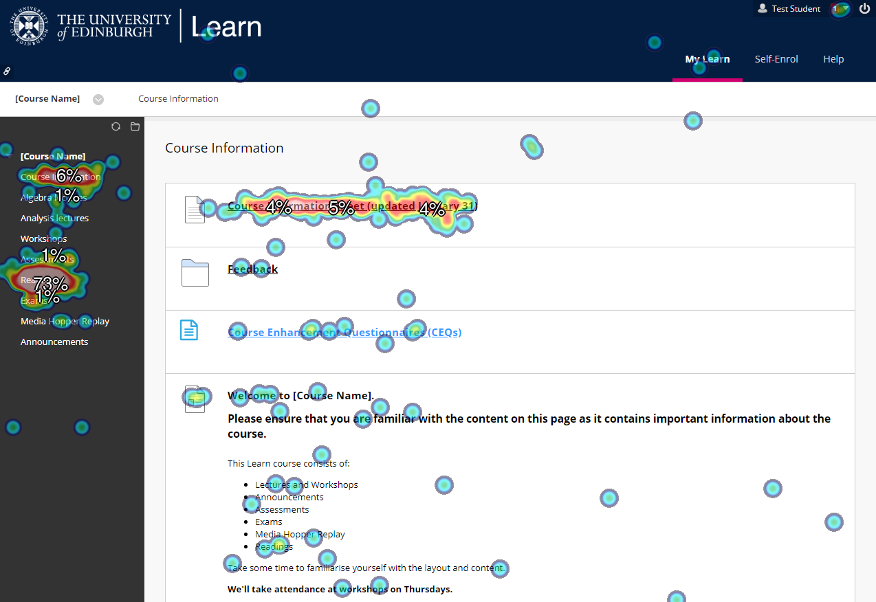
Heatmap of an existing Learn course
After the study is complete, the software produces a heatmap showing you where people have most frequently clicked.
Our first click test
This study had two aims:
- Test an early prototype version of the new Learn Foundations template with a large number of students.
- A/B test the new prototype against representative examples of existing courses.
Ultimately, we needed to understand if the Learn Foundations team were going down the right path with this new template, or if the design needed any changes before being developed further.
We used screenshots of existing courses, and compared them against a screenshot of an early prototype of the new template built in Learn. So we weren’t quite comparing like with like. But it was an important point for us to test the prototype in the state it was at, to understand if there were any changes required before it was developed further.
We set five tasks. We asked participants to complete each of these tasks twice — once with the new template, and once with an example of an existing Learn course. (We didn’t tell people which was which, or indeed that we were comparing a new template with existing ones — although it was probably obvious to many participants.)
Lessons learned from the first click test
These results were slightly less encouraging than the tree test.
In each case, the new prototype template did not perform as well as the examples of existing courses. However, this alone wasn’t as bad as it seems at first glance.
The prototype screenshot we tested with was unfinished, unpolished, and did not have any real content. Meanwhile, each of the existing courses we tested with were well-established, with real content, and often tailored to that specific course. The new Learn Foundations template is attempting to do a different job — to provide greater consistency among different courses.
With three of the tasks, the unfinished prototype came close to equalling the success rates of the existing courses. In this context, these results were relatively encouraging. Two other tasks caused more concern, however.
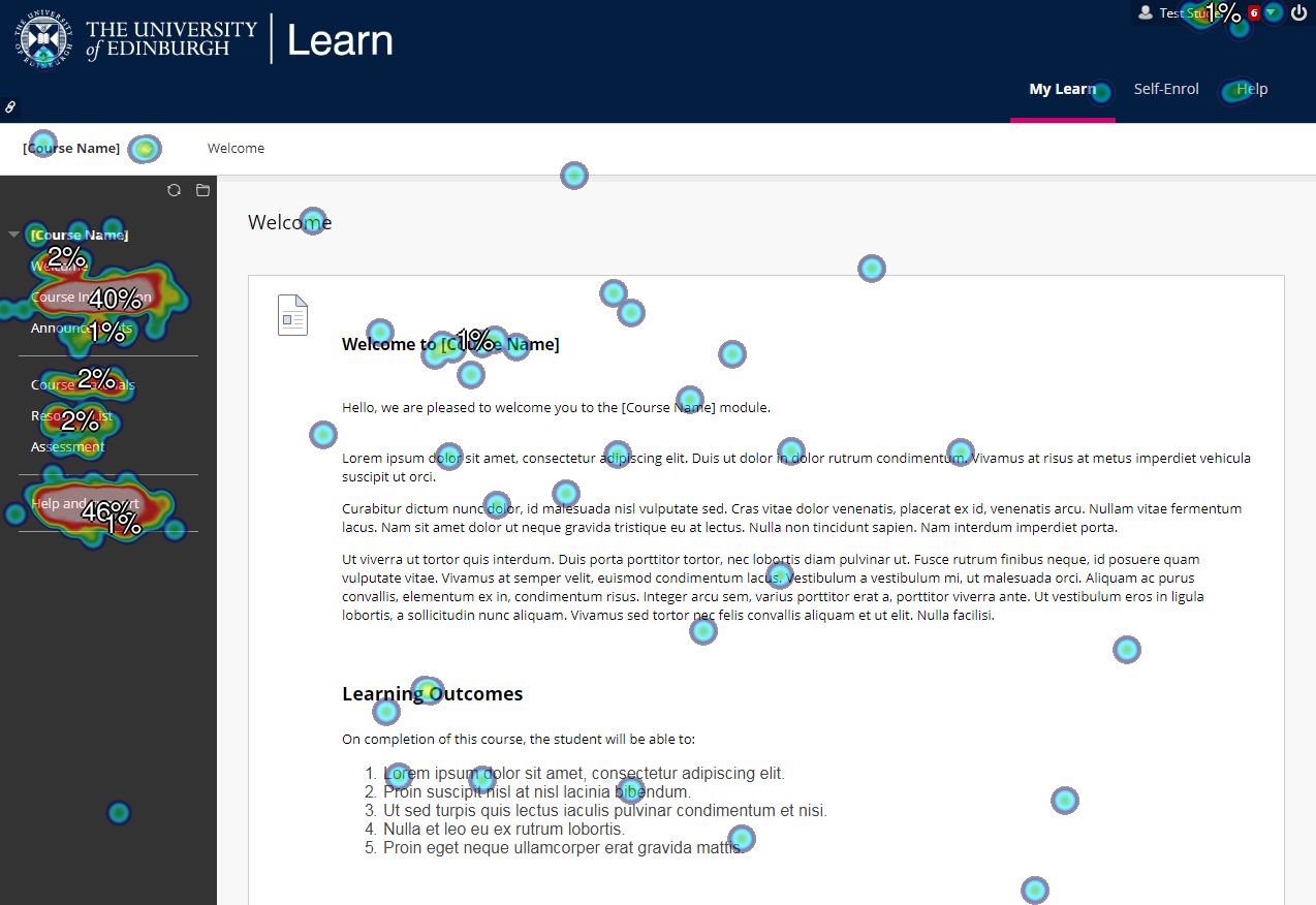
Heatmap for finding contact details in the new template
The first of these was:
“You’ve got a question about the course, and you want to get in touch with one of your lecturers. How would you do this?”
Only 46% of participants selected the correct section (Help and support), with 40% selecting Course information. This result prompted the Learn Foundations team to create a top-level Course contacts section. The project team had been debating about this, but we had lacked clear evidence to decide one way or the other. The results of this first click test gave us a sense that we had to add this clearer menu option.
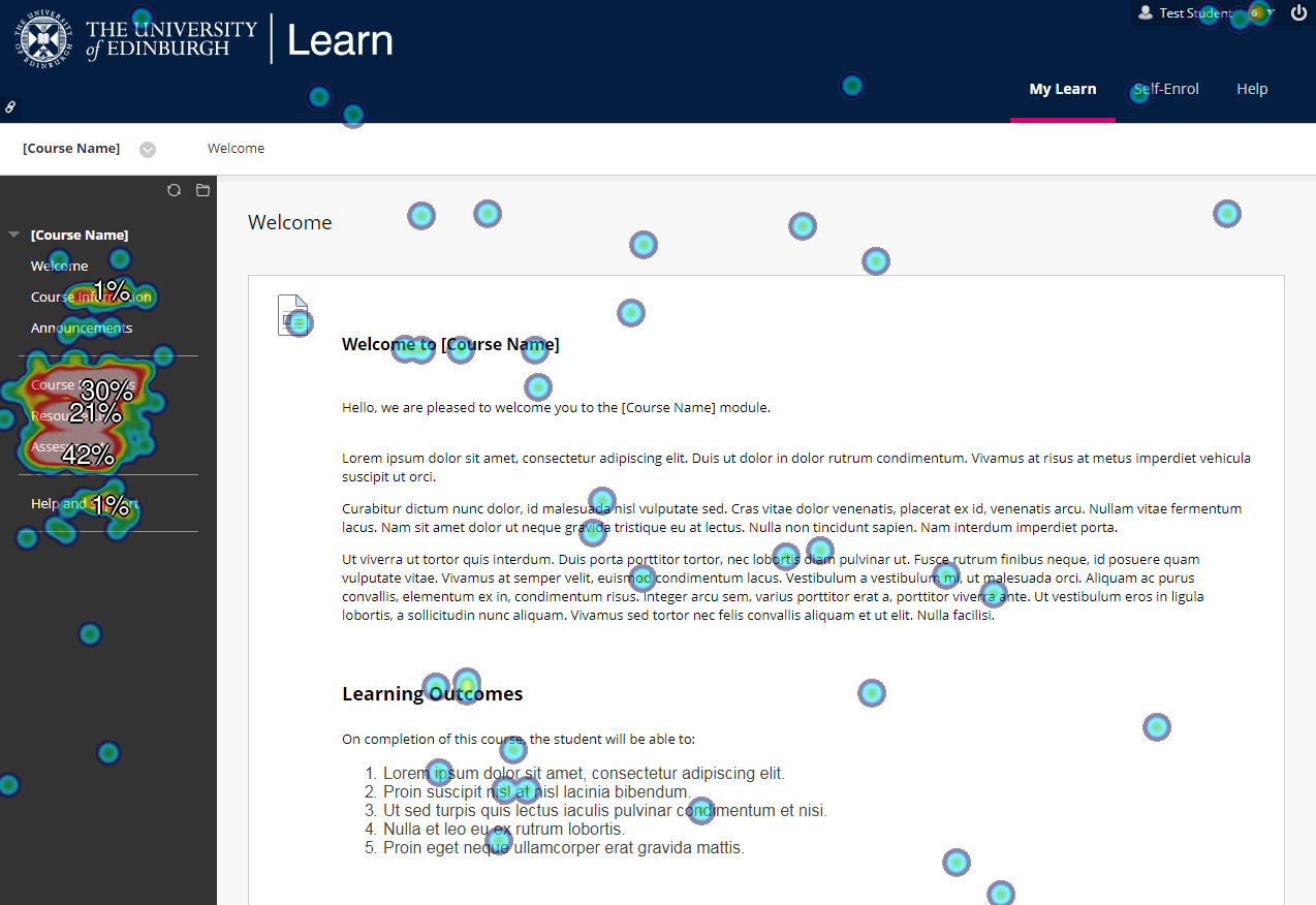
The second task with concerning results was:
“It’s coming up to exam time and you’d like to see some mock exam papers. Where will you find them?”
Here, only 42% selected the right option (Assessment), with 30% clicking Course materials, and 21% selecting Resource List.
Past paper problem
Heatmap for finding mock exam papers in the new template
The fact that students seemed unable to find mock exam papers appeared to present us with a big problem. In the top tasks survey, past papers came out as the 4th most important task to students. So we felt that it was important for students to be able to complete this task.
Top tasks surveys have identified what really matters to students using Learn
The card sort showed that students did not strongly agree on what other items it should be grouped with.
Card sorting has informed a new information architecture for Learn courses
The clearest indication was that it belonged with assessment content, so we placed it there.
However, the first click test demonstrated that the majority of students did not expect to find mock exam papers there.
Usability testing helped us understand what was really going on
Coincidentally, in the round of usability testing we were running at the same time, we had set a task around finding past exam papers within a Learn environment set up by the School of Philosophy, Psychology & Language Sciences.
By watching just four students trying to access past papers, it became clear that students do not expect to find past papers through Learn. They simply Google for them. Students find past papers easily this way.
This made us feel less concerned about the fact that students seemed confused about where to find past papers in Learn. It’s because students don’t expect to find them in Learn in the first place.
Only by using a mixture of research methods — both qualitative and quantitative — have we been able to truly understand users’ needs.
Our comprehensive programme of user research with the Learn Foundations project has demonstrated the benefits of following a human-centred design process.
Introducing a new template ultimately designed to be rolled out across the University is a big change. By undertaking this user research, we have been able to confidently ensure that the design is based on a strong understanding of the needs of students and staff.
Find out more
If you would like support on planning and undertaking user research, visit the User Experience Service website to find out more and get in touch.