
Iterating a navigation scheme for the Web Publishing Platform – combined menu solution
The latest phase of developing the navigation scheme for EdWeb2 involved testing a menu system comprising a top-level menu and a left-hand menu.
Developing a navigation scheme for the Web Publishing Platform is a complex task. To ensure a consistent end-user experience, we need to develop a single navigation system that will work for all of the existing sites in EdWeb.
The solution needs to:
- be straightforward for editors to use
- support the automated migration of existing EdWeb site content
- provide a usable way for website users to navigate and orient themselves within University of Edinburgh websites
We have continued our research to find a solution while aligning with these design constraints.
We encountered some challenges with earlier versions of the top-level horizontal menu:
- Our visualisation tool demonstrated that for some sites, horizontal menus could become overcrowded when populated with existing EdWeb content.
- Usability testing showed that users struggled to find content in a top menu dropdown when it displayed menu items from the top three levels of a site.
- Realising the complexities of achieving a top menu where the dropdown contains a curated, customisable set of menu links (as typical megamenus do).
From left-hand menus to megamenus – our visualisation tool
Testing menu designs for the Web Publishing Platform
Navigation scheme research using the Stanford Graduate School of Business website
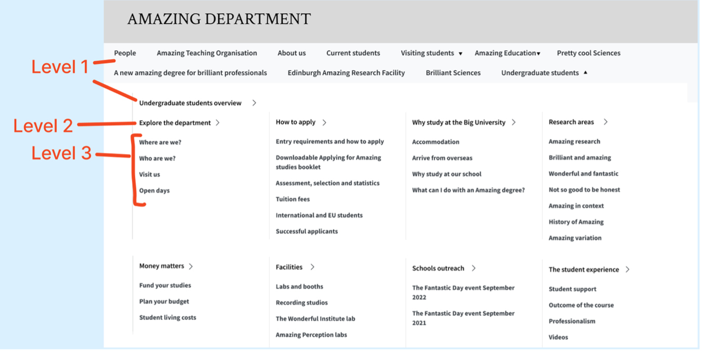
Our previous menu with links to levels 1, 2 and 3 in the top menu.
A proposed solution combining a top menu and left-hand navigation
In response to these problems, a proposed solution was to reduce the amount of content in the top menu by showing menu items from the top two levels of the site only.
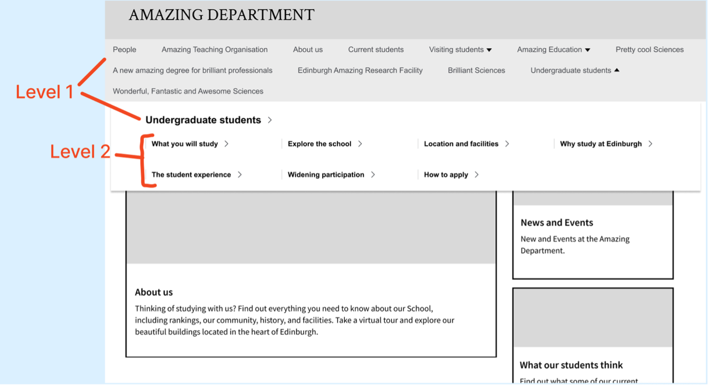
Our adapted prototype, which shows only level 1 and 2 links in the top menu.
Making this change meant that further navigation was required to enable users to reach content at deeper levels. A left-hand menu was proposed as an additional navigation element.
- We iterated on a prototype used in the previous round of testing (which contained the top menu only) to include an additional left-hand menu. Instead of the top menu containing all the menu items, these were split between the top menu and the left-hand menu. The design and functionality of the left-hand menu in the prototype was similar to the menu defined in EdGEL and present in existing EdWeb sites. In this combined solution, the left-hand menu and the top menu work together as follows:
- the top menu displays menu items two levels beneath the root level/homepage
- the left-hand menu displays menu items at levels deeper than level 2
- the left-hand menu reveals deeper levels of content when expanded
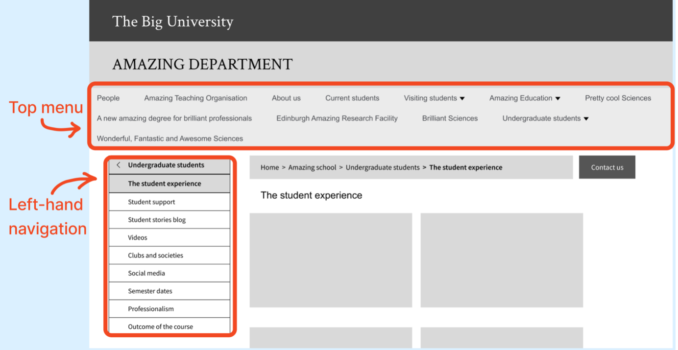
Screenshot of a page at level 2 in our new prototype with added left-hand navigation.
Planning research on the proposed navigation scheme
As part of the project team, we wanted to test some assumptions about this proposed navigation scheme:
- Would reducing content in the top menu improve usability from the previous test?
- Would users understand how to use a combination of top menu and the left-hand menu when navigating across a site?
- Are there any usability issues when this navigation scheme is applied across sites with different content and structures?
To address these questions, we designed a research study involving participants completing information-seeking tasks on the iterated prototype previously described as well as two other prototypes were representative of existing EdWeb sites, one with a shallow site structure and another with a deeper hierarchical structure.
The research on the first prototype is detailed here, and the research on the two other prototypes is detailed in a separate blog post:
Usability testing a combined navigation solution with representative EdWeb sites
Research testing set-up and tasks
We recruited six participants who were all student workers within ISG (Information Services Group) and unconnected with the Web Publishing Platform project. Tests were carried out using a Windows laptop and mouse and beginning on the homepage of the prototype. We used testing platform Maze to host the tests so we could obtain heat maps of participants’ interaction patterns.
We were interested in finding out how the combined navigation solution compared to the previous solution we tested. For this reason, we kept the content and the task the same as in the previous study, avoiding the introduction of additional variables.
We asked participants, ‘From this page, could you tell us when the undergraduate courses start?’
The solution:
- Select ‘Undergraduate students’ from the top menu
- Select ‘The student experience’
- Select ‘Semester dates’
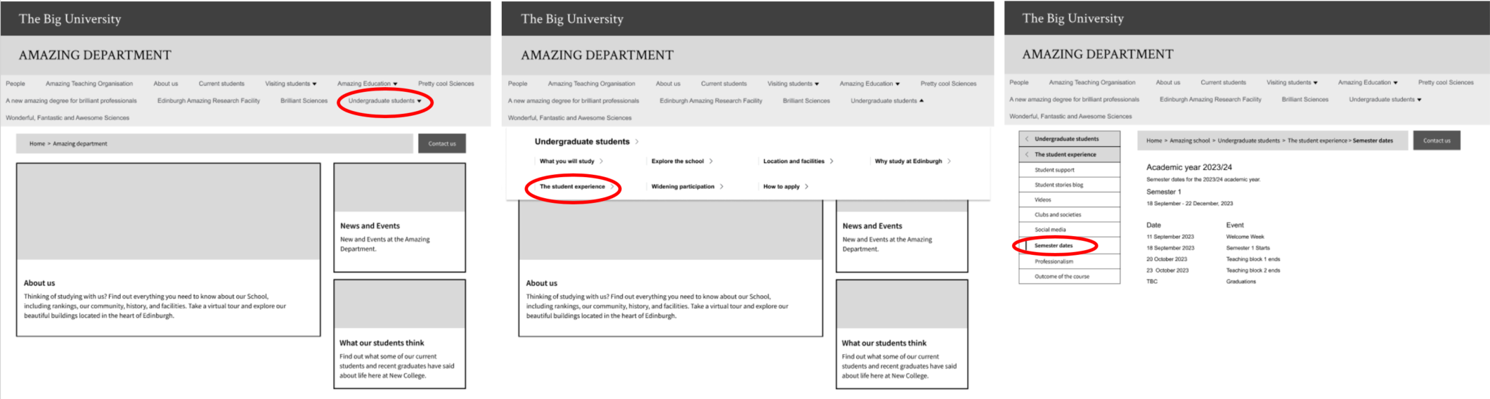
Screenshots showing sequence of steps to arrive at the destination ‘semester dates’ page in the prototype
What we found and next steps
More participants successfully completed the task using the combination navigation scheme in the iterated prototype than in the previous version of the prototype (with the top menu alone). Four out of six participants were able to navigate to the ‘semester dates’ destination, compared to one out of six in the test using the previous prototype.
We also found that users struggled to understand where to click once they had opened the top menu. They weren’t clear which of the items available would lead them on the path to ‘Semester dates’. We saw that several participants clicked across several links before they found the right one.
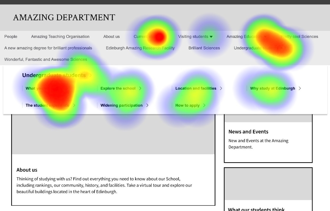
Heatmap showing that participants still struggled to work out where to click once they had opened the top menu.
Those participants that found the correct link from the menu (’The student experience’), then quickly located ‘Semester dates’ from the left-hand menu. This was in contrast to our previous test, where users spent over 30 seconds looking at a page full of links and still didn’t click on ‘Semester dates’.
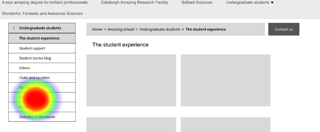
Heatmap showing that all participants who found ‘The Student Experience’ page were able to find ‘Semester dates’.
These findings validated our assumption that reducing the volume of content in the top menu improved the usability of the navigation, although how clearly the content labels described the content available to users clearly played a part in helping them select the right menu item from the start. The findings also indicated that users could understand the combined navigation scheme. However, it was important to test this further with wider use cases, to represent the range of different structures and content arrangement of EdWeb sites.
Read about our further testing in the blog post:
Usability testing a combined navigation solution with representative EdWeb sites
Our previous research on menus and navigation for the Web Publishing Platform
Testing menu designs for the Web Publishing Platform
Navigation scheme research using the Stanford Graduate School of Business website
Implementing and evolving a megamenu in the Web Publishing Platform
From left-hand menus to megamenus – our visualisation tool
Revisiting our Information Architecture Guidelines
Comparing a megamenu to a left-hand menu in task-based scenarios using Figma and Maze
Testing a mobile menu concept with Figma and Maze
1 replies to “Iterating a navigation scheme for the Web Publishing Platform – combined menu solution”