
Navigation scheme research – using the Stanford Graduate School of Business website
As we continue to shape the navigation scheme of the Web Publishing Platform, we wanted to learn about the holistic experience of megamenus from the perspective of editors, developers and end-users. We conducted usability tests using the Stanford Graduate School of Business website and collaborated with the team behind it to understand how a megamenu can work in a navigation scheme of a higher education website.
Our work on megamenus so far
We recognise that including a megamenu in sites within the Web Publishing Platform represents a shift in our navigation approach and we’ve carried out various pieces of research to ensure we design, develop and configure this component in the right way, both from the perspective of migration and for longer-term, continuous iteration. You can read more about our work in these blog posts:
Comparing a megamenu to a left-hand menu in task-based scenarios using Figma and Maze
Implementing and evolving a megamenu in the Web Publishing Platform
From left-hand menus to megamenus – our visualisation tool
Why the Stanford Graduate School of Business?
To understand how a megamenu operates as part of a wider navigation scheme we recognised the value of referring to a real-life example. Megamenus are often used on retail sites, however, examples from commercial sites contain content that’s not representative of the higher education context. Many university sites include megamenus at an institution level to give an entire web estate overview (such as the University of Stirling and the University of Manchester websites) or to display links to specific departments or colleges (such the University of Oxford website), however, to match our intended use-case we wanted to look at an example where the megamenu was used on an individual site within the web estate, such as a School site. Stanford Graduate School of Business (SGSB) site satisfied this criterion as its megamenu covers the school-level site.
University of Stirling website
University of Manchester website
Stanford Graduate School of Business website
Another reason for choosing the SGSB site as an example to continue our research on megamenus was that it was built using Drupal, which is the same Content Management we are using to develop the Web Publishing Platform. Through connections in the Drupal community we were able to connect and hear from those who built the SGSB megamenu and those who manage it, giving us the holistic perspective we were looking for.
About the Stanford GSB navigation scheme: megamenu, left-hand menu and in-page navigation
The Stanford GSB navigation scheme comprises various elements, but for the purposes of this research, the megamenu, left-hand navigation and in-page navigation elements were of interest to us.
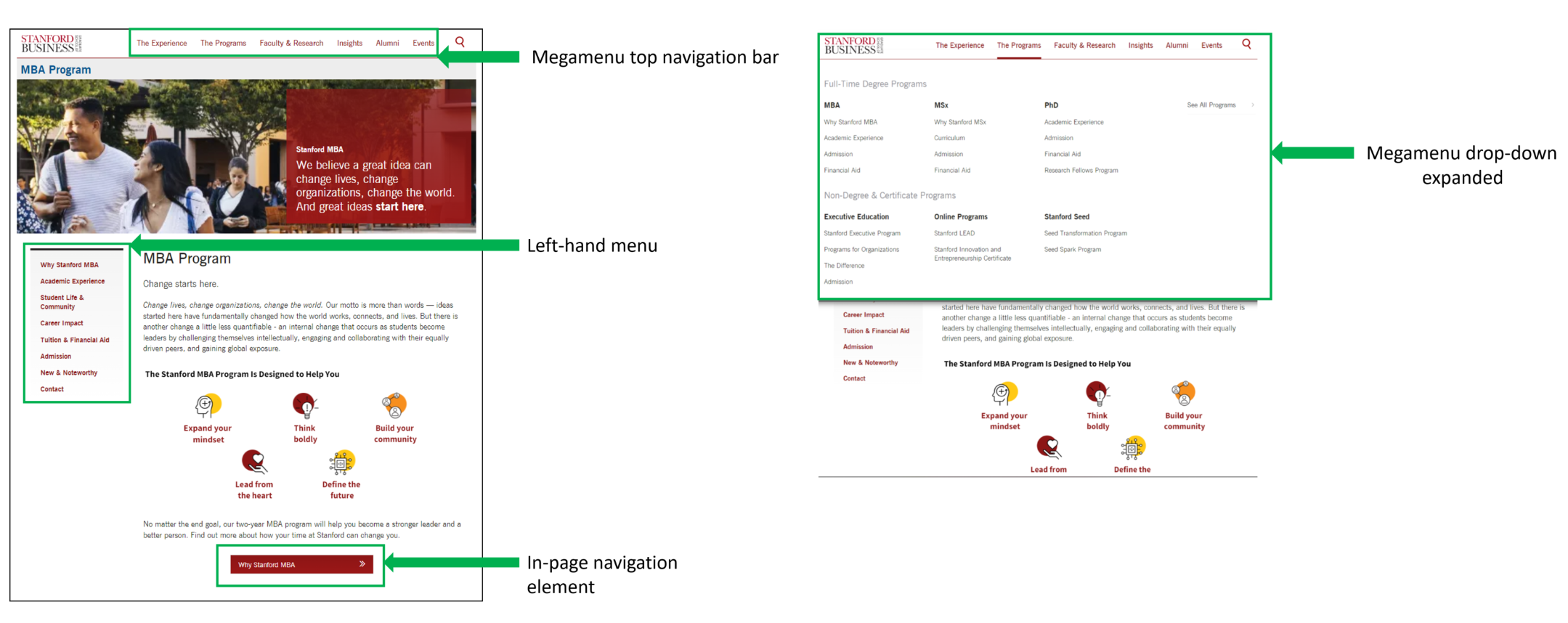
Stanford Graduate School of Business navigation scheme with megamenu top navigation bar, drop-down, left-hand menu and an in-page navigation element outlined
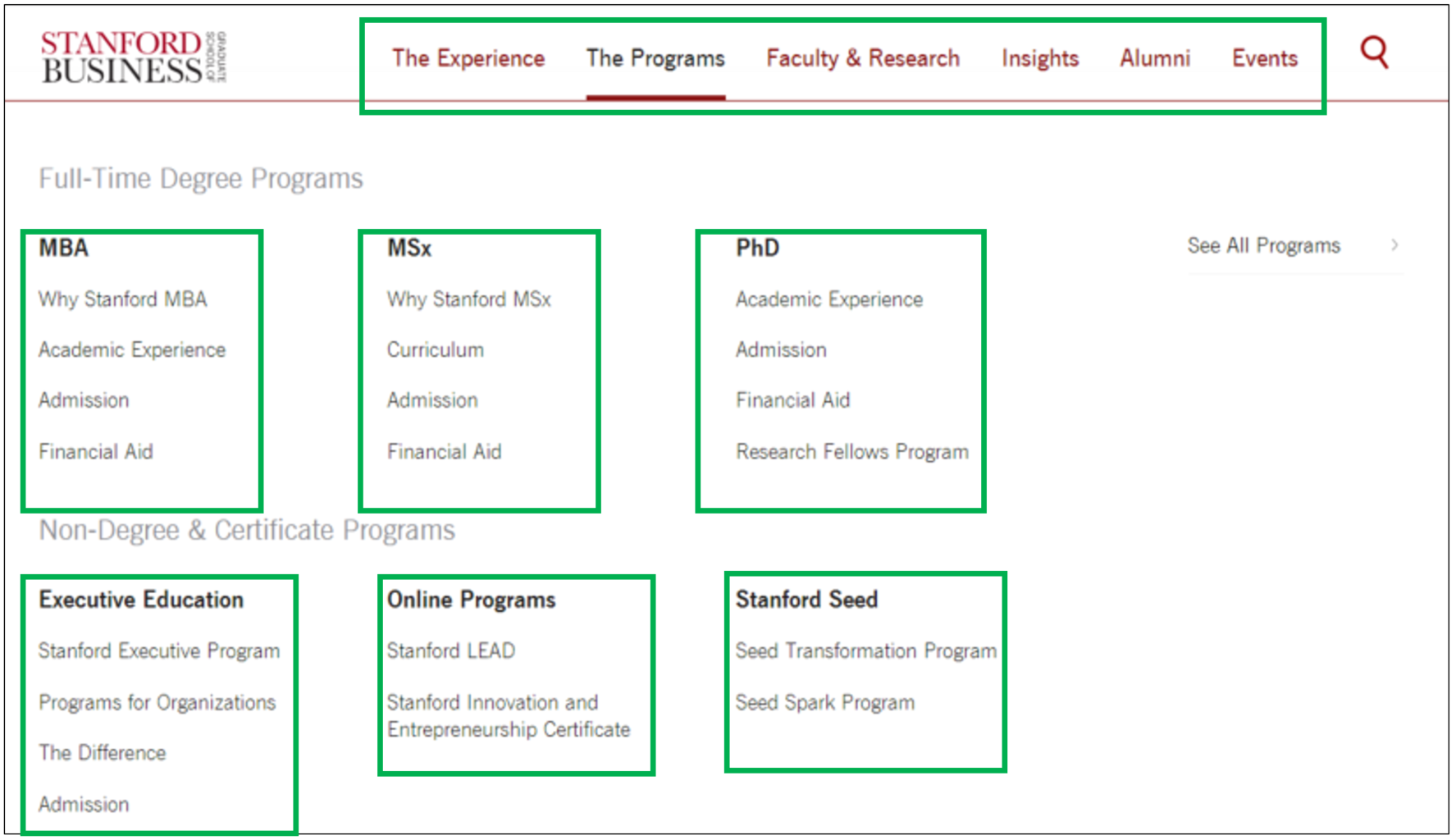
Megamenu drop-down contains sets of curated menu items not a site map
When the SGSB megamenu is expanded (activated by a person hovering over it), the items within the drop-down do not represent a site map and do not faithfully reflect the site hierarchy. Instead this area contains a collection of specially-selected headings and links designed to take end-users to key pages or sections of the site, performing a similar role to a landing page.
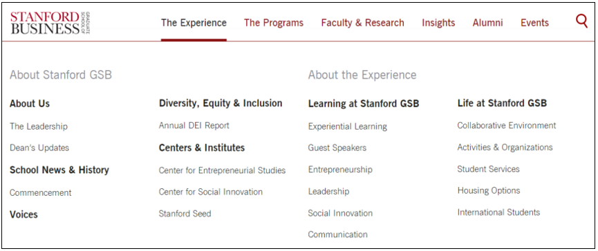
The SGSB megamenu drop-down expanded showing the menu items under ‘The Experience’ category
Left-hand menu indicates hierarchy of pages
When on a particular page within the site, the left-hand menu shows the position of that page in the site structure and reveals the parent-child relationships between pages.
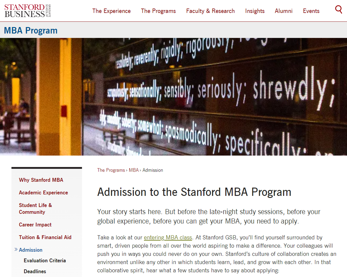
The SGSB MBA Admission page with the left-hand menu showing the where the page sits in the site structure.
Usability testing the Stanford GSB navigation scheme with end-users
On the face of it, the SGSB navigation scheme seemed to work well. But I wanted to understand if it presented usability problems when people used it to find content. I also wanted to understand how website visitors interpreted and used all three navigation elements together when looking for pieces of information to complete a task. I specified three main areas to learn about to help me assess whether this type of navigation scheme could be suitable for the Web Publishing Platform.
How do people navigate from the homepage?
I assumed people would use the megamenu top navigation bar from the SGSB homepage but I wanted to validate this assumption.
How do they make sense of the megamenu?
I wanted to learn:
- What terms do they use when referring to parts of the megamenu?
- When they have expanded the megamenu and can see the drop-down, can they easily find content within it (even the ones in the lower row of columns)?
- When they examine the items in the megamenu do they notice relationships between them?
How do they navigate between pages within the site (including deeper ones)?
I wanted to find out about information seeking when on a page within the SGSB site. I particularly wanted to know:
- Do people opt for the megamenu, the left-hand navigation or the in-page navigation to move to a different part of the site?
- When they need to get to deeper content (such as pages at three levels below site root level – the homepage) which navigation elements do they opt to use?
Scenario and tasks
With the help of Pete Watson from the Prospective Student Web Content team, I recruited four student participants to take part in the tests on Teams. I designed a scenario which required participants to move around the website to find various pieces of information to enable them to assess SGSB as a prospective place to study.
Tasks 1-3 required participants to compare two programmes available at the SGSB – the MBA and the MSX – on the basis of three criteria: application requirements, student life and curriculum. This information was available as subpages of each programme page (for example the ‘mba/life-community’ page, and the ‘mba/admission’ page). Links to these subpages were available in the megamenu, the left-hand menu and the in-page navigation elements.
Task 4 required them to find a piece of information on a page about the SGSB Energy Business Innovations Initiative (this represented one of the site’s deeper pages – three levels below the homepage).
SGSB Energy Business Innovations Initiative page
Findings and learnings
The research showed that, apart from difficulties navigating to deeper content, the SGSB navigation scheme did not cause people usability problems when they used it to find task-related content. As hoped, the tests also revealed useful insights into how participants made sense of the navigation elements and used them in combination to find information to complete the tasks.
All four participants used the megamenu top navigation bar from the homepage
The SGSB megamenu drop-down expands when people hover over it. From the homepage, all of the participants went to the top navigation bar and hovered over it to expand the megamenu drop-down as a first step.
Participants talked about ‘tabs’ and didn’t refer to sections
As they thought aloud in their completion of the tasks, several participants described the items in the top navigation bar options as ‘tabs’. They didn’t comment on the sections laid out in the megamenu drop-down or the relationships between the menu items.
Half of the participants went straight to programme subpages through the megamenu, the rest used the left-hand menu
The megamenu drop-down for ‘The Programs’ includes links to ‘Admission’ for both the MSX and MBA programmes. When tasked with looking into this aspect of the MBA programme, two out of four participants directly used the menu links in the megamenu. The other two clicked into the ‘MBA’ menu link first and then selected the ‘Admission’ option from the left-hand menu.
Participants used a combination of navigation elements with equal ease
To complete tasks 1-3 (finding different pieces of information on subpages of the MBA and MSX programmes) the participants easily flipped between the in-page navigation, megamenu and left-hand menu to orientate themselves and work out where to go next for the information they needed.
Getting to the deeper page was difficult for participants
Only two out of four participants were able to navigate to the required ‘Energy Business Innovation’ page which was three levels below the root level. The other two were unable to find the right menu link and failed to complete the task. Of those who did navigate successfully, one found the right menu link in the megamenu after multiple attempts, and the other found it in the left-hand menu.
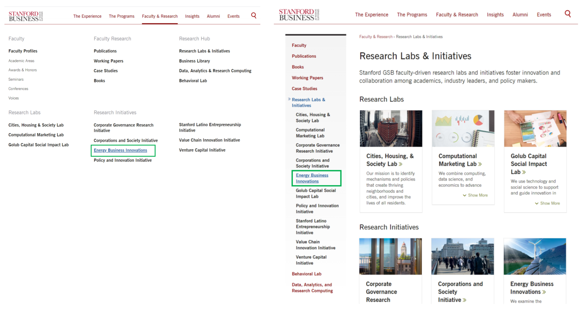
Screenshots of the SGSB megamenu and left-hand menu showing the position of the link participants are required to find in the test.
Learning from the staff at the SGSB
Having established from the usability testing that the SGSB navigation scheme was, on the whole, usable for end-users, we wanted to learn more about how it worked from those who built and operated it. Using contacts in the Drupal community, we were able to meet with the developers and the Associate Director of Web Strategy at the SGSB who very kindly provided a demonstration of the back-end build and gave insight into their processes to edit and manage the different navigation components. This provided an additional perspective on the whole scheme, enabling us to assess the suitability of something similar for the Web Publishing Platform.
Back-end build perspective
The SGSB development team showed us how they had used multiple menu systems in the back-end to power different parts of the megamenu and the left-hand menu. The megamenu top-level navigation bar (containing the top-level items ‘The Experience’, ‘The Programs’, ‘Faculty & Research’, ‘Insights’, ‘Alumni’ and ‘Events’) was achieved with one menu. Within the megamenu drop-down, the columns of items were underpinned by additional multiple menus each comprising small numbers of items. The left-hand menu was controlled by a separate menu which also powered the mobile menu, and there were additional menu structures for the navigation schemes of SGSB microsites. Drupal block layouts and configuration had been used to determine how the different menus displayed across relevant pages and sections of the website.
Screenshot of the SGSB megamenu drop-down showing the multiple menus within it outlined in green boxes.
Content editing and management perspective
The set-up of multiple menus in the back-end enabled significant editing flexibility for the front-end menu display. A layout displaying the columns and regions of the megamenu drop-down enabled the editing team to see which items sat where so they could adjust them easily. Since the desktop and the mobile menus were underpinned by different systems, it was possible for editors to adjust the styling of the megamenu drop-down without impairing the responsive view. This meant, for example the megamenu drop-down could be adjusted to include a 4-column display or a 3-column display, and the headings within the drop-down could be adjusted to span one column or multiple columns.
Balancing technical needs with the needs of end-users and editors
Testing the Stanford Graduate School of Business website and collaborating with the team behind it was very valuable, not only to obtain an understanding of how people use a megamenu as part of a navigation scheme on a Higher Education institution website, but also to learn about what it takes to develop and maintain such a scheme. It was clear that the ability to customise and curate items in the megamenu drop-down came with added complexity. Understanding this bigger picture reiterated the need to follow a design process as we shape the navigation scheme and wider information architecture, and carefully consider our decisions about the navigation in context. Every piece of development work merged into the Web Publishing Platform codebase has implications for our development team, our web publishers, our EdWeb service support team and our website visitors, and in all cases it is necessary to obtain a compromise in our solutions.
Next steps – more testing and research
We still have work to do to finalise our navigation scheme design. We have more concepts to test and more research to do both from the site visitor and editor perspectives. Taking what we’ve learned from SGSB, we appreciate the need to be mindful to balance our vision of what a megamenu can achieve for our website visitors with what can be sustainably built, without the need for custom code and associated technical debt, and avoiding creating a navigation scheme that is too difficult for our web publishing community to get to grips with.
1 replies to “Navigation scheme research – using the Stanford Graduate School of Business website”