
Usability testing a combined navigation solution with representative EdWeb sites
We used prototypes based on two different EdWeb sites to test the usability of a navigation scheme comprising a top menu combined with a left-hand menu.
In previous rounds of testing, we established that a top menu drop-down populated with menu items from the top three levels of a site presented usability issues to people trying to find content. From research we carried out with the help of the Stanford Graduate School of Business website, we learned that it would require significant technical effort and the implementation of multiple menu systems to curate or customise the number of menu items displaying in the top menu drop-down (as a megamenu typically works). Therefore to reduce the volume of content in the drop-down, a solution was proposed that included the top two levels of menu items instead of the top three – with a supplementary left-hand menu to access deeper levels of content. Using like-for-like prototypes, we compared the usability of the combined navigation scheme with a scheme comprising a top menu only and found the combined solution fared better in usability testing with participants.
What we still wanted to know about the proposed solution
Our previous tests used a prototype based on a typical School site which was abstracted to ensure participants did not require specific knowledge to take part in the testing. It was difficult to generalise our findings knowing that EdWeb sites have a range of different structures and content. To increase our degree of certainty that the proposed solution was a good fit we wanted to test it using EdWeb sites with real site content that represented some of the variety.
Read about this round of testing in the related blog post:
Iterating a navigation scheme for the Web Publishing Platform – combined menu solution
Selecting EdWeb sites to build prototypes to test with
We picked two sites that we felt reflected contrasting site structures in the University web estate.
The first was the Undergraduate Study site. We picked this site to test with because it has a ‘shallow’ information architecture, with four levels of menu items – meaning a user won’t need to click into more than four levels to reach a page. This site has 10 items in the top menu, which, when viewed on a standard-size desktop means the menu items display over two rows:
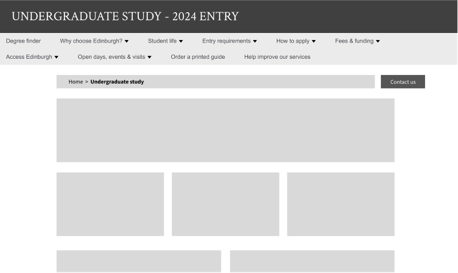
Screenshot of our Undergraduate Study prototype, which takes content from the existing site and fits it with the proposed menu system
By contrast, the Careers Service site has a deeper information architecture. It includes eight levels of menu items – meaning a user needs to click through eight levels of the site to reach some pages. Compared to the shallower site, this site has fewer links in the top menu bar and therefore presents a different navigation path to users:
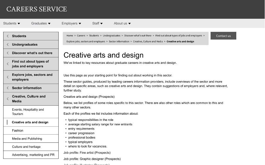
Our Career Service prototype fitted with the proposed navigation scheme.
Research goals – questions we wanted to answer
From this round of testing, we wanted to establish the following:
- Would users understand how to use a combination of top menu and the left-hand menu when navigating within a site?
- Are there any usability issues when this navigation scheme is applied across sites with different content and structures?
Designing the tasks
A successful website navigation scheme needs to be usable by people from wherever they are in the site. From any page, the scheme needs to support users orienting themselves and establishing the following:
- Where am I?
- Where can I go?
- Where have I come from?
With this in mind we designed tasks to be completed from different starting points of the two prototype sites. Some participants were asked to complete tasks requiring them to find defined pieces of information starting on the homepage of the site. Other participants were asked to complete the same tasks starting from a deeper page within the site. Both types of tasks were designed to require participants to use the top menu and left-hand menu so we could see how the scheme worked. This would also enable us to understand if participants could figure out their location within a site and navigate successfully to another area.
For the Undergraduate Study site prototype, the scenario-based tasks were as follows:
- You live in Wales and you want to find out how much it costs to study for a degree at the University. Can you find this information?
- You’re interested in studying at the University of Edinburgh. Where would you find application deadlines?
For the Careers Service site prototype, the scenario-based tasks were as follows:
- You are an undergraduate student looking at job options for when you graduate. Can you find information about becoming a school teacher?
- You are an undergraduate and you are looking for careers help. Can you find advice for preparing for a job interview?
Conducting the tests
The participants were all student staff unconnected with the Web Publishing Platform project. Five out of six tests were carried out in-person using a Windows laptop and mouse. We set the prototypes within the Maze platform to provide heat maps of where participants interacted with the prototypes.
What we found
To analyse the findings from the different tasks on the two prototypes we referred back to the research questions we set out to answer.
Did users understand how to use a combination of top menu and left-hand menu?
We observed all six participants make use of the top navigation and left-hand menu to move through prototypes without confusion. We saw this most clearly when they completed tasks on the Undergraduate Study site, where all participants selected a link from the top navigation bar, chose an option from the drop-down, and then found the right link from the left-hand navigation. For the Careers Service prototype with deeper hierarchical levels of content and where there were different routes available to get to the right information, users approached the task in different ways. Some clicked into the top menu first, while others navigated only with the left-hand menu.
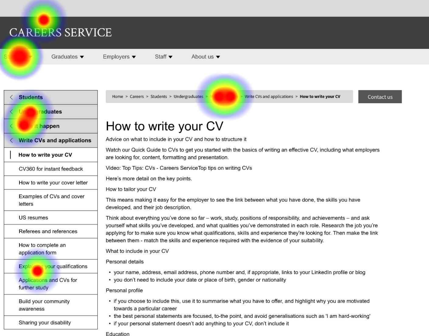
Heatmap to show where users were clicking to find information for interview advice.
Observing participants’ actions in-person, we noticed that four out of six users scanned through the left-hand menu first. If they couldn’t find a relevant link or section heading, this is when they looked at the top navigation. Taking these findings together, the evidence suggests that participants could use the combined navigation scheme, for a range of different site structures representative of EdWeb sites.
Are there any usability issues when this navigation scheme is applied across sites with different content and structures?
We saw no usability issues for the Undergraduate Study prototype, where all participants successfully completed both tasks.
For the Careers Service site, we frequently saw users clicking on links which did not take them on the path to the content the task required them to find. Participants commented that there were similar-sounding page titles, such as ‘Become professional’ and ‘Make it happen’. They felt it wasn’t obvious from these labels what the page might contain.
It got complicated because there were so many sections – participant talking about trying to complete a task using our Careers Service prototype
We noticed some users clicking randomly all over the page to find the correct path, especially if the top menu was used. In our prototype these clicks didn’t work to take them to other pages – in other words they couldn’t proceed without finding the correct link – but in a real site, each of these clicks could have resulted in a deviation from the path to the desired content, which would have cost them a lot of time and wasted effort.
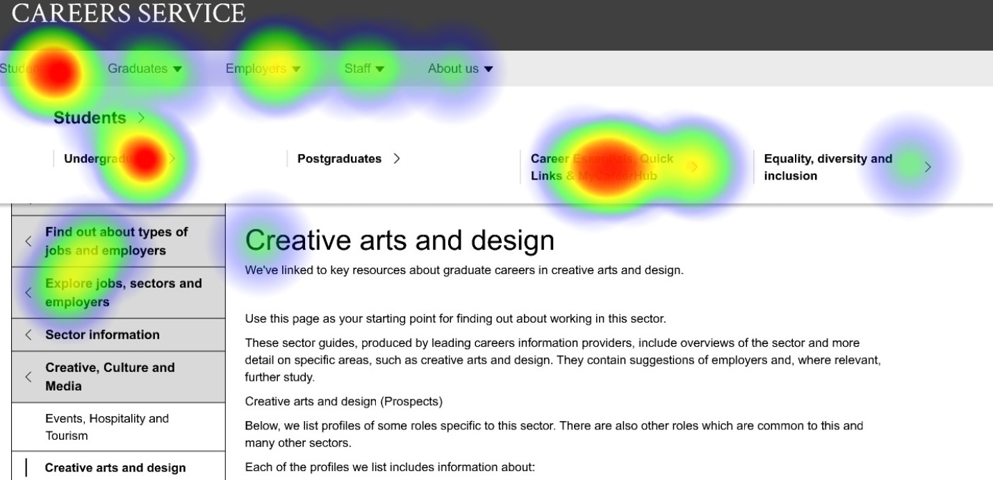
Heatmap showing that when participants used the top menu, it was difficult for them to know where to go next.
We saw that once participants got deeper into the site and content was more clearly labelled, they were able to follow the content progressively presented to them as they clicked through the different levels of the left-hand menu to quickly reach the information required by the task.
Conclusions and next steps
To ensure the team were aligned on the results of the tests, we ran a playback session to review selected videos from the testing and decide on actions. From the playback we agreed that menu items presented in a combined navigation scheme presented fewer usability issues than when presented in a single top menu, although we acknowledged that the combined scheme gave users more places to look for navigational clues. We noted again that the labelling of menu items played a major role in how successfully tasks were completed, and that, for some sites, menu labels developed within the existing EdWeb may be out of context when displayed in the new structure.
From these findings, and weighing up the need to begin migrations without further delay, our team will proceed with developing this combined navigation scheme using Drupal functionality. Through examination of site content and structures and test migrations we will be able to visualise more EdWeb sites within the new scheme to identify any problem areas to fix. We will develop guidance for web publishers to optimise the usability of their sites as their content is migrated, recognising that there will be cases where menu labels created for EdWeb may need to be tweaked to fit the new navigation structure.
Reflections
It’s difficult to make decisions on a navigation approach that affects hundreds of sites varying in size and structure. However, from the evidence we’ve seen in this latest round of research, we believe that this current navigation scheme would work well enough for sites across the University web estate. As we begin to run test migrations ahead of migration restarting, we’ll monitor and review the usability of the top menu. For now, it’s easier to develop a minimal scheme and make additions later, if we’re sure they’re needed.
This study has shown that it’s important for us to work closely with Web Publishers to inform them of the proposed design and how it will affect the content on their sites. After further investigation, we hope to provide publishers with best practice guidance on how to optimise their content for the new navigation scheme.
Really interesting read, Emma. Thanks for sharing this level of detail on your findings. In particular, it was interesting to see research being done on our undergraduate study site.
Couple of things come to mind:
– Have you done any testing on the existing Careers and Undergraduate Study site? Would be interesting to see how experiences there doing exactly the same tasks compare.
– What are plans for mobile testing? A significant proportion of prospective students are reading the website on smaller viewports, so be good to hear how the proposed navigation performs mobile-first.
Thanks Neil. We considered doing tests on the existing Undergraduate and Careers sites (with the current EdWeb single menu on the left-hand side) but since the decision had been made to move away from the single left-hand menu to the solution incorporating the horizontal menu it was most logical to test the combined navigation.
Re mobile testing, we did initial testing on a mobile menu concept using a prototype (in 2022) and we have implemented a first iteration of a Drupal out-the-box menu solution to enable migrations. We need to do more work to adopt the designs from the prototype so once that is done this will warrant a fresh round of testing.