
Testing menu designs for the Web Publishing Platform
At the end of June, the UX and Content team had an opportunity to test out some ideas during the Undergraduate Open Day. Armed with ipads and sunscreen, we took to the streets of Bristo Square to enlist some willing volunteers…
The study in brief
- Previous research showed that using a top navigation menu in EdWeb sites caused usability issues when there were up to 6 hierarchy levels of parent links.
- We ran usability tests with a further iteration of the top menu. We designed a prototype to explore whether users could navigate a long list of page links that extended past the bottom off the screen.
- All 6 participants understood they needed to scroll down through the menu, but 5 participants couldn’t find the information they were looking for, even though the page link was visible.
- We played back recordings in a session with stakeholders to identify usability problems and possible solutions to test. The main issues identified included clarity of content labelling and the overwhelming quantity of links in the menu.
- Next steps are to test a further menu iteration restricted to show links up to 2 levels deep. We will test this across a wider range of University site content.
Background
The development of the new Web Publishing Platform (WPP, also known as ‘EdWeb2’) is well underway within our team. While sites on the current EdWeb platform display a left-hand menu component, migration to the new platform will also include a top menu dropdown, which as has been referred to as a megamenu.
The UX team have already tested this concept in multiple ways, both in the University of Edinburgh’s site and other university sites – you can read about this in previous blog posts:
Navigation scheme research using the Stanford graduate-school of business website
Implementing and evolving a megamenu in the web publishing platform
The findings from this research showed that if we displayed too many links within the top menu, users would struggle to find the information they needed. A proposed solution to this problem was to restrict the menu to show only 3 levels of links, shown below:
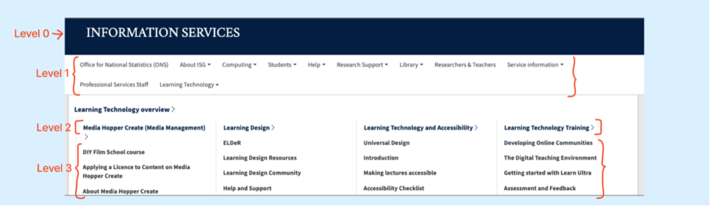
Example of expanded top menu showing up to 3 levels of links.
Would this solution improve usability?
Planning the research
After adapting the menu to show only 3 levels, we also noticed that the menu component extended below the edge of a screen when there were too many level 3 links. This led us to wonder – would users know that they would need to scroll down to find the link they needed?
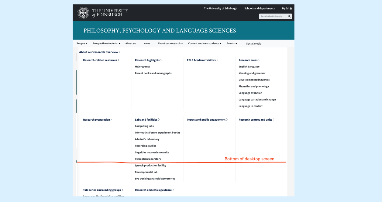
Screenshot to show that in some cases, the dropdown menu may stretch below the edge of some device screens.
From this next phase of research, we therefore wanted to know:
- Would users of the menu realise that they needed to scroll down through the top menu to find what they were looking for?
- Could users locate a particular link when it was near the bottom of the menu?
- Would presenting a large volume of content within the top menu cause any usability issues?
Given we were recruiting people on the street, our tests needed to be quick and snappy – we didn’t want to be taking more than 10 minutes of people’s time. We designed a prototype that was based on real school sites that contained many level 3 pages. By displaying a menu that contained a large number of links, we could test the worst-case scenario to see what problems this might cause.
We asked participants, ‘From this page, could you tell us when the undergraduate courses start?’
The solution: (1) select ‘Undergraduate’ from the top menu, then (2) select ‘Semester dates’.
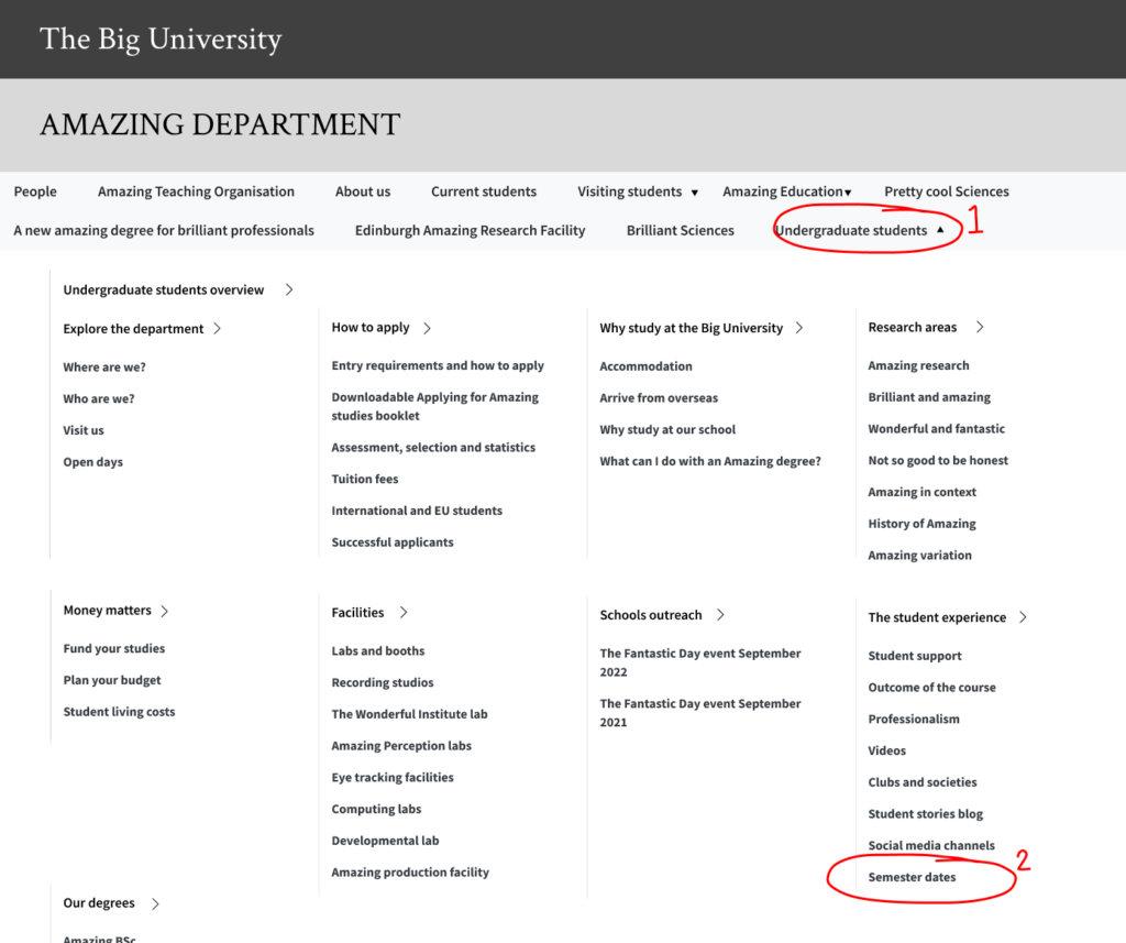
Prototype of the expanded dropdown menu showing where users were expected to click.
Some notes on the experiment design:
- We picked ‘semester dates’, as this was a piece of information that those attending the Open Day – prospective students (and their parents) were likely to want to find.
- The content in the prototype was based on information architecture and terminology found in multiple EdWeb sites. However, we modified labels to be non-subject specific so that participants didn’t need expert knowledge to complete the task.
- The prototype did not look like a real live website, just a sketch of our ideas. We wanted to test our ideas quickly and designing realistic websites takes a lot of time! It also meant that we could force users to navigate using the menu – there was no search bar, for instance.
- We worded the experiment task to avoid using the term ‘semester dates’. This gave us a better idea of how users would interpret the content and navigation on the screen, rather than searching for the exact word.
Our expectation was that people would not realise they could scroll down through the page and might struggle to find the right link.
On the day
We set off to Bristo Square on a gloriously sunny Undergraduate Open Day and found that people were more than happy to chat to us as they waited for events to start! We tested with 6 people in total, and these were a mix of existing students, prospective students and parents.
We observed the following behaviours:
- All participants opened the top menu using ‘Undergraduate students’ and scrolled through the menu to find more links.
- Despite the link being visible on the screen, all participants struggled to find ‘semester dates’. 5 out of 6 people didn’t complete the task.
- Participants spent an average of 33 seconds searching for ‘semester dates’ once they had opened the menu dropdown – this is a long time to be stuck on a page!
“I’m struggling… it’s too cluttered, there’s too much on there.” – Participant 6
- We saw several people scan the parent links but didn’t look at all of the child links underneath.
- When prompted, participants told us were looking for the terms like ‘calendar dates’ and ‘term dates’.
- One person expected to see ‘semester dates’, but they were an existing student with knowledge of university terminology. They also didn’t spot the link in the menu.
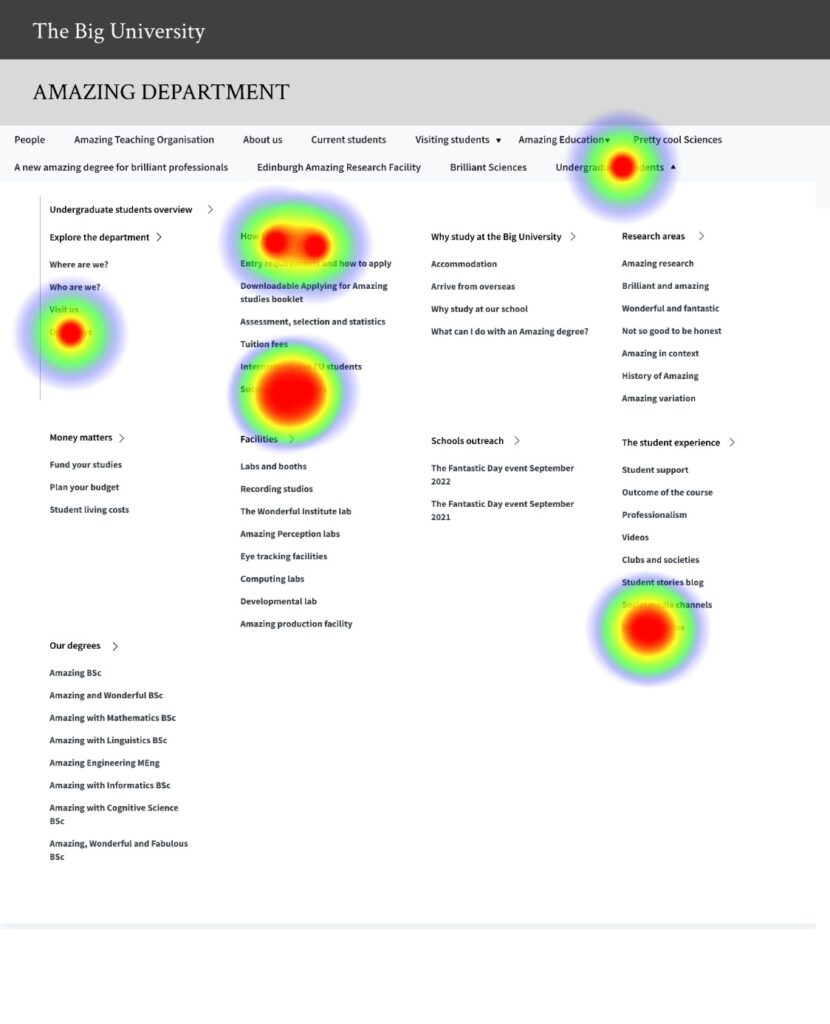
A heatmap showing where users expected to find course date information.
Playing back our findings
Once we’d captured all the responses, it was important to involve the project team and wider stakeholders in our analysis of the findings. We set up a session to review the experiment recordings with two members of our development team and the scrum master.
We asked the following questions:
- What usability issues are evident?
- What might be causing these issues?
- How might we solve these issues?
This format helped us think about the problem before considering possible solutions. Some of the possible causes that were identified included:
- Styling of text, such as font and heading size.
- Too much content in the menu.
- Unclear information architecture and content groupings.
What next?
Given the University’s devolved publishing model, the Website and Communications team are only able to control the menu component itself, not the content inside it – responsibility for this rests with web publishers of individual sites. Was there anything we could do with the menu component to make content easier to navigate? There were two options available to us:
- Option 1 – reduce the number of parent levels displayed in the top menu to show links only to level 2. This would drastically reduce the amount of content permitted in the top menu.
- Option 2 – limit the number of child links shown per parent. This would need a different technical approach, as well as requiring web publishers to choose which links they wanted to display.
The simplest solution for us to test therefore seemed to be Option 1. We will be testing this out in our next round of research, so stay tuned for the results!
Reflections
One limitation of the prototype was that we had adapted EdWeb site content to be non-subject specific. In future studies, we’d like to see how participants navigate around existing University content.
We also deliberately tested a worst-case scenario with our prototype, so we predicted there would be usability problems. It would have been useful to see if the same problems were present with content that had already been optimised for users. This could help us make recommendations for content owners and web publishers.
The results have shown that it’s really difficult to test the usability of a navigation component without also testing the content that sits inside it! In the coming months, it will be important for us to work closely with the University’s web publishing community to understand how their content can work within the new navigation scheme.
Finally, a big thank you to the Prospective Student Web Content team who invited us along to the Open Day and gave us some pointers for conducting pop-up research. I was initially nervous about approaching people to test our screens, but our participants were happy to help out – the great weather also helped!
For further blog posts on user research from the Open Day, you can read the following posts from our colleagues in the Prospective Student Web Content team:
1 replies to “Testing menu designs for the Web Publishing Platform”