Tuition fee experience for PGT – usability testing
Following the changes we made to tuition fee content we conducted a round of usability testing to determine whether students’ needs around fees and cost of study had been met. In general, most tasks tested were completed with relative ease however several issues were highlighted that need addressing to improve the user experience further.
Pain points included the general uncertainty on the total cost of multiple years of study, a lack of interlinking fee content to the fee enquiry form, and confusion over navigational elements for online part-time intermittent programmes.
What we did
Our discovery research at the Postgraduate Open Day provided us with the top issues to fix around the postgraduate fees experience. Once our work was completed, we tested usability through confirmatory research to make sure things worked as intended. How successful were users in completing a task? How efficient was task completion and how did the users feel about their experience?
Read the issues that came out of the Open Day usability testing
The testing was remote moderated sessions using MS Teams or Zoom, depending on participant’s access to these video conferencing software. We recruited 7 participants to represent prospective students that met one of the following criteria:
- first degree graduates (2)
- postgraduate offer holders (3 overseas and 1 home)
- postgraduate alumni (1)
Why we did it
The objective was to test the fees experience with the target users in order to understand which aspects of the experience were working well and which could be improved going forward.
We wanted to understand whether participants can:
- establish tuition costs for a particular programme over multiple years
- establish that costs over multiple years will increase
- can easily find a programme cost from the tuition fee table
- understand how the university determines fee status
- understand how and when to pay tuition fees

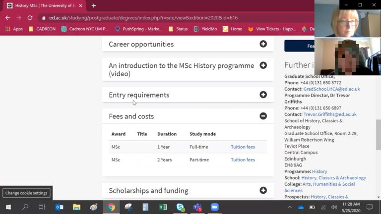
Screenshot of remote moderated usability test
Collaborative usability playback session
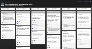
On 8 June we ran a usability test review session. Playback sessions are a great opportunity for staff to see for themselves what users are doing and saying and allows them to become involved in our research. Staff watched 3 participants as they tried to establish the cost of study for a programme on-campus and online. At the end of the videos we used Padlet, an online bulletin board to capture our observations of the biggest issues we saw the participants having.

Collating biggest usability issues on Padlet
Key findings from the research
The overall result was that participants did find suitable content for the majority of tasks but at times were not entirely satisfied. Participants needed further clarification to reassure the assumptions they were making especially around the total cost of study.
Cost of study
When asked to compare tuition fees for the History MSc on-campus and online learning programme there was some confusion in how the fee information is presented.
Empty table cells – The table heading ‘online distance learning’ on the on-campus programme caused some participants to make assumptions that the course was not available through online learning, not realising there is a different programme for that study mode.

On-campus programme fees
N/A abbreviation – For the online learning programme it shows N/A under the fee status classifications which caused some uncertainty that the cost for online is the same rate for all students regardless where they are from.

Online learning programme fee
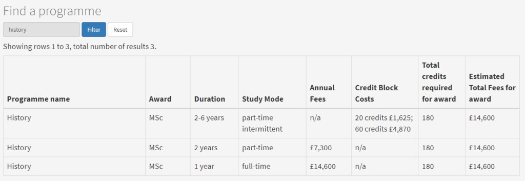
Filtering the fees tables
The ‘find a programme’ filter was used to find the relevant programme though wasn’t immediately obvious to all users. There was an expectation that the table would be filtered on the programme when navigating from the programme page rather than a “huge big wall of information”.

Filtering the fees tables
The table of fees allowed participants to compare programme costs which participants liked but the ‘estimated total fees for award’ column suggested that regardless of study mode it will cost the same. Although it says estimate it doesn’t explicitly state that programmes longer than one year will increase in fees each year and therefore can cost a lot more than the estimated figure shown.
Confusing navigation
The navigation between ‘online learning fees’ and ‘part-time intermittent fees’ meant that users were going back and forth to ensure they were at the right place. Having chosen tuition fees for an online part-time intermittent programme to be presented with all study modes for online learning was confusing.
Channelling fees enquiries
The ‘contact us’ call to action is not immediately obvious. 3 participants didn’t find the specific tuition fee enquiry form where some instinctively looked within the footer for contact before finding alternative contacts at the degree finder and general enquiries through search.

Majority of participants failed to notice the ‘Contact us’ call to action
What happens next
We will work through the findings from the research and identify ways to address them. We continue to assess the success of the prospective students’ fee experience, and work with the Fees and Student Support team to improve further as we reduce unnecessary enquiries and meet user needs.
If you want to comment on our findings and share experiences that you have with prospective students leave a comment on this page.


