
If everything stands out, nothing stands out: how standout elements affect user behaviour
I recently did some content improvement work with the Postgraduate Recruitment team that taught me a lot about the use of standout elements and how they influence user behaviour.
Background
I recently collaborated with the Postgraduate Recruitment team to improve some of their open days and events content. Specifically, we wanted to review and rework the pages used to promote open days and events.
We chose a page that was currently live and promoting the upcoming Online Learning Essentials (OLE) event for prospective postgraduates. This page also promoted online events hosted by schools happening on the same day as the OLE event.
The idea was this would result in a page template the team could use to promote future events throughout the year.
Gathering evidence and reviewing the content
The first thing I did was chat with the Postgraduate Recruitment team to get their insights on any known issues users have when booking and taking part in online open days and events. I then performed a review of the content for readability.
Identifying pain points
The Postgraduate Recruitment team provided us with insights they had gathered about how users interacted with this content and how that impacted their experience of the booking process and the event itself.
- Some participants were unfamiliar with (and struggled to use) the platforms we use to host online events (such as MS Teams or Blackboard).
- Due to technical requirements, users get a better and more consistent experience when attending on a laptop or desktop as compared to attending using a mobile device.
- There was some uncertainty about the difference between the sessions run by the Postgraduate Recruitment team and those run concurrently by schools, including how to register for them.
- Some participants were unsure about what to expect from a session and what type of information they would get.
Reviewing the content
A content review involves asking questions such as:
- How well does the content support the purpose of this page?
- Is the language clear?
- Does the page make good use of standout elements and headings to make the content easy to scan?
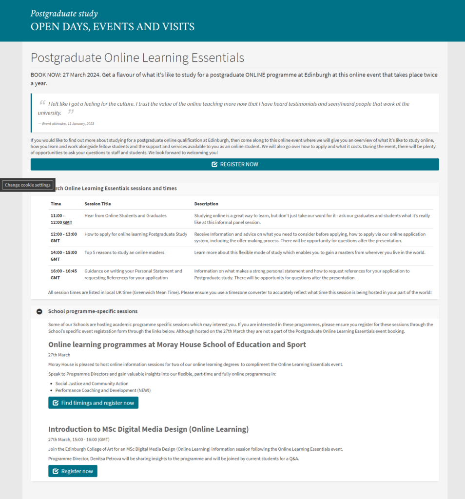
The original Postgraduate Online Learning Essentials page.
My assessment of the page was that:
- The language was clear enough.
- There was a lack of headings, making the content difficult to scan.
- The text on the registration link button was difficult to see.
- The accordions were not helpful, but rather hiding information.
- Based on the evidence we gathered from the team, there was some important information missing from the page (in particular, about technical requirements for attending events and any potential accessibility issues associated with that).
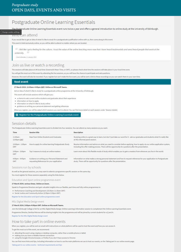
What I changed
Based on the evidence I gathered from the team and the content review, I made a few changes to the page.
- I added subheadings to make the content easier to scan.
- I put the event registration link into a feature box alongside key information, such as the date and time of the event and what platform it would be hosted on, so that it stood out more on the page.
- I added some content about the technical requirements for attending, to make sure participants knew what they needed to get the most out of the event.
- I removed the accordions so nothing was hidden from the user.
My first draft of the updated Postgraduate Online Learning Essentials page.
I then presented my ideas back to the Postgraduate Recruitment team to get their feedback and collaborate on any further tweaks to the content.
How did I know if the design was right?
The Postgraduate Recruitment team were happy with my changes, but that didn’t tell me anything about how well the new design worked for our users.
In order to assess this, I wanted to know:
- Can users easily find event information, like when it’s on and what will happen?
- Can users work out that they have to register for the main event separately from the events run by schools?
- Are there any usability issues with the registration link and booking form?
There’s no better way to answer these sorts of questions than to observe users interacting with your design. However, this doesn’t always have to take the form of formal, in-depth usability testing.
In this case, I created a set of tasks and a script (with the help of my manager Lauren) to help me test how well the new design worked. I took my script out on to campus, with my draft design loaded on an iPad. I then approached students and asked them to give me five minutes to go through the test with me.
This type of usability testing is called pop-up or guerrilla testing, and it’s a technique we use frequently in the team alongside more formal user interviews and usability tests.
You can read more about pop-up testing, why we use it and what we think of it as a method on our blog.
Read about pop-up testing on our blog
Testing the design – what happened?
I tested my design with five people, and the results were mixed.
All users were able to identify the event timings and what would happen at each of the events. And most of the participants were able to use the booking form without any problems.
However, most failed to distinguish between the main event and the school-specific events. In fact, some users identified the school events as the most important, and one even missed the registration for the main event altogether.
My changes had influenced user behaviour in a way that didn’t support the page’s purpose. For one person, the changes I made had the opposite impact on their behaviour to what I had intended.
Why my design didn’t work
The next step was to identify why my design didn’t work.
One reason why testing your design in the ‘real world’ is so important is that it lets you see it through the eyes of your user, in real time and while trying to complete a task.
While watching the test participants interact with my design, it became pretty obvious that I had tried to make too much stand out on the page, and this was impacting users’ ability to understand and interact with it the way the Postgraduate Recruitment team wanted them to.
In other words, it was causing the user to think too much about what they needed to do or what content on the page was relevant to them.
Why did I design it like this?
I’d prioritised the appearance of the page over its usability and didn’t think deeply enough about how we could best support the user behaviour we wanted to see.
Specifically, I failed to realise how much impact standout elements like feature boxes can have on user behaviour.
Back to the drawing board
I considered using a low (instead of medium) priority styling for the feature boxes containing the school events, but I worried this would still draw too much attention away from the main event registration link.
I decided to take the school event listings out of feature boxes, and placed this information under headings instead. This reduced the visual prominence of this content on the page, while the headings made sure the content was still scannable.
My final draft of the updated Postgraduate Online Learning Essentials page.
What I learned
This work taught me a lot about the impact of visual elements on a web page. In particular, if you try to make too much stand out, nothing stands out.
I believe we have a tendency to think that a page with just headings and text is ‘boring’ in some way, and that standout elements are important to make a page more visually appealing or ‘break up’ blocks of text.
However, we should remember that standout elements are not there purely for decoration – they should always be used with a desired user behaviour in mind:
- “How does a feature box support what I want the user to do or find out on this page?”
How this backs-up what else we know about standout elements
These findings mirror other pieces of evidence we’ve gathered around use of standout elements throughout the ongoing future degree finder project. Various rounds of usability testing during the project have shown us that:
- Users tend to ignore content surrounding high or medium priority feature boxes.
- High and medium priority feature boxes are more eye-catching to the user than headings, and caused section headings to be missed.
These insights have led us to consider how we might use font weight, headings and colour to reduce the visual prominence of these standout elements in relation to headings.
Key takeaways
In summary, this is what I took away from this mini project and what I will keep in mind when using standout elements in future:
- Standout elements are an effective way to influence user behaviour, and this should always be the main consideration when using them on a page.
- Less is more when it comes to standout elements in general.
- Don’t forget the content that surrounds standout elements and how it might get lost in the mix.
Watch my presentation of this case study
I originally presented this case study as a talk at a recent Web Publishers Community forum and you can watch the recording.