Creating a content model schema for our future degree finder
In our work to create a content model for the future of undergraduate degree provision, we had to find a way to visually present the model information from an initial spreadsheet. Here’s how I created this visualisation, our content model schema, and how we presented it to the University community at an event last December.
The background of the project
In spring 2022, our content design support assistants Nicole and Louis carried out a content audit of the University web estate. The purpose was to identify sites outside the undergraduate degree finder that housed content for prospective undergraduates, and to assess their purpose and relevance.
Read Nicole’s blog to find out more about the content audit
After the audit was complete, our senior content designer Lauren kickstarted the development of a content model for our future degree finder – essentially a detailed framework for all the content that would be contained on an undergraduate programme entry.
Our team fleshed out this framework in a detailed spreadsheet, studying the current degree finder alongside the degree finders of other universities. We compiled as many desirable features as possible, and wrote guidance on purpose, content ownership, reusability and writing style (among other things).
Read Lauren’s blog to find out more about the content model attribute spreadsheet
With the content model spreadsheet complete, the next step was to represent it in the visual medium of a schema.
Aims of creating the schema
There were two main aims behind creating a schema:
- to have a straightforward, visual depiction of our content model that we could use to disseminate our ideas for a future undergraduate programme entry
- to start thinking in more detail about the relationship between the future degree finder and other sites within the University that support prospective undergraduates
The schema would therefore need to include:
- attributes for the undergraduate programme entry listed on the content model spreadsheet (such as Entry requirements and Fees and funding)
- websites identified within our 2022 content audit that contain prospective undergraduate content
- the relationship between the programme entry and these websites
What are the benefits of a content model schema?
- The process of building a schema will help you refine the ideas in your content model, by encouraging discussion around topics like content responsibility, technical feasibility, and timelines.
- A schema is a quick and palatable way of presenting a content model to people outside the project.
- A schema can be a useful touchpoint to refer back to at later stages of the project, ensuring you stay on track.
- Lastly, if you’re a visual person like me, building a schema is a great way of consolidating your understanding of complex information. By the time I finished, I knew a lot more about the IA of the University web estate than when I started!
Where I started
My starting point for creating the schema was Sara Wachter-Boettcher’s book Content Everywhere – in particular the chapters “Breaking Content Down” and “Creating Content Models”.
As well as giving me a refresher on the approach Lauren took to creating the content model in the first place, this reading offered some basic tips on building a schema.
I then kickstarted the build of the schema in Miro, creating a space to represent the programme entry and populating it with:
- the 16 main attributes we mapped in the content model spreadsheet (for example, Applying)
- the sub-attributes for these main attributes (for example, What you need to apply)
- supporting sites surrounding the programme entry that serve prospective undergraduates
I also began experimenting with how to show the connections between supporting sites and the programme entry, and how to indicate which areas of content would be new to the degree finder.
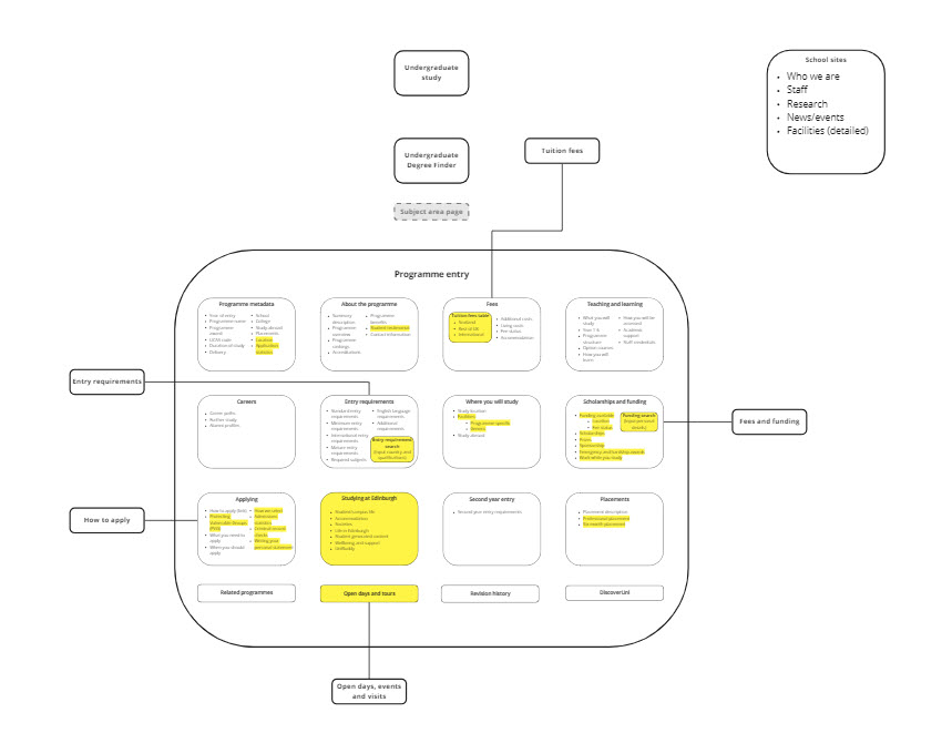
My first attempt at the schema.
How the schema evolved
Creating the “onion”
Early on in this process, I struggled to find similar work that not only depicted a content model of this scale and complexity, but also mapped relationships between multiple websites. This made it difficult to know how to approach the overall look of the schema.
A breakthrough moment came during a workshop when, while brainstorming ideas for information architecture on a whiteboard, Neil, head of our team, drew a series of rings depicting the University web estate, with our programme entry at the centre.
It struck me as an approach that enables quick, visual comprehension, by portraying our programme entry as the centrepoint of a wider ecosystem of websites, which orbit and feed into the degree finder. With this in mind, I went back to Miro and created a rough version of this ring structure – what we would quickly start calling “the onion”!
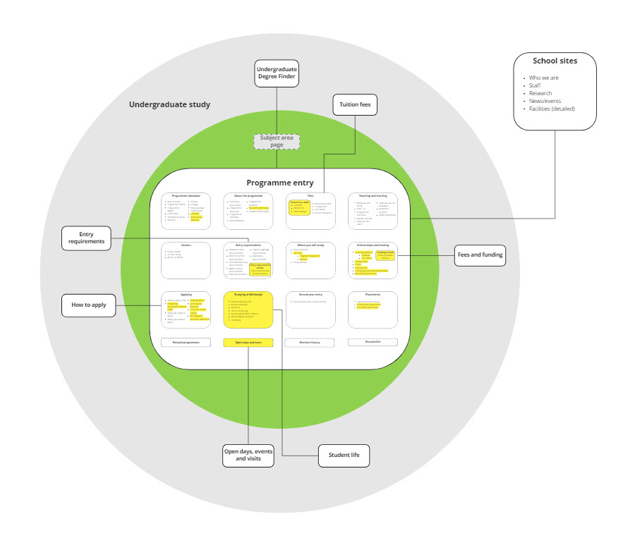
Version 1 of the schema, trying out the “onion” approach.
Mapping relationships between the degree finder and supplementary sites
With the “onion” structure in place, I got to work studying the content audit and mapping all relevant, supplementary sites to the Miro board, including:
- all pages on the Undergraduate study site
- school sites
- central pages like International applicants and New students
Beyond this, I started to indicate areas of content from the wider web estate that could be repurposed into our future degree finder, or otherwise removed.
One area that we quickly identified for repurposing was the content that currently lives on our subject area pages. The decision to strip content from these pages is something our performance analyst Carla has explained in a recent blog.
Read Carla’s blog post on why we’re removing content from subject area pages
This mapping of supplementary site content was an ongoing process that involved check-ins with our content design support assistants Nicole and Louis, who carried out the majority of our 2022 content audit and therefore had the most detailed knowledge of undergraduate sites.
Reordering attributes to reflect priority order
Partway through building the schema, Lauren and I began working with our user experience specialist Pete to settle on a priority order of attributes.
Pete had asked students to rank the features that might appear on a programme entry by importance, and then combined these results with a top tasks survey and data analysis from Carla to result in a list of priority content.
Working from this research, and inspired by layouts on other university degree finders, we made some key changes to how the attributes were organised in the content model.
First, we re-categorised our main attributes, creating a smaller number of sections containing more sub-attributes – for example, we combined Teaching and learning with Where you will study to create a new section called Programme details.
Next, we changed the order of our main attributes on the basis of the priority ranking that came out of Pete’s research.
As part of this work, we started thinking about the layout for our future programme entry, ultimately settling on an approach that would allow the user to tab between the seven most important areas:
- Overview
- Entry requirements
- Fees and funding
- Programme details
- Careers and further study
- Applying
- Life at Edinburgh
I then worked to reflect this approach in the schema so that it could show, at a quick glance, the proposed layout of our future programme entry.
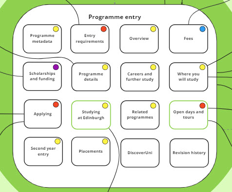
Version 2 of the schema, which I created before we looked at the results of Pete’s user research.
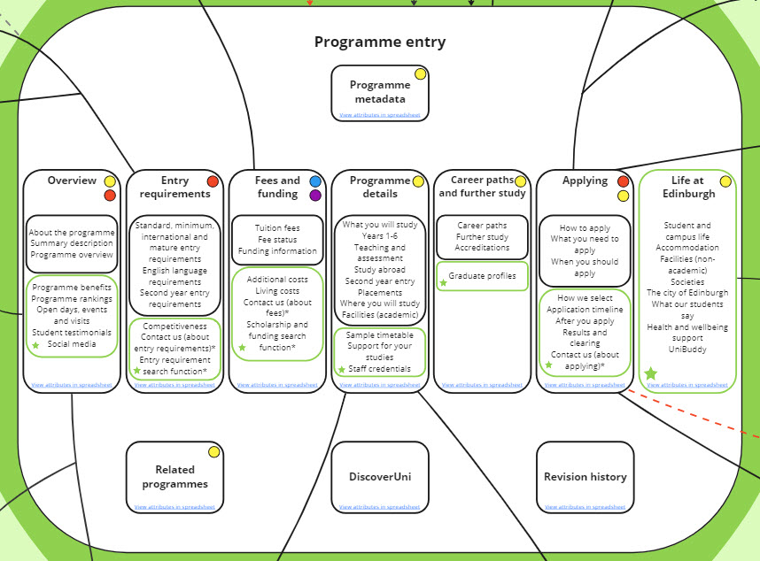
Version 3 of the schema, which is informed by the results of the research, and shows a tab layout.
Creating visual signifiers – and making them accessible
Throughout the process of creating the schema, I had to devise ways of visually portraying the concepts and relationships in our content model.
It was important to do this in a way that was as accessible and inclusive as possible. This meant I couldn’t rely solely on colour-coding, which is inaccessible for people with colour blindness.
Some of the visual signifiers I used included:
- connecting lines with arrow points to show the “direction” of the link (in other words, content linking into or out of the programme entry)
- dashed lines and red or grey shading to indicate areas of content that should be moved or repurposed during a current or future phase of the project
- green borders and star icons to indicate new content areas, or content moved to the programme page from elsewhere
- icons like circles and arrows to indicate repurposed content and content ownership
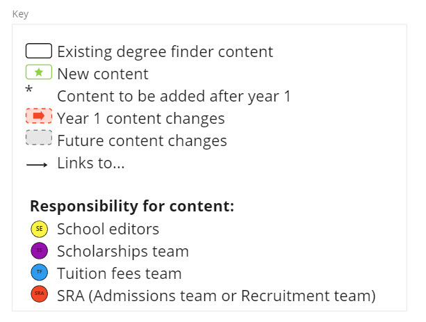
A key for the schema.
Meetings with key stakeholders
With the schema approaching completion, Lauren and I scheduled meetings with the teams responsible for sites where we were proposing significant changes.
These meetings were an opportunity for us to talk through these areas of content, and make sure everyone was on the same page when it came to where content should live in the future – whether on the future programme entry, within the undergraduate study site, or elsewhere.
During these meetings we got some great insight on what was needed, allowing us to make some final tweaks to both the content model spreadsheet and the schema.
This process also functioned as a dry run for the December event, helping Lauren and I to decide on the best ways to discuss and present the ideas in our model.
The finished schema
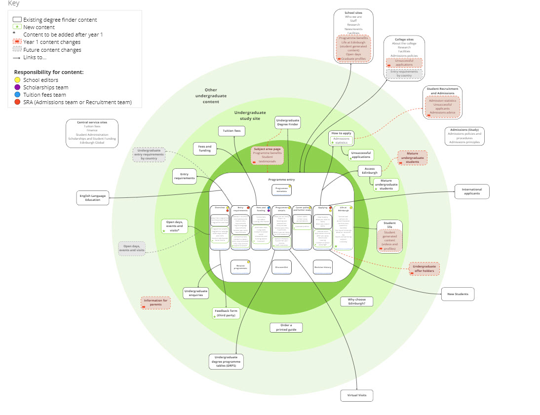
View the finished content model schema on Miro.
Presenting the schema at our December event
Our online event with the University community took place on 1 December. I prepared by creating a slide deck detailing the creation of the content model.
As I was unable to attend on the day, Lauren presented the schema along with the content model spreadsheet. The event was also an opportunity for Neil to speak about the broad aims and progress of the project, and for Pete to present his user research findings.
Watch a recording of our 1 December event
Read our slides from our 1 December event
Following the event, we circulated the spreadsheet and schema and invited attendees to give feedback and raise any concerns via a webform. It was really useful to get input at this point, especially from staff who are responsible for compiling their schools’ degree finder content.
Read Neil’s write-up of the December event
Next steps for the future degree finder
Following the event, Lauren, Pete and I started building an initial prototype in Miro for our proposed programme entry, drawing on:
- user research
- the detailed data in the content model spreadsheet
- the broader view of the information architecture presented in the content model schema
- the feedback we received after the event
As part of this process, Lauren and I have met with schools and other stakeholders involved with prospective undergraduate content to discuss needs, concerns and current ways of working. At the time of writing, a co-design process is underway with school editors to develop key attributes for the future programme entry.
With our prototype refined, Pete will build a clickable version of the prototype in Axure and begin usability testing with students.
Get in touch
If you’d like to learn more about our content modelling process, please send me an email. We’d also love to hear from you if you’ve produced anything similar.


Really great insight into the process. Thanks Flo.