
ContentEd 2024 keynote transcript: We’re all designers
I had the honour of presenting a keynote at this year’s ContentEd Conference, held in Liverpool. This blog contains a transcript of pretty much what I said, plus links to many of the resources I mentioned.
If you’re interested in any of the themes I cover here, I’d love to hear from you. I’m also open to delivering the presentation again. Drop me a line or leave a comment.
Introduction
I’m pretty sure all universities will say they’re user-centred, that the student experience is paramount and staff are at the centre of their strategy. But are they really?
In this session, I’m going to explore what this means at different levels for you, for your team, and beyond.
What empowers us? What holds us back? What does this mean for you as a member or as the leader of a digital team?
A disclaimer
Okay, full disclosure here, I don’t have a silver bullet for you.
It’s been said time and again by people far smarter than me that someone coming in from the outside will not change leaders’ minds. So if world-famous expert consultants can’t do it, I’m not going to try.
But what we can do is explore their behaviours a little, and talk about how your corresponding behaviours can move the dial.
My journey
First of all, indulge me for a minute while I tell you a little about what I’ve done over the years to get me to the point where I’m here trying to share a bit of what I’ve learned.
I’ve spent the majority of my career in higher education, and much of that in website-related stuff, going right back to the coal-fired days of hand-coding HTML and FTP uploads. Back when the web was a place to paste in copy from print brochures.
I’ve seen the transition from locally cooked up solutions hosted on machines under people’s desks through to institution-wide system rollouts, to where we are today with digital services central to University business and the user experience.
I’ve managed websites, transitioned into using content management systems, gone on to manage institution-wide content management system services, set up in-house digital and user experience consultancies and now am very fortunate to head up a talented multidisciplinary team who manage the website provision for prospective students at the University of Edinburgh.
Prospective Student Web Team details

I was honoured to be invited to present a keynote at ContentEd 2024, after winning the Martin Bojam Award at ContentEd 2023
Large scale transformational projects
I’ve had my fair share of frustrations with stakeholders and frequently tried to work out how best to keep them onside.
At the end of the day, all we want is for them to have confidence in our decisions and avoid the dreaded situations where someone senior comes in at the last minute and tells you there’s something wrong with what you’ve been working on. A situation so common, it even has a name. UX strategist Jared Spool calls it “the executive swoop and poop.”
Preventing the Executive Swoop and Poop with Design Sprints – Jared Spool
I’ve learned a bit along the way though, and that’s what I’d like to share with you today.
How we might get colleagues to think about – even care about – the user experience, even if they might not express it in the same terms as you.
Something I’ve seen time and again… we say that we care about the user experience, the student experience is a big thing in all institutions I think.
The problem is we don’t necessarily know how to do that in a systematic, structured way. So the institution invests heavily in “great ideas” and places some pretty large bets on initiatives. And then they expect that they will succeed.
Why do I say bet? Well, it’s a gamble isn’t it? You spend money and you anticipate a particular outcome as a result. But as we know, that’s by no means guaranteed.
Okay, hands up. Who has worked in an organization where they’ve spent an awful lot of time and money on a major transformation initiative?
Okay, now keep your hand up if those big flagship projects have paid off, have they got you where you want to be?
Transformation failure isn’t unusual
According to McKinsey & Company in 2016, 70 percent of complex, large-scale change programs don’t reach their stated goals.
(Source: “The ‘how’ of transformation” – article on the McKinsey website)
Meanwhile in 2022 another survey by the same company found only 20% of the companies achieved more than three-quarters of the gains they had anticipated. Even fewer saw the cost savings they’d hoped for.
I wonder what kind of figures we’d see if we looked at higher education alone. I’m inclined to think that they’d be much worse – given our sector’s organisational complexity and our relative lack of investment in digital.
So how does this happen? Well it’s for a number of reasons.
- Incoherent strategic vision
- Organisational culture the inhibits change
- Ways of working that don’t keep pace with the needs of digital services
These are all are big issues.
But today I’m here to focus on another critical factor – our focus on user needs.
Influencing user behaviour is fundamental to almost any successful project. Wherever there is interaction between a user and a system, there is the risk that the user is not going to behave as you would like.
The cost of failure
And with those unexpected or undesirable behaviours typically comes errors, user frustration and fundamentally for a university: cost.
When it takes staff a long time to complete a task. Cost.
When a student can’t self serve and needs to get in touch. Cost.
When they don’t do a critical thing you need them to, or they do it wrong and you need to chase up. Cost.
I could go on and on.
You would think that being able to connect the dots between improving user experiences and reducing costs would be the silver bullet, but so often it isn’t. Now why is that?
There are lots of reasons, but this Dilbert cartoon sums up a lot of my university experiences.
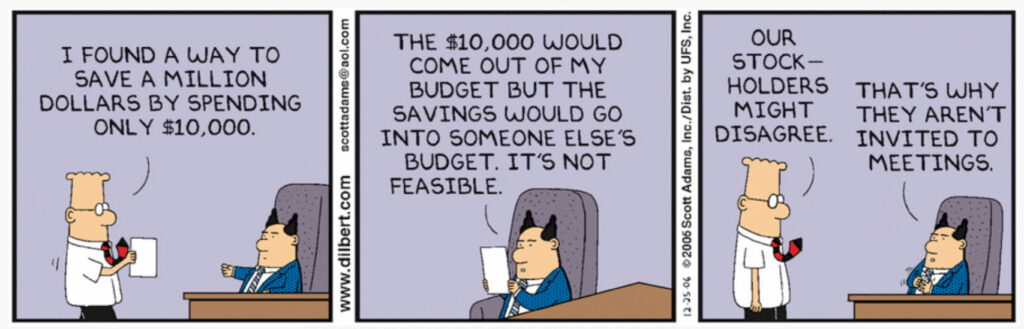
This Dilbert cartoon brilliantly humorises the constant tension between centralised costs and distributed savings present in all big organisations.
(Post-presentation note: I am aware of the controversy around comments by Dilbert author Scott Adams. I also still listen to The Smiths despite the offensive views of Morrissey. By enjoying or referencing someone’s art I am not condoning or supporting their views.)
In short, centralised costs, distributed savings.
Looking at user experience and design from different levels
So what I want to do now is talk about how colleagues think about the user experience. For sure, they say they care, but do they care like we care? No of course not. And I’ve got a couple of things to share which can help to explain why.
A few years ago, Jared Spool wrote an article in which he talks about how different types of design co-exist, refering to a 7 minute film called ‘Powers of Ten’ created in the 1960’s for IBM. Let’s take a look at it for about 2 minutes.
Read “Zooming In and Out of UX Design Resolutions” by Jared Spool
Powers of 10 – a short film on You Tube
You can probably guess where this is going. The film actually zooms out to 10 to the power of 24, past a million light years looking at a galactic scale.
And then at this point, we zoom back in past the picnic scene and on all the way down to a proton in the nucleus of a carbon atom.
This is a really powerful analogy. It helps us better understand why design management is challenging. User experience is part of design management, but it’s only happening at a particular scale.
Essentially, colleagues at different levels of the organisation have different perspectives. All valid, but all require different skills and processes.
The key takeaways from Jared Spool’s article:
- You can’t see what exists on any level other than the one you are viewing.
- Different things are important at each level.
- Because you can’t see what exists on other levels you can’t tell what’s important at those levels by looking only at the level you’re on.
- What happens at one level can affect the other levels.
Now this is not as precise as the film, but zooming out of design might look something like this:
- A single web page or computer screen (Interface design)
- A collection of linked screens which form a website or software application (Interaction design)
- A collection of different websites and web-based applications (UX design)
- The changing use of different digital systems over time and in tandem with offline touchpoints (Service design)
And we could go even further, out into the solar system of university policy or beyond that to the galaxies of higher education sector policy. There are people in our universities thinking about “design” – in heavily inverted commas! – at all these levels.
We can also compare the ‘zooming in’ view.
Our starting point of a single web page can be ‘zoomed in on’ to see its components:
- Things like the user interface elements like text, links, buttons, accordions and drop-down menus
- And deeper still to the code for the user interface components and so on
As with the film, in our design example:
- What people experience differs depending on the level you’re viewing
- What’s important changes depending on the level you’re viewing
- What happens on one level can affect the other levels
If I want to create something which someone else will routinely use, I have to always keep in mind that I am not the end-user and so what works for me might not work for them.
I also have many assumptions. There are things that I just don’t know.
It is often the case that a person who is requesting or sponsoring our work is viewing things from a different ‘level of magnification’ to the people who will use the end result.
So it’s helpful to understand what is important for people at every ‘level of magnification’ involved.
When we engage someone not thinking on our level, they may well not care so much about the things that we care about.
Full stack service design
We see this sense of perspective in another thought piece which I’ve found really insightful – Sarah Drummond’s Full Stack Service Design.
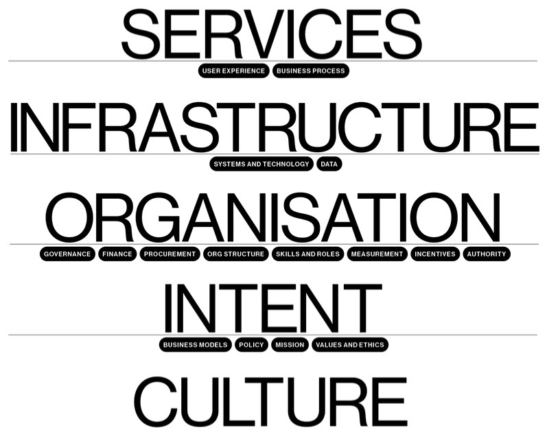
Sarah Drummond’s Full Stack Service Design exposes the layers and dependencies that empower or inhibit the design and delivery of good services.
Read the blog series on Full Stack Service Design
In this blog series, Sarah talks about all the components that play a part in shaping a user experience – be that the experience of the student or customer, or the experience of the staff involved in delivering service to those end users.
So you where user experience sits, right alongside business process. No doubt you’ll be familiar with this plane in the course of your work, and likely the plane below it – systems and technology and data.
But look at all the stuff sitting behind that – governance, finance, organisational structure and so on.
There’s a lot here, isn’t there? How often do you think about all that?
And of course we still haven’t zoomed out fully as in Jared’s analogy.
Over my career, I’ve bumped up against more and more of these points of consideration, when reflecting why something hasn’t gone smoothly, or why it feels like people who should care don’t seem to, or why we’re about to go round the cycle of past events yet again.
So what I’m saying here, is that even when we’re liaising with colleagues who exist on a different plane – a different level of magnification to us – we need to be mindful of the other factors that are influencing their views – way beyond the end user experience.
Your stakeholders may well not have considered how these things are playing their part in the user experience. And they almost certainly won’t have the agency to move these.
Feedback loops
One last thing I want to touch on before we start to look at what we can actually do. Feedback loops.
They’re so, so important. Fundamental to more effective ways of working in fact.
There’s an old saying – “practice makes perfect”. But that’s not necessarily the case.
This analogy is taken from the book about behavioural economics called Nudge.
Read my previous post about the book, Nudge “Why practice doesn’t necessarily make perfect”
Imagine for a moment, you’re a golfer.
So you’re putting on a putting green, practicing your putting.
You make 10 putts all from the same spot, and bit by bit, your putting accuracy improves. You get closer to the hole, as you see how your previous efforts performed. You’re adjusting your behavior based on the immediate feedback that you’re seeing.
Now imagine how you would perform as a golfer, trying to putt that ball into the hole, if you were unable to see the results of your putting, if you didn’t know how close you were getting to the hole, if you didn’t know whether the ball was going in the hole.
And it’s just exactly the same when you’re creating content or designing interfaces. You need to know how effective the output that you’re creating is against the goals that you’ve been set. You need that feedback.
When you’re working at the level of content on a page, or the user flow through a series of interactions towards task completion, it’s relatively easy to gather that feedback. You can prototype, test, iterate and improve towards the point of go-live and then monitor on an ongoing basis via analytics.
Your feedback loop is pretty small. You can adjust your approach regularly.
But what happens as we zoom out? Our feedback loop gets longer and longer:
- To the sprint
- To the quarter or the release
- To the academic year
- To the five year plan and so on
It gets harder and harder to close the feedback loop. Both because of the timeframe involved, but also because, as we zoom out, there are more factors at play. The environment becomes more complex and dynamic.
“The more dynamic the situation, the poorer your foresight will be.
Therefore, the more uncertain and dynamic the situation, the more proximate a strategic objective must be.”
Richard Rumelt
Good Strategy, Bad Strategy: The Difference and Why It Matters
That’s a line from a book called Good Strategy Bad Strategy by Richard Rumelt.
Read my previous blog about the book Good Strategy Bad Strategy
Good Strategy Bad Strategy on GoodReads.com
A product manager’s review of Good Stratgy Bad Strategy – Sebastien Phlix
We work in very dynamic environments. Sometimes they feel almost chaotic. And that’s before external factors come into play. Think about what the pandemic did to your university, or the changes in immigration legislation.
Difficult though it is, we must prioritise feedback and learning as we go. I don’t know about you, but I’ve felt at times that leaders are not so much putting blindfolded but actively doing it with their eyes screwed shut.
Feedback is a complication. Never mind whether the ball went in the hole: We managed to hit it with our club! We got the ball moving!
We need to encourage proximate planning. We need to facilitate feedback loops that communicate user outcomes that in turn suggest that business outcomes will also be met.
So I’ve one or two ideas about ways in which we can engage with leaders around the user experience which I hope you’ll find useful.
Working with leaders
Despite my disclaimer at the start, I have picked up a few things over the years that have helped me make sense of things, helped me raise awareness of the value and impact of working in an iterative, user centred way, and helped me to gently challenge leaders direction and in some cases, evolve their behaviours.
A big part of my approach is rooted in a book I read over 10 years ago – Lean UX by Jeff Gothelf and Josh Seiden.
Find out more about the Lean UX book
Read my blog: Lean UX – Requirements are hypotheses
The big takeaway from this book is that your products are experiments, and your requirements are hypotheses.
Let’s just say that again, and dig into it.
The requirements you’re presented with are hypotheses. Someone is saying “do this” or “build that”. Why? Well yes it’s because they want it. But the reason they want it is that they believe it’s going to change something. It’s going to achieve an outcome.
They are hypothesising. Your challenge is to get behind the requirement, and align on the assumed outcome. And then work out how you’re going to measure whether this is being achieved. Or indeed before you build it, whether it’s likely to be achieved.
Get that worked out, expressed in terms of user behaviour, and you’re on your way.
So if you can agree that the requirements are a hypothesis, it’s easier to accept that the thing you build is an experiment to test that hypothesis.
The thing is though, the challenge with leadership is that you’re expected to lead.
As a leader you’re expected to know where we’re going, what we need to do to achieve our goals. But these sort of expectations result in behaviours where big assumptions are made and long projects are planned.
And with this kind of perceived certainty comes the increasing risk of the ‘swoop and poop’.
The challenge here is to lead with humility.
Read my blog: Humility in development
There’s an analogy I love by Jeff Gothelf and I’d like to share it now.
The tree in the fog

Jeff Gothelf states: “There is a fog between you and the mythical state of perfection. A position of humility.” This analogy has been a great inspiration to me.
In this digital world we manage, there is no end point.
There’s this state of perfection that we’re constantly pursuing. But the thing is, it’s a myth.
Between you and that mythical end state of the product that you’re working on, there is a fog.
And if you think about a fog, you can only see two or three steps into it.
If you were in this position, would you say “I’m just going to pick a direction and then go”?
Would you assume this is the right direction and hope you don’t fall off a cliff?
Or would you say: “I think I should go in this direction, but I’m going to take two steps in that direction. And when I get through those two steps I’m going to sense what’s changed around me. And then based on that new information I’m going to respond.”
Would you take a position of humility? These few small steps could be a small deployment, an iteration, a sprint, whatever you want to call it.
If the information says keep going -terrific – you’re going to keep going. But if the information says don’t continue down this path – there’s a cliff over there – then you have to change course.
And that’s by far the most difficult thing to do in any of these situations. As you’re collecting all this information, new ideas are emerging, old ideas are getting invalidated, you have to be the one who raises their hand and says, “I don’t think we should keep going in this direction. ”
And that can be very difficult.
But the interesting thing is that a position of humility creates agility. Because when you’re never terribly confident of the direction that you’re heading in, it’s easier to change course.
Encouraging hypothesising behaviour
This mindset doesn’t necessarily come easily, and you’ll be lucky to be in a position where you’re empowered to work like this, or be in constant contact with your leaders where you can encourage such behaviour.
But there are things you can try that are slightly more concise and direct.
There are various things that drive decision making – things like revenue generation, cost saving, risk aversion.
When you build something, you are taking risks. You’re hypothesising that if you build, people will behave differently. You’re expecting an outcome.
The thing that I’ve found resonates is the offer – wouldn’t it be good if we could find out as early as possible whether something is likely to work? To fail fast fail cheap. Or better phrased as ‘Learn fast, learn cheap’.
Ultimately we’re talking here about avoiding building things that people don’t want. Things that aren’t useful, things that aren’t usable.
Lean UX hypothesis statement
The Lean UX hypothesis statement encapsulates this beautifully:
- We believe this
- [business outcome] will be achieved
- if [these users] successfully
- [attain this user outcome] with
- [this feature]
And you can tack onto the end of this:
And we will be more confident we will be successful when we see: [metric]
What I like about this statement most is that the feature only comes at the end.
How often do you find yourself on the receiving end of a diktat to deliver a feature? In a perfect world, our leaders would think strategically, communicate the outcomes they seek and challenge you to show that your plans are likely to deliver on these outcomes.
But while we’re not in a perfect world, the Lean UX Hypothesis Statement can help us become aligned around the business outcome we’re expecting, and around our assumptions of user goals and behaviours.
This opens a door to validating our assumptions and to understanding our users better.
I’m not suggesting you apply this to everything you do, but there are definitely some high risk – high value areas that warrant this kind of attention.
I love a decision matrix and this one shows you where the greatest value of user research and early stage development experimentation exists.
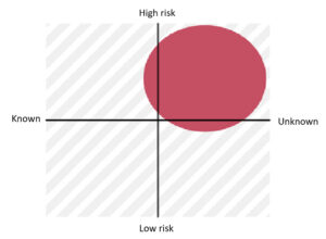
This decision matrix illustrates where there is greatest value in conducting user research and design experimentation.
The other thing I like to challenge leaders on, is their response to seeing a new development, or ideally a prototype, a concept or a work-in-progress. (Because if the first time you’re showcasing your work is when it’s essentially done, there’s almost certainly going to be swooping and pooping on the way).
Leaders feel they need to comment on features, appearance, functionality. They essentially zoom right in from being out there in space looking down on the earth from a distance galaxy to being sat on the picnic rug in the park. They become the user, even when most times they’re absolutely not the target audience and they lack the domain knowledge to play that role effectively.
When I sit on project and governance boards I’m typically one of the most junior people there. But it does give me the opportunity to politely challenge other board members. I try to encourage my colleagues to focus on things like:
- What the team learned when they watched target users trying to complete tasks.
- What has changed from the initial brief as the team has learned as they’ve gone.
If the team hasn’t watched users, if they’ve not changed tack along the way, either they’ve got a crystal ball giving them confidence they’re building the right thing, or they’re in that field marching through the mist towards a cowpat or a cliff edge.
And when I’m on the other side of the desk – as part of the team explaining to stakeholders what we’re doing and why – I make sure that the emphasis is on the journey we’re on, and the lessons we’re learning, the outcomes we’re seeking, the evidence we’ve generated that shows we’re likely to succeed in our goals.
This is not just on the “ta-da” moment when the thing we’re building is revealed.
So what I’m saying here is that you can’t magically turn your senior stakeholders into user advocates. People with real empathy for the end user. Tree-huggers but for users, as design thought leader Leisa Reichelt once said.
But you can join the dots between the user and what stakeholders care about. You can nurture the behaviours you want to see in them.
Working as a team manager
It’s no good waiting for that rare opportunity to corner your senior stakeholder, that point when you’ve delivered as an opportunity to showcase what you’re doing and how you’re doing it. You need the constant drip of information and insight. You need other people to be advocating for you. You need to be providing the ammunition for them to use on your behalf.
It’s long been said – Work in the open, it makes things better – but it’s really true. And to do this, unfortunately it means moving more slowly. Spending time talking about what you’re doing instead of actually doing. Spending time bringing people together to share your insight and work-in-progress. Spending time setting the shape and scope for co-design with subject matter experts and users.
All of this takes more time than just holing up by yourself or in your small team writing content, writing code, designing interfaces.
As a manager, I need to tell you:
- If you don’t make time, things don’t happen.
- If you don’t set expectations and set an example, people don’t do things.
- This is my responsibility. I make the space for collective personal development, reflection and sharing.
Some things I do with my team…
I set the expectations I mentioned earlier around expecting requirements and plans to evolve as we learn. I’m as interested in how students interact with what we’re producing as I am in what we’re producing. I help team members to work with their stakeholders to externalise assumptions and agree anticipated outcomes for what they’ll produce.
I want to be managing a team of capable communicators, who are confident in what they do and why, who can advocate for the prospective students they serve.
This doesn’t come naturally for everyone, and not everyone wants to be putting themselves out there. But I try to create the space for everyone to grow. Ultimately, if you want to be the best designer you can be, if you want to progress you need to be able to communicate and advocate for your work and your discipline.
Some things we do regularly are show-and-tell sessions, collaborative blog writing sessions and Lean Coffee meetings
Weekly show-and-tell sessions
We have a weekly 30 minute slot which anyone can take over. They don’t necessarily need to use the full time. When you’re not all working on the same thing, coming together to share your work informally helps keep us feel like a team and provides a forum for exchanging ideas and support.
But most importantly it provides a safe space for people to get comfortable with talking about their work. Not everyone wants to be up in front of an audience, but to be able to do our best work we need to have confidence in our ability to talk about what we’re doing, how we’re doing it and why.
Monthly blog writing sessions
Similarly, we need to be comfortable with writing about our work. It’s really easy for blogging to fall down our set of priorities especially as so often, one project is ramping up as another is winding down. Once a month we all come together and commit to writing or pairing up with a colleague to talk through ideas and flesh them out. This doesn’t often deliver completed pieces, but it does keep up the momentum. It helps ensure we get blogs over the line and published.
And why does that matter? Well it’s good for your personal profile, for one. Another thing I love about higher education is the opportunity to talk about your work. From the humble blog right up to standing in front of a room of peers like I am today. So often, ideas that are covered first in blogs provide the backbone for a subsequent talk. So good for the individual.
But also really good for the profile of the team, and for the dissemination of our work. So often I’m in a meeting and something comes up where I can draw on our previous experience; a project that we’ve run and appraised, or some discovery work we’ve undertaken. Instead of just mentioning it, I can actually share a link to more detail. A blog becomes the collective memory of the team. It provides a touchpoint informing future decisions and approaches.
And it can be a reference point for your advocates. There are people in your organisation who feel like you do, but aren’t UX specialists or user centred content designers. You’re giving them the material that empowers them to speak up for you.
This institutional memory of what you’ve done, how you did it and why is vital.
Open discussion with Lean Coffee
If you’ve not encountered this approach to collaboratively generating an agenda and running a discussion, I strongly recommend it. We hold sessions like this quarterly. The first 10-20 minutes are spent generating a list of things people want to talk about, and then dot voting to prioritise the order. And then we cover the topics based on popularity with the conversation timeboxed to keep things moving along.
Read my blog: How to run a Lean Coffee session
Democratising the agenda like this is a great way to bring your team together to cover what really matters to them. It empowers everyone to have a say about what is covered and can be a confidence boost when things you want to bring up are voted for by others too.
It’s easy to run and empowering, so a great way to bring in collaborators and subject matter experts to – again – give your team a platform and enable more of them to share their work with a wider group.
Hopefully you’ll see a theme running through these approaches – communication and empowerment.
And this brings me on to the final area I want to talk with you about today.
Working as an individual
So what about you as an individual? As someone wanting to progress in your career? As someone wanting to make a difference through the work you do?
I’m not going to spend time here talking about particular human centred techniques or methodologies to employ. There are plenty of books and experts out there. I’ve learned from many of them.
What I want to talk to you about is mindset.
First up – you are responsible for the user experience. I am. We are all responsible.
If you are building something that people will interact with then you are a designer. You are seeking an outcome in terms of a change in future behaviour.
This goes right down to things as simple as writing an email. You want the recipient to open it. You want them to read it. You probably want them to click something. All interactions.
Build, measure, learn
Build measurement, reflection and learning into everything you do. This isn’t always easy. But it’s essential if you want to want to improve next time. You don’t want to be that blindfolded putter.
Next, get out there and watch people interact with stuff, record it, play it back with your colleagues and stakeholders. There is nothing more powerful than to watch someone having an awful time trying to do something that should be easy.
We are so lucky to be working in higher education. For most of us, our target audience or at least someone who can play the role for you is walking around our offices and campuses pretty much all the time. There really shouldn’t be any reason not to do at the very least quick-and-dirty pop up usability testing. You don’t need to wait for a user researcher to do this, you can do it yourself.
You will make mistakes, it will be a bit intimidating at first, but you will get better.
Usability is like cooking
Jakob Nielsen
Jakob Nielsen, the granddaddy of mainstream usability testing once said: Usability is like cooking. We think that we can’t do it and imagine we need an expert delivering haute cuisine. But the vast vast majority of the time we just need beans on toast.
Anybody can do usability – Jakob Nielsen
There are tonnes of resources out there to help you get started and avoid making the biggest mistakes.
One of the best things about the technology we have today is that it’s so easy to record stuff.
Back when I started my recording technology was a pen and a pad of paper. And the thing that helped me improve the most was the advent of screen recording software so I could go back not just to review what the user did, but also to review what I did and said.
Start earlier than you think makes sense
Steve Krug
Finally, one more bit of advice from the other granddaddy of usability testing, Steve Krug: “Start earlier than makes sense”. You will always want to tweak or polish what you’re doing a bit more. You will always find a reason to push back testing. The sooner you start, the sooner you learn, the sooner you improve. Close that feedback loop as early as possible.
Steve Krug’s essential book for everybody starting usability testing: Rocket Surgery Made Easy
Most of us here today are content designers. Those words on a page in a Word document – they’re your first prototype.
You know how you know you’ve built a prototype? When you get people to interact with it and it turns out to be totally wrong, and you need to tear it up and start again. When that happens and it doesn’t make you want to cry. Then you’re prototyping.
If you can’t bear to tear it up and start again, it’s not a prototype.
Makes the whole senior stakeholder swoop and poop so much less messy.
Conclusion
So you’ll have noticed I’ve been standing on the shoulders of a lot of giants today.
I’m going to end with one more quote, but this time someone from another time and another line of work altogether. Because I think if you take one thing away from what I’ve been talking about today, it’s the importance of humility and proximate planning.
Successful leaders of armies have known this for centuries. Face it, in the midst of battle, it doesn’t get much more dynamic.
“In preparing for battle I have always found that plans are useless, but planning is indispensable”
Dwight Eisenhower
Remember the tree in the fog. Always be learning and adjusting. Watch for the cowpats and the cliffs. Stay humble.
Thank you.
Get in touch
If you saw me present, or just enjoyed this transcript, I’d love to hear from you.
I’m also interested in other opportunities to talk about this stuff.