
Lean UX – requirements are hypotheses
Back in September 2015, I attended a day-long workshop on Lean UX, led by author of the book, Jeff Gothelf. The day was all about how large organisations can adapt to the challenges of today’s business environment where small start up companies are significantly disrupting established business models. In this post I’ll run through the key points, share my experiences of putting what I learned in to practice and link to a load of further information on the topic.
I took away so much from the day, and came back to the office enthusiastically looking for opportunities to try things out for myself. Results so far have been pretty good.
Update July 2016: I presented a version of this blog post at a conference, which is available to view via YouTube
So what’s this Lean UX thing all about?
I’ll start with the textbook definition…
Inspired by Lean Startup and Agile development, it’s the practice of bringing the true nature of a product to light faster, in a collaborative, cross-functional way. We work to build a shared understanding of the customer, their needs, our proposed solutions and definition of success. We prioritize learning over delivery to build evidence for our decisions.
Jeff Gothelf
Or to put it another way (my words), it’s about making sure that what you’re doing is likely to be a good idea before you put too much effort into it.
I’m not a designer, you’re probably not a designer either. But the ideas behind Lean UX should matter to you if you are responsible for some of these:
- Software development, or maintenance of functionality
- The management or execution of a service or process
- A website, or areas of a website; the content you curate and how you structure it
How many web pages, or features, or service elements are you responsible for that are not well used, or not fit for purpose, or just basically redundant?
How much does it cost you to maintain? How much does it interfere with your end users’ experience?
How did they come to be there, or be like that, in the first place? How much time, cost and effort went into getting it there?
Is it because nobody stopped to ask why? Or because the boss said just do it? Or because what seemed like a good idea at first turned out to be not such a good idea, but by that point you were too far down a particular road?

The video clip nicely illustrates what can happen when the concept for a product is exposed to potential customers.
Willie Wonka on product development
Jeff beautifully illustrated this with a clip from Charlie and the Chocolate Factory. Watch the clip for about 30 seconds; I have set it up to start so far in.
Charlie and the Chocolate Factory clip on You Tube (begins at 2:45)
In summary, this is what happens in the clip:
(Wonka): It’s a stick of the most amazing and sensational gum in the whole universe. You know why? Because this gum is a full 3 course dinner all by itself!
(Parent): Why would anyone want that?
At which point Wonka looks thrown, and pulls out a pile of cue cards that he proceeds to read through to justify his product.
(Child): It sounds weird!

A significant proportion of users just want essential features of a product.
There have been numerous photos of horrendous interfaces hacked by users like the one of ‘Grandma’s remote’, which again highlight the cost of not adopting a lean and iterative approach to development. It’s not just grandmas. The majority of us use only a small percentage of a product’s features.
So Lean UX is all about doing just enough to establish whether a development is a good idea; using evidence of user interaction and demand to justify continuing down a particular path. A well used phrase in the field is “Fail fast, fail cheap“.
Or as Jeff put it on the day:
Reduce waste. Don’t build things that people don’t want.
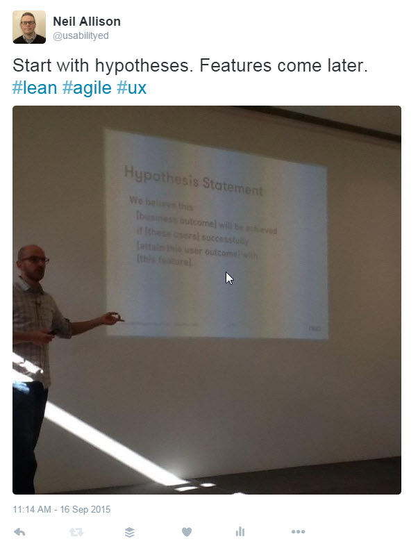
The Lean hypothesis statement
At the core of this is the concept of turning your requirements in to hypotheses. The Lean UX hypothesis statement:
We believe this
[business outcome] will be achieved
if [these users] successfully
[attain this user outcome] with
[this feature]
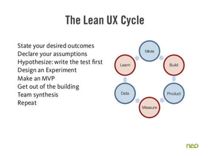
The Lean UX cycle
The starting point in the cycle should always be ‘Learn’:
- State your desired outcomes
- Declare your assumptions
- Hypothesise: write the test first
- Design an experiment
- Make an MVP
- Get out of the building
- Team synthesis
- Repeat
The Lean UX workshop – what we did on the day
The day itself was a mix of seminars and workshop activities, where I got to put some Lean UX techniques to practice in a scenario relating to a Virtual Learning Environment, in collaboration with other attendees who had backgrounds in UX, design and product management.
The activities were fun, collaborative and thought provoking, although at their core they followed the same principles of most agile collaboration techniques, and indeed the digital strategy workshops I run myself:
- Clear goals for the session and rules for each activity
- Strictly observed short burst activities
- Quick individual brainstorming tasks using post-it notes
- Idea sharing, everyone getting a turn
- Sorting, collating and prioritising exercises
- Lots and lots of collaboration
So there was nothing revolutionary about the nature of the activities we did or the way that we did them. Collaboration exercises that facilitate clarity, transparency, democracy and quick decisions are common in agile and UX workshops. But it was the focus of tasks that really stood out, and the way that the initial problem was presented. This drove us down a particular route of considering business and user needs, making assumptions explicit and from there moving on to potential solutions.
This I found most enlightening, because in so many scenarios I find stakeholders coming to the table with a solution in mind, before there is a common understanding of the problem. Or indeed if the problem they are trying to solve is the right one in terms of serving the business and the user.
Overview and task intro
Here’s what we did…
Jeff introduced a software product – a Virtual Learning Environment funnily enough, so pretty appropriate for me – and gave a bit of background before stating the problem.
The business was well established in the market place, but concerned about competition from smaller new entrants who could respond to the changing expectations of customers more quickly than they could.
They had decided to invest in their mobile offering, but had no clear idea where this investment should go. Instead they stated a desired outcome, which was to see a 15% increase in use of their product on mobile devices among students.
We were to be the project team and would undertake a series of collaborative exercises that would identify a set of features to develop. Or rather, a set of hypotheses about features that we would validate.
The activities would deliver us answers to 4 fundamental questions:
- What business outcomes are important to us?
- Who is the user?
- What outcome does the user want to achieve?
- What features will they need in order to do so?
(This is actually very similar to the model Lou Rosenfeld uses in a fantastic article I share with just about anyone I work with. Lou comes at it from the perspective of appraising what you already have. So the final question differs, and his attention is on tasks, not outcomes. Stop Redesigning And Start Tuning Your Site Instead – article by Louis Rosenfeld )
Business outcomes
First of all we were challenged to think about the primary business goal, and key performance indicators that would give us confidence that we were working towards achieving it. The group wrote tons of ideas on post it notes like “Month over month growth of student collaboration groups initiated via mobile”. We then ran through everything we’d come up with together, grouped the ideas on the wall, rationalised and then dot voted to identify as a group what we thought was best.
So, out of this we had a small set of things that we could measure, that we felt were supporting the underlying goal. If we performed well on these metrics, the likelihood is that we would be working towards that higher level target of a 15% increase in mobile usage.
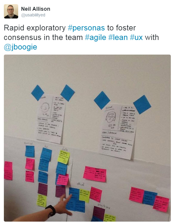
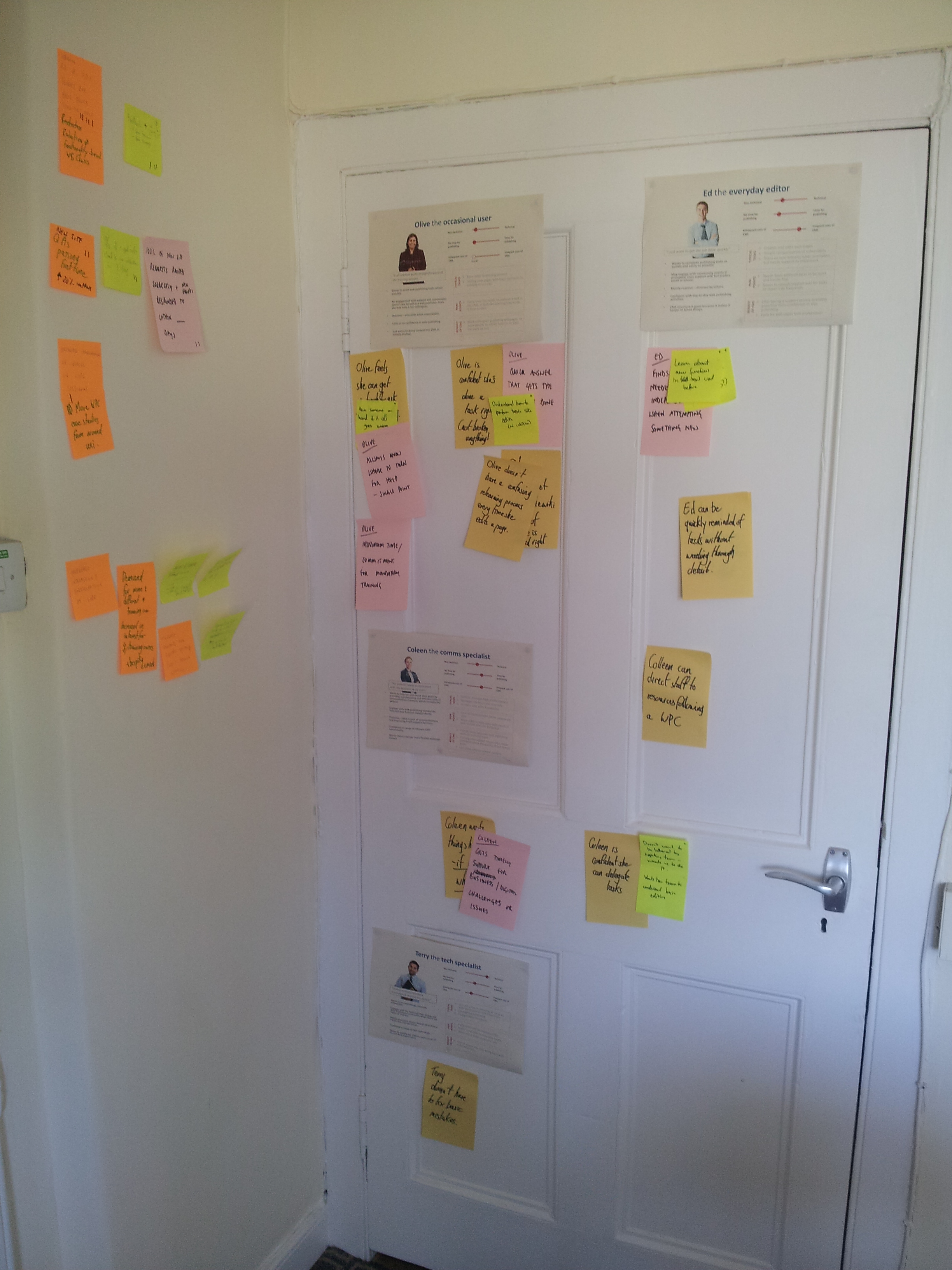
Rough personas and user outcomes on grouped post-it notes help focus ideas for product features. Source: Twitter
Who is the user?
We then did a very quick-and-dirty exercise to develop rough personas that focused on basic demographics relevant to the use of the product, needs they had and obstacles they faced.
The majority of people in the room knew little about the target audiences of a VLE, but the point of this exercise was to force the group to externalise and share their assumptions. Rather than keep who we think the user is in our heads (which makes for difficult conversations when we all have different unshared thoughts on this) we got it all out, and, however imperfect, came to a shared view of who the users were that we were serving.
Of course, the idea here is that you would validate your assumptions and develop the personas over time based on what you discover through research and engagement with the business.
What outcomes does the user want?
For this exercise, we focused on our personas’ needs and pain points, putting one idea down per post-it note. After doing this individually, we shared as a team and grouped them.
Our user outcomes were broad, ranging from tech-specific such as access to wi-fi and mobile data caps, to attitudes and motivations with regard to learning.
Features
The final brainstorming exercise was about features. The thing that is typically talked about first. Sometimes it’s the only thing that is talked about. So coming to it last, after we have collaborated on business outcomes, users and user goals, made feature brainstorming more focused and easier to share our ideas.
Again, we put our ideas down on post it notes (the focus being on features that we thought would serve our personas and create their desired outcomes), then shared with the team, then grouped and rationalised.
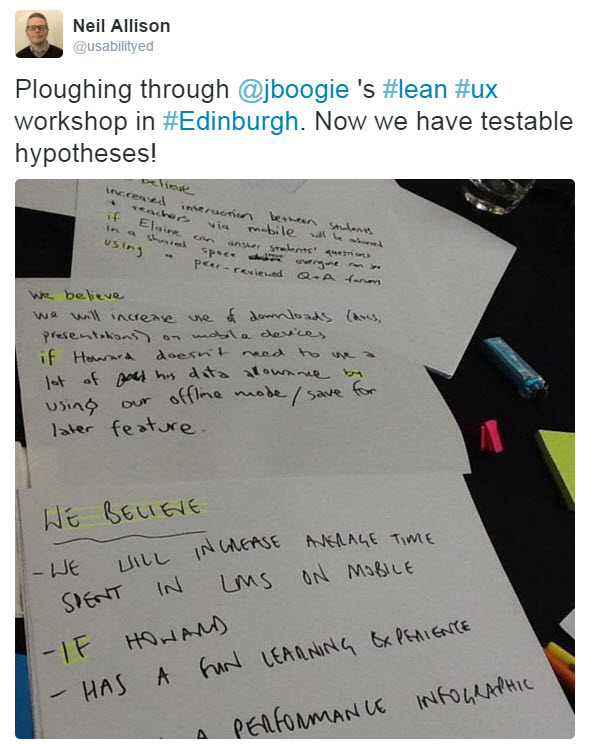
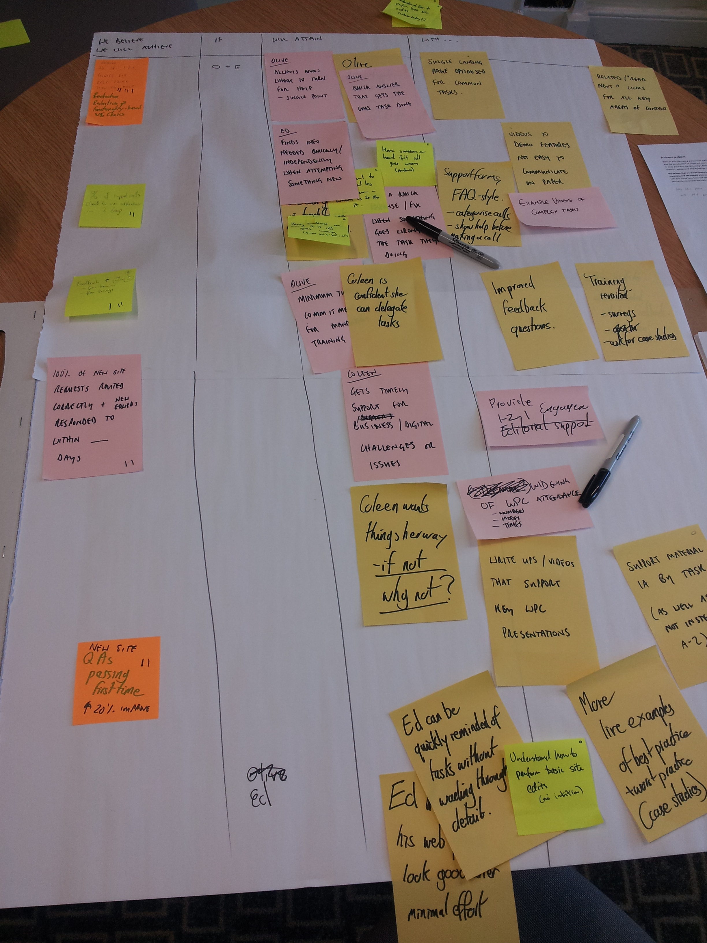
Hypotheses generated as part of the Lean UX workshop. Source: Twitter
Pulling it all together
This was the lightbulb moment for me. I’d been happily participating in the activities without really giving a lot of thought to where it was going.
Jeff pulled us back to the Lean UX hypothesis statement that I mentioned earlier:
We believe this
[business outcome] will be achieved
if [these users] successfully
[attain this user outcome] with
[this feature]
Using a table drawn on a flipchart, we started to fill in the columns to complete this sentence. We had prioritised our business outcomes, so the number of rows in the table was limited by this. But what we had was different personas, with different pain points and priorities, potentially being served by multiple features that ultimately (we hypothesised) would support our priority business outcomes.
So you can imagine it was quite messy as we moved around and grouped and traded post-it notes. But ultimately our challenge was to write some hypothesis statements that would form the basis of a direction for the development of the product.
The next questions to ask would be:
- What is the smallest thing we can do or make to test our hypothesis?
- What do we need to learn first?
- What is the least amount of work we need to do to learn that?
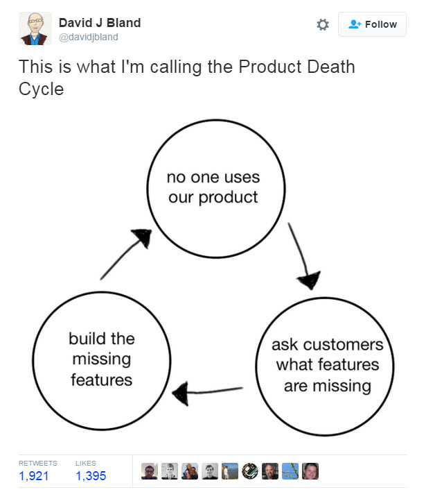
The product death cycle by David Bland. Source: Twitter
Workshop conclusions
It was a really great workshop, with some genuinely enlightening moments and all enhanced by getting to hear it from the mouth of the guy who wrote the book. I left enthused by what I’d experienced and determined to try it out for myself.
In particular, one slide stuck with me, and as soon as I got back to the office I printed it out and put it on the wall. In our environment though, I had to do an edit. Instead of ‘No one uses our product’ I inserted ‘Everyone complains about our product’. Because of course, many products around the University are the only available option to staff.
And the closing quote of the day said it all, really:
“It’s not a validation effort or an experiment if you (or the client) isn’t willing to kill the idea.”
Jono Mallanyk @jonomallanyk
Our trials of Lean UX techniques
I’ve tried out these concepts a few times, to greater and lesser degrees of rigorousness, but always with the aim of doing the minimum possible to learn whether we were on the right track. Here are a couple of examples that I’ve chosen to illustrate very different uses of the techniques. One quite quick-and-dirty, while the other completing the whole process I experienced in the workshop.
CMS user support provision
Last year I was asked to undertake a review of our user support and training provision, in preparation for the brave new world of a single CMS to support once migration from Polopoly was over. (At the moment we’re supporting both users of the legacy Polopoly CMS and users of the new EdWeb CMS). I’d had a chat with the team, reviewed some feedback data and was in the process of drafting something when I attended the Lean UX workshop. I decided to use what I’d learned there to experiment with our service provision – what we provide and how we allocate resources – and more importantly for me, empower Duncan and Lizzie to move things forward themselves.
I do little hands-on training and virtually no direct user support any more, so I wanted the people who drive the service and meet our customers all the time, to identify opportunities with me and collaboratively prioritise what we gave focus to. So over the course of two slots of about an hour each (ideally we’d have had a little longer and done it in one sitting) we ran through the activities I outlined above.
The overarching business objective I set was: “We see a month-on-month reduction in one-to-one time (phone, email and in-person) spent supporting customers with CMS-specific questions, freeing us to spend more time on strategic and research-related support matters.”
So, following the steps I went though at the workshop…
We brainstormed ideas for business outcomes that we thought would support the overarching goal, grouped and dot voted.
We didn’t actually develop rough personas, as we already have a set for our CMS user group that are well established.
So we moved on to drafting outcomes for three of the four personas. (The majority of our user support doesn’t cater for Terry the tech specialist’s needs).
Finally came up with features. But our features weren’t really things to develop in the main. They were more about changing our processes, and supplying information and services in different ways, that we thought would enhance self service,
And these features were mapped to a matrix to produce hypothesis statements.
And here are some of the statements we produced:
We believe a better understanding of the effectiveness of our CMS training will be achieved
if Colleen, Ed and Olive successfully
let us know how confident they feel after a period of active CMS usage with
a short, twice yearly survey
We believe an increase in user support self service will be achieved
if Ed and Olive successfully
get a quick answer to their CMS support question with
an enquiry form that suggests FAQs based on keywords
We believe an increase in user support self service will be achieved
if Colleen, Ed and Olive successfully
get a walkthrough key features and top tasks with
video guidance to supplement written support materials
And so now, we’re in the process of implementing elements of these features (at varying rates of progress) to see just what impact it has.
University website search enhancements
Back in September 2014, I ran a prioritisation survey of potential enhancements to website search.
My blog post on the results of the search survey
We identified a few potential features that were significantly more popular with staff and students than the rest. One of these was ‘advanced search query builder’ which came in third, attracting 11% of the votes. (The top 3 attracted over a third of the votes, and the top 5 over half out of a list of 20 potential features).
The development team decided to prioritise this as it was a ‘quick win’; we could just turn on standard Google functionality. But then they encountered a problem. Which advanced features to use, and how to present them in the interface in a manner that was easy for website visitors to use?
Callum’s post about the launch of the new search design and features
I was asked to help them design and test the interface. But I suggested instead that we check that this was something people actually wanted.
Why would I do this when our survey already was telling us we should prioritise this?
A few reasons:
- It’s well established in research that what people say and what they do aren’t the same (UX Myth: People can tell you what they want)
- We typically think that we want more power, more features, when really we appreciate simplicity and efficiency
- While implementing these features was technically easy, from an interface design perspective there was a lot of hard work ahead of us.
I wanted to be sure that if we went to a lot of effort to deliver these features, people would actually use them.
So we introduced an advanced search link – very simply alongside the search box when initial results were presented, in much the same way as Google do. But if anyone chose to click it, they wouldn’t get any new features. They’d just get a message saying we were planning to implement advanced search and inviting them to tell us what they want to see.

Website search results page with the advanced search option presented
We implemented this very briefly. Because so many use search it wouldn’t take long to get a good sized sample. (And, presenting controls that don’t do anything is pretty irritating to the user!) We revealed this interface on 3 separate days, and it appeared 35,097 times in that period.
And guess what? Next to nobody tried to use advanced search and nobody wanted to tell us what they wanted.
- The interface was seen 35,097 times
- The advanced search option was clicked 91 times – that’s 0.003% of visits
- The survey was started by 67 of these, but none resulted in a submission
So with minimal time and effort, we were able to close off a potential avenue for development with reasonable confidence. We concluded that it was better to focus our efforts elsewhere, and to not actually develop what our survey was telling us users wanted.
Instead the team spent more time on the redesign needed to make search results responsive for EdWeb, and to deliver improvements around the other features requested. We ultimately introduced the new responsive search interface ahead of schedule.
Interested in Lean UX?
If you’re a web manager or developer or service manager at the University, and interested in learning more, get in touch.
My staff profile and contact details – Neil Allison
I’d also love to hear what you think about this post and the resources I’ve listed below. Leave a comment on this page.
I presented this material at the University Web Publishers Community session on 3 February. The slides from this event are available to University staff and student
Web Publishers Community (February 2016) agenda and slides (EASE login required)
Further reading
I hope I’ve fired your interest with this post. If you’d like to learn more, I’ve pulled together this list of further reading. Enjoy!
Lean UX – a book by Jeff Gothelf
Both Bruce and I have attended workshops by Jeff Gothelf, and read his book, which sits on the University Website Programme bookshelf.
If you can’t face reading a book though, here are a few things to try:
Almost Everything I’ve Learned From 5 Years of Lean UX – Slides by Jeff Gothelf on Slideshare
Jeff Gothelf’s blog, including links to lots of his articles and presentations
Lean UX: Getting Out Of The Deliverables Business- article by Jeff Gothelf for Smashing Magazine
The Lean UX Manifesto: Principle-Driven Design – article by Anthony Viviano for Smashing Magazine
Validating Product Ideas – a blog promoting the new book by Tomer Sharon
Thanks for this, a new concept to me. My first thought is that it provides the positive framework that is often missing from more problem-solving-focused user story methodology. I’m wary of constantly being asked to frame new ideas only in terms of existing problems they fix.
Yes I’d agree. The survey I used for search features is essentially agile poker chip prioritisation done online. What I love about it is working with the customer to unpick what the problem is perceived to be. That extra bit of time ultimately gets them better value for money, and empowers designers and developers to do a better job.
Thanks for the information.