
How the Effective Digital Content course led to a collaborative project to explore ways to improve the School of Informatics course materials site
In January 2026, Alex Burford, a learning technologist from the School of Informatics contacted the UX Service following completion of the new Effective Digital Content online course. Alex had really enjoyed the course and was keen to explore ways to implement the content design best practice principles it teaches within Open Course – the platform that the School of Informatics use to share their course materials.
Informatics Open Course Materials
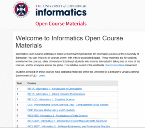
Screenshot of the homepage of the School of Informatics Open Course Materials platform.
Identifying key areas for improvement
Alex had received positive feedback from students who were able to successfully locate their course materials. However, from our discussions and a review of the content on the Open Course platform, (which relies heavily on tables), we both felt there was scope to review the current layout and explore potential alternatives.
Within the tables, we also identified that a more consistent and informative approach to formatting links as well as creating more effective headings could improve the user experience.
In addition, Alex was keen to look at the best ways to support Open Course publishers with content design and embed ways to make it easier for them to prepare effective content. To this end, we talked through potential guidance and training that could be developed with a specific focus around Open Course content.
We spoke with Open Course publishers to gain their perspectives
Before progressing any further with our ideas, we were keen to establish a baseline understanding of how Open Course is currently used by those who publish content on it. This would help us to learn about their processes and approaches, identify pain points as well as areas that were working well.
Alex reached out to Informatics colleagues to see if they would be happy to speak to us about their experiences of using Open Course. In late January / early February 2026 we carried out a series of semi-structured interviews.
Format and aims of the interviews
The UX Service facilitated the interviews via Teams, observed by Alex, to learn about the experiences of Informatics colleagues who published content on Open Course. Informatics colleagues shared their screen and talked through how they achieve content publishing and formatting tasks in Open Course. This enabled us to see first-hand how they went about these tasks and hear their perspectives and feedback.
The aim was to confirm areas that were working well and also the main pain points. We were keen to learn the reasons why tables were used, what the experience was like for those editing content within them and understand more about their approach to writing headings and links.
We gained a lot of useful information from the interviews both from a content perspective, but also in relation to more technical aspects relating to the platform itself which Alex could feedback to Graham Dutton, the developer working on Open Course.
This information then provided the basis on which to form an action plan around how to make improvements and decide on the best way to provide support and/or guidance.
Tables: were they necessary, if so could they be improved?
Following our discussions with Alex and the semi-structured interview insights, we felt we had a good understanding of how tables were used and the pain points relating to editing content within them.
We first wanted to explore whether tables were needed, or if there were alternative layout options to avoid the need for tables completely. If they were needed, we could then look at how they could be improved?
Prototypes were created by the UX Service
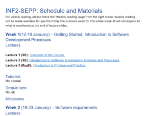
The UX Service mocked up some prototype tables, initially in Word before also creating them in an Open Course playground site we had access to. We used the following ‘Schedule and materials’ page, where almost all information was displayed in a table.
INF2-SEPP: Schedule and Materials | Open Course Materials
Prototype one
Our first prototype involved removing tables completely and using headings and paragraph text to display the same information. What we soon realised was that this made the information hard to scan and increased the length of the page. We felt from trying this approach, there were definite benefits to having a structured column layout to help communicate key dates and materials for course participants efficiently.
Screenshot of a word document prototype displaying information from Open Course using headings and paragraph text rather than tables.
Prototype two
Our second prototype then explored how we could improve the current table layout and make it as accessible as possible. The existing page had a continuous table with six columns. All headings and links were included in the table itself which made it quite hard to navigate. Also, the number of columns meant that text was wrapping onto two lines quite often, which again impacted on readability.
We explored presenting the same information in a two-column layout, using rows with clear left-hand headings to signpost key information. We also split the continuous table into multiple tables, one for each week of the term. Column and row headers were also applied within the table editor tools. These changes we felt improved the overall look and feel of the page but also made it easier to navigate to the information you needed.
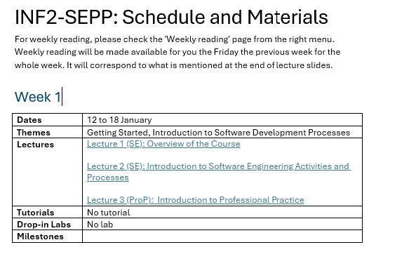
Screenshot of a word document prototype displaying information from Open Course in an alternative table format.
Stress-testing prototype two
After sharing both options with Alex, we decided to proceed with prototype two and carried out some further testing to make sure it was fit for purpose.
JAWS – Screen reader testing
Using the prototype in the our Open Course playground site, we used JAWS to test out how the content on the page would be navigated and interpreted by a screen reader. Whilst this approach may not fully capture how all users of assistive technology navigate, interact and experience the page, it did provide useful insights around how tables in Open Course interact with screen readers. Overall, the new table layout responded well.
We found that JAWS:
- read out the number of columns and rows in a table as expected.
- navigated the table content in a logical order. It interpreted tabled cells moving from left to right, first reading the column headers (‘dates’, ‘themes’) before information and links within the cells.
JAWS didn’t pick up on blank cells within the table. Instead, it moved to the next table cell which had content within it. Therefore, we recommended that if this table layout was adopted that there should be no blank cells to aid clarity. Where there was no information to put within certain cells, text such as ‘no milestone’ or ‘no tutorial’ should be used.
We are also aware that screen reader users can and may wish to jump from table to table on a page. When navigating in this way, JAWS moved table content to table content without reading out the assigned ‘Week X’ heading we had inserted. Therefore, when you have multiple tables on a page, it’s hard for the user to tell which table they are on. A potential solution to aid understanding could be to incorporate the week number within the table itself, rather than using headings.
Magnification and responsiveness on mobile
When tested, the page (including tables) responded well to 400% magnification, with no loss of information. This check was carried out to ensure that the content reflows correctly for users who routinely view web pages using zoom functionality. We wanted to ensure that information did not move off screen or overlap when zoom was used.
The tables also responded well in mobile view, including when the screen was rotated. This is important to test given the increased usage of mobile devices to access digital content, to ensure all users were able to easily read / navigate the information on the page.
UX Service recommendations
Recommendation to use prototype two table layout going forward
Following our prototyping and stress-testing, we reported back to Alex that prototype two was the option we would recommend.
Recommendation to consider best formats for guidance on headings and links
From reviewing the pages and considering the insights gained from the interviews, we also felt that it would be beneficial to create guidance around:
- writing effective headings and using correct heading levels in tables
- how to use links and write effective link text.
Having this guidance close to hand, ideally accessible directly from the edit screen of the Open Course platform would be preferable to enable ease of access for users.
Reflections and next steps
As a team, we really enjoyed working with Alex on the project. It provided us with the opportunity to apply the content design best practice principles that we teach specifically to learning and teaching content. It was interesting to explore and test out options for using tables in a different context, outwith the central EdWeb 2 Content Management System, for student-facing content.
We are glad that the Effective Digital Content online course provided the impetus for this work. We hope that the course continues to provide the starting point for interesting conversations about how digital content can be improved as it reaches wider audiences around the University.
We look forward to continuing to work with Alex in relation to the guidance and potential implementation of the new table layout before the next semester or at an appropriate time in the future.