
EdWeb feature prioritisation survey results
A couple of weeks ago we distributed a short survey to all EdWeb CMS users, and also invited participation from their colleagues who, while not using the system directly, are stakeholders in the management of University websites. In this post, I share the data collected, and provide a little commentary.
Why conduct this survey?
First and foremost, because we believe very strongly in listening to users of the systems we support and develop. And not just listening to the louder voices. This survey provides a democratic voting opportunity. Everybody’s opinion here has equal weighting.
This approach is something I’ve employed since the early days of the previous CMS, Polopoly, with the first survey taking place in 2010. Everyone sees the list of areas for potential improvement. Everybody gets the same number of votes. Everybody gets the chance to add extra items to the list.
We can’t say that we will address every area that is prioritised, but we can be transparent about what users of EdWeb think, and use the feedback as the basis for ongoing discussion.
A few open comments complained about the restriction to 5 votes each. They wanted to vote for more items. The reason for the 5 votes is that we need you to prioritise. The reality is that we aren’t going to be able to address everything on the list, but we will definitely address some and we will definitely repeat the survey. So a small number of votes focuses the mind and acknowledges that some items will still be on the list next time the survey comes round, regardless.
What do we do with the data?
Firstly, we share it back to the community. It’s all here in this post.
Secondly, we use it to inform our thinking. Both in terms of what we try to prioritise to do next with the resources we receive from Information Services central funds, and in terms of training, strategy and communication.
Finally, we promote the results to colleagues in the University who have funds to boost our development effort. During this academic year we’ve been fortunate to receive additional funding from two colleges (Medicine & Vet Medicine, and Humanities & Social Science) and from Communications & Marketing which has led to enhancements around sub-branding presentation, staff profiles and homepage functionality respectively. We can share subsets of the data back to these and other groups who may wish to top up central investment in EdWeb and the website, so that they can be confident that their investment focus correlates with what people in their business area think.
Who contributed to the survey?
The survey was open for a week in early May, and promoted via our usual community mailing list channels and then on through proactive members of the community.
There were 177 contributions in all, with 174 completing the demographics questions.
The colleges are all pretty much equally represented, and the balance between college and support group contributions also fairly equal. On the support group side though, the University Secretary’s Group contributed more opinions than Information Services or Corporate Services. Indeed, this group was the largest overall contributor.
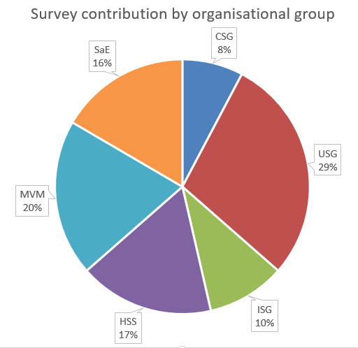
Responses by organisational grouping was broadly balanced.
- College of Medicine & Vet Medicine 20%
- College of Humanities & Social Science 17%
- College of Science & Engineering 16%
- Information Services Group 10%
- University Secretary’s Group 29%
- Corporate Services Group 8%
The three main staff roles contributing to the survey are:
- Administrators
- Marketing and communications specialists
- Technical specialists
This is unsurprising to us, given our experience of training and supporting the community, and indeed is reflected in the 4 personas we use to aid our communications and planning.

Survey respondents identified the kind of role they perform at the University
The following graph combines the information in the preceding two pie charts. I’d suggest you only give this attention if you’re going to dig into the detailed data. So if you’re looking at responses by particular colleges for example, bear in mind the nature of the roles of those who contributed. You’ll see (and probably would expect) that more technical people (like computing officers) feel different features are more important than, say, administrators or clerical assistants. So this potentially is a reason for differences in opinion across the colleges. Science and Engineering’s contribution contained more technical staff and fewer marketeers than the other two colleges, for example.
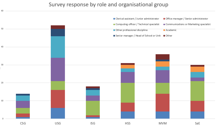
Breakdown of respondees by role, on a organisational grouping by grouping basis
The results
There were 27 items in the survey and every participant got to vote for 5 of them, plus leave a comment at the end should they feel there was another feature at least as important as those they’d voted for.
The technique comes from the work of Gerry McGovern and his top task surveys. In a previous post I discuss long neck/long tail graphs and our approach to feature prioritisation.
Optimising what’s important – Get to know your long neck (Neil Allison post from April 2016)
In this post, I’m not going to deal with the open comments. We’ll look at these subsequently.
Here’s a graph of where those votes went, with the items arranged high to low:
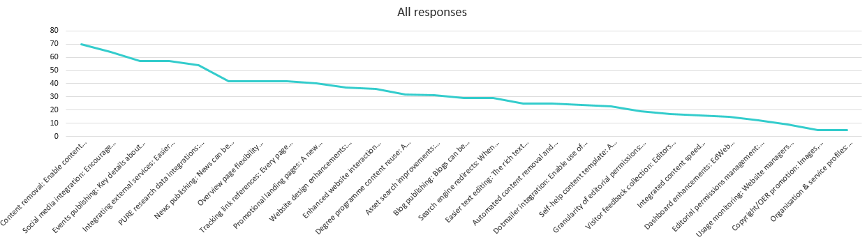
The line graph clearly shows than some areas for development are significantly more popular than the majority.
While this isn’t your classic long neck/long tail graph, it does show a strong weighting towards some features over others. In fact, 50% of all votes went to the top 8 items. And this pattern persisted across every slice of the data I analysed; in a couple of cases as few as 6 items accounted for 50% or more of the vote.
The top 8 items were:
- Content removal: Enable content that is no longer required or created in error to be removable, reducing unnecessary clutter in the EdWeb content tree for editors. (8%)
- Social media integration: Encourage sharing of website content via social media buttons, and features to monitor engagement on popular networks. (7%)
- Events publishing: Key details about events can be displayed differently in different contexts, such as the automatic creation of an events calendar. (7%)
- Integrating external services: Easier integration of services such as Google Maps, You Tube videos, Twitter feeds. Simple URL pasting into EdWeb with no need for interaction with HTML or assets. (7%)
- PURE research data integrations: Introduce more opportunities to present information from the Edinburgh Research Explorer in EdWeb-managed web pages, with no technical knowledge needed. (Currently only publication lists possible). (6%)
- News publishing: News can be published using a dedicated content type (template); enhancing presentation on different device sizes, allowing more intelligent sharing and promotion in search results. (5%)
- Overview page flexibility enhancements: Introduce new layout options to enable overview pages to dynamically present the content below in a range of ways. (5%)
- Tracking link references: Every page will contain a list of all other EdWeb pages that link to it, so that when it is edited, moved or removed the editor is aware of the impact of their actions on other publishers across the University. (5%)
You can get the full list of features and how they were voted for, from the Excel spreadsheet. I’ve removed the comments from the data as this information is publicly available. We will however, write a further blog post on the comments received.
Download EdWeb survey data (Excel workbook)
Similarities and differences across the demographics
As the data I’ve presented so far in this blog post is an aggregation of what everyone thinks, it’s to be expected that there are differences in priorities between job roles and between areas of the University business.
I conducted a comparison of the overall top 8 features.
The greatest areas of consensus (where every demographic scored the feature as important) were:
- Content removal
- Integrating external services
- Overview page enhancements
- Events publishing enhancements
The remaining 4 had lower degrees of consensus:
- Social media integration was scored lower by Science and Engineering, although this may just be due to a higher proportion of technical specialists contributing from this area
- PURE research data integrations was scored significantly by support group respondents, which we would expect. Looking only at the colleges’ scoring, this is actually on average the most important feature to enhance.
- News publishing was scored lower by support groups as we might expect, but also surprisingly low by the College of Medicine and communication specialists. Technical specialists scored this highly, perhaps because there are instances across the community where news content is managed in an external system and integrated into EdWeb. Better news publishing functionality would enable technical specialists to retire locally managed solutions, and perhaps they better appreciate the news aggregation opportunities that would arise from investment in this area.
- Link tracking scored surprisingly low for the College of Humanities, and less surprisingly low for technical specialists. It’s understandable that other staff roles who publish more content would value this more highly, and in particular staff in support groups who tend to produce more content that they wish to encourage others to link to as a golden source.
Stand out priorities by group
Here I’ve focused on areas that one or two groups prioritised more highly while the majority didn’t:
- Degree programme content reuse: A means to re-use and extend golden copy content about degree programmes, that is currently published only via the Degree Finder
- Scored more highly for college-based respondents and for communication & marketing specialists
- Promotional landing pages: A new page type designed for promotional impact and flexibility, which can be used at any point in a site structure.
- Scored more highly for two colleges, and unsurprisingly for communication & marketing specialists
- Enhanced website interaction monitoring: Enable use of additional analytics tools (click heat tracking, A/B testing etc)
- Support group staff and communication & marketing specialists prioritised this
- Website design enhancements: Evolution of design to improve website visitor experience on small devices
- One college and technical specialists prioritised this higher
- Dotmailer integration: Enable use of Dotmailer through EdWeb
- Communication & marketing specialists prioritised this
In the listing for this section, I’ve only picked on items that were in each subgroup’s top 7 or 8 items (that attracted their first 50% of votes).
You can derive from the frequency within which they’re mentioned here that communications and marketing specialists were the group whose priorities were furthest away from the average. They had 4 items in their top 7 ( 51% of votes) that didn’t make it into the overall top priorities.
Priorities by feature type
One final bit of analysis I did was to categorise each feature that appeared in the survey to get an overall feel for what participants had felt were important. You can see how I classified each item in the spreadsheet, and to be fair some could fall into more than one category so you may not agree with my choices.
I think this gives a good ‘at a glance’ view of what our user group value most in terms of future development.
| Number of votes | % votes | Number of items in survey | Votes/item | |
|---|---|---|---|---|
| CMS efficiency | 265 | 31% | 7 | 38 |
| Website visitor interaction | 183 | 21% | 6 | 31 |
| Content template | 238 | 28% | 7 | 34 |
| Content reuse | 86 | 10% | 2 | 43 |
| CMS editor management | 40 | 5% | 3 | 13 |
| Tech | 45 | 5% | 2 | 23 |
Because each category contains different numbers of items, some categories collected siginificantly more votes than others. For this reason, I calculated an average number of votes per item in each category.
What we can see quite clearly is that on average, what matters most to EdWeb users is:
- Having more and better opportunities to integrate content in from specific golden copy sources (like PURE, the degree finder and 3rd parties like Google)
- For the CMS itself to be more efficient and easy to use
- To have more and better content templates to work with
- For the website design to evolve and facilitate greater interaction with, and understanding of visitors.
It might be argued that the techier items scored lower because a proportion of survey contributors perhaps didn’t understand the items fully. What isn’t debateable however is that – at present at least – there is relatively little interest in features that would empower local site owners to do more with their editorial groups in terms of assigning permissions and reviewing activity.
Download & continue the conversation
I’d encourage you to dig a little deeper into the survey data.
Download EdWeb survey data (Excel workbook)
And let us know what you think and what you’ve interpreted from the data via a comment below.
4 replies to “EdWeb feature prioritisation survey results”