
The complexity in reducing complexity: redesigning a form for registering how students pay tuition fees
We worked with the Finance department to redevelop a form for students to tell the University how they will pay their tuition fees. In this post, I recap the complexities we faced in designing the form, how we addressed these and how a complex solution can simplify the experience for students.
Project background
The Income Section in the Finance department approached us to help improve their process around how students inform them of how they will pay their tuition fees.
Last year, they set up a form (called the Financial Registration Form) to capture this data, which they use to set up payment plans and respond to students who contact the service.
Read Flo’s post for more background on the project and form
We did some initial usability testing of the current form they had to see the issues students had while trying to complete it and the subsequent process around arranging fee payment.
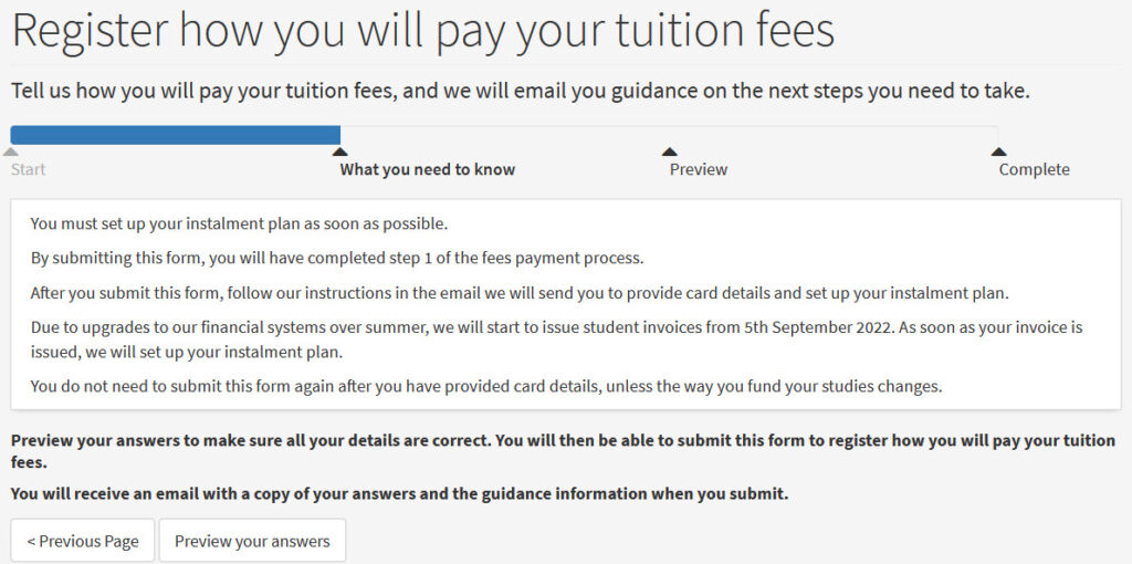
This testing, combined with additional user research we did, fed into how we designed a new solution – a form called ‘Register how you will pay your tuition fees’.
Register how you will pay your tuition fees form (University login needed)
Why so much complexity
The complexities we had to address in this project had to do with a variety of issues:
- There are many different funding types. Not all students pay fees the same way. Some pay with their own or a family member’s money, others receive loans or scholarships. We needed to provide directions for all these different funding types.
- There are multiple steps to pay fees. Prior to the project, the existing web content in this area did not tease all these steps out.
- Students arrive at the form at different points in their payment process. For example, for funded students, some may already have applied for funding, while others have not. We needed to provide different messaging for where someone is in their payment or funding journey.
- There are constraints in the form content type in our CMS, EdWeb. What we designed had to work with the technology we have. This means we couldn’t always design what might have been the ideal solution because the functionality didn’t exist.
How we addressed the complexities
Complexity 1: Giving students the guidance they need but also making sure they submit the form
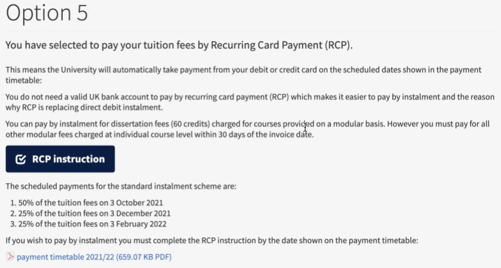
This complexity has the do with the number of funding types and the constraints of our CMS. In the Financial Registration Form previously set up, after answering all the questions, students were prompted with a message telling them which ‘option’ number they were based on their answers.
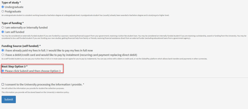
The original form showing an instruction to choose Option 3 after submitting.
After submitting the form, they were taken to a page with a bunch of option numbers, and they had to select the option number they were given before submitting. This option number linked them to relevant guidance relevant on how to pay fees.

The page students were directed to after submitting the form. They had to select the option number they were given before submitting the form.
This relied on students remembering their option number after they pressed submit, which was not ideal. However, this set-up had to do with technical limitations of the CMS.
In EdWeb, you have to send all users to the same page after submitting a form. There was no functionality to, for example, send someone who selected to pay by instalment to a pay by instalment page, or send a student with a scholarship to a scholarship page.
Solution
Because of this technical limitation, we knew we had to explore other options of how to give students the guidance they needed without them needing to remember any info.
Ultimately, we knew we needed to email students the guidance relevant to them. Our discovery showed students submitted the original form multiple times, as it was the only way to access the relevant guidance for them. We wanted to avoid this and make sure students received a copy of their answers and guidance.
In addition to receiving an email, we wanted students to have access to this information while still completing the form. This way, they are not left waiting for an email which may be delayed telling them what to do.
As such, we first designed a solution where a student answers a few questions.
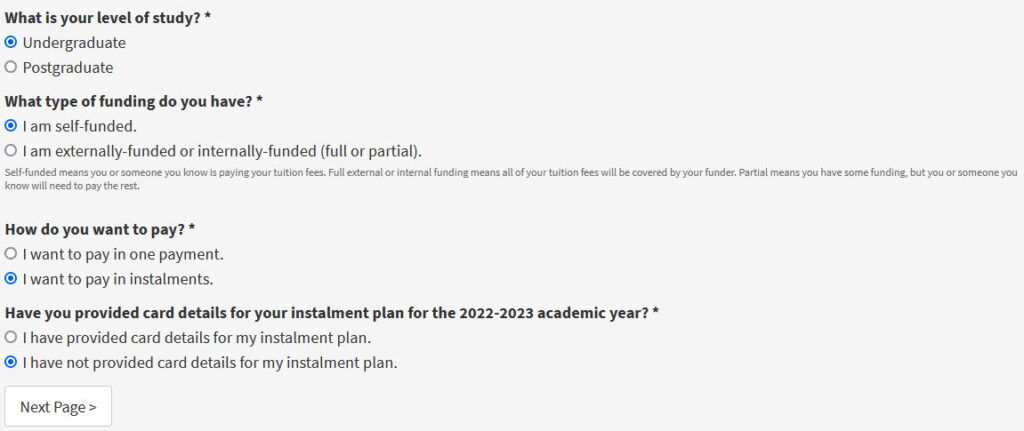
The types of questions students have to answer on the new form we designed.
Then, a different piece of prompt text appears with a link to relevant guidance depending on their answers.
In our first iteration of the form, after answering questions on how they will pay, students were given prompt text with instructions on how to pay and a link to payment guidance.
After submitting the form, they also receive this guidance by email for their records.
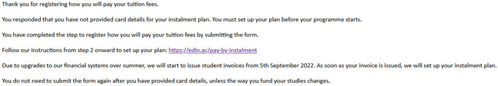
The text in an email submission links students to guidance on what to do next.
When we usability tested this solution, though, we found students went to the linked guidance from the form immediately and then in some cases forgot to submit the form.
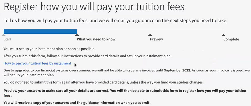
To mitigate this issue, we redesigned the form to remove links from the prompt text. Instead, we gave a brief overview of what payment instructions they will need to follow and then only send the link to guidance in the email.
The revised prompt text tells students what to do next, but doesn’t include a link to payment guidance.
This means that the students:
- get some basic information about their payment instructions while completing the form
- are incentivised to submit the form to receive a link to guidance
- have a record of their submission and guidance in their inbox, so they don’t need to go through the form to find it again
Complexity 2: Students might be completing the form before or after they have paid their fees or applied for funding
As stated previously, students were arriving at the form at different points in their payment process. In the previous form, all students of the same funding type were taken to the same funding guidance, regardless of where they were in their payment journey.
For example, all students paying by instalment plans were taken to guidance explaining how to set up a plan, regardless of whether they had done so already.
Part of the previous guidance page on how to pay by instalments. Both students who had set up a plan and those who had not were sent to this page.
Solution
To address this issue, we added additional questions to the form to ask if they had paid or applied for funding already.
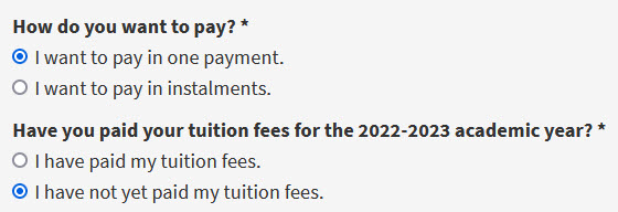
The first question asks for payment method. The second questions ask if the student has already paid.
Depending on the answer, the student was delivered tailored content on what to do next. For example, if they still needed to pay, they received info on how to pay.
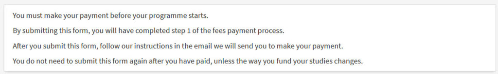
The payment instructions prompt text if a student still needs to pay.
If they had already paid, they received acknowledgement of their payment and were told where they could view their receipt of payment.
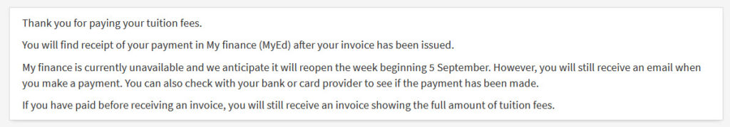
The prompt text if a student has already paid, telling them they can check My finance to find recipt of their payment.
The tailored guidance also helped address an issue we learned in our discovery. Some Scottish undergraduate students don’t realise they need to apply to Student Awards Agency Scotland (SAAS). This is the agency that fully funds tuition fees for Scottish students. As a result of not applying, students get charged for tuition fees when they should be fully funded.
The way the form works now, they have to indicate if they applied for funding.

The options to select whether or not you have applied for funding to SAAS.
If they haven’t, they receive an email telling them they must apply with guidance on how to do so.
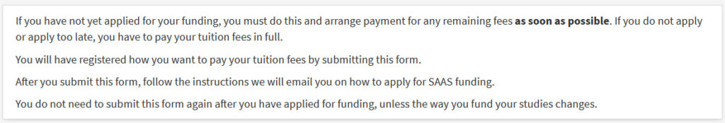
The prompt text telling students who have not applied for SAAS funding to do so.
So this improves on the previous form by catching the students who have not applied for funding and risk receiving a tuition fees invoice because of it.
A complex solution, but a simplified experience
The form we designed in this project was a more complex solution than the previous Financial Registration Form.
We created more content and features that will need to be maintained. However, this complexity will ultimately benefit the Income Section because we have created a better experience for students.
Students no longer:
- need to remember which guidance page to go to – this is emailed to them
- are directed to generic content – they receive tailored guidance depending on where they are in the process
As a result, we expect to see a reduction in queries to the Income Section because this new design better serves student needs. We’ll be assessing the impact of the form with the team later this year.
So reducing complexity for students can mean a service needs to create a more complex solution. But a better experience for students ultimately benefits the service, too.
Learn more
Read our other posts about the fees payment project


Such a tricky problem to solve there Lauren, and so many business and system constraints! Looking forward to hearing about the impact of this work on the student experience and the size of the Finance Department Income Section’s support inbox.