
Taking it step by step: an effective way to simplify complex content
During a recent project with the Student Immigration Service, we found that breaking down guidance into numbered steps helped us simplify complex information and improve user experience.
Our project with the Student Immigration Service (SIS)
In January 2022, we began work with the Student Immigration Service (SIS) to redesign a large area of their website providing guidance on the visa application process.
For incoming students, the process of applying for a visa can be incredibly stressful, scary, and confusing. Early discussions with the SIS team revealed that applicants struggled with several aspects, including getting their Confirmation of Acceptance for Studies (CAS), a digital document created by the SIS team that is required for the application.
Typical email enquiries to the SIS team included:
- “What documents do I have to submit?”
- “How do I get a CAS?”
- “How much money do I need?”
Despite there being existing guidance about these topics on the SIS site, it was clear that the message wasn’t getting through.
The problem lay in how the content was presented on the page.
Identifying the hurdles
When we looked at the enquiries fielded by the SIS team, it became apparent that students lacked clarity on:
- the actions involved in applying for a visa
- the order in which these actions should be completed
- how long various aspects of the process would take
In the case of the Confirmation of Acceptance for Studies (CAS), there was confusion about:
- when during the year a student could request their CAS
- when their CAS would be ready
- how these timescales might affect the progress of their application
With these issues in mind, we began to overhaul the content on the SIS pages, starting with CAS.
Redesigning the CAS pages
In an early version of our revamped CAS pages, we ticked a lot of “good content design” boxes:
- We wrote in plain English to keep the language simple for people who aren’t native speakers.
- We used descriptive H2 headings that echoed common enquiries.
- We added formatting features to structure the text, improve readability, and emphasise key information.
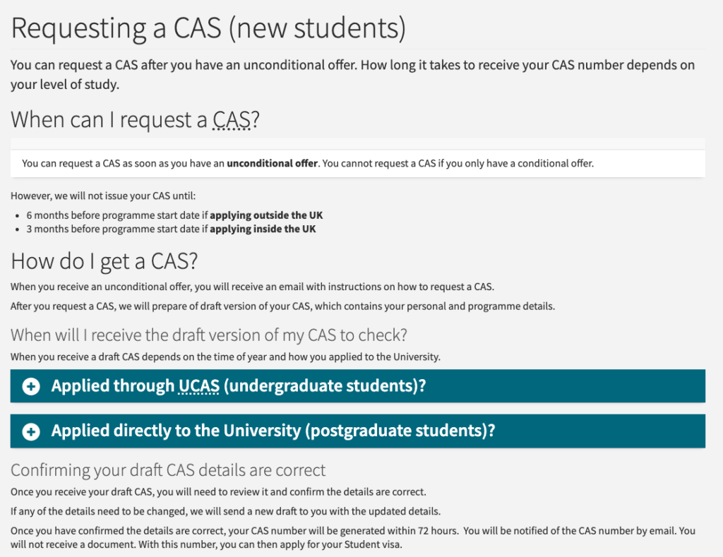
An early version of our content for Confirmation of Acceptance for Studies (CAS).
Despite our best efforts, however, the content on this page tested poorly. In our usability sessions, testers stumbled over the instructions and remained confused about the process of requesting and receiving a CAS.
As before, they lacked clarity on the actions required, the order in which to perform these actions, and how long the process would take.
It was time to try something new.
Adopting the step-by-step approach
Following a playback session of our usability tests with the SIS team, we talked through our options and settled on using numbered steps.
We began by dividing the CAS process into six steps. Next, we presented these steps in a short, numbered list using imperative verbs to hammer home each action. We made sure to include references to timescales, including the fact that at several points in the process, the student would have to wait to receive further instructions from the SIS team.
Beneath this summary we added collapsible feature boxes offering more detailed information.
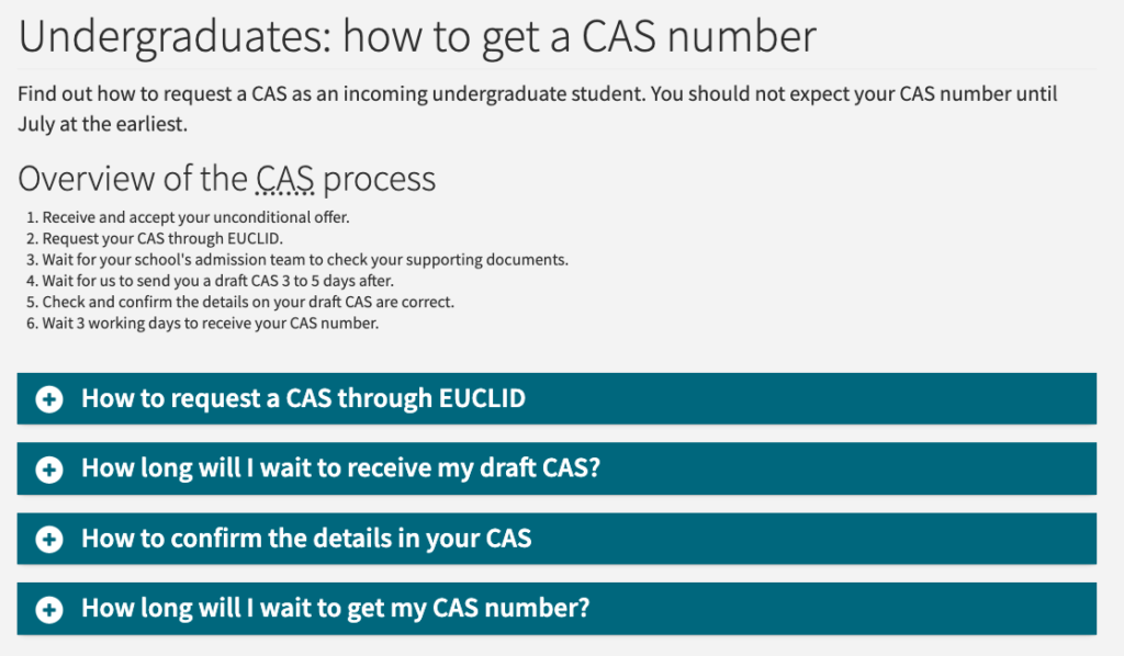
Our new CAS page, featuring an overview with numbered steps and collapsible feature boxes.
When we tested our CAS content a second time at the end of the SIS project, we found that our revamped approach helped testers successfully complete the given tasks, including identifying wait times.
Separating steps onto different pages
We were able to use the step-by-step approach in other areas of the SIS website, including financial requirements and International Check-in.
However, the area where it made the biggest impact was applying for a Student visa outside the UK.
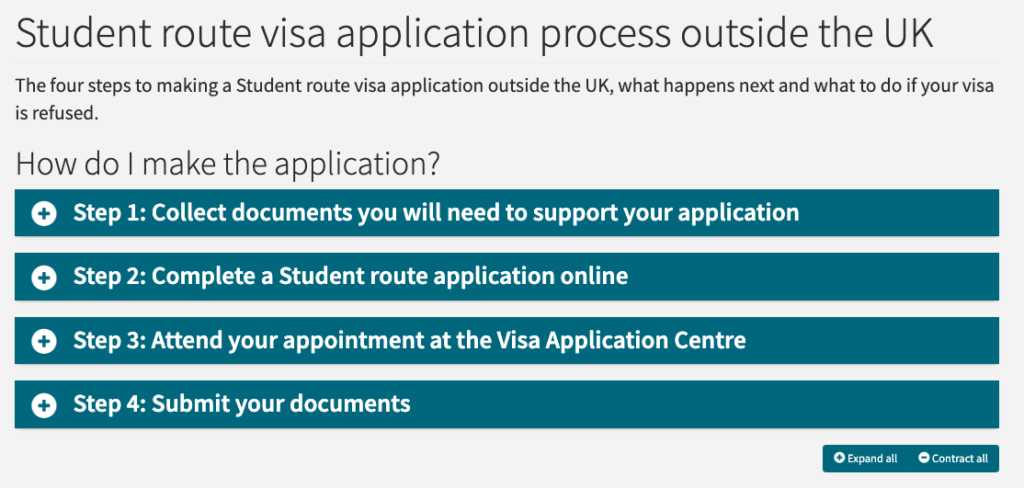
A page from the previous applying for a Student visa outside the UK section, showing four steps in collapsible feature boxes.
When we started work on this section of the site, we found that some of the content was already set out as steps. At first glance, the guidance seemed clear but, looking closer, we found that each step was complex and time-consuming – far more so than the simple actions we set out in our overview for the CAS process.
What’s more, when we began digging into the Student visa guidance on GOV.UK, we realised that the overview presented skipped over some key parts of the process. Fleshing out these steps within the existing format would result in an overwhelming amount of complicated content being contained on one page.
Following workshops, usability testing, and discussions with the SIS team, we settled on a more effective approach:
- Separate the application process between European and non-European applicants (due to different requirements).
- Create a definitive set of steps for both processes.
- Set out the steps for these processes on individual but interlinked pages.
We ultimately devised six steps for non-European applicants, and five for European applicants. We created the steps as generic pages sitting beneath one overview, allowing the user to navigate via feature boxes on the overview page, or via the navigation panel on the lefthand side.
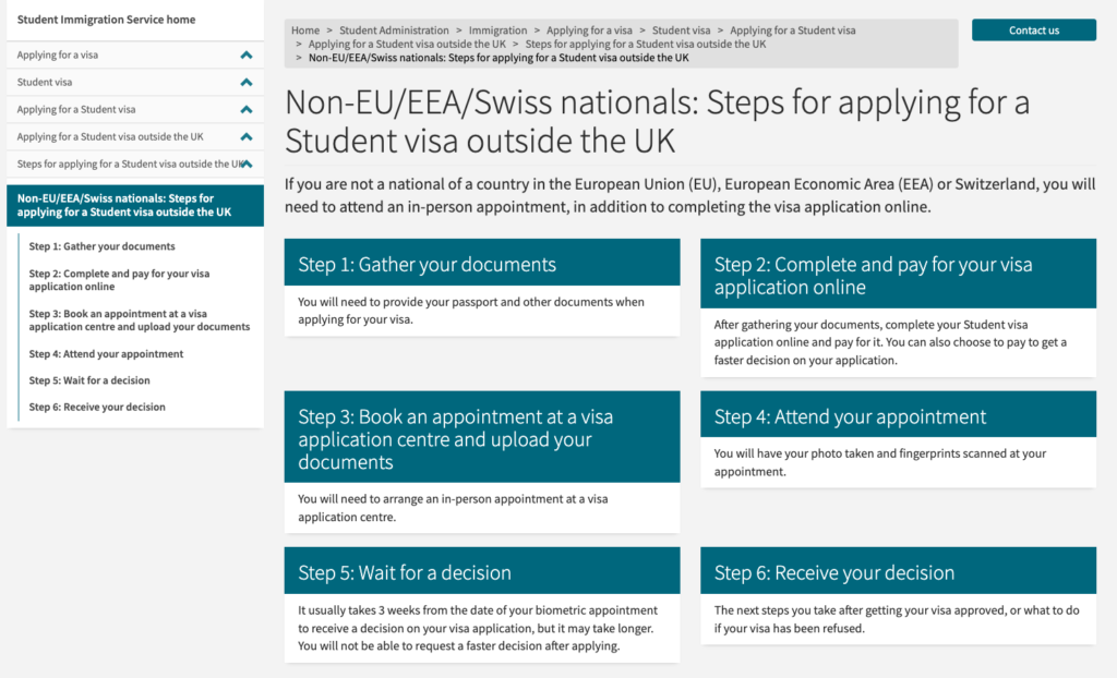
Our new content for non-European students applying for a visa outside the UK.
For each step, we added the H2 heading “Next step” at the bottom of the page, and a button linking to the next action in the process. With the navigational menu still visible, the user can jump between steps depending on what they want to see, or simply follow the flow of the pages by clicking the “Next step” buttons in turn.
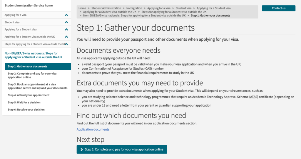
Our Step 1 content for non-European students applying outside the UK.
In our final usability tests, our testers successfully completed the given tasks. They were able to pick up on key information, including which documents were required for their application and how long a decision on their visa would take, and seemed to have a better understanding of the application process as a whole.
In short: our step-by-step approach was a success!
Learn more about our project with the Student Immigration Service
Our team has written other blogs about our project with SIS, including detailed recaps of our sprints.


Great post Flo. Really interesting to see how the team evolved the content design and tried different approaches to get the best out of EdWeb.
Great post, thanks for sharing. Really good to see how such a complex process can be presented in a easy to understand way!