Staff prioritise usability issues through collaborative review sessions
In January we ran two open-invite sessions to collaboratively review some of the usability testing videos we recorded during November’s Postgraduate Open Day. Nearly 70 colleagues joined us to agree the biggest issues facing prospective students as they tried to establish their cost of study online.
These sessions are a great opportunity for staff to see for themselves what students are doing and saying. The workshop approach we take allows everyone to become part of the decision-making process.
The approach supports our commitment to working in the open and making decisions directly informed by user insight.
Read Neil’s post on our working principles
Format of the sessions
Neil and I gave a brief introduction to the user research that we conducted at the Open Day, and went through the technique of observing the videos and taking notes of the problems observed.
Doing guerrilla usability testing at the PG open day blog post
Write up of the collaborative review approach on the Website and Communications blog

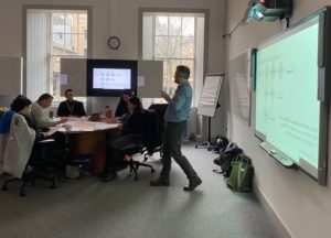
Colleagues from across the University joined us to watch videos of students using the website, and prioritise the problems they saw.
We allowed a little time between the videos for small group discussion and everyone prioritised their top 3 usability issues.

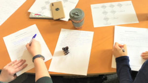
Attendees writing down the key issues observed
After watching 4 videos, and each attendee picking their top priority usability issues, Neil led the group through a prioritisation exercise that led us to a list of issues the group commonly agreed were most important to address.

Neil Allison facilitated the review process that brought together the observations of around 40 attendees in under an hour.
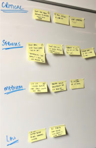
The end result was a “report” in the form of usability issues on post it notes that had been objectively assigned a level of importance from critical to low.

At the end of the session we had a summary of the most important issues and how critical they’d been to student success.
Findings from the sessions
Across the two sessions, we saw some recurring themes in terms of student behaviours and the problems they encountered.
We also saw trends in what colleagues prioritised as the most important things to fix.
Key findings include:
- Our use of terminology and language is not simple and easy to understand. We use terms that hold little meaning for students, and we’re inconsistent in their use across the website.
- Costs presented in different ways across different parts of the web estate reduce students’ confidence in what they find. This is a very important and costly decision for them, so whenever they’re not sure they will get in touch which is frustrating for them and costly for us.
- Our core presentation of fees information – what should be the definitive, authoritative source – is cumbersome and difficult to interpret. This experience was compounded by students using mobile touch screen devices.
- Navigation and findability of content is unnecessarily complex and confusing.
- Circular navigation journeys were made in finding fee information, where participants had to navigate several pages to find relevant information.
- Purpose of the Scholarship and Student Funding website wasn’t obvious for tuition fee content. Participants navigated several funding pages before realising that it was the wrong route in finding fee information.
- The findability of the fee search functionality (in the Scholarship and Student Funding section) was difficult and not memorable for participants who had used it previously. The search facility was liked as a way of filtering and getting results quicker.
The insights gathered have contributed to a collection of other discovery phase activities which has allowed us to gain an in-depth understanding of our users (both students and staff), their needs and requirements.
Feedback from attendees
We had tremendous interest in the sessions with over 100 colleagues booking places and ultimately 68 joining us over the two dates.
Thank you for the session this morning, it’s a great opportunity to feed into this work
A few comments we received via email after the first session:
- “I liked that the usability tests focussed on a very specific task… I’d come to future sessions on other usability testing topics.”
- “Thank you for the session this morning, it’s a great opportunity to feed into this work”
- “I’ve already recommended these sessions to colleagues as I thought it was a great way to experience what students actually do when looking for information. It’s made me think again about our website.”
- “Great to watch the videos… and have a [an opportunity to be involved in] prioritisation…”
- “…being invited to this kind of sessions are a good way to catch up on what’s happening across different areas…”
I’ve already recommended these sessions to colleagues…
Tell us what you thought
Leave a comment on the post to tell us what you thought of the sessions.
We plan to run more of these events as we conduct further research into our prospective student’s needs.
Sign up to our mailing list to be kept informed of future sessions


2 replies to “Staff prioritise usability issues through collaborative review sessions”