What we found in our audit of postgraduate taught content
Over the summer, our team audited various University websites with content for prospective postgraduate taught students. We were looking to find areas of content that might benefit being in our new postgraduate degree finder.
Goals of the audit
The goals of the audit were to:
- identify current content provision for prospective postgraduate taught students on central, college and school-level sites
- identify what content might be beneficial in a new postgraduate degree finder to better serve prospective student needs
- support creation of an updated content model for postgraduate degree finder project
What we audited
We looked at:
- the content in the current postgraduate degree finder for taught programmes
- a selection of 12 school websites from across the three colleges
- central service areas that deal with prospective students (for example, tuition fees, scholarships and funding, international applicants)
- postgraduate taught sections of our central postgraduate study site
How the audit worked
The audit was a combination of:
- creating an inventory of all the postgraduate taught content on these sites
- assessing whether this content was redundant (repeating information already on the degree finder), outdated, or trivial (not addressing a prospective student top task)
We did this by looking through each relevant page on these sites and logging details about them into a spreadsheet. We also took screenshots along the way of anything worth sharing with the team, so we had a visual way to recap what we were finding.
What we found
The current postgraduate degree finder has a lot of content gaps compared with the undergraduate degree finder
Although our team works with these degree finders every day, it struck us while auditing the differences between the undergraduate and postgraduate degree finder.
Namely, the former provides more set headings to provide content for, while the latter has fewer set headings. For example, the postgraduate degree finder doesn’t have set headings for areas we’d expect, like facilities, teaching and assessment.
As a result, we saw that many schools were using their own websites to fill these content gaps. What this means, though, is some schools have essentially created their own version of the degree finder on their websites.
Duplication of content creates risk, and we did see instances of outdated content on school sites.

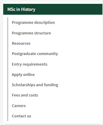
A school site with subsections for programmes that duplicate degree finder content.
Applying section does not have enough space in current degree finder
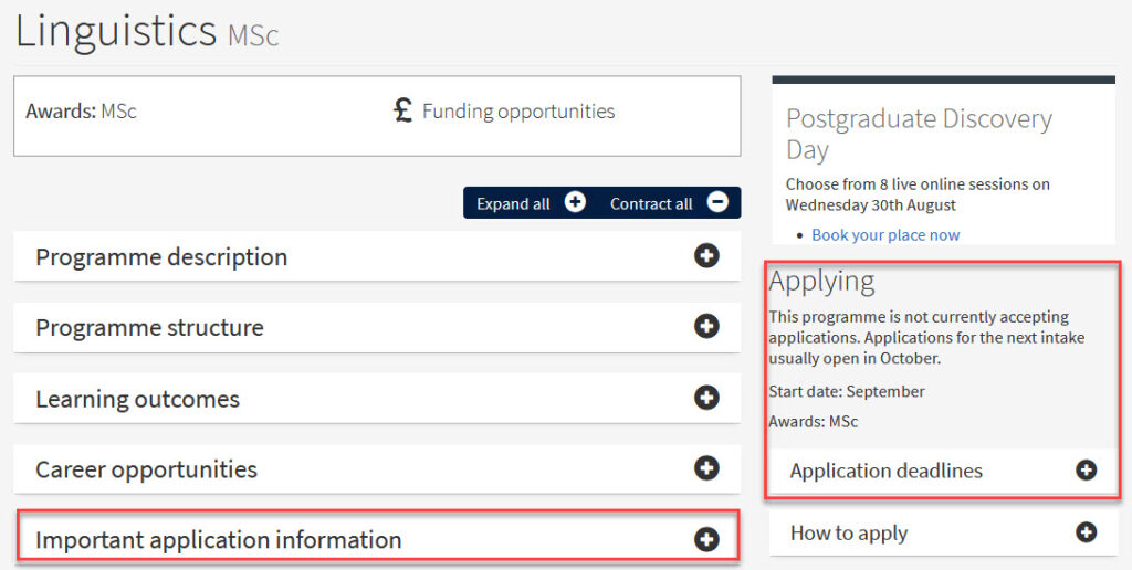
In addition to the content gaps, the current degree finder also has presentation issues. This is most notable in the applying section, which sits at the top right side of a programme page.
Some schools have a lot they need to say about the process, but the current presentation leads to students not finding applying information, and the section does not have the space to effectively display all the relevant content needed to share with prospective students.
For example, we saw some schools using the miscellaneous (create-your-own) section of the degree finder to add more applying info, indicating a need for more comprehensive and easy-to-find provision for this.

This programme has an extra applying section to provide more context than the default applying section (top right) has space for.
Central services often mix the undergraduate and postgraduate (or taught and research) experience
On our central service area sites, we found some content that didn’t make it clear which student groups it applied to. In some instances, content was clarifying if it was relevant to undergraduate or postgraduate students, or in postgraduate content, it wasn’t clear if it was for taught or research students.
For example, in the Scholarships and student funding site, postgraduate taught and research funding opportunities are mixed together. This means when browsing through the site, you sometimes have to read the full summary sentence or even click onto the page to find out who the funding is relevant for if this is not made clear in the page title.

On an overview page, you cannot tell if this scholarship is for taught or research students.
A lot of content is signposting to other content
This wasn’t a surprise to us, but we did see the primary purpose of many pages we looked at being to signpost to other pieces of content.
For example, a lot of our postgraduate study site and the online learning postgraduate study site was signposting to relevant services areas on fees, funding, applying and various student support services.
This is a result of our very siloed approach to content at the University, which places content under different service areas rather than where they fit in the user journey.
This has given us food for thought of how we can best design a new degree finder experience that ensures the content related to these services can effectively live in the degree finder programme page.

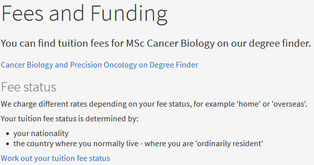
A fees and funding page on a school website signposting to central fees and funding content.
What’s next
The insights from this audit are being used to help us build a content model for postgraduate taught programmes. This is essentially a list of all the different content components that will make up the new postgraduate taught programme content type.
From the audit, we compiled a list of components to start building our model with based on what we saw on the websites we looked at.
Learn more
You can read more about our updates on our future state of prospective student content on this blog.


I have to admit I’m looking froward to seeing the content model.
I’ve said it before and I’ll say it again: Death to signposting! 🙂