
Testing a new navigation for the degree finder
As part of the future degree finder project, our team has been exploring navigation options. We wanted to learn how students would interact with our degree finder content without left hand navigation. We found removing this navigation had no impact on their ability to use the site and they used alternative means to get to other content they needed.
Background
There will be a period when the Study site will be published using the new Web Publishing Platform, but the degree finder will need to be hosted by another means. The technical reasons for this interim state aren’t important here, but essentially it means that the left hand navigation that currently exists on the degree finder will no longer be present.
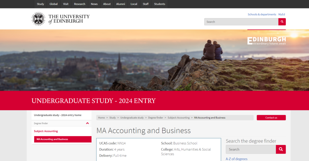
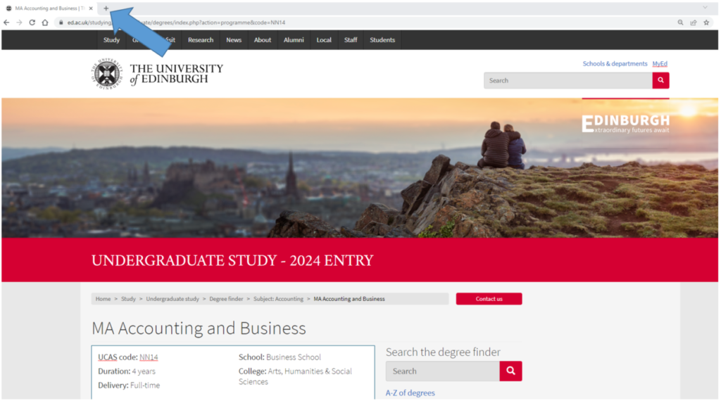
Current degree finder programme page with the left hand navigation
As such, we wanted to learn how users would navigate our degree finder content if they had no left hand navigation to rely on.
Specifically, if users came to a programme page on the degree finder without the left hand navigation, would they be able to navigate to the Study site?
What we did
To help us answer this question, we decided to do some pop-up research.
Pop-up research involves doing short, informal interviews or usability tests in environments your audience are already in. In our case, we wanted to talk to students, so we went out on campus.
Find out more about pop-up usability research in the Gov.uk service manual
We find pop-up research is a quick and easy way to get feedback on content you’re designing and it’s something we do regularly in addition to more formal usability testing.
Read about our experiences of pop-up research and why it’s useful
We didn’t have a working prototype so instead we mocked up images of:
- the Undergraduate Study page
- the degree finder search results page
- a programme page without the current left -hand navigation
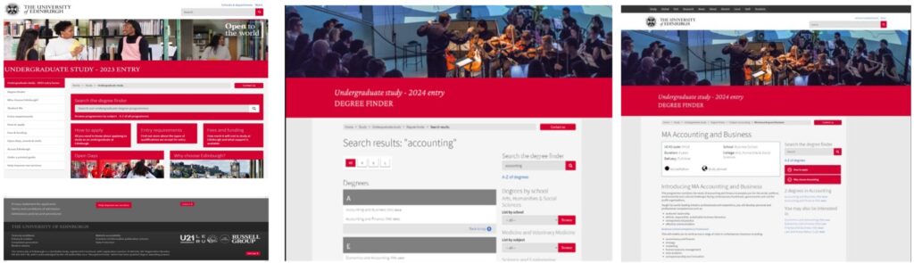
Mock-ups (l-r): Undergraduate Study homepage, degree finder search results page, degree finder programme page without the left hand navigation
We formulated a couple of questions to test how easily the user could navigate from the programme page back to the Undergraduate Study site; specifically, how they would access accommodation information.
What we found
All participants except one were able to complete the task successfully.
We identified three different methods the participants used to navigate back:
- using the back button on their browser
- clicking on the breadcrumb
- opening a new tab
Using the back button was the most common response. When asked how they thought they could get back to the Undergraduate Study page, most of our participants used the back button on their browser as their first option.
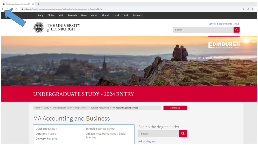
Using the back button to navigate to the UG study homepage
When asked where they would click on the page itself to go back, the majority of participants recognised the breadcrumb on the screen as a method of getting back to the Undergraduate Study page, although no one identified this as their first choice for navigating back.
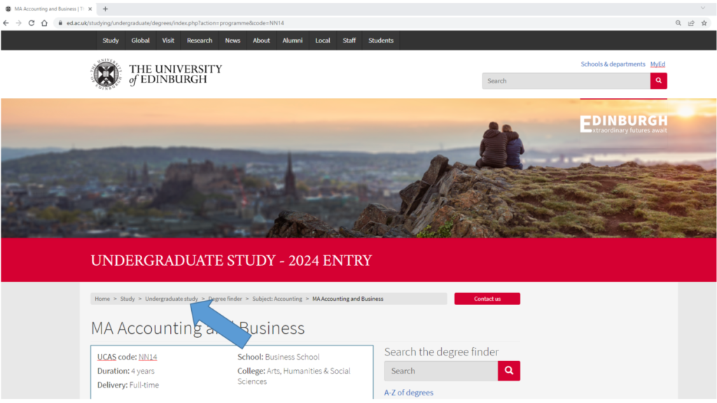
Using the breadcrumb link to navigate to the UG study homepage
A couple of participants responded to the “where would you find accommodation information?” question by opening a new tab and using Google to search for “Edinburgh University accommodation”.
Using a new tab to access accommodation information on the Undergraduate Study homepage
As for the participant who didn’t do what we expected, they chose to click on the University logo on the top left of the page, which would have taken them back to the homepage rather than the Undergraduate Study overview page. Slightly less efficient, but still only a click away from where they needed to get to.
Conclusions
We were able to see that removing the left -hand navigation from the programme page did not have a detrimental impact for our users. They were able to navigate by other means.
The results give us the confidence to explore different navigation options. Pete, our UX specialist, is currently exploring and designing different navigation options and testing these out to find out what would will work best for the new degree finder.


Just getting round to this. Really interested in this and is really useful useful to read this