
Exploring the impact of changes in webpage subheading style
We tested a new approach to webpage content layout on University webpages with prospective students, comparing it to the existing style. While we didn’t see significant improvements in effectiveness and efficiency of user performance in the tasks set, all participants strongly preferred the new proposed design when questioned at the end of the usability test. We will continue to experiment with new content presentation styles and test to identify potential improvements.
Background
The Prospective Student Future State Website Project’s goal is to improve the experience of website visitors interested in study at the University of Edinburgh. Part of this improvement focuses on how students interact with information on a degree programme.
The new and evolving approach to website navigation being introduced with EdWeb 2 – the website content management system that delivers the University website – has established some design considerations which shape how degree profiles are presented.
Degree profile pages are long, containing a lot of information and a new in-page navigation panel has been introduced to support students’ ability to quickly ‘jump to’ the content they are looking for.
The design of in-page content – size, style, spacing and weighting of paragraphs, headings, and other elements – has been the same since the current website design was introduced with EdWeb in 2013.
The problem
In earlier rounds of usability testing we had observed that students – whether using the in-page navigation or scrolling independently – frequently struggled to efficiently find the appropriate part of the page for completing their goal:
- Students who used the in-page navigation panel exhibited behaviour suggesting they were initially disorientated after it jumped them to another part of the page
- Students who scrolled at times missed the key orientational anchor of the relevant subheading
The hypothesis
We noted that some university degree finders have similarly long pages which don’t cause the same level of problems. These typically use elements similar or identical to well-tested design elements from the Government Digital Service (GDS). One notable difference between these and the University of Edinburgh approach is the size, weighting, and spacing of subheadings relative to the content in paragraphs and other lower emphasis elements.
We wanted to see whether adopting similar subheading styles would have a positive impact on the usability of our degree programme page content.
We hypothesised that if we presented students with tasks on two identical pages of content, where the only difference was the heading styles and paragraph spacing, we would see fewer usability issues in the version adopting the new styling.
To measure the usability of the page, we would consider how prospective students performed in these areas:
- Effectiveness – The student is successful in completing the task
- Efficiency – The student completes the task in a timely manner
- Satisfaction – The student explicitly prefers the new design over the old
The design proposal
We used a representative web page presenting a degree programme profile and created two versions of it. The first used the current University header styling.
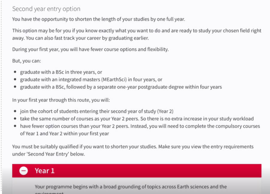
Representative degree programme information using the website’s current subheading and paragraph styles.
The second used our new proposed header styling.

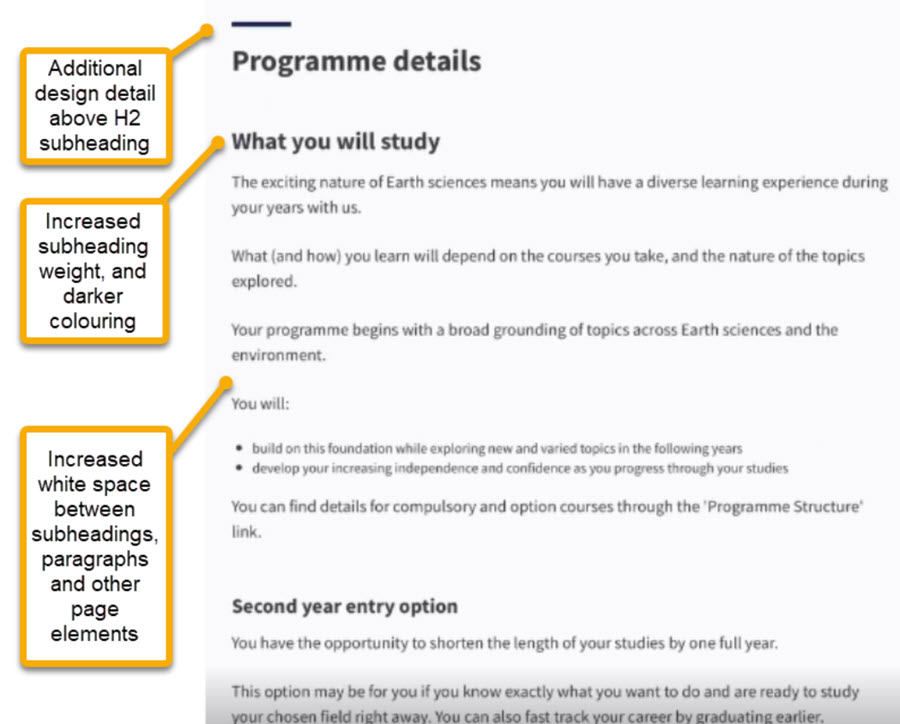
An identical copy of the degree profile content, but with new subheading and paragraph styling derived from the Government Digital Service design.
The differences between the two content styles:
- Additional design detail above the H2 subheading
- Increased subheading weighting and darker colouring
- Increased whitespace between the subheadings, paragraphs and other page elements
Our hypothesis was that introducing new content stylings would improve usability and students’ levels of task success in tests.
Test methodology
We designed four tasks which required participants to find information on a programme page. Each participant was given two tasks to complete on each version of the page.
To ensure prior learning didn’t bias the results of the testing we randomised the order of the tasks, and the version we presented first.
We recorded the sessions so we could measure:
- Task success rate
- Time to complete each task
- Which version the participant preferred
Findings
Task success
Tasks success was generally consistent across all participants. Only one failed to successfully complete all tasks set.
Task efficiency
Due to the small-scale nature of usability testing, we do not have statistically significant data to demonstrate one page performing better than the other.
For all participants, the task completion time was faster on the second version presented, regardless of the order in which they were presented. This suggests that increasing familiarisation with the context and content contributed to increasing efficiency in task completion time
User preference
To gauge user satisfaction with the interfaces presented, all participants were asked to express a preference between the two presentations and to say why.
The new design was consistently chosen by all participants, with most noting that they were more easily able to identify the section of the page they were in, and/or they felt the page was easier to read.
Related feedback on live beta degree profile pages
Since this usability testing has taken place, the beta programme pages have been launched, including a feedback mechanism provided via Hotjar.
We are seeing feedback here that corresponds to what we saw in testing. Users are commenting on how overwhelming the length of the page is and the difficulty in navigating it. For example: ‘I find the layout confusing and too much information to clearly see what I want’
Update: After this blog post was written, we changed the content style presentation in the beta webpages and saw an improvement in the feedback we were receiving via the Hotjar feedback mechanism. In Carla’s summary of what we learned from the beta, she says: “We saw a significant change from the average rating with the original headings (3.6/5) to the average rating with the updated headings (4.3/5). ”
Read Carla’s summary of what we learned by releasing a beta
Conclusion
Our findings from this study correspond with those of other usability studies we’ve undertaken. The current styling of the content on University of Edinburgh webpages does not support scanning and reading online as well as it might, particularly in the case of long, text-heavy pages.
On the basis of this work, we will continue to evolve the presentation of content style and compare to the current live version. Ongoing analytics and further rounds of usability testing will help us appraise the impact of the change and inform further improvements.