
Undergraduate beta programme pages showcase (event summary)
On 30 April 2024, we hosted an event to showcase the insights we gained from releasing a beta of the new undergraduate programme pages. This post gives a summary of the event, with access to the event slides and recording.
Slides and recording
Slides: Undergraduate beta programme pages showcase (University login needed)
Recording of 30 April 2024 undergraduate beta programme pages showcase event on Media Hopper
Event summary
The event covered:
- context and background of the project
- what is a beta? and why did we decide to release one?
- an overview of the design and development process that lead to a beta release of undergraduate programme pages
- a review of the insights gained from analytics and feedback on the undergraduate beta
- usability testing tasks emerging from the beta
- what’s next for undergraduate programme pages
Context and background
We are in year two of a three-year project to transform the central provision for prospective students, including our degree finders. Last year we focused on the undergraduate prospective student experience, culminating in the release of a beta version of our programme pages.
The current prospective student web presence:
- built on technology at end of life with out of date platforms that are patched together with manual processes
- structured around a print mind-set with unnecessary and out-of-date presentation
- relies on extra websites to plug gaps which renders it inefficient and poses CMA risks
This leads to a poor student experience filled with circular journeys that make it difficult to answer basic questions and leads to high levels of unnecessary enquiries. It also means we have a very complex and inconsistent web estate.
A 2021 audit showed that we have close to 3,000 pages in 26 central websites managed by over 65 web editors accross twelve teams and six departments. And, that doesn’t account for other central services with other prospective student responsibilities like scholarships, fees, and the immigration service.
We also found that, in 2021, the central provision for prospective students accounted for 26% of all tracked traffic across the university (4.6 million visitors) and generated over 230,000 emails to the Enquiry Management Team. In the same year we received 165,000 applications from undergraduate, postgraduate & research prospective students and admited 17,000 students.
These are all issues that drive our team’s strategic priorities to have:
- fewer ineligible or wasted applications
- fewer unnecessary enquiries
- coordinated and accountable content management
- management information feeding future decision making
As a team, we work in iterative cycles using the build-measure-learn process where we create a product, measure it’s performance and make informed changes and adjustments based on the gathered insights.
Explore the audit in detail on Miro
What is a beta release? and why did we release one?
A beta is part of an agile development and release cycle adopted in many organisations, including GOV.UK, that has four steps:
- Discovery: where we aim to understand the problem(s) from a user perspective
- Alpha: where we explore early solution candidates with prototypes in controlled situations
- Beta: where we launch the first working release of the website
- Live: where we have a live service that undergoes continuous improvement
Why release a beta?
A beta release was an opportunity to learn before our development budget is spent and the project concludes and allowed us to:
- see how prospective students interact with the web pages at scale
- work with school editors to develop new content based on the new content model
- set up live environments for development and analytics
The release of the beta was done in four phases:
- Discovery phase: involving user research, a content audit, and the creation of a content model
- Design phase: creating initial prototypes in collaboration with schools, and usability testing them
- Development phase: software development, building the web pages, and analytics setup
- Delivery phase: launching the beta, ongoing analytics and feedback reviews, usability testing designed from insights
Read our blog on our beta launches
Discovery
Content audit
In summer 2022, we did an audit of UG content across the web estate, which included looking at the UG degree finder, UG study site, school sites, and service sites that serve prospective UG students, like the tuition fees site and mature students site.
The goal of auditing these sites was to learn about what content these sites where hosting to help inform what should be in the new UG degree finder programme page. We wanted to find out what the gaps in our current degree finder were that are currently being filled and school and central service sites.
Our approach to conducting the audit was we did a manual review of undergraduate-focused content on selected school sites and central service sites. We logged any findings in spreadsheets to create a bank of data of content types we came across and trends.
What we found was the current degree finder was not well equipped to host the quantity and variety of content being created by schools.
We also saw that across school and central service sites, there’s a clear focus on student-generated content (like videos, student profiles, blogs, social media) and multimedia content on practical aspects of programmes, such as videos about field trips.
Read a more detailed summary of the content audit
Creating a content model
After the audit, we transitioned into creating a content model. A content model breaks down content into its component parts and notes how those parts related to each other. In the case of the degree finder, our content model broke down programme pages into their component parts. In content modelling, these component parts are called ‘attributes’.
Our first iteration of the content model was creating a comprehensive list of attributes that could be on the programme page based on what is in the existing degree finder, what we found in the audit on other University sites, and we also audited other University sites to see what kind of content they were hosting.
With a long list of attributes, we worked with our user researcher to refine the list of attributes based on what we learned when conducting interviews with prospective UG students. We also did a card sorting task with students to see how they categorised the proposed attributes together. In other words, we wanted to see how students through these attributes related to each other and where they would expect to find them on a programme page.
The content model is housed in a spreadsheet, which describes the features of all attributes in detail. For example, it lists things like, is this attribute required for all programmes and who authors the content.
Read more about creating the content model
Design
Prototyping and collaboration with schools
The next stage of developing the content model was translating it into a protoype. In other words, a visual representation of all the attributes.
We built a prototype for the UG programme page using content from BSc Earth Sciences. We chose this programme because it had lots of content for attributes in the content model that were non-compulsory, such as second year entry and placements. This meant we could stress test our content model more easily by having content already available for these attributes.
The process of prototyping was our content designer and user researcher working together to decide on which design components should convey each attribute. We tried to make as much use as possible out of existing design components so we could focus development time in other areas, like entry requirements which we knew was the top task for prospective UG students and our current design had a lot of issues with it.
To make sure our content model worked for other programmes, we also chose 5 other programmes to stress test the content model with. By doing so, we learned about what would or wouldn’t work in our content model and made updates to our model based on those insights. For example, it was through testing our content this way we realised we have a few China-based programmes, so our attributes around student life on the Edinburgh campus could not be compulsory for all programmes.
As part of the prototyping process, we also held collaboration sessions with 5 school-based editors to refine the design of our prototype and help us update the content model.
The collaboration involved different activities. We started with 1-2-1 initial chats about current content practices in schools. We then held a workshop with all the editors where we asked the editors to assess the priority and importance of each of our proposed attributes.
Based on answers to that activity, we then held 1-2-1 pair writing and discussion sessions with the school editors to create the content for or define requirements for certain attributes.
Read more about the prototyping process and collaboration with schools
Usability testing the prototype
We did several rounds of usability testing on the prototype to identify usability problems and prioritise areas of improvement. This process helps ensure we are releasing software that works and meets our users’ need, and give our stakeholders confidence in the design and development decisions we make.
In this instance we had three topics for UG prototype usability testing:
- in-page navigation for desktop and mobile
- entry requirements interaction pattern
- content format and findability
In-page navigation for desktop and mobile
Context: in-page navigation helps users understand what information is on the page and how to find it.
What we tested: other universities approaches, an approach using existing university components and a design following GDS design principles.
What we learnt:
- breaking a long page into sections performed well
- the design with existing university components was missed in most tests
- the design based on GDS design principles did not present significant usability issues.
Entry requirements interaction pattern
Context: currently, all entry requirements are displayed for all prospective students and we have confusing terminology (e.g. standard vs minimum entry requirements). Also, entry requirements information sits on several sites and this leads to circular journeys.
What we tested: a design for a new interaction pattern for entry requirements that allows prospective students to select and view entry requirements information specific to their circumstances and how to present information to make it easy to understand.
What we learnt:
- styling of the component and accompanying introductory text helps understand how to interact with the new design
- changes to the way entry requirements information is displayed meant better understanding of the information
- replacing the term ‘minimum requirements’ with ‘widening access requirements’ helps select the right information
Content format and findability
Context: we aimed to improve the ability of users to find information on a page.
What we tested: A/B testing of two designs, one using the current university format and another one with revised formatting using GDS design principles.
What we learnt:
- task completion times did not show a style performing better than the other
- users preferred the revised design as it made the page easier to scan and read
Side by side of the A/B test headings styles. Right: the university’s current formatting. Left: revised formatting using GDS design principles.
Development
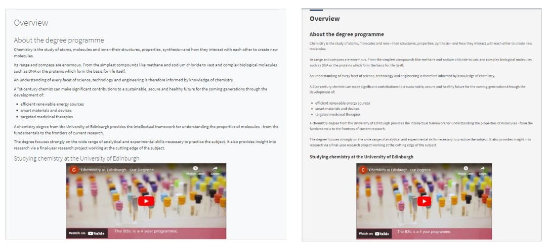
When creating the programme pages, we wanted to chose 3 programmes, 1 from each college and from schools who were involved in the co-design sessions, that would help stress test the content model and use a variety of attributes.
- French and English Literature – a joint programme and one where study abroad content was important.
- Chemistry – features second year entry requirements
- Veterinary Medicine – has a lot of unique entry requirements and applying information
We worked closely with the editors in those schools to create and edit the content for those programmes for the new UG page template.
Analytics setup
We set up the pages so we could track their usage continuously using two analytics packages: Google Analytics and Hotjar.
This allowed to track all sessions on beta pages and generate session recordings, click maps and scroll maps for each programme page.
We also implemented a feedback widget that allowed users to rate the pages from 1 to 5 stars and leave feedback.
Read more about the analytics & feedback setup
Delivery
Finally, we launched the beta pages in Sep 2022 and had them running until Jan 2024. We did analytics and feedback reviews throughout and based on these made the decision to change the headings styles halfway through the beta period from the University formatting to the revised formatting we had A/B tested earlier in the project.
We had a few key questions to answer from analytics:
- how do users interact with the programme pages?
- how do users interact with the navigation bar?
- what are the content priorities of our users?
- how do users feel about the new design?
Analytics summary
We had a total of 918 sessions with users scrolling, on average, to 43% of the page and spending an average of 6 minutes 47 seconds on the page. We didn’t see any significant rage clicks or u-turns.
77% of users were UK based, with another 3% in the USA and 2% each in Hong Kong, Netherlands and France.
The majority of new users (71%) were using desktop devices but a significant minority (24%) were on mobile devices. This proportion was lost when looking at returning users where 90% were on desktops and only 6% on mobile devices.
The top 5 in-page clicked links (navigation, buttons, accordions) were on entry requirements (21%, navigation and interaction pattern) followed by fees and funding, sample timetable, programme details and applying (8-9% each)
We saw that 65% of users did not interact with in-page navigation and only 29% of users clicked a navigation link while the other 6% hovered over the area but did not click on it. And, users that interacted with the navigation bar are mostly on desktop with mobile users only using the navigation bar once per session.
Feedback summary
We got a total of 82 responses (9%) from our feedback widget. The average rating was 3.9/5 stars.
We saw a significant change from the average rating with the original headings (3.6/5) to the average rating with the updated headings (4.3/5). And, this was also reflected in the overall sentiment of the written feedback.
What we learnt from running a beta
- changing the headings improved the overall ratings and we saw a shift to positive sentiment feedback after the update
- 65% of users did not use in-page navigation – how can we improve in-page navigation for desktop and mobile?
- we lost users from mobile to desktop – does that mean the mobile experience is not working? or did they just want a bigger screen?
- our pages are too long – how can we improve navigation and findability? and, are our users missing key information at the bottom of the page?
Post-beta usability testing
After the beta was retired, we ran a new round of usability testing designed based on insights from analytics and feedback on the beta, and research activities for the postgraduate taught prototype.
Goals
- to identify usability issues associated with:
- orientation and navigation on a beta undergraduate degree profile page on desktop and mobile
- the completion of priority tasks
- to gauge the impact of a change of wording on the in-page navigation panel on the findability of information about open days
- to understand students’ perceptions of the presentation of the beta page
What we learnt
- In-page navigation and orientation
- users saw and interacted with the in-page navigation on desktop and mobile when given a task
- users struggled to orientate and understand where they were on the page
- Priority tasks
- users were able to find information they were looking for and complete the tasks
- Change of wording for findability of open days information
- users thought the information would be in the ‘Life at Edinburgh’ section
- they eventually found it in the ‘Contact and events’ section
- What users expected to see on a beta page when accessing it form the current degree finder
- to complete a feedback form
- expected to see an unfinished design
- Users noted how useful it was to have access to a sample timetable
What’s next?
We are designing and testing a new approach to in-page navigation on mobile to help prospective students orientate and find information on the page.
We are improving the content format, making style changes to improve findability and changing the wording on the navigation panel.
We are creating guidance for school editors alongside improvements to back-end, including adjusting to the new content model, testing help text, and responding to feedback.