Designing a Clearing vacancy list in the age of Covid-19
We followed a human-centred, collaborative approach to meet the needs of the business and applicants for this summer’s Clearing campaign.
Our human-centred design approach
Clearing availability for the University in 2020 was very different from previous years as Covid-19 changed the scale of it.
Our design challenge was to create a solution for showing available places in Clearing for nearly 400 degrees.
With the time we had (5 weeks) we still followed a human-centred design process which was to:
- specify the context of use: who will use it (applicants and colleagues) and what they will use if for
- specify the requirements: the business requirements that must be met
- create design solutions: co-create ideas with stakeholders
- evaluate the solution: through usability testing with users
The initial step in the process
Desk research
To start our design process, we did some research to better understand the student journey through Clearing.
Our investigative work was spent doing desk research which is finding relevant previous research such as:
- the National Clearing Survey annual report
- Pickle Jar Communications report on ‘Students preparing for University 2020’
- Student Room forums
Experience map
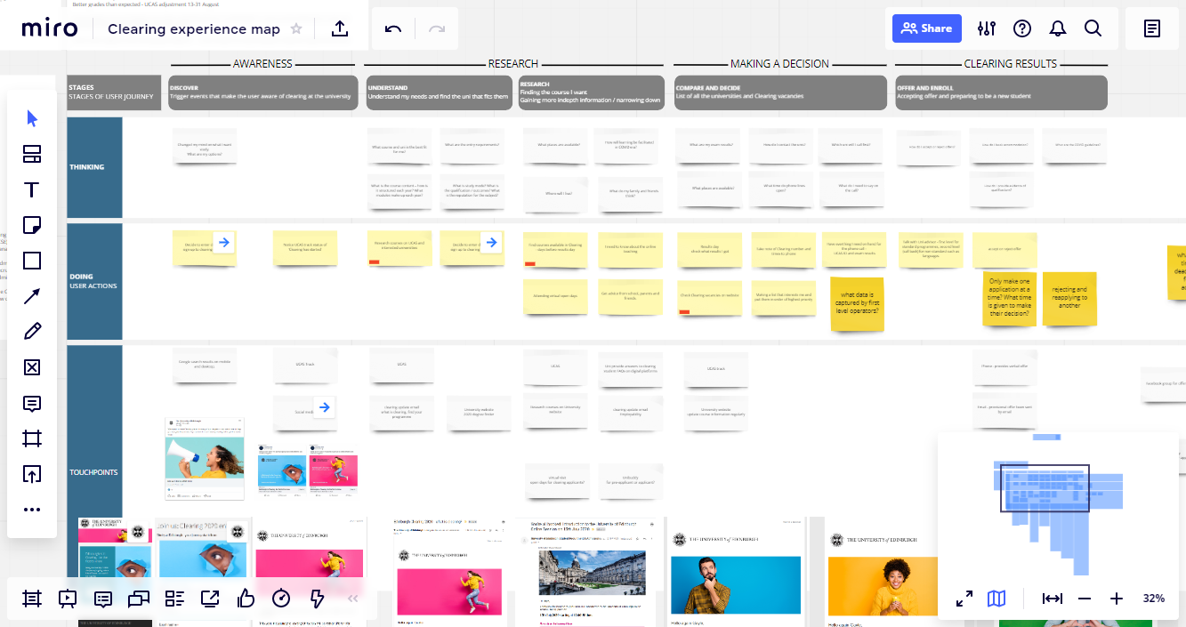
Following the desk research, we visualised the research findings through an experience map. This allowed us to map the student journey and communicate this with colleagues who helped us further in understanding what Clearing looked like for University of Edinburgh applicants.
Scenarios we designed for
This co-creation with colleagues helped us to identify the scenarios of Clearing applicants and their specific needs.
The scenarios that we needed to design for were for the:
- traditional Clearing student – didn’t meet their offer conditions required to attend the university of choice
- direct applicant – applying for the first time
- mind changer – changing course and university choice completely
Contextualising user needs
We mapped out a Clearing applicant’s desired end-to-end experience to identify the phases that we understood them to go through before, during and after Clearing. This included their actions, touchpoints and the effect on the student going through each phase. These phases were:
- doing research following exams in course, course content, career prospects and accommodation
- deciding on which university(s) and course(s) to study
- checking their results, checking Clearing vacancies
- preparing for Clearing opening
- accepting an offer and preparing to be a new student
Course choice is competitive and therefore Clearing applicants are time-pressured to receive their results, check for vacancies, check if they meet the entry requirements, and then phone to apply.
The emotions they would typically go through:
- before Clearing: feeling anxious, nervous and stressed
- after Clearing: relieved, happy, excited

Experience map on Miro
The development process
Co-creation sessions
We used the experience map to facilitate co-creation sessions with subject matter experts to inform how we design the Clearing vacancies web page.
Having student recruitment colleagues as co-creators of the web page was extremely valuable in designing the vacancies for nearly 400 degrees.
Bringing their knowledge of the Universities degrees and how we present them in a human-centred, collaborative iterative approach was essential to our activities in order to meet the needs of the business and the applicant.
Mockups
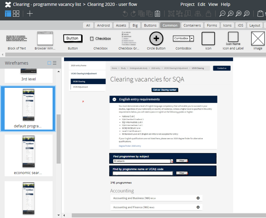
Mockups of the web pages were created in Balsamiq which is a tool on the wiki that enabled us to outline the structure and visual representation of the Clearing website.
It provides a graphic representation which is helpful in showing the project team of how the finished website can be and help team members review the design visually.

Balsamiq pages on the wiki with iterations of the design
Balsamiq mockup on the wiki with iterations of the design (University login needed)
Usability testing
We used our prototypes in usability testing with 6 participants. From testing we were able to let the participants interact with the prototypes from a task given to them to test the user flow of the Clearing website and the functionality of the Clearing vacancies.
Testing validated whether the user flow of information was understandable and if the vacancy functionality was intuitive and efficient in presenting the expected results.
Turning our idea into a prototype and testing it gave us the confidence that our solution would work in reality.
Results
We are evaluating how successful we were in the decisions we made in the design of the website.
Although what we expected was not actually how it transpired with the U-turn in exam results, we can still learn how users behaved through the site, track whether the user flow met objectives and monitor the overall performance of the scenarios we designed for.
Aaron, our team developer, and I will be talking more about our Clearing case study at the Web Publishers Community session this month.
Web Publishers’ Community sessions (University login needed)
(Balsamiq pages on the wiki with iterations of the design )


2 replies to “Designing a Clearing vacancy list in the age of Covid-19”