
Chunking your content makes it easier to process
By breaking your content into short sentences, separating by subheadings and using bulleted lists, you can help users more easily understand your content.
The top 3 of my top 10 ways to create effective digital content
At our postgraduate degree finder event last month, I shared my top 10 list for things you can do to create effective digital content.
Top 10 ways to create effective digital content (UoE login needed)
With our deadline degree finder updates approaching, I wanted to blog about the top 3 items in that list that all fit under the heading of chunking your content:
- create short paragraphs
- add subheadings
- make bulleted lists
Why chunking
Chunking your content into distinct units is all about making it easier for users to understand what you are trying to communicate.
[You can break your content] into smaller chunks to help users process, understand and remember it better.
This is because when we read online, we are scanning information. We are looking for the answers to the questions we have.
When we break up our content, it allows us to zone in on key elements. From those elements, we can work out whether a particular bit of content will help answer our needs.
Create short paragraphs
With digital content, a paragraph should never be more than a sentence or two.
And according to the Readability Guidelines (an evidence-based style guide), your sentences should average 15 words long.
Sentence worth length (Readability Guidelines)
Helping our F-shaped readings patterns
Short paragraphs help our online reading habits. When we read in an F-shaped pattern online, we “fixate on the words toward the beginning of lines and toward the top of the page” (Pernice 2019).
Text scanning patterns (Nielsen Norman Group article)
In other words, we’ll start reading a paragraph and work out if it helps answer what we want to know. If it doesn’t, we’ll move on.
The shorter the paragraph, the more likely we’ll find the content we’re looking for. We won’t catch it if it’s buried in a larger paragraph.
Print versus online paragraphs
I love this screenshot from this Mike Blankenship blog post (2020) which demonstrates the difference between what a print and online paragraph should look like.
How to write a paragraph in 2020 (blog post)
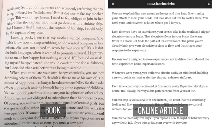
Long paragraphs in a print book compared with short paragraphs on a webpage (Blankenship 2020).
Hopefully, you can see that the right-side image looks more appealing for reading online.
If you were taught in school that a sentence has 5 paragraphs, leave that lesson for school essays. Digital content is different.
Add subheadings
Subheadings are my go-to content cure. If I’m given a piece of text to edit, I’m always adding subheadings to it.
Why? Because when we’re scanning, subheadings are our indicators to let us know if we’re in the right place.
Short paragraphs can only take you so far. You need subheadings to indicate that a group of sentences belong to the same topic.
My subheading-print paragraph analogy
I like to think of subheadings as the digital version of a print paragraph.
In print, you know those 5 sentences you want to put together as one paragraph because they’re about one topic?
In digital content, put each of those sentences on its own line and give them a title. The subheading is the glue that ties those sentences together, even though there is white space separating them.
Again, I have another great image to illustrate this (Loranger 2017). Even if you can’t read the words, you can see that the right-side image is a lot easier to tackle when subheadings can direct you to the content you want.
Plain language is for everyone, even experts (Nielsen Norman Group article)
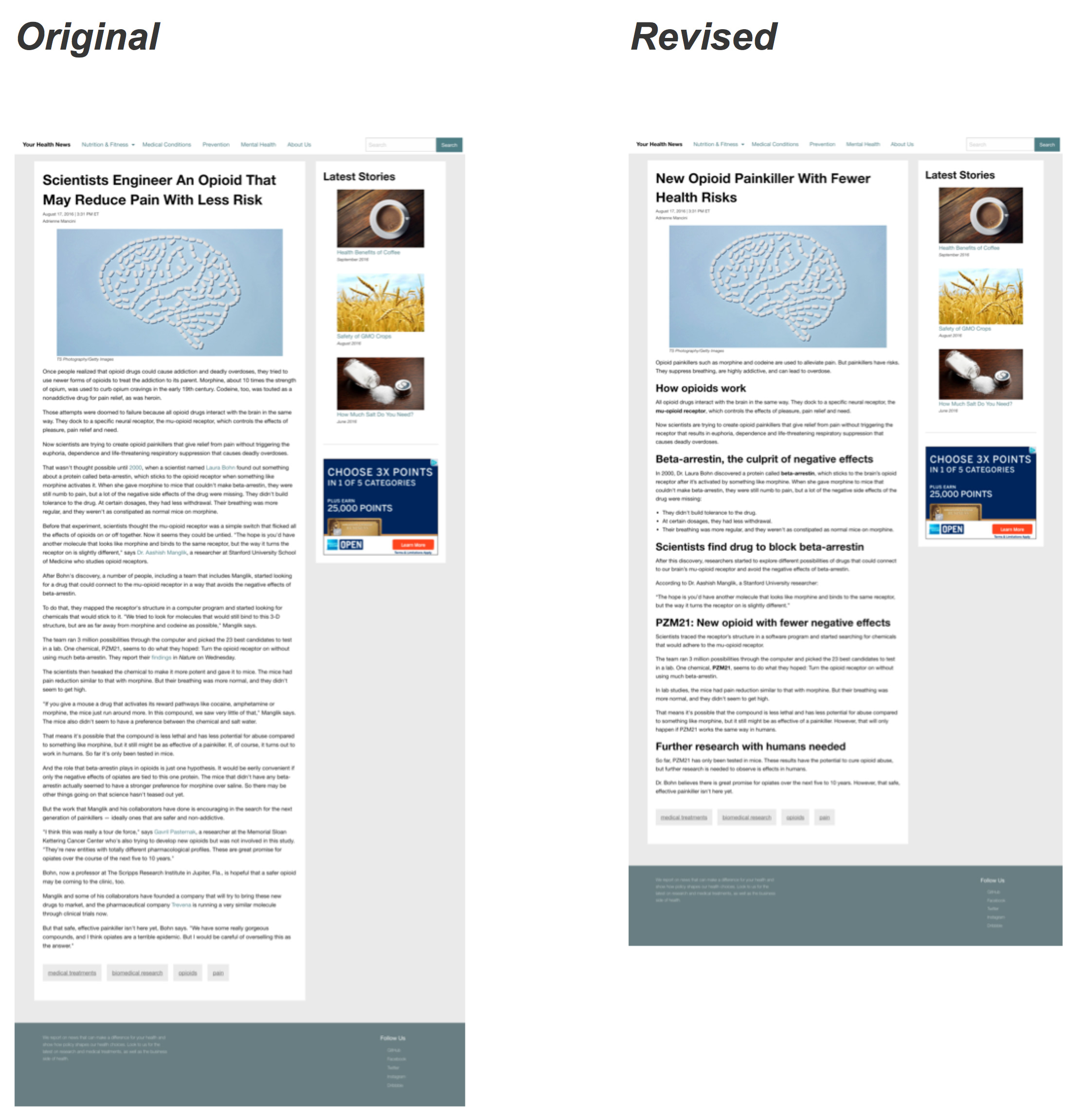
A before and after image of a webpage without and with subheadings (Loranger 2017).
Content without subheadings would be like if your website was one long page of scrolling text, rather than broken up into pages. You need those ‘chunks’ to make it easier to find what you need.
Make bulleted lists
Finally, you can chunk content within a sentence by making bulleted lists (where relevant).
Have a sentence with 3 or more ‘items’? Put them in a list.
I put items in quotes because it doesn’t have to be discrete objects or concepts. They can be phrases.
Example of listing phrases
For instance, I recently bulleted part of our guidance for applicants affected by the government U-turn announcements on exam results.
The two bullets are long phrases themselves. If they were shoved together in one long line, it would be that much harder to process.

Guidance on what to do when you hold an offer from Edinburgh as your insurance choice. The two bullets are used to list the two conditions you must meet to not need to contact the University.
In this case, I even decided 2 ‘items’ was appropriate to make a list. When in doubt, if your content can be made easier to read if it’s in a list, make a list.
Push keywords to the left
When you do list items, make sure the most important keywords are on the left.
Remember that F-shaped reading pattern. We read the start of lines.
Apply these techniques to your degree finder content
When we’re looking through degree finder content, these top 3 techniques are some of the most common edits we make.
If you’re about to submit your content changes, have a look through and see if your content could benefit from some more chunking. Your content will be that much better for it.
Prefer this guidance in video form?
Our colleagues in Website and Communications have a video all about chunking, which forms part of the online Effective Digital Content course.
It’s a good visual refresher of the topics mentioned in this blog post.
Chunking your content (3 minute video on Media Hopper)
Effective Digital Content course information
References cited in this blog
Blankenship, Mike. 2020. How to Write a Paragraph in 2020 (Yes, the Rules Have Changed). SmartBlogger.
Content Design London. Readability Guidelines.
Loranger, Hoa. 2017. Plain Language Is for Everyone, Even Experts. Nielsen Normal Group.
Moran, Kate. 2016. How Chunking Helps Content Processing. Nielsen Normal Group.
Pernice, Kara. 2019. Text Scanning Patterns: Eyetracking Evidence. Nielsen Normal Group.


1 replies to “Chunking your content makes it easier to process”