Design sprint 1 retrospective
We completed our first design sprint just before Easter. At the end of each design sprint we look back on what we’ve learned. This is the first in a series as I share our progress working towards an interactive concept of what will replace the current degree finders.
What’s a design sprint?
If this is a new concept to you, take a look at my previous post that explains the whole user-centred, collaborative design approach.
We’re blogging regularly about various aspects of the design sprints.
An index of all our writing about design sprints
Why retro?
Retrospectives are a fundamental aspect of any agile or iterative improvement process. It’s vital that the team have the opportunity to reflect regularly on what has gone well, what has been less successful and what we need to change. Even when we’re not running agile projects, for me, retrospctives are an important element of a healthy working environment. I’ve written previously about the principles that steer how we work as a team.
Taking a principled approach – my blog post about how we work as a team

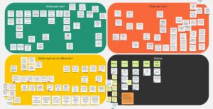
We used a standard retro meeting process, with the team taking turns to talk about what went well, what didn’t and what we might do differently. This is our summary using Miro.
Looking back on our first design sprint
This first design sprint wasn’t just about delivering testable concepts to inform the future replacement of the degree finders.
It was also about designing our design sprints.
Learning how to sprint
I consider our team to be very lucky that we’ve been able to bring in an experience researcher and designer to help us. Nicola Dobiecka has worked with me previously when I set up the User Experience Service in Information Services, and has also brought user-centred expertise to other parts of the University (including Student Systems and Student Health & Wellbeing).
Nicola taking on the design of the sprints themselves and facilitating the collaborative design sessions meant that the team has been able to get fully involved in the process of defining the problem space and designing potential solutions. And I’ve been able to focus on the schedule of future sprints.
Nicola picked up my early design and planning activity quickly, and together we’ve largely followed the Google Ventures script with a few customisations recommended by Design Sprint experts AJ & Smart. But the challenges of working remotely and the nature of our organisation meant we knew some things would have to change.
While the Design Sprint process went well, we’ve identified a number of improvements that we’ll implement in the next sprint in a few weeks’ time.
How the sprint workshops ran
While the originally defined Design Sprint process was set out to run for 5 days with a team staying dedicated the whole time, we’ve had to flex considerably. We’ve split the activities of the sprint into those which we do in collaboration with colleagues bringing their subject matter expertise, and those which we do within our team after the workshops.
Read more about the breakdown of our Design Sprint activities
The workshops took place on two consecutive afternoons, and we were joined by colleagues from Student Recruitment and Admissions undergraduate and postgraduate teams, plus a colleague from Digital Marketing who has many years’ experience of supporting colleagues in the management of the degree finders. We also brought in a couple of senior voices for short ‘expert sessions’ to help us shape the problem we were setting out to solve.

The challenge we refined and focused on for the sprint: What do students most value when identifying and comparing our programme offering?
Workshop 1 focused on us:
- Envisaging a future state
- Mapping student interactions
- Listening to expert input
- Refining the problem
Workshp 2 focused on us:
- Considering on how other organisations solved similar problems
- Sketching ideas rapidly
- Refining our sketches
- Reviewing and prioritising together
The workshops were fast – we only had three and a half hours together each day – but stimulating and fun. They set the team up for more focused prototyping the following day, and for Gayle to get started on designing a user research script.
… it was really interesting to be a part of this experience and to work toward something positive for both prospective students and us…
Pilot sprint participant

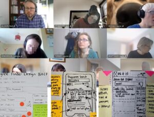
We ran the workshops using Microsoft Teams. Participants sketched interfaces at home, then photographed and uploaded them to our Miro virtual whiteboard
The prototyping process
We may have had two busy days in workshops, but there was no time to pause.
The following morning the team reconvened, this time without colleagues from other departments.
Our tasks were to:
- Design a user research script that would shape what went into our prototypes
- Recruit students we would test with at the end of the week
- Identify and agree the interface features we would take from the most popular sketches
- Agree the prototyping tools we would use (we settled on Miro this time for speed and collaboration convenience)
- Agree who would do what to ensure our prototype was going to be ready in time.
By around lunchtime the following day we had a prototype we felt was good enough to test our ideas of what we thought students would value.

Our refined prototype interfaces which we used in user research with students.
Testing with students
While the majority of the team was focused on pulling together representative content and design elements from the University website pattern library, EdGEL, Gayle was busy recruiting students we could interview. She and I also produced an interview script that would make sure everyone in the team involved in testing would engage students in the same way.
Because we were presenting static design concepts, we had to shape our interview script accordingly including directions to team members about when to flip from one image to the next and what to do when students responded in unexpected ways.
We were keen to see students interact in more naturalistic ways too, so we took them to the University of Bath’s website where they could undertake tasks relating directly to their own information needs. For our concepts we had to ask students to pretend they were interested in a particular subject in a particular context, but on the Bath website they could ‘be themselves’.
We chose Bath because during the workshops it was a website that we thought was tackling similar problems to us in interesting ways, and the digital team there clearly have a strong user-centred design culture.
I won’t go into what we found through the research findings here, as Gayle has that covered in another blog post.
Testing a prototype for a new degree search – outputs of our first design sprint
To close off the Design Sprint, just before the team retrospective, we also ran an open invite research playback event for colleagues across the University so that everyone could watch videos of students interacting with our prototypes. We had a fantastic level of interest in the session, with over 50 colleagues joining us and lots of positive feedback both about our work and for the opportunity to get involved.
So what have we actually learned?
First and foremost, we’re confident that the design concepts we developed are a good idea.
Students responded positively to much of what we showed them, and comparing with Bath gave us some strong steers on a few things too.
Our shared team reflections from the retro were honest, constructive and will help us continue to improve together. I’ve summarised the big themes from our discussion.
What went well
- The mix of expertise and seniority among the sprint group generated really productive conversation and a large number of sketched ideas.
- Our collaborators from outside the team engaged fully across the two workshops and gave great feedback about their involvement.
- The blend of technologies and equipment worked really well on the whole.
- We delivered a lot in a very short space of time. Everything on schedule without people putting in time out of hours.
(Almost! I wrote parts of the script after hours, but it was my own fault for nipping out to a meeting instead of staying with the sprint team.) - Student recruitment wasn’t too onerous and we got excellent insight from the interviews.
- The research playback session to staff was well attended with good feedback.
What was bad?
- We had a few workshop teething problems meaning we missed breaks to stay on schedule and everyone was worn out by the end of the first session.
- The mapping exercise didn’t go as smoothly as we’d have liked, taking more time than planned and pressuring other parts of the workshop.
- There was too much individual sketching work, which wasn’t great for people who hadn’t done this kind of thing before. Not enough collaboration or time to review each other’s work before prioritising.
- Our preparatory analytics research didn’t get included during the experts sessions as we were behind schedule.
- Our coordination of script and prototype development wasn’t tightly enough aligned, meaning we did rework which could have been avoided.
- We had to do the student research on a day when some people don’t work so they missed out on the chance to contribute.
What will we do differently?
- We will cap workshop participants at eight, and make sure all our guests do induction activities the week before so we don’t spend time on orientation in Miro on the day.
- We will interview experts the week before so we can more tightly manage the time spent on expert review in workshop 1.
- We will do preparatory mapping as the degree finder is a complex product. In the workshop, our focus will be on review rather than map generation.
- We will approach the sketching workshop activity differently to foster greater collaboration and convergence of ideas, and improve the clarity of the images uploaded.
- We will be clear about our prototyping tools and responsibilities before we start the sprint.
- We will book more time for the team to review the user research outside of the open-invite playback.
What’s next?
We’ll be running our next design sprint in the week commencing 19 April, and I’m hoping to have a schedule for the next few sprints around that time too.
If this is interesting, and you want to track more of our work on design sprints to inform the future state of the University’s degree finders, check out the index of all tagged blog posts.
An index of all our writing about design sprints


