
Collaborative usability test reviews with our users
I recently ran an open invite session review for our latest round of usability testing. Normally I run these sessions within our team, but we wanted to involve colleagues across the University in our work to improve the editorial experience. It was also an opportunity for school editors to see the new degree programme editorial interface that they will be using from early next year.
About the session
Our collaborative usability testing review sessions follow a standard approach that we’ve been using within our team throughout our project, and that others have been using for some years now.
Neil’s blog on collaborative usability testing for EdWeb
The session involved colleagues who attended in-person and online. The majority of which were either:
- People who edit programme content on the degree finder currently or who have a student recruitment marketing responsibility
- Members of the Website and Communications team who have been building the EdWeb2 content management system
- Members of our team who attend these sessions regularly
My open invite blog to promote the session
What happens in collaborative usability review sessions
Our collaborative review sessions involve:
Getting the right people in the room: We like to think of user research as a team sport which is why it’s beneficial that anyone who has a stake in the product attends these sessions. It’s important because watching users together helps us make better decisions about what improvements we prioritise.
Watching real users complete real tasks: Watching users complete representative tasks allows everyone to see usability issues that prevent them from achieving their goal. We typically focus on the most critical and most common tasks.
Prioritising the issues we see: Usability testing often produces a lot of insight into problems users encounter and it can be challenging to make sense of them all. We ask each observer to take notes as they watch the videos and after each one, we give time for them prioritise the top three issues they saw.
Collaboratively consolidating the issues we see: We put everyone’s top usability issues through a prioritisation flowchart to objectively grade their severity. This might sound like a time-consuming process, but we find that most observers will prioritise the same issues. It’s like usability bingo. Once someone has called out an issue, everyone crosses it off their list.
The flowchart use was developed by David Travis and published on userfocus.co.uk
Read “How to prioritise usability issues” by David Travis

The flowchart we use for rating the severity of each usability issue we observe
What a collaborative usability review session produces
By running each issue through the flowchart, we end up with a list of usability issues that have been graded by severity.

Our prioritised usability issues graded by severity
Why we run collaborative usability review sessions
Preparing for and facilitating sessions like this is more time-consuming than writing and sharing a summary of my findings from usability testing. However, it is worth the extra effort because collaborative workshops like this bring extra benefits:
Allows more informed and objective decision making: The issues we log have been seen and discussed by multiple people, rather than just written up from one person’s perspective.
Common points of reference across the team: When we discuss changes and new feature development as a team, we reference user behaviours that we observed with our own eyes which helps support common points of reference. These experiences remain longer in the memory than written summary reports.
Building a user centred culture in the team and beyond: The more people observe usability issues testing sessions, the more empathetic to users they become. We all make better decisions when keep the user in mind.
Read “Fast Path to a Great UX – Increased Exposure Hours” by Jared Spool
What we learned from this session
In each of the usability sessions we asked school editors to complete tasks in the new editorial interface that they would expect to be able to in their real working scenarios.
We intentionally did not give any guidance in advance to participants as we wanted to learn how intuitive the editorial interface was for someone with experience of editing content in the current interface. When the new editorial interface goes live though our editors will be well supported with training and guidance.
Editing standard content: We asked editors to update sections of a programme page by adding and removing text and images.
We didn’t see any significant usability issues for editors completing this type of task.
Editing reusable content: We asked editors to edit reusable content where changes to they make to one programme will be reflected in all other programmes that share that content. We wanted to understand their level of understanding of the impact editing reusable content would have.
We learned that editing reusable content poses usability issues for editors. Reusable content looks different to standard content in the interface. It is not initially clear to editors why this is and it is not intutive to them how they are supposed to interact with it.
We saw editors try to complete the task in different ways and engaging in a trial-and-error process. We also learned that editors were not aware of the impact changing reusable content would have.
Changing the workflow stage: We wanted to learn if editors understood what they would need to do to get their programme changes published to be seen live on the degree finder.
We learned that most editors did not know how to change the workflow stage in the interface and get their changes published. We also learned that when presented with a preview of an edited programme page, some editors perceived that their changes had been published.
What happened after the session – planning improvements
The day after the session I ran a follow-up workshop with members of the team to review the usability issues and agree what we might do to improve each one.
Once we agreed a solution, we used a prioritisation matrix to identify what we should do first, and how. Each proposed solution was plotted against:
- Severity of the usability issue (as decided from the collaborative usability review session)
- How easy it would be to implement the solution
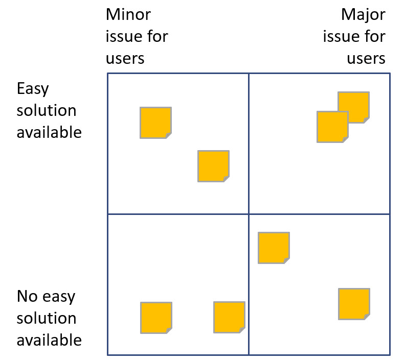
The prioritisation matrix helps us identify solutions which are easier to implement and are likely to have greatest impact for the user.
This helped us understand where we want to focus our time and how much it will require.
All of our solutions fell into one of these categories:
- Development change to the editorial interface to be implemented by our team
- Development change to the design of the broader EdWeb2 editorial experience. We passed these findings onto Website and Communications in Information Services who manage the EdWeb2 service.
- Training and guidance requirements. These are currently in development by our Content Operations team.
In all cases, we opted for the quickest, simplest solution which was often a requirement for training and guidance. Once colleagues have been trained and begin to use the new editorial interface, we will appraise again to ensure these usability issues have been mitigated.
What attendees said about the session
I thought the session was very engaging. We were all asked to note down the issues we observed in the videos which encouraged us to think and discuss what we saw as a group. I really enjoyed the opportunity to do this with other colleagues across the University.
John Wilson, Content Design Assisstant, Website and Communications
Get involved
We are preparing for a follow-up round of usability testing from this session. We will be testing the new comments functionality in the editorial interface to see how school editors use it across the different stages of the workflow.
Watch out for emails and a promotional blog for this session which we will be running before Christmas.
We are always looking for participants to test with so if you want to get involved with future usability testing sessions then please do get in touch and let me know.
Register interest in helping us with future usability testing