From left-hand menus to megamenus – our visualisation tool
Sites on the new Web Publishing Platform will have a megamenu instead of the left-hand menu currently in EdWeb. This shift has implications for the way content is structured and presented in University sites. We’ve developed a tool to help visualise and tweak megamenus in EdWeb sites.
What are megamenus?
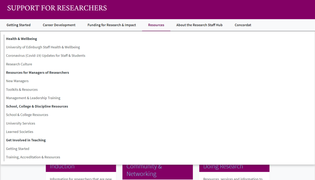
Megamenus are a type of navigational component which display menu choices in a drop-down panel. The menu items can be arranged in blocks (or columns) and can be organised into categories or subcategories. Megamenus are commonly used on content-heavy sites as a way to provide visitors with an overview of what a site contains to help them navigate to the content they need.

Screenshot showing expanded megamenu from the Support for Researchers site.
Why are we moving to megamenus?
We want to make it easier for people to find the content they need in our websites, without the need to click through multiple pages and series of menus. Implementing megamenus will provide people with an overview of a site content and structure at a glance, to help them choose the right options, and provide a better user experience. For those editing content, the megamenu presents an opportunity to facilitate improved content design and website structuring practices. It will also help ensure pages can’t be published and buried – to curb the problem of bloated sites and excessively long vertical menus – and lead to a more manageable and sustainable web estate.
Will the megamenu be the only navigation?
In short, no. The megamenu will be one part of a new navigational system in the Web Publishing Platform. Usability testing of a megamenu prototype showed people struggled to use it to navigate to content at deeper levels – the decision was then made to only include menu items to a depth of three levels in the megamenu – with deeper content to be handled by additional navigation components. We’re also developing additional navigational solutions suited for specific types of content – for example a listing content type to aggregate large numbers of linked items like news articles, events pages and staff profiles.
What are the implications for moving from left-hand menus to megamenus?
Since the navigation structure in the new platform is different to EdWeb, the left-hand menus won’t directly map across.
The megamenu comprises a navbar and a dropdown which occupy a defined amount of horizontal space. This means that things like the number of menu items and the character count of their labels become important as there is a need to fit content on a top line. If there are too many menu items, or if they are too long, the megamenu cannot display in full and it collapses to the navbar toggler (or burger menu). The child items to the top-level items display in the expandable dropdown, and they are arranged in four blocks (or columns). When there are more than four child items, they wrap to a line below. If there are grandchild items, these display beneath the child items in the relevant blocks and represent the third level.
Try our megamenu visualisation and playground tool
Having migrated some sites to the new platform with a first-iteration megamenu, we have learned that it can be helpful to experiment with menu items and to see how megamenus will look in individual sites. Nick Bush, working with us as a Content Migration Liaison Assistant, built a tool which can create a visualisation of an EdWeb site with a megamenu, based on the items in its original left-hand menu.

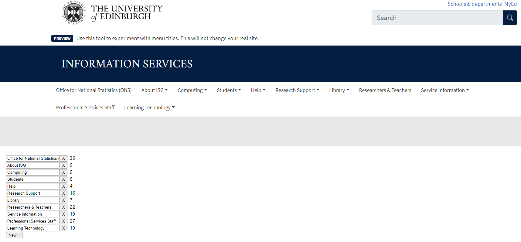
Megamenu visualisation tool showing the Information Services Group website megamenu.
The tool contains a lower left hand panel which you can use to remove menu items, add them, and change the character counts to change the way your megamenu will look.

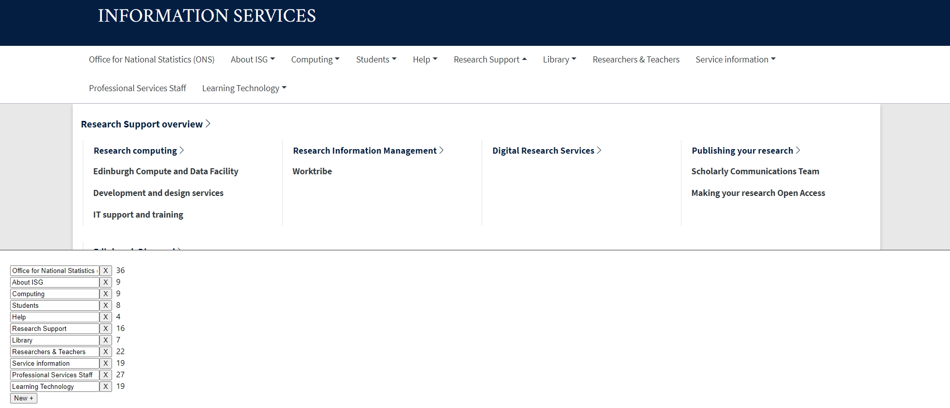
Megamenu visualisation tool showing dropdown expanded for Inforamation Services Group site.
You can also use the tool to see what the dropdown will look like, however, you will be unable to interact with the items in the dropdown, this is for visualisation only. Use the right hand scroll to see the full dropdown area.
Getting access to the tool
There is a megamenu tool available for every site in EdWeb. To find the one for your site, visit:
Megamenu visualisation tool page on the Website and Communications website
Once here, search for your site by name (you can use ‘control +F’ for a keyword search). Click on the link on the left to take you to the tool for your site.
Some things to note about the tool
- It only contains menu items, there is no other content from your site (e.g. cards, links etc)
- You can experiment with adding, removing and editing top-level menu items in the navbar, but you won’t be able to change items in the expandable dropdown part of the megamenu
- There is no save facility on the tool – if you want to keep note of your experimentation then you can screenshot and save the images
- It is not connected to your live site – any changes you make will not affect your real site
- It uses data taken from an EdWeb extract taken in mid-March 2023, therefore the menu items you see in the tool may be different from your live site
The tool is a first iteration, and we’re keen to improve it, therefore we would welcome feedback and questions (please email us at website.support@ed.ac.uk). We’ll be planning clinics and workshops in due course to help you use this tool and prepare for migration, as well as firming up guidance of what to include and not include in your megamenu, how to write effective menu labels. etc.
Read more about menus, navigation and information architecture
We’ve published several blogs documenting our work on the information architecture of the University web estate and the navigational structures in the Web Publishing Platform.
Comparing a megamenu to a left-hand menu in task-based scenarios using Figma and Maze
Revisiting our Information Architecture Guidelines
Implementing and evolving a megamenu in the Web Publishing Platform


2 replies to “From left-hand menus to megamenus – our visualisation tool”