
Comparing a megamenu to a left-hand menu in task-based scenarios using Figma and Maze
We used Figma to create a mocked-up megamenu for a School site and used Maze to test how people used it to complete a set of tasks. We repeated the test for the same site using a left-hand menu and compared the results.
Using Figma and Maze to test navigation ideas
Navigation has been a pivotal piece of work within the project to build a new Web Publishing Platform. To ensure the new platform provides a navigation experience which is intuitive, consistent and effective, aligned with our information architecture principles, we needed a way to test navigation ideas with real users, in the context of real tasks.
Through experimentation, and working closely with our agency partners TPX Impact (formerly Manifesto) we came up with a way to use online platform Maze to test navigational prototypes built in Figma to gain quick feedback from large numbers of users.
Megamenus – what they are and what they do
A megamenu is an expandable menu which displays menu links formatted as columns or rows. They are typically used on sites which have a large number of menu options – the mega menu structure enables all the options to be visible at a glance, and the column or row formatting enables similar menu items to be grouped together.
An example of a megamenu can be seen on My Ed, the staff and student portal.
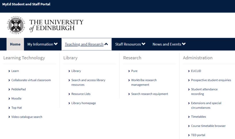
The megamenu in MyEd, the staff and student portal
Testing a megamenu for a School site – our hypotheses
Megamenus can support several sorts of information seeking behaviour, but they can be especially helpful to support instances where a person doesn’t know what they are looking for, and also exploratory information seeking (when a person has an idea of a need, but may not know where to start). A megamenu presents an overview of all the site content at a glance, to help users recognise information that might be of use to them, without them having to look for it in nested menus.
For these reasons, we felt a megamenu could be an effective means of navigation for a School site, and particularly a School site with lots of menu options – such as the Moray House School of Education and Sport website. We wanted to test the following hypotheses:
- People can make sense of a megamenu and use it to get to destinations within a website
- A megamenu will allow users to get to destinations in a site quicker and with less steps than a series of left-hand nested menus.
Comparing two menu structures
To test our hypotheses we designed an experiment. We wanted to directly compare how people used a megamenu versus a left-hand nested menu structure, so we devised a set of navigational tasks and set out to build two prototypes of the same site, differing only in the menu structure. Half the participants would complete the tasks using the prototype with the left-hand nested menus, the other half would use the version with the megamenu. When it came to analysing the results for each prototype, we planned to focus on two key metrics to help us draw comparisons:
- Time to complete each task
- The number of steps or screens taken to complete each task
We also wanted to compare the pathways people took to complete the tasks using each menu structure and to look at how they corrected their paths if they got lost.
Megamenu and left-hand menu prototypes
Using Figma, Keith Symonds from TPX Impact built two prototypes to test in Maze:
- Prototype A – representing the ‘As is’ site with the left-hand menu
- Prototype B – conceptualising the ‘Could be’ site with a megamenu
Both prototypes were built with desktop-sized screenshots of the Moray House website, overlaid with interactive ‘hotspots’ on the two menu structures – on-page navigation elements like panels and breadcrumbs were not clickable, meaning people could only use the menu structures to navigate.

The homepages of each prototype – left-hand navigation on the left, megamenu on the right
Why we used a prototype, not the live site
We initially considered using the live Moray House site – with its left-hand nested menus – in the test but decided against this because we only wanted to test one thing, and therefore have one variable – the menu. Using the live site would have meant participants could have clicked on the working on-page elements as well as the menu, which wouldn’t have been a fair comparison with the prototyped megamenu site.
The navigational tasks
We came up with 8 tasks for participants to complete, starting on the homepage of the prototype each time, these were as follows:
- Find a page about an undergraduate degree in Physical Education
- Find a page with details of the cost of a postgraduate research degree
- Find a page about ‘Place2Be’ – a partnership to support teachers
- Find a page about Sport-Related Research
- Find a page about an undergraduate degree in Childhood Practice
- Find a page with details of staff
- Find a page with recordings of professional learning webinars
- Find a list of the types of institutes
We acknowledged that, in reality, people searching a website often don’t have a specific destination page in mind, however, for the purpose of the test, and comparing the two menus, the destinations needed to be specific. Also they needed to be easily understood by people with no prior knowledge of the University or the Moray House site.
The Maze set-up
From previous experience using Maze and Figma to test with users, we knew participants would take some time getting used to how the prototype worked – therefore they would be likely to find earlier tasks trickier than later ones. We factored this in firstly by including two similar tasks (‘Find a page about an undergraduate degree in Physical Education’ and ‘Find a page about an undergraduate degree in Childhood Practice’), and secondly by splitting the tests into batches so we could change the order of tasks across the participants.
We used Maze to set the ‘direct path’ (i.e. the route we expected participants to take) for the completion of each task using each prototype which gave us a benchmark to use in the analysis.
What we found – analysis
Using a spreadsheet, we tracked how participants completed each task using each prototype, logging metrics from Maze, like average time on task and average number of screens taken to complete the task.
Tasks done by the direct paths took less time and fewer screens using the megamenu
A large proportion (greater than 80%) of participants completed tasks 1 and 5 (finding pages about undergraduate degrees) and 8 (finding a list of institutes) by the direct (or expected) paths in both prototypes. Comparing the time and number of screens taken to complete the task in the two prototypes showed that the participants using the megamenu prototype arrived at the destination more quickly, and via fewer screens:
Task 1 (find an undergraduate degree in Childhood Practice):
Using the left-hand menu prototype
Average time to complete task by direct path: 26.3 seconds
Average number of screens: 4
Using the megamenu prototype
Average time to complete task by direct path: 9.1 seconds
Average number of screens: 3
Task 5 (find an undergraduate degree in Physical Education)
Using the left-hand menu prototype
Average time to complete task by direct path: 27.2 seconds
Average number of screens: 4
Using the megamenu prototype
Average time to complete task by direct path: 9.1 seconds
Average number of screens: 3
Task 8 (find a list of institutes)
Using the left-hand menu prototype
Average time to complete task by direct path: 9.1 seconds
Average number of screens: 2
Using the megamenu prototype
Average time to complete task by direct path: 5.8 seconds
Average number of screens: 2
Task 2 was done with an indirect path – in less time and fewer screens using the megamenu
A reasonable proportion (around 30%) of participants completing the task requiring them to find a page with details of the cost of a postgraduate research degree did so by an indirect route. This was the same for participants using both prototypes. Instead of navigating to ‘Fees and funding’ from the ‘Postgraduate study’ menu, participants selected ‘Scholarships and studentships’ as they looked for information about cost. When this did not take them to the required destination, they went back to the ‘Postgraduate study’ menu and selected the correct option. This corrected pathway took less time and fewer screens to achieve in the megamenu prototype.
Task 2 (find a page with details of the cost of a postgraduate research degree)
Using the left-hand menu prototype
Average time to complete task by indirect path: 44.9 seconds
Average number of screens: 8
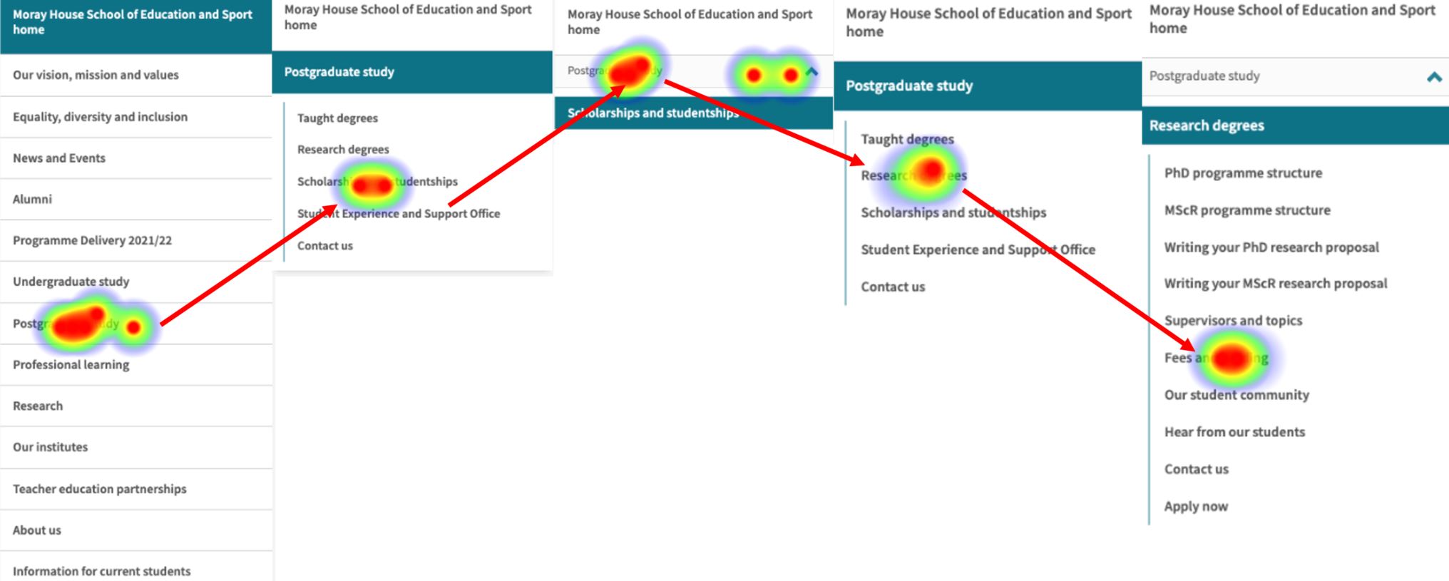
Heatmap showing interactions with left hand menu to complete task 2 (on an indirect path)
Using the megamenu prototype
Average time to complete task by indirect path: 19.5 seconds
Average number of screens: 4
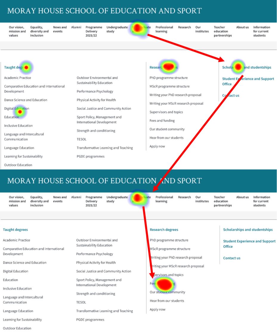
Heatmap showing interactions with megamenu to complete task 2 (on an indirect path)
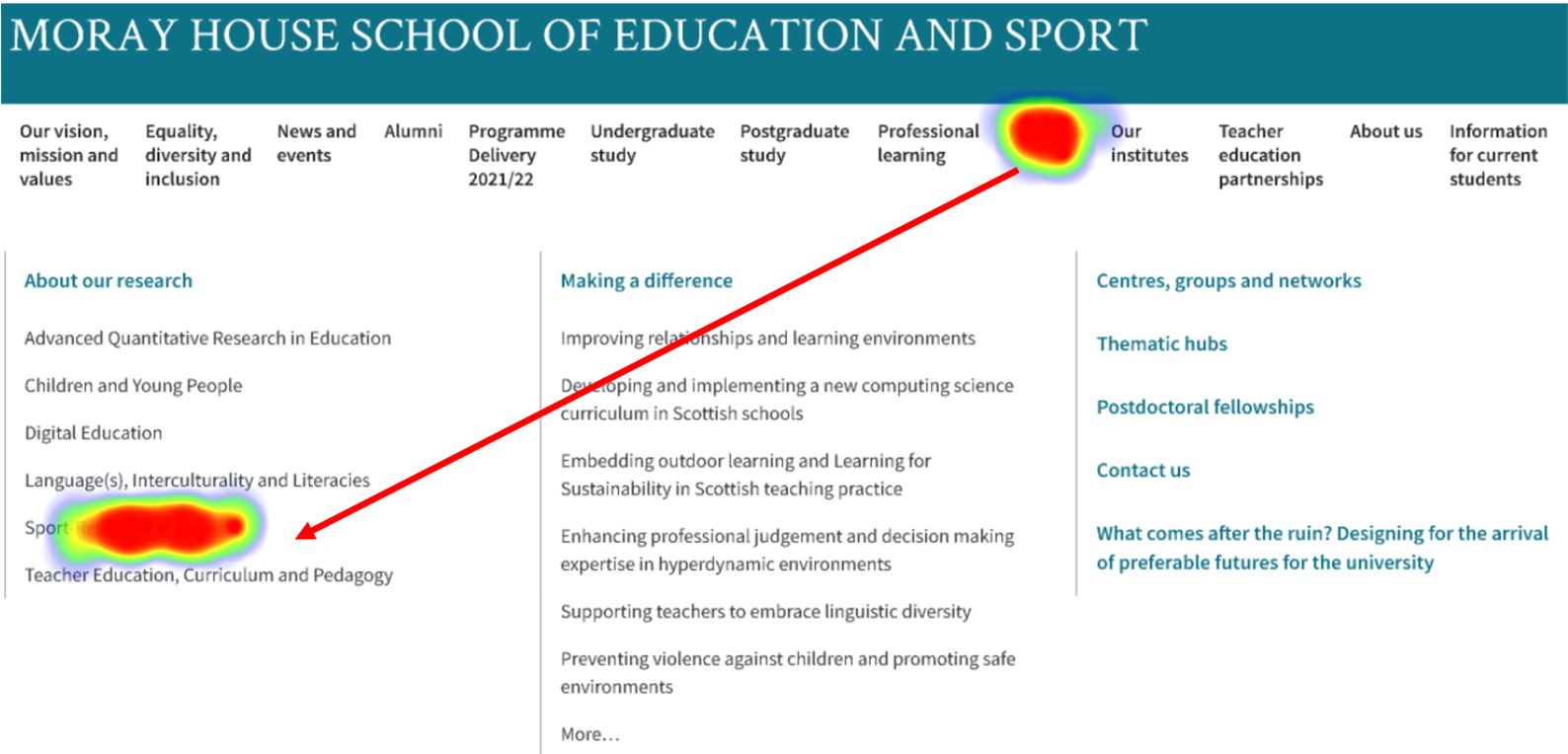
More participants did task 4 directly using the megamenu than the left-hand menus
This task required participants to find a page about ‘Sport-Related Research’. Over 80% of participants completing the task using the megamenu took the direct path, whereas around 60% took the direct path using the left-hand menus.
Comparing the heatmaps, it was clear that in the megamenu prototype, the item ‘Sport-Related Research’ was visible with one click (to open the megamenu), meaning more participants were prompted to take the direct path. In the left-hand menu prototype, however, participants needed to actively choose ‘Research’ and then ‘About our research’ before they could see the option for ‘Sport-Related Research’. This meant that if they didn’t select ‘About our research’ (as some did – opting instead for ‘Centres, groups and networks’) they needed to go back to ‘Research home’ to try another option, meaning their path to the destination page took longer and involved more screens and clicks.
Heatmaps showing interactions to complete task 4 in the megamenu prototype
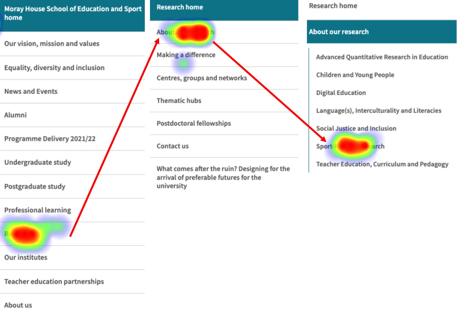
Heatmaps showing interactions to complete task 4 using left-hand menu prototype
Impact of content on task success
We decided to build prototypes from screenshots to give testers the look and feel of a real site – to encourage natural navigation behaviour. Adopting this approach, however, we acknowledged that participants would be presented with surrounding content which may cause them to deviate from the expected paths to destination pages.
In the results for task 3, which required testers to find a page about ‘Place2Be’ – a partnership to support teachers, we saw how the presence of a menu label for ‘Professional Learnings as Critical Enquiry (PLaCE) caused participants to take an indirect route to reach the required destination. This was observed in both the megamenu and left-hand prototype.
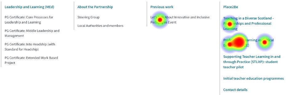
Heatmap showing interactions with megamenu prototype to complete task 3
A similar phenomenon was seen in task 6, requiring participants to find a page with details of staff. The presence of menu labels ‘Academic staff A-Z’ and ‘Staff by area’ in the megamenu layout deflected attention away from the ‘People’ item, which was on the direct route to the destination. Interestingly, this was not the case in the left-hand menu prototype, where, having selected ‘About us’, participants were presented with a next-level menu which contained the item ‘People’ (without exposure to menu items like ‘Academic staff A-Z’ and ‘Staff by area’). This led to a higher direct success rate for this task using the left-hand menu compared to the megamenu.
Megamenu styling also impacted task success
The heatmaps showing the paths taken to complete tasks 3 and 6 also highlighted another factor impacting how successfully participants could use the megamenu to complete tasks – the way it was styled. In the megamenu concept prototype, the top-level menu items (such as ‘Place2Be’ in task 3 and ‘People’ in task 6) were styled in bold, consistent with the brand colour of the site. These menu items received less interactions form participants than the lower-level items, indicating participants thought they were static headings rather than clickable links.
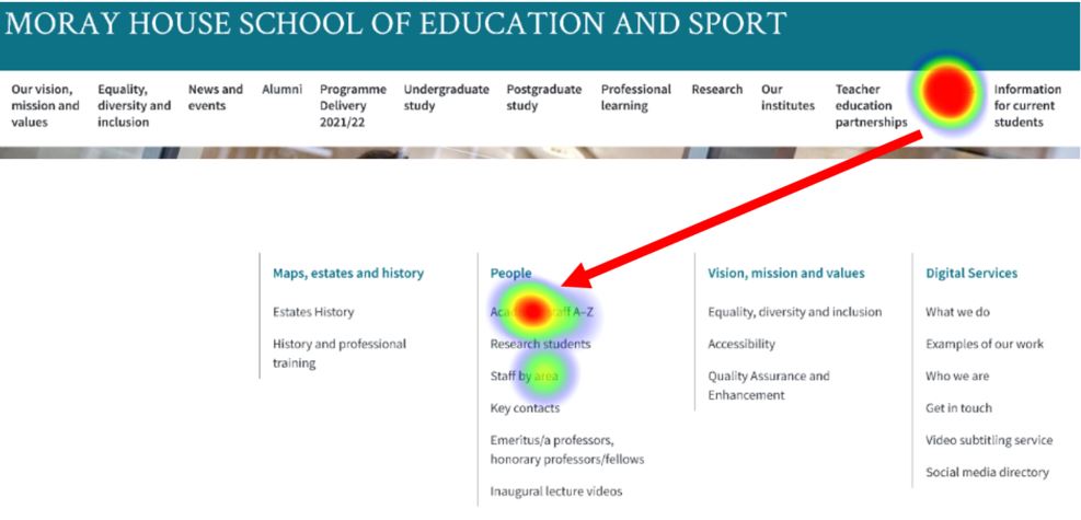
Heatmap showing interactions with megamenu prototype (avoiding ‘People’) to complete task 6
What we learned and next steps
We set out to investigate how participants interacted with a megamenu compared to a left-hand menu to complete the same set of tasks. We learned that they were able to use both structures to complete the tasks, and we saw that, for some tasks, participants took less time and fewer clicks to use the megamenu to navigate to a destination than using the left-hand menu.
The test results affirmed that constructing a test to gather specific evidence about the performance of a particular menu structure was quite difficult, as there are many factors affecting the effectiveness and usability of a navigation structure in the context of a website – significantly the content used and the styling. The megamenu’s strength in revealing all available menu options at a glance was only a strength if the menu options were clear and unambiguous to help people make appropriate choices towards achieving their information needs – in other words, for the megamenu to work in the way it is intended, the content must be thoughtfully planned to align with users’ needs.
Since the prototyping and testing, we have built an iteration of the megamenu in Drupal, and we’re experimenting with it as part of our migration testing, considering styling aspects, character length and appropriate numbers of menu items it can support. Going forward, we’ll be looking to test the megamenu with web publishers, to see how well it supports navigation within a range of websites at the University.
Read about a related test:
Testing a mobile menu concept with Figma and Maze
This was a very interesting read, thank you for sharing the findings.