Testing a mobile menu concept with Figma and Maze
We wanted to test a mobile navigation concept so we built a prototype mobile menu structure using Figma and tested it with 100 people using the Maze testing platform.
Figma and Maze – our navigation testing toolkit
A key strand of work in the project to build a new Web Publishing Platform has focused on navigation. We want to ensure the new platform includes a navigation system which is intuitive, straightforward and supports users to find the information they needed efficiently, in line with the 4 University information architecture principles.
Through experimentation, and working closely with Keith Symonds from our agency partners TPX Impact (formerly Manifesto) we came up with a way to use online platform Maze to test navigational prototypes built in Figma to gain quick feedback from large numbers of users.
Mobile menu prototype
We decided to make mobile navigation an initial focus on the premise that mobile users account for a significant proportion of visitors to the University of Edinburgh website.
Julie Freeman from our Graphic Design team created an interactive Figma prototype with a mobile navigational structure for a fictitious School (‘School of Science’) within a fictitious University (‘Russell University’). The prototype was designed to look and feel like a real website. It included 16 screens which users could move between via a clickable menu system. Navigational elements like breadcrumbs and on-page panels were included in the design but only menu elements (like menu items and hamburger menus) were fully clickable. Details like interaction modes gave affordance to the design – to encourage users to interact with the prototype in a natural way.
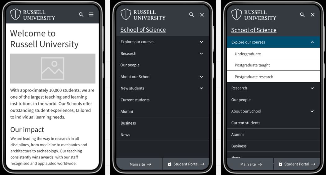
Screens of mobile prototype showing homepage and menu options, designed by Julie Freeman
Setting up tasks and paths in Maze
Once the prototype was uploaded to the Maze testing platform, we needed to set tasks requiring participants to use the menu structure to move to a given page or area of the site. We created a sequence of 7 tasks, starting on the prototype homepage and subsequently requiring participants to make sense of each page they arrived at, in order to progress through the test.
The tasks were as follows:
- Find a list of the postgraduate taught courses available at the School of Science
- Find a page about the qualifications needed to enrol on a course at the School of Science
- Go to the School of Science homepage
- Find a list of the School of Science’s research projects
- Find a page that lists the School of Science’s staff
- Next find a page containing details about virtual tours of the School of Science
- Now go to the Russell University homepage
For each task, we defined a ‘direct path’ – which was the expected series of interactions we expected participants to take to arrive at the required destination. These paths were a benchmarks to use for comparison in our analysis.
Analysing the paths taken for each task
Taking the tasks one by one we were able to see which tasks participants were able to easily complete using the prototype, and which they found more difficult
Direct successes for tasks 1, 3 and 4
The results showed high percentages (around 80%) of participants completing tasks 1, 3 and 4 by the direct paths (in other words, the paths we had predicted). For these three tasks, a minority of participants took an indirect path to reach the destinations, with very few (approximately 1%) unable to reach the desired pages and giving up.
Direct path taken to complete task 1 (image) starting on the homepage, the direct path was to go to Explore our courses, and from here select the postgraduate taught courses menu link to take them to the required page
Several testers were able to complete task 4 (finding a list of the School of Science’s research projects) indirectly – they tried clicking on the ‘About our School’ menu item first, then having viewed the options here and realising there was nothing to help them complete the task, they selected ‘Research’ from the menu which set them on the right path.
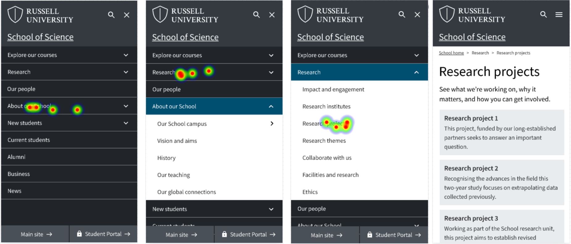
Heatmaps showing interactions with mobile menu prototype to complete a task to find a list of research projects
Results for task 2 showed participants getting used to the prototype
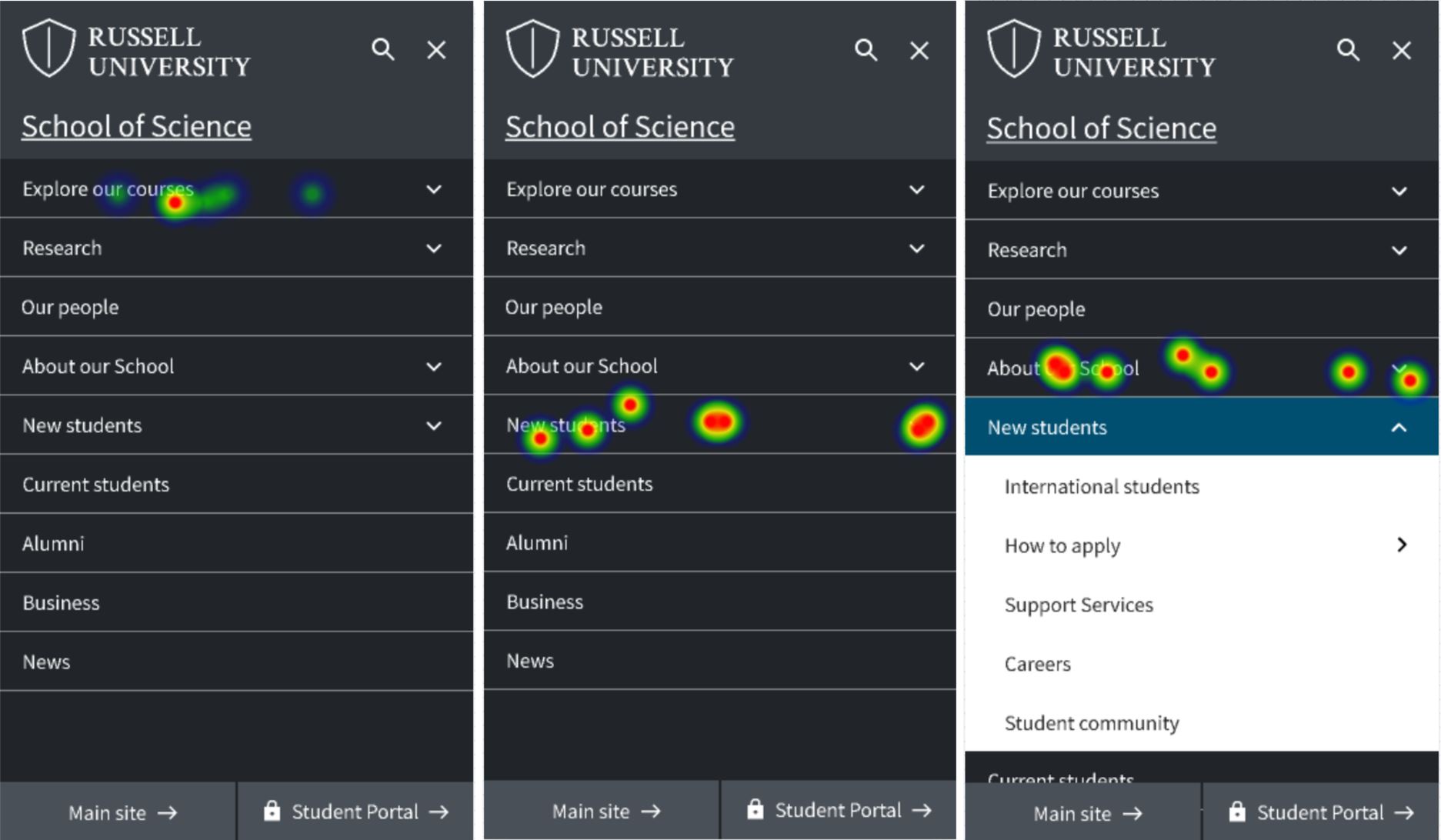
Task 2 asked participants to find a page about qualifications needed for enrolment, starting on the page about postgraduate taught courses. The expected path involved navigation back to the menu, then to ‘New students’, from here ‘How to apply’ and finally ‘Entry requirements’.
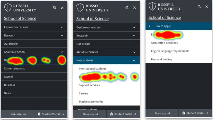
Heatmaps showing interactions with mobile menu prototype to complete task to find enrolment information (direct path)
This path was used by 25% of participants, however, 61% took different paths, and 14% gave up. Analysis showed several testers tried clicking on breadcrumbs and on-page elements to try and find the page required. When they realised these elements weren’t clickable they used the menu.
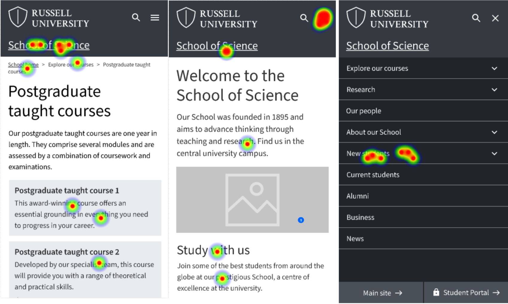
Heatmaps showing interactions with mobile menu prototype to complete a task to find enrolment information (indirect path)
Ambiguous labelling led participants on indirect paths for tasks 2, 5 and 6
The results for task 2 also showed the impact of menu labels on successful navigation. Several testers did not go directly to ‘New students’ to find enrolment qualifications, they also tried ‘Explore our courses’ and ‘How to apply’.
A similar result was seen for task 5. This task required people to navigate to a page about the School staff. The direct path (taken by 61.6% of testers) was to open the menu and choose the ‘Our People’ item, but several testers went to ‘About our School’ instead.
Task 6 required testers to find a page about virtual tours. The direct path (taken by 50.5% of testers) was the menu link sequence: ‘About our School’, ‘Our School campus’ and ‘School tours’. Several participants were swayed from the direct path because they chose ‘Explore our courses’ and ‘New students’ before selecting ‘About our School’.
Heatmaps showing interactions with mobile menu prototype to complete task to find a page about virtual tours (indirect path)
Inconsistent prototype clickability caused difficulty on task 7
Throughout the prototype, certain elements were clickable on all screens – (for example the hamburger menus and menu items) and others were consistently non-clickable (such as the on-page panels, and the breadcrumbs). In an attempt to make sure participants remained on the School pages to complete the tasks, however, we limited clickability of parts of the interface which would take participants to the ‘Russell University’ homepage (the ‘Main site’ button at the bottom left and the ‘Russell University’ logo at the top left). These were only interactive on 3 of the 16 screens.
This meant that when testers tried to do task 7 (navigate to the ‘Russell University’ homepage) they were only able to do so from some of the screens. Participants would naturally have expected to click these elements on all the screens – which explained why this task had a high ‘give up’ or bounce rate of 54.5%, and a low direct success rate of 40.4%.
What we learned and next steps
We set out to run a test requiring participants to use a prototype to complete tasks in the context of a University School site – as a way to gain feedback on a mobile navigational menu. The test succeeded – we were able to see how people used the structure to navigate to destination pages within the site.
Analysing interactions with the prototype, we confirmed people could use our mobile navigation concept to get to destination pages. Interaction patterns showed people used a combination of navigation elements (breadcrumbs and panels as well as menus) to move around the site, and comparison of direct and indirect paths taken showed that how menus are labelled had an impact on peoples’ navigational choices.
The next steps for the mobile navigation will be to consider ways it can be built in Drupal – to be contributed as a component to the Design System backlog, and to inform wider navigational design within the Web Publishing Platform. Having validated Figma and Maze as a testing protocol, we plan to apply this to test other navigation ideas and concepts.
Read about a related test in a separate blog:
Comparing a mega menu to a left-hand menu in task-based scenarios using Figma and Maze


1 replies to “Testing a mobile menu concept with Figma and Maze”