
Redesigning how we display entry requirements in the undergraduate degree finder
Earlier this year, we collaborated with admissions colleagues to design a new presentation for entry requirements in the undergraduate degree finder. In this post, I share the different iterations we designed and how testing with students informed our design decisions.
Background
Last year our team started work on creating the future state for the University’s undergraduate study provision.
To begin with, we created a content model and then progressed to creating a prototype for the new undergraduate degree programme content type.
Read our posts on developing the content model and prototype
Most sections of the degree finder are populated by our devolved group of editors working in the University’s schools. For entry requirements, though, admissions colleagues are responsible for populating this content.
The Admissions team in Student Recruitment and Admissions work with colleagues across the University’s colleges to gather the requirements each year, which they then add into the degree finder.
Through past research our team has done, we’ve learned a lot about the issues with entry requirements in the current degree finder, both for students interacting with the content and admissions staff gathering the content.
As entry requirements is the top task for prospective undergrads, it was our top priority to work with Admissions to design a better experience both for their team and prospective students.
Pain points in the existing entry requirements experience
From our research, we learned what content areas of entry requirements are most difficult for applicants to understand.
For example, the following areas are not clear:
- international qualifications: It’s challenging for prospective international students to find relevant entry requirements information for their specific country.
- required subjects: In the current format, applicants don’t realise they need certain subjects to apply for a programme as this information is not too far removed from the grades they need to apply.
- minimum entry requirements: The minimum academic grades are only relevant to applicants from widening access backgrounds, but many people think these are the minimum grades anyone can apply with.
- English language requirements: It’s not clear these apply to everyone, even if English is their first language.
Goals of the collaboration
With those issues in mind, our goal was to introduce a new design for entry requirements that:
- prompts website visitors to actively select the requirements they believe are most relevant to their situation
- only presents a subset of all entry requirements for a particular degree based on what requirements they select
- improves student success rates in identifying what is relevant to them
Our first prototype
Our team worked closely with colleagues in Admissions to co-design and restructure an entry requirements section for a sample programme.
Our first design included the following features and sections:
- initial introductory text explaining the type of entry requirements needed to apply
- a dropdown menu where users select what country they study in, and then another dropdown appears to pick their qualification
- use of the terms ‘standard entry requirements’ and ‘minimum entry requirements’ to describe the difference between grades needed for widening access applicants versus the rest of applicants
- text for grades needed that appeared when a student selects a country and qualification from the dropdowns
- separated white boxes for additional requirements and English language requirements content that were always present on the page
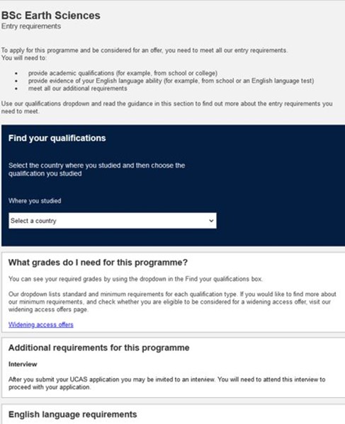
Our first iteration had a dropdown to select where you study and separated white boxes for grades, additional requirements and English language requirements.
Usability testing and what we discovered
When we tested the first prototype, we saw that:
- the initial introductory text (which was above the dropdowns) was largely ignored
- UK students didn’t use with the dropdown as they didn’t understand why they would need to select a country and so thought the only entry requirements were the additional requirements and English language requirements listed below the dropdown menu
- the white boxes for each chunk of content created a false end, so some didn’t read on past the first box
So our first design had some significant issues. What did work well, though, was the experience for international students.
In our current degree finder, international students are just directed to a website where they have to find a page listing their country’s qualifications. In the new design, students were able to select their country at the programme-level and were given the direct link to their country page.
Eventually, we’d like to get the relevant international entry requirements on the degree finder, but linking to the correct country page is our interim solution. The international students we tested with greatly appreciated being directly linked to the page they needed to get to.
Unlike UK students, they readily interacted with the country dropdown on the prototype.
Second prototype and what still didn’t work
Noting the issues from the first round of testing, we:
- hid all the content until someone interacts with the dropdown menu
- put all the text that appears after the dropdowns are used into a single white panel box that contains all of the grades, additional requirements and English language requirements
- added a pre-selected option to the dropdown menu for country (we set this to United Kingdom) and had the dropdown for qualification show alongside it
This new design performed much better with UK students who used the dropdowns and could see all the different aspects of entry requirements in one content area. International students still performed well in finding their country pages.
However, the main issue with this testing was the use of the terms ‘standard’ and ‘minimum’ requirements in the qualification dropdown. UK students thought minimum entry requirements referred to the minimum grades they could apply with, when they are in fact the grades that students from widening access background can apply with.
This resulted in a lot of task failures because students who would be eligible for standard entry requirements wrongly assessed themselves as needing lower grades to apply with.
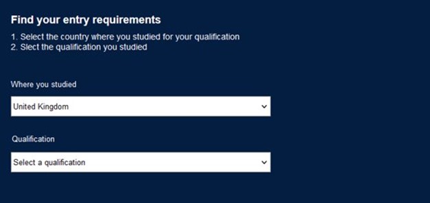
UK students interacted with the second iteration, but wrongly chose minimum entry requirements when they were not eligible.
Third prototype: a compromise solution for minimum entry requirements
It came as no surprise that students made this incorrect assumption with minimum requirements. As stated previously, we’ve known this has been a major issue from past research.
However, Admissions were keen to use the terms standard and minimum as these terms were agreed as a sector some years back of what we should use when describing entry requirements.
After showing Admissions the test results after the second design iteration, though, we agreed to a compromise solution.
We decided to remove the term minimum from the dropdown menu where you select your qualification. Instead, students now have the choice between ‘standard’ and ‘widening access’ requirements. Only when you select widening access requirements do you see the term minimum requirements in the text that appears showing the grades.
So the point at which students have to decide which requirements to choose, they’re not faced with the confusing term ‘minimum’.
When we tested this design solution at the June Undergraduate Open Day, no prospective student chose widening access requirements when they weren’t eligible for it. One tiny change to the text made a massive improvement to the user experience.
As a result, this change will also inevitably improve the staff experience as students will be better able to assess what grades they need to apply for a programme, leading to fewer ineligible applications.
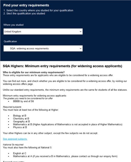
The latest iteration uses the term ‘widening access’ instead of ‘minimum’ in the dropdown menu.
What we learned in the collaboration
Prioritise the visual presentation as much as the content structure
With entry requirements, we spent a lot of effort creating a new structure for the grades, additional requirements and English language requirements content that appears after a student uses the dropdown menus. It was important to get this structure right to mitigate the issues we knew were pain points in the current presentation.
However, by spending so much time on this structure, I don’t think we gave enough consideration to the visual presentation of the entire entry requirements interface.
As a result, we ended up with the issues we saw in the first round of testing, namely that certain visual design choices led to students ignoring bits of content and creating false bottoms in the content.
While testing is there to catch things like this, going forward, I’d like us to give greater thought and attention to our visual design choices as much as our content structuring ones.
Show is more powerful than tell
While we had discussed with Admissions the idea of changing the problematic term ‘minimum entry requirements’ before the second round of testing, they were hesitant to change an agreed term. We kept it in, but it obviously led to a lot of task failures in the tests.
Having those test recordings, though, and being able to show them to Admissions, was so powerful in getting them on board with our compromise solution. As much as you can talk about the pros of a design change you want to make, sometimes showing someone fail at a task can be a more effective catalyst to make changes to improve the experience.
See the latest design on our beta programmes
We launched our beta of the new undergraduate degree finder experience. You can view the latest iteration of entry requirements on the three programme pages in the beta.
See the new entry requirements experience on the undergraduate beta pages
We’ll be analysing performance on the beta which may inform any future changes we make to the design of entry requirements.
Read more about our work on the future degree finder
Parts of this post were written by Freya Cookson.