Payment of tuition fees: updating the referral pages
Last year we worked with Finance to redevelop their registration form for the payment of tuition fees. As part of that work, we had to find the routes to the form and update the corresponding web content.
The project
For the start of the academic year 2021-22 Finance introduced a new webform, the Financial Registration Form. The Finance team wanted to make it easier for students to pay their tuition fees on time. The form helped with this by directing students to payment guidance.
For the Finance team, the form provided them with information about students and funding details, so the team could set up payment plans and better respond to enquiries.
The old form caused lots of problems such as multiple or failed submissions. Students also had trouble following payment guidance. As a result, the team received a high number of queries. Due to this, Finance asked for our help with the form and web content.
Investigating the route to the form
We audited the website to find links to the form. We found four referral pages:
- the New students webpage ‘Pay your fees’
- the Finance page ‘Student academic fees’
- the Tuition fees webpage ‘Paying your tuition fees’
- the EdHelp system page on paying fees

The webpages leading to the registration form.
We were surprised at the number of possible routes to the form and were not aware of all these pages at the start of the project.
We needed to make sure that all referral pages had the correct new information and had the updated details for the webform. We wanted students to get a consistent experience even though they may start the process for registering to pay their tuition fees on webpages that are under the control of different site owners.
Initial usability testing with students
In our discovery phase, we conducted usability tests with students, which started them on the New students webpage. The task was to go through the registration process for the payment of tuition fees.
Through the tests we saw that the students were unclear about the purpose of the registration form. They ultimately chose it as first step, but did not feel confident about this.
Improvements we made
Changing the form name
As part of our work updating the Finance site content, we changed the name of the finance form to make its purpose clearer. The new name is ‘Register how you will pay your tuition fees’. We arranged the change to the new name on the pages that link to the form.
Designing better content for referral pages
A new name made the form purpose clear, but we also had to make a few editorial changes in the referral pages to get students to complete the form.
In all the referral pages we updated, we:
- highlighted that new students need to complete the registration form before they start studying at the University and at the start of every academic year
- made it clearer that completing the form is a mandatory task
- told students what would happen when they submit the form
We also made a few design and formatting tweaks to help get students to the form.
Student academic fees webpage
In the Student academic fees webpage, we updated the link text in the call to action button so it was descriptive and not a URL.
The section of the webpage at the start of the project:

The fees information at the start of the project.
The same section of the webpage after we updated the content:

The updated content on the Student academic fees webpage.
Tuition fees website
In the webpage for paying tuition fees we created a feature box to make the content stand out more.
An extract of the webpage at the start of the project:

The Tuition Fees webpage before the project.
The same section after we updated the content:

The updated Tuition Fees webpage with the feature box.
New students website
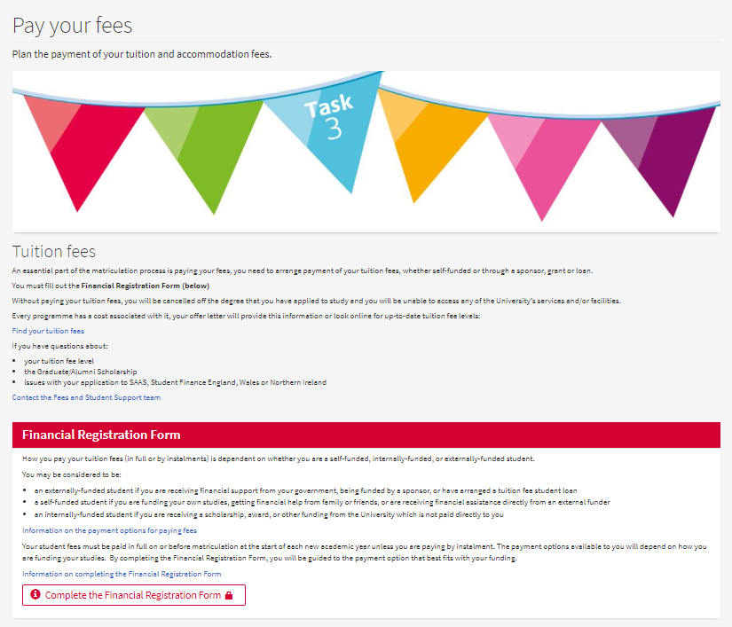
In the task 3 webpage of the New students, website we moved the information to the top of the page to draw attention to the form.
The top of the webpage at the start of the project:

The New students webpage before the project.
The same section after we made changes to the content:

The updated New students webpage.
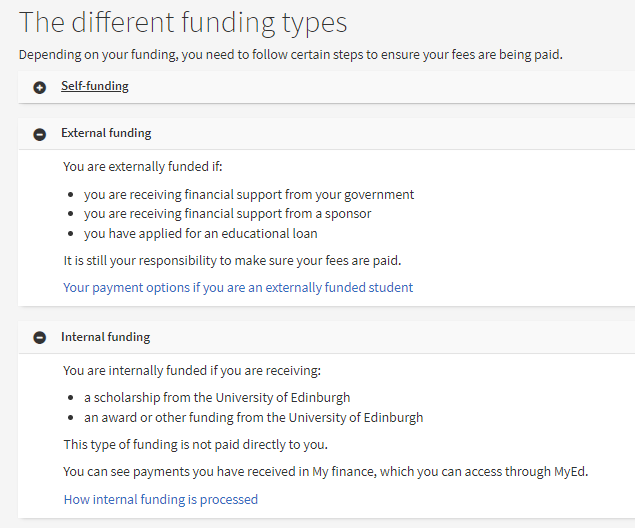
We also improved the information on the different funding types in this webpage, which caused confusion in the past.

The improved description of the funding types.
EdHelp
We also developed similar content changes for the referral content on EdHelp. However, as we did not have editorial access to these pages, we could not make these changes ourselves.
Usability testing for the updated content
We repeated the tests with students with the new content. We used the same scenario as before.
We started the tests again at the ‘Pay your fees’ webpage, one of the essential top 6 tasks on the New students website. We asked the students what they would do from here.
This time the students were confident in moving from the referral content to the form, with the content giving students a better idea of what to expect. We did not see the insecurities from the initial tests.
What we learned
Content changes can affect other parts of the University
Changes to one webpage or form can affect many other teams. Other University webpages or systems might refer to the content or repeat it.
When we are redesigning content, we need think about links across the whole University website:
- other webpages or systems might use part of the content or link out to a form
- the information needs to be consistent and up-to-date across the University
- changing a URL could break a link in another location
In this project, our form design changes would not have had the intended effect if students could not find it. As such, improving the experience of getting to the form was equally as important as improving the form itself.
Dealing with different content owners can be challenging
Working on content outside the Finance site brought more stakeholders into the project. This came with its own set of challenges, such as:
- having to find out who the content owners were
- liaising with more people than anticipated
- not having editorial access to make all the changes we needed to
Find out more about other stakeholder challenges we faced and how we overcame them in Flo’s blog post.
Readability depends on findability
Lauren reflected on the impact of the form and content improvements in a separate blog post. We were excited to learn the Finance team saw a 75% drop in enquiries on paying by instalment, the main focus of the project.
Read Lauren’s blog post ‘Our improvements to finance content led to a 75% drop in enquiries’
While not the main focus of the project, improving the referral pages played an important part in creating a better experience for students registering to pay their tuition fees.
For your content to be readable, it needs to be findable first.


A great Blog post. Thanks Heike.