Design sprint 6 research summary: Scholarships and funding experiences
Our design sprint challenge was to identify how we might make all funding opportunities findable and comprehensible to prospective students. We designed and tested a prototype concept to help us gauge how useful students find a new scholarship search facility and the presentation of the funding information.
In this sprint we set out to make it easier for students to find all funding opportunities open to them, and to better understand how this service fits into the overall application process. We again generated a prototype with the support of subject matter experts and then tried it out with students, learning a lot about how useful students might find a new way of presenting funding information.
The design sprint framework has helped us explore a potential degree finder future state that better meets student needs and reflects the business priorities of the University.
An overview of the design sprint process and why we’re taking this approach
Design sprint’s long-term goal
In the design sprint workshop the sprint team set an aspirational long-term goal. The purpose of this is to set an optimistic goal for the sprint, looking at what we would like to achieve over the long term with everyone working towards the common goal.
Applicants can be provided with a comprehensive list of all available funding, without needing to visit multiple parts of the University web estate. They will be able to filter this information to match their personal circumstances.
This means they will be able to easily see what funding types are available, which they might be eligible for and when & how to apply.
They will be able to sign up for updates so they can be notified of new funding opportunities which match their chosen criteria, or if there are changes to existing opportunities.
What it is we set out to try and solve
The long-term goal helps keep the sprint team aligned during the process, but it’s the sprint questions that we need to find the answers to in order to make our long-term goal a success.
Lurking beneath every goal are dangerous assumptions. The longer those assumptions remain unexamined, the greater the risk.
Jake Knapp (Sprint: How to solve big problems and test new ideas in just 5 days, 2016)
Explore the Design Sprint book
The sprint team turn assumptions into questions that we can evaluate at testing. Our sprint questions were:
- Can we identify the criteria to include in an advanced funding search?
- Can we separate out funding based on merit and achievement from funding for financial support?
- Can we collect applicant data in order to inform them of opportunities?
Issues students face with scholarships and funding
Financial support and funding opportunities are important factors that influence the decision to study at the University. Top task surveys conducted in 2018 showed that for all types of students, it’s a key area of concern.
We focused our attention in the sprint on postgraduate experiences because of the range of funds available, and the high volume of applications and enquiries from prospective postgraduate students.
We interviewed staff in the Scholarships Office and in school and college admissions offices before the sprint, and also looked at trends in enquiries and website analytics.
This is a brief summary of what we learned:
- The process is not always straightforward to convey to students:
- Funding opportunities emerge throughout the academic cycle not all at one time
- There are multiple deadlines to remember and manage
- Multiple different processes and ways of being assessed
- Scholarships are highly competitive
- Enquiries about availability and requests for clarity on the process are common. People are often anxious when looking for support with tuition fees.
- Information available online is not always easy for students to find and understand:
- Lack of a definitive central source for all funding opportunities
- Prospective students appear unaware of the scholarship search
- Scholarship search is not comprehensive. (Schools can advertise their own funds and administer them themselves.)
- Potential confusion between search results not showing funds that are listed in the school section of the Scholarship website
- Funds that are past the deadline aren’t shown in the scholarship search, which may be unhelpful for students planning future study
- Information on the processes for applying is not prominent
- Students need to read the finer details of each fund to determine their eligibility
- Pertinent information may be harder to locate. For example, common questions include: What does the funding cover – living costs or tuition fees? Does my nationality affect the percentage of the funding? How and when do I receive the funding?
Assessing the viability of our idea
Following our two half day collaborative design workshops, the team once again set about building a prototype to help us understand whether our digital service enhancement ideas would be valued by prospective students.
Our prototype started from a degree finder programme page for MSc Business Analytics. In the ‘Scholarship and funding’ section we showed specific funding relevant to that particular programme along with a call-to-action button to find other funding opportunities.
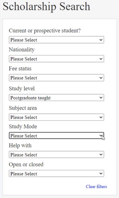
We designed an advanced scholarship search that showed all of the funds and a list of filters. On selecting items from the filter categories the results responded to the users’ information needs by removing the funds that didn’t meet certain criteria, for example:
- Prospective student, current student, alumni
- Nationality
- Fee status
- Study level
- Subject area
- Study mode
- Type of funding – tuition fees, accommodation, fieldwork, living costs
- Open or closed
We prepopulated some of the filters based on coming from the degree finder programme page, such as study level and subject area.
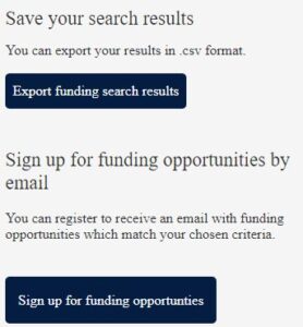
Also added to the search results page were the options to export the results and to sign up for updates so users can be notified of new funding opportunities which match their chosen criteria, or if there are changes to existing opportunities.
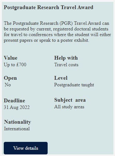
The presentation of the search results included important details like value, type of fund and deadline which are important factors in the users’ selection process.

We created a standardised page for the scholarships profile page with content that had a clear purpose and hierarchy, which was:
- key facts – when it opens and closes, value, duration of award, number of scholarships available, whether an application is required or is automatically considered
- eligibility criteria
- how to apply
- timeline of when a user would be notified about their application
- who to contact if more guidance is needed
What we learnt from testing
We tested with 6 representative postgraduate students (3 offer holders and 3 current students) who all have scholarships.
Insights we gained through the testing were:
Featured programme specific funds
- Specific programme funds were identified: participants understood that the funds shown on the programme page were connected to the programme and they noticed they were eligible for one from the scenario we gave them.
Advanced scholarship search
- Advanced search valued and matched expectations: participants liked having scholarships all in one place and being able to find specific funds that fits their circumstances.
- Results summary was helpful: the key funding information we included in the results was useful and gave participants the information they needed in order to choose between funds.
- Providing filter and sort options: participants liked having the filter parameters to narrow the results and make them relevant to their circumstances. Some mentioned being able to organise the results by sorting them by award value and deadline.
- Filtering parameters were not all clearly understood: some were confused what ‘fee status’ and ‘open or closed’ meant and unsure of its purpose.

Filter parameters for the advance scholarship search
- Choosing more than one type of fund: participants wanted to filter by multiple criteria in the ‘helps with’ category, for example selecting both tuition fees and accommodation rather than having to do two separate searches.
- Missing an apply filter button: participants were unaware that the results were changing automatically and looked for a button to submit their criteria.
- Clarity of search results: participants were unsure how many results returned and how the results were ordered.
- Saving the search results: reactions were mixed to saving the search results but some did like the idea of reviewing and comparing the results offline. The export format wasn’t clear to everyone with some preferring to return to the search to use it when needed.
- Signing up for emails: having the ability to receive personalised emails that met their circumstances was seen as very helpful. They did not want email spam for any funding opportunities.

Facility to export results and sign up to emails
Stardardised layout for scholarships
- Structure of the scholarship page as expected: the structure and flow of the scholarship page met expectations with key facts, eligibility criteria and how and when to apply. The timeline wasn’t expected but was very useful in knowing how long an application would take to be considered.
- Confusing terms not understood: some of the key fact headings were not clear to participants who wanted more clarity on what they meant – ‘opens’, ‘considered automatically’ and ‘duration of award’.
- More detailed information needed: participants wanted more clarity on what was required in the application, whether they needed to answer specific questions to support their application. Some questioned what level of academic achievement is needed to meet eligibility for academic merit. It was also suggested to show previous scholars to give reassurance and to assess their chances of getting a scholarship.
Where next?
We have started to consolidate our work from all of the 6 design sprints. We are looking at what we did, what we learnt, and the similarities from the wealth of information we have. We are also capturing what we didn’t learn and where we need more evidence, which is important when designing for a broad range of audiences and business services.
Our consolidation will help us make decisions on which aspects of our sprint concepts we’ll take forward into a master prototype. This prototype will provide greater detail and cohesion of our services for a future degree finder.
Further testing will then be conducted on the prototype so that we can ensure that we are designing services that meet our student’s needs and provide them with a more consistent and effective experiences.
Learn more about our degree finder design sprints
We’ve been running design sprints since April and writing about our work.


1 replies to “Design sprint 6 research summary: Scholarships and funding experiences”