Design sprint 3 research summary: testing the breakdown of tuition fees
Sprint 3 had us researching and designing potential new features to help prospective students estimate their cost of study. We tested whether students would value being able to calculate their total cost of study, if presented with a breakdown of costs – whether certain, variable or estimated.
The value of design sprints
The benefit of a design sprint is being able to experiment. To come up with an idea, have the ability to quickly determine its value and – critically – validate that idea with the right people. This avoids wasting time pondering whether the idea will work or not.
Design sprints are useful because they make you frame an idea as a question – what problem are we trying to solve – and how can we solve it?
Our sprint questions were:
- Can we present potential costs to students that are clearly indicative and not guaranteed?
- Can we empower students to confidently asses their fee status before application?
This became the hypothesis that the design sprint set out to prove:
- We provide prospective students with a tailored study cost based on their individual circumstance, and a clear contact route if their particular circumstance means this can’t be easily determined.
Known issues with understanding the cost of study
Cost of study is a key factor for prospective students and their sponsors who are looking for certainty regarding the total cost of the fees for postgraduate taught. Therefore we need to make it clear what this full cost of study is likely to be, even if this cost is estimated.
Known issues include:
- Cost of study can be tricky to work out, particularly for study that spans multiple years e.g. part-time over 6 years instead of 3 or an online programme. There’s also a lack of clarity whether fees presented are for one year.
- Fee status is estimated by the applicant and confirmed by the university. The process is vague, meaning students can make mistakes when determining their fee status.
- Study mode might not be presented to students at the right stage of the user journey and isn’t always clearly described. Part-time intermittent fees, in particular, are hard to locate.
- Presentation / user Interface design could make relevant information more obvious. The website doesn’t always direct students down clear paths, there’s a need to go back and forth between pages and to remember information as they explore numerous locations in the website.
Our prototype
Our prototype is not a complete solution, indeed that’s not the point of a sprint.
The idea is to look ahead to the replacement of our current degree finder without worrying about a full solution right away. So we’ve zoomed in on the problem – understanding the total cost of postgraduate taught study – then prototyped and tested on representative students.
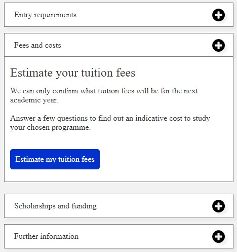
Our prototype presented an ‘estimate your tuition fees’ feature within a degree finder entry page for a PGT programme.
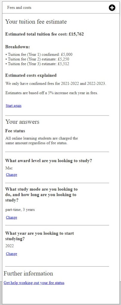
Participants would complete a form answering questions about the type of programme they were looking to do (fee status, award level, study mode, duration, start year) which ended with a tuition fees estimate and breakdown of costs.
The prototype allowed us to actively see whether our idea has any value, without asking participants to imagine and speculate, which is unreliable.
User validation
For our idea to succeed we need to know if it provides a solution to our problem.
The goal was to see if prospective students would value being given a breakdown of costs and assess whether they have understood that certain costs are estimated.

Our prototype of a programme page that we tested with 5 representative postgraduate students
This is where design sprints is a good approach to test ideas with representative users. We tested with 5 representative PGT students:
- 3 current students studying on-campus at the University of Edinburgh
- 1 current student studying at a Canadian university
- 1 international student considering PGT study in the UK (looking at various study options)
We created a task scenario where the participants were clear on what they had to do but which was also something they could relate to. The scenario required the users to complete 3 tasks:
- Find the cost of study for a Masters degree in History
- Select the relevant fee status
- Calculate and compare the cost for both online and part-time options available

Breakdown of tuition fee costs for the duration of the 3 year masters degree
What we learnt
The results showed us that our prototype of the ‘estimate tuition fees’ feature was helpful in providing relevant information in one place – rather than the disjointed experience that many have had when calculating costs.
Other insights we gained from the testing included:
- The display of the breakdown of tuition fees was helpful: participants found the breakdown information useful and clearly laid out. They understood and appreciated that the total was estimated due to yearly fee increases.
- Clarity on yearly increases: although it was clear to participants that fees increased every year some did question what caused this and why it had to happen.
- Further explanation needed: some participants wanted an explanation of what they are paying for – rather than just being presented with a number. What do the tuition fees cover and what they don’t.
- Multiple steps, multiple times: Participants felt there were too many steps to get an answer and had to repeat this to be able to compare other costs. They wanted to see all the values in one area, side by side, or in a table. This could have been influenced by the task we gave them.
- Other student costs: There was an expectation to see other costs other than tuition fees such as field trip and course materials. Accommodation and living costs is also a major consideration when it comes to costs and is important when factoring the total cost of study.
What’s next?
We have two more design sprints to go, entry requirements and scholarships, after which we will be consolidating everything we’ve learned to understand and reimagine a master prototype – which we will test further and iteratively improve.
Design decisions are only effective if they work for our end users, if they are to understand and use the service.
To achieve this we have to base our decisions on user research, understand user goals and barriers, and uncover opportunities that we can provide to help users complete their goals successfully and effortlessly. Design sprints have allowed us to do just that – come up with ideas to problems and confirm whether we are on the right track.
Join us at our next research playback event on overseas entry requirements


1 replies to “Design sprint 3 research summary: testing the breakdown of tuition fees”