How we run our content ideation and prototyping workshops
During our collaboration project with the Student Immigration Service, we kicked off developing each new piece of content with an ideation and prototyping workshop. In this post, I recap the format of these workshops and what we learned from them.
What ideation and prototyping workshops are
Ideation and prototyping workshops are the first step in our process to develop a new piece of content.
Before we write any sentences, we generate ideas and concepts that can get us to a point where we are ready to start writing.
The workshops take us through a process to:
- assess issues with the current content (how is well it is currently addressing what users need?)
- come up with ideas for new content (what can we do to meet those needs?)
- sketch outlines of new content (what might a potential solution look like?)
By the end of a workshop, we will have aligned on a version (or multiple versions) – the prototype(s) – of the content we’re working on to take forward and develop further.
Format of the workshops
The format of the workshops follow these steps:
- Review the user stories and current content.
- Come up with ideas for how to improve the content.
- Sketch ideas for what the new content could be.
- Share ideas as a team.
- Resketch ideas following feedback.
- Share ideas again and start to develop a prototype.
Review the user stories and current content
We start each workshop by reviewing the user stories we had agreed with the Student Immigration Service for the area of content we were working on. This is to remind ourselves what the content needs to do.
We then review the current content that existed for this topic on the Student Immigration Service site. My reason for including this activity is to help the team familiarise themselves with the finer details of the subject area.
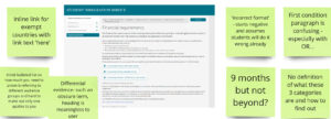
Our comments assessing what was then the current content on financial requirements.
We add comments about:
- parts of the content we found confusing or had lingering questions about
- information we thought was missing or not answering the user stories
- style or formatting that made the content hard to read (and thus we wanted to avoid in future designs)
Come up with ideas for how to improve the content
The next part of the workshop is a ‘how might we’ exercise, a popular design thinking activity. In it, we come up with ideas of how might we better answer the user story we’re working on. For example, ‘how might we help students figure out what criteria they must meet for the student visa financial requirements?’
This is a helpful step because it allows us to share ideas for what could be in our sketches before we start drawing anything out. It can be difficult or daunting to come up with a sketch from scratch, so the how might we ideas can be a useful starting point.
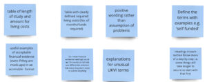
Post-its for the how might we exercise.
Sketch ideas for what the new content could be
With ideas generated for how we can improve the content, we move on to sketching new content solutions. We often used ‘crazy 8s’ as the format for this – sketch 8 ideas in 8 minutes. In reality, we usually could only sketch 2 or 3 ideas in 8 minutes.
Because of this, I adapted the sketching exercises for each sprint. For example, if we were working on a content topic that was likely to be multiple webpages, I’d give us 16 minutes to sketch out 1 or 2 ideas.
Sketching out content looks a bit different than, say, a new interface. They do ultimately look like rough drawings, but we put more emphasis on thinking about the wording in our content.
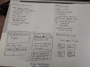
An example sketch of a new idea for financial requirements content.
Our sketches are a good place to try out new ideas for effective:
- page titles
- summary sentences
- subheadings
- calls to action (what we want students to do on a page)
Share ideas as a team
With initial sketches done, the next step is to share our ideas with the rest of the workshop participants. We go around the table (or video call) with everyone holding up their designs and talking through what they created.
We then highlight or star the sections of the sketches we like best, whether we like a particular wording or use of a formatting element to display the content.
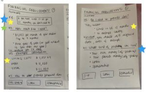
A sketch with areas starred that the team liked.
Resketch ideas following feedback
Feedback in hand, we do another round of sketching. This time, we mainly focus on developing one of our original ideas more fully.
Sharing our first round of sketches provides some valuable insight for creating this new sketch.
We both:
- know what ideas were well-received by other team members
- come away inspired by ideas we’ve seen in other people’s sketches
Share ideas again and start to develop a prototype
We again share our new sketches with the team. At this point, we discuss the direction we should go in for starting to develop a prototype of the content:
- Do we each want to develop our own ideas further?
- Do we want to choose two ideas to develop?
- Do we want to focus on one idea and develop it together?
Our decision changed from workshop to workshop. If our ideas were going in different directions, we each developed them further or developed two. If our ideas were roughly similar, we worked on something together.
In either case, we normally start drafting content in Miro or a Word document. Once we have enough content to show our subject matter experts in the Student Immigration Service, we can also build the content in our CMS, EdWeb.
From then on, we work hand-in-hand with the Immigration Service to develop the content together before testing, refining and publishing.
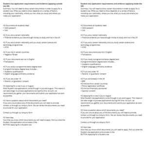
A protoype in Miro for document checklist content.
What we learned from our ideation and prototyping workshops
A good opportunity for in-person collaboration
We tended to run these workshops in our office as we felt this work benefited from in-person collaboration and was a nice break away from a screen.
However, we always had a backup workshop board in Miro if we needed to run the workshop online or hybrid. The Miro board also became the repository from any pictures of our post-it notes and sketches from the workshop.
Limit the number of prototypes you develop
As mentioned earlier, we would decide each workshop how many sketches we wanted to take forward and develop into prototypes.
We felt, though, that it’s best to not develop more than 2 prototypes. We found it was a better use of time to combine our efforts and work on prototypes together, rather than everyone develop a prototype individually.
For example, each of the content designers originally developed their own prototypes for the financial requirements content. We then developed a single prototype incorporating elements from everyone’s ideas, but found it was difficult to develop something cohesive from multiple ideas.
From then on, we would only develop 2 prototypes if we were torn between different ways to present the content and wanted to get the Immigration Service’s feedback first or decide to test both.
Put your prototype in the CMS sooner rather than later to see how it reads
Finally, we found it beneficial to add our initial prototypes to a test section in our CMS sooner rather than later. Sometimes what we thought was a good idea when we were writing it in a Word document, ended up not reading well when in the CMS.
This meant we needed to play around with features or formatting to make sure the content in the CMS was easy to read and encouraged the right calls to action.
Learn more about the project
You can read more about the work we did in our immigration project in our posts on this blog.


