
Usability testing of new programme search and page navigation features
Last year, we carried out usability testing around the proposed search and filter interface for the future degree finder. We also tested the effectiveness of updated navigation features to help users orientate themselves on programme pages. We were pleased to see students encounter no major usability issues when interacting with these.
Purpose of this testing
The main purpose of this work was to test new features we had been developing:
- a unified search integrating undergraduate and postgraduate study levels
- search results filters
- in-page navigation on desktop and mobile
Our search solutions were the third iteration of designs we originally started at our design sprints in 2021.
Our solutions for in-page navigation were to address issues we observed while carrying out usability testing for the undergraduate degree finder beta programme page.
Page navigation design
Issues observed on the undergraduate beta programme page
We launched a beta of our undergraduate programme pages in summer 2023, where we conducted both analytics and usability testing to find out how users interacted with these pages.
From analytics, we learned that:
- there was low use of the in-page navigation we originally designed
- users had negative feedback about the length of the page and difficulty finding content
During usability testing, we observed:
- participants finding it hard to orientate themselves on the programme page
- excessive scrolling and inability to locate page sections, on mobile and desktop
- participants not using, or sometimes not seeing, the in-page navigation on desktop
A number of these issues stemmed from programme pages being very long. In effect, our programme entries are displaying multiple pages worth of content, but design constraints outside our control meant we needed to design a single-page solution.
We tried to make the best solution we could under these constraints, but it was clear we needed to do further design work to mitigate these issues.
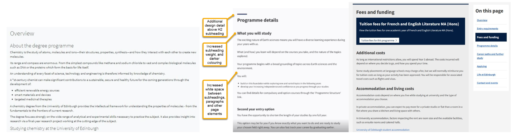
Navigation design changes to address beta issues
We made a number of changes to address these issues around navigation and orientation.
On mobile, we changed the in-page navigation to an accordion style interaction pattern. This was to help with the excessive scrolling issues we saw on mobile, where users could only access the in-page navigation from the top of the page.
On desktop, we made styling changes to make it easier for people to identify the different sections of programme pages. We:
- added a visual container around (and space between) page sections to make it clearer when one logical grouping stopped and another began
- added a visual container around the in-page navigation to make it stand out from the page background, and stronger highlighting of the active section to make it easier for the reader to see where they were within the whole page
Evolution of design changes since 2021 to improve navigation and orientation on degree finder programme pages.
Search and filters design
Aside from the usability issues we addressed around in-page navigation, we also tested new designs for a programme search interface.
Our first search prototype from design sprint 1 in 2021
The existing degree finder search was split by undergraduate and postgraduate. However, our plan for the future state was to combine these into a single search.
We first explored this in our design sprints in 2021, using a static wireframe prototype, focused on finding postgraduate programmes. A static wireframe uses screenshots to create a non-interactive representation of how a webpage or series of webpages will look and behave.
Design sprint 1 research summary: Testing a prototype for a new degree search
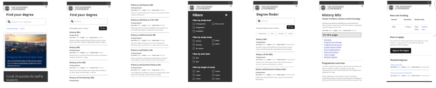
Static wireframe prototype of combined undergraduate and postgraduate search interface.
Using a static wireframe, we learned:
- some users prefer to see a full A to Z list, rather than search and filter, which they find too limiting
- mixing undergraduate and postgraduate in the results confused people
- filter button placement didn’t work well (participants didn’t see it)
- there was a need to review use of the word ‘filter’ (low understanding of its meaning and function)
- there was confusion over whether applying the filter would ‘add’ items to or ‘remove’ items from the list of search results
- there was a desire for a college and school filter
Iterating on results from design sprint 1 in 2023
In 2023 the team workshopped the learning from design sprint 1, this time while we were focused on seraching for undergraduate programmes.
Heike produced a wireframe of the outcomes of that workshop for search and A to Z listing.
Search and filter iteration after design sprint 1.
We also created a prototype for an A to Z listing, after learning in the design sprints that students wanted a full listing of programmes.

A to Z listing iteration after design sprint 1.
Read Heike’s post about creating this prototype
Creating the latest search iteration in 2024
To take the work into the next iteration, we needed to make a clickable prototype of the proposed feature for development. To get there, our team had to work collaboratively to answer a series of design questions.
What should the search interface do?
We had to answer many interaction design questions about what the interface should do and how it should behave. For example, what happens when people don’t use the provided search button? Do they see everything, or nothing?
Is our chosen design for the search interface effective?
To assess whether our design was effective, we needed to answer questions about how users interact with it:
- Do people see and use the dropdown to change study level?
- Is the display of search results effective?
- Is the pagination (numbering of the results pages) useful and usable?
- Is the placement of content effective (for example, how do users understand the results header which shows the number of results returned?)
- How well do users understand what the results are showing?

Location of the search panel on the study site homepage in our prototype.
What is the most effective way to present the filter function, and how should it behave?
On mobile, we needed to assess the placement of the filter button and the behaviour of the filter interaction.
Search results page in the mobile prototype.
On desktop, we wanted to evaluate behaviour of tags showing the filters that have been selected and applied and how users interact with them.
On both desktop and mobile view, we wanted to assess:
- how people use the ‘Refine results’ feature
- user understanding/awareness of selected filters
- how users expect filters to behave
What we observed in the testing
We performed usability tests with 10 prospective or current postgraduate students, with roughly half on desktop and half on mobile.
The results were overwhelmingly positive.
Search panel
- Nobody accidentally searched for undergraduate. All participants used the dropdown in the unified search panel to filter for postgraduate programmes.
- The presentation of search results was understood, and the pagination was easy to find.
- We saw a 50-50 split in initial navigation choice, with half of participants choosing to use the search box and half clicking through to the A-Z list.
Filtering search results
- Filters were easy to find, and their use was intuitive. At least two participants used this feature without prompting in an unrelated task.
- Participants showed clear understanding of how to apply filters and remove what had been applied.
Page orientation
- No excessive scrolling.
- Everyone found the content they needed when moving between sections on the programme page.
- Moving between the sections on the page was quick and easy.
- On desktop, everyone saw and used the in-page navigation and was also able to locate the relevant page sections without using it.
What we went forward with
After seeing such positive results in the usability tests, we went forward with developing what we prototyped, with a few concessions we had to make.
For search, we were able to develop almost all the design features we prototyped and tested. However, due to technical constraints, we were unable to develop the feature which gave users the ability to see which filters they have applied and to remove each one or clear all of them.
For in-page navigation, we could develop that as intended, but were unable to implement the feature boxes with accent colours, as this requires greater discussion first with colleagues who look after our pattern library.
See the search interface and in-page navigation for undergraduate programmes
Our postgraduate programmes don’t go live until October, but you can view the search and in-page navigation features for our undergraduate programmes, which launched in March.