
UX Scotland 2018 — my day-by-day notes
I set myself the challenge of writing a summary of each session I attended at UX Scotland, as a way of forming my own thoughts on each topic, and to make sure to follow up on everything I wanted to.
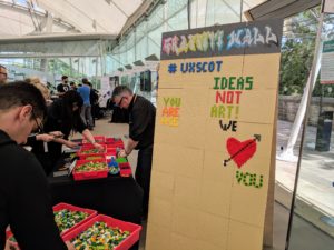
Lego graffiti wall at UX Scotland
My colleagues and I have already each written about our top three sessions.
But I attended 12 other sessions during the conference. Even though some of those sessions didn’t quite live up to my expectations (as is inevitably the case), in looking over my notes I have found that I took something of value away from almost every session.
This resulting blog post is long. But I am sharing this on the basis that others might find it useful and seek to learn more about these topics, as I did.
Day 1
Designing services using DesOps in the industrial revolution 4.0
The conference kicked off with Peter Fossick. He argued that design thinking techniques, which have been around for 30 years, are no longer suitable for today’s problems.
With design thinking having been created in a “data-poor, analogue world”, he argues that it is too slow and laborious for “industrial revolution 4.0”, which he defines as cognitive (in other words, the rise of artificial intelligence and machine learning).
He also argued that “big wow diagrams” such as experience maps are too slow to work with, and the situation has changed by the time you produce it and work with it. It wasn’t the last time this conference I would hear doubts expressed about experience mapping.
User-centred content
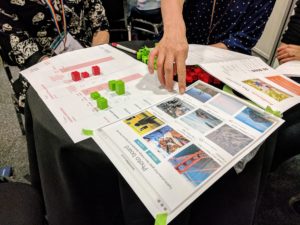
Grading the effectiveness of content with Lego bricks
I was particularly looking forward to this workshop from Helen Triggs and Mike Dunn from Edo. This topic had the greatest crossover with the editorial and content design that makes up the bulk of my role.
In groups, we used Lego bricks to score fictitious items of content against user needs and business objectives. From there, we identified ways in which the content needed to improve based on the scores we had given them.
Balancing user needs with business objectives and feasibility is a fundamental of UX. This method introduced a fun way to think about how to evaluate content.
In a sense, it was reassuring that this is very similar to the way we talk about prioritising requirements by developing a report card of user needs and business objectives — a technique popularised by Louis Rosenfeld:
Stop redesigning and start tuning your site instead — article by Louis Rosenfeld
This Lego technique is a slightly different method, but the same fundamental approach.
UX methods for helping your customers help themselves
Jay Brewer and Thao Doan from Rapid7 talked through their work to improve self-service. I was interested in this, because improving self-service is a big focus of a lot of our work. For example, it is central to our ongoing work with IS Helpline:
A year of continuous improvement with Helpline
The most interesting aspect of this session was their explanation of how they use Net Promoter Score (NPS). This popular marketing metric has been a hot topic of debate after it was placed under scrutiny by Jared Spool earlier this year.
Rapid7 outlined how they found the score itself unhelpful. But they continue to use the NPS survey when targeting it on specific experiences. They say the comments that come with NPS are very useful.
For people who give a positive score, responses give a clue about what your customers are using right now. For negative scores, the comments help you understand what’s going wrong. If you can contact these people, you can then do further research with them.
Bridging the 3,000 mile gap between your users and you
FanDuel are based in Scotland, but their main market is the US. In fact, they have 6 million users — more than the population of Scotland.
This was of interest to me, because the ESPA project I was involved in last year involved undertaking user research with people based in Asia and Africa.
Moreover, the University of Edinburgh is an international university, with students coming from two thirds of the world’s nations. So we may find ourselves researching the needs of prospective international students.
So I was keen to find out if there was anything I had been missing.
Sarah Morgan from FanDuel outlined how they approach this challenge. They most commonly use one-to-one interviews using video conferencing software. This is exactly what we did with our research for ESPA.
But Sarah Morgan also outlined how FanDuel use diary studies to fill the gaps in their understanding. Diary studies are less common than some user research methods, because they are costly to undertake. But Sarah Morgan described how they are perfect for FanDuel’s case, in that it helped them understand blind spots in user behaviour, when their users are thousands of miles away.
Be more certain: A practical approach to research practice
The most useful and interesting session of day 1 was from Gregg Bernstein. He contrasted his experience working in his two most recent roles.
When at MailChimp, he had a well-established UX team who had the budget to travel across the US to research with their users. But when he moved to Vox Media, he found himself being the only user researcher for a network of 300 websites with a staff of around 1,500.
Gregg Bernstein’s fundamental premise was that there should be “no dogma and no gatekeepers”. In other words, you don’t have to do user research the textbook way, and you should make it as accessible as possible to everyone. Any research is better than no research.
Again, this is fundamental to the way we approach user research. No matter what your timescale or budget, there is a way of getting closer to understanding your users — and most approaches can be scaled up or down. The important thing is to figure out what suitable method is achievable, and finding the quickest, cheapest way of validating your hypothesis and improving your understanding.
I especially enjoyed Gregg Bernstein’s point about a small sample size being a large opportunity. When people ask him if a sample size of 73 can yield statistically significant results, he replies, “I don’t care! It’s more than we had before.” Or as he put it, “One story is better than no clue.”
This session also reminded me a lot of Leah Buley’s excellent book The User Experience Team of One.
The User Experience Team of One book
Day 2
Systems, discontinuities and thinking beyond UI: key questions for designing connected products
Day two saw a keynote talk from Claire Rowland, an internet of things (IoT) expert. IoT is in that funny space on the Gartner hype cycle, somewhere between peak hype and the trough of disillusionment — with opinions tending to lie at either of those extremes.
Clair Rowland’s talk was refreshingly realistic about IoT, succumbing neither to the breathless hype, nor the dampened cynicism. While not so much of our work touches on IoT yet, it will inevitably become a greater focus in the coming years. Regardless, many of the principles Claire Rowland covered are applicable to wider UX cases as well.
Practising creativity
John Lloyd from Hilton Worldwide talked through how he pursued “intentional practice of being creative” by drawing on whiteboards. He sought to explain how this made him a better designer.
One anecdote I appreciated from this session was the idea that Bach valued quantity over quality. He wrote at least 1,128 compositions, and is estimated to have written an average of one composition every 16 days in his adult lifetime.
My own further online research suggests that Bach did not set himself a schedule of writing compositions regularly. But he was certainly prolific. The quality came from quantity.
The lost art of task modelling
I was really inspired by Jesmond Allen’s session on task modelling. I had not really come across this technique before, and Jesmond’s synoposis said that task models have become “eclipsed by experience maps and service blueprints” in recent times.
It did strike me that task models are essentially doing a similar job to experience maps, but in a different format. But the fundamental difference is that a task model focuses on one specific task, and plots the decision points a user goes through when completing that task.
What seemed particularly useful about task modelling was that it can often be mapped to an interaction flow. This means it can directly inform an interaction design or information architecture in a way that an experience map can’t.
During her session, Jesmond said that it is often difficult to design using an experience map. When I asked Jesmond more about her thoughts on experience maps later on in the conference, she explained that in her experience, they were often overwhelming and difficult for some stakeholders to understand.
Following Peter Fossick’s comments on day one, this was the second time I had heard doubts raised around the value of experience mapping.
For me, what matters is what you do with it. If you don’t have a plan of action and a way of prioritising the issues an experience map highlights, it will indeed be difficult to work with. In that sense, the map by itself may be overwhelming. But I still think it is a useful tool to understand the full picture of what’s going on, which is essential if you are involved in running a product or service.
Day 3
Changing the remit
Day 3 began with a keynote from Kate Tarling. The remit she wants to change is that of designers. She sees a need for designers need to get involved in designing organisations in order to make better services.
An organisation needs to define what a service means to it. A service should reflect what a user needs, when the organisation has to achieve a particular outcome. Organisations should be structured around these services. We can make better services by designing better service organisations.
Expecting the unexpected: Designing for edge cases
Scott Logic’s Courtney Yule drew a distinction between expected edge cases and unexpected edge cases.
There are edge cases that can be anticipated — such as humans making mistakes, or technologies failing.
On the other hand, unexpected edge cases cases are about those unknown unknowns that take longer to discover, and require more complex solutions. Courtney Yule talked about how we need to try to cover more of the edge cases by making more of those edge cases expected ones.
UX and the spaces in between
From being at the edges, it was now time to go to the spaces in between. Kevin Richardson explained that boundaries are interesting places. He drew a comparison to ecotones, where ecologies are in tension.
In UX, he sees three areas of tension:
- Usability — Often application-specific and easy to fix, most of us are able to achieve this.
- Understanding what people want — The interaction-focused work that makes an application useful. You can have a long career simply by stopping here.
- Understanding what people need — This is where innovation lies, and involves improving people’s lives in ways they could not have requested or imagined for themselves.
This is about going beyond what people tell you they want, and figuring out what they need. These are ‘latent requirements’. Businesses don’t get it, and even users don’t get it. But as designers, it is our job to interpret information to understand what people truly need.
A new IA for NHS.UK
I was particularly looking forward to this session from Sophie Dennis, having seen the same speaker’s strategy session the previous day. Information architecture is a big part of my work, so I was keen to learn how a highly complex organisation like the NHS is tackling it.
The NHS need to create structures that hide the complexity of the organisation from users, while still allowing them to navigate the system.
A lot of the NHS’s existing information architecture principles are based on print ideas. Parts of the website are like an encyclopedia, a magazine, or a directory. Some of that content is valuable, so they don’t want to throw all that away.
But they need to direct people to action-oriented information and tools to help people make better decisions. So don’t talk endlessley about the causes of a blister. Just tell them what they should do about it.
Sophie talked about the five different information-seeking modes that people have. The NHS currently only supports one of those modes adequately. Sophie illustrated the complicated nature of the “why do my bits itch?” journey.
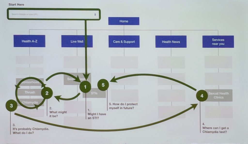
NHS Digital “why do my bits itch?” user journey
At present, with the “health encyclopedia” structure, users have to jump around between various different sections of the website to get all the information they need. The new approach is to start with practical, actionable advice for someone who has been newly diagnosed.
Finally, Sophie talked about one case where digital cannot be as good as a human face-to-face interaction. That’s where we have to pick one set of language and stick to it. For the NHS this is “the pee, poo and fart problem”. A certain segment of the audience doesn’t like this. But the NHS has an obligation to make their content as accessible to as many people as possible.
More about UX Scotland
I wrote about my top three sessions in our team’s write up of the conference:
We also have posts about each of the previous UX Scotland conferences:
1 replies to “UX Scotland 2018 — my day-by-day notes”