The elements of a better user experience in Learn
As part of the Learn Foundations project, we have carried out a programme of quantitative research to ensure a user-centred approach to solution development.
The Learn Foundations project team wanted to develop a new template using a user-centred approach. This template would be designed to introduce more consistency between different courses in Learn. But it also had to support a diverse variety of needs across different courses, supporting different Schools, Colleges and teaching needs. It also had to be developed quickly.
We took inspiration from a classic user experience diagram to ensure this new template could be built on firm foundations.
The elements of user experience
This diagram was developed in 2000 by Jesse James Garrett. While some aspects of the language now seem a little dated, the principles of the approach remain valid to this day.
The elements of user experience diagram
It shows how designing a good user experience requires us to move through five planes of understanding.
Before considering anything else, you must first establish a strong understanding of user needs and business objectives.
Once you have understood what those are, you can begin to identify functional and content requirements.
After that is established, you begin to consider information architecture, before moving on to information design. Only then should you consider the visual design.
Research methods to support these elements

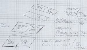
The sketch that started it all – mapping our requirements and proposed research approaches to the Elements of UX diagram
Our programme of quantitative research was specifically designed to move us up each plane of the diagram in a methodical fashion.
- User needs: Top tasks survey with students to understand students’ needs around accessing course materials digitally.
- Business objectives: Top tasks survey with staff – We asked staff to tell us what they thought was important for students to do when accessing course materials digitally, to develop our understanding of business requirements.
- Content requirements: card sorting with students to understand how students would group items together in Learn. This informed the first draft of the new information architecture.
- Information architecture: tree testing with students to test a prototype navigation menu without having to build a full-blown prototype Learn course.
- Information design: first click analysis on visual prototypes of the new template to understand if users knew where to go to complete common tasks in the new design.
These studies have attracted a total of 4,585 responses from students and staff. This is a phenomenal response, and it has been great to get this high level of engagement from our users.
At each stage of the process, we have learnt valuable information. Each of these studies has both informed how the following study should be conducted, and given us valuable data to inform the solutions being developed by the Learn Foundations project.
In conjunction with the qualitative elements of our user research – interviews and usability testing – this has enabled us to build a very rich picture of what users of Learn are currently experiencing – and a clear direction in terms of how we can improve it.
Forthcoming blog posts will go into each of these strands of quantitative research in more detail, explaining the methodologies and our key findings along the way.
Video
In this video, I briefly introduce the elements of user experience diagram, and explain how our programme of user research moved us up the planes.
Find out more
If you would like support on developing a user research plan, visit the User Experience Service website to find out more and get in touch.


Funny to see a scribble I made on the spur of the moment in a meeting about a year ago make it into your blog post!
Full credit to Jesse James Garrett though, of course…
Neil, your sketch was the pivotal moment. It’s been on display on my desk as inspiration ever since!