
Optimising what’s important – Get to know your long neck
In most walks of life, a small number of things are significantly more important than the rest. To be effective as the manager of a web presence or service, you need to know what matters most to your target audiences. Fortunately this is fairly easy to do.
We see these top items, top priorities, top tasks everywhere. In this post, I’m looking at some examples that crop up most commonly in my work:
- Goals when visiting a website
- Web page popularity
- Search term popularity
- Features in a piece of software
In all these scenarios and more, a small number of items are significantly more important than the rest. When you analyse your website, or survey your users, then graph responses from most to least popular you always get the same result.
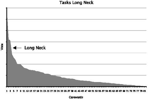
A top task graph by Gerry McGovern, showing the small number of tasks forming a ‘long neck’. Source: Customer Carewords website
Digital strategist Gerry McGovern has written extensively about this, graphing data to produce what he calls a ‘long neck and long tail’. I discovered Gerry’s work about 10 years ago and have been using his technique and disseminating it within the University ever since.
It’s not especially revolutionary; in fact it’s incredibly simple. But then, the best concepts usually are.
The long neck is everywhere
You may not have heard of Gerry McGovern, but you may have heard of the Pareto Principle, or the 80/20 rule.
Management consultant Joseph M. Juran suggested the principle and named it after Italian economist Vilfredo Pareto, who showed in 1896 that approximately 80% of the land in Italy was owned by 20% of the population. Pareto developed the principle by observing that 20% of the peapods in his garden contained 80% of the peas. (Source: Wikipedia article on the Pareto Principle)
The graphs themselves are roughly similar to Zipf Curves, named after the American linguist George Kingsley Zipf who observed that in any given language, the most frequent word will occur approximately twice as often as the second most frequent word, three times as often as the third most frequent word, etc (Source: Wikipedia article on Zipf’s Law)
Some examples from around the University
The list goes on and on, but I’ll run through a few examples here just to illustrate the diversity. You’ll notice that the curves are smoother in some cases than others. When there is a small number of items, or when the sample size is smaller, this tends to happen.
Top tasks
I’ve run top task surveys for many years to support the redevelopment of University websites, particularly in support service areas. They’re pretty quick and easy to execute, and I run through how to do this for yourself a little further on.
The first time I tried out Gerry McGovern’s technique was in 2007 when I asked staff at the University why they use the website on a day-to-day basis. I offered about 70 choices, and gave participants the chance to choose up to 5. About 350 colleagues took part.
- Top 2 tasks – 25% of votes
- Top 6 tasks – 50% of votes
- Top 20 tasks – 80% of votes
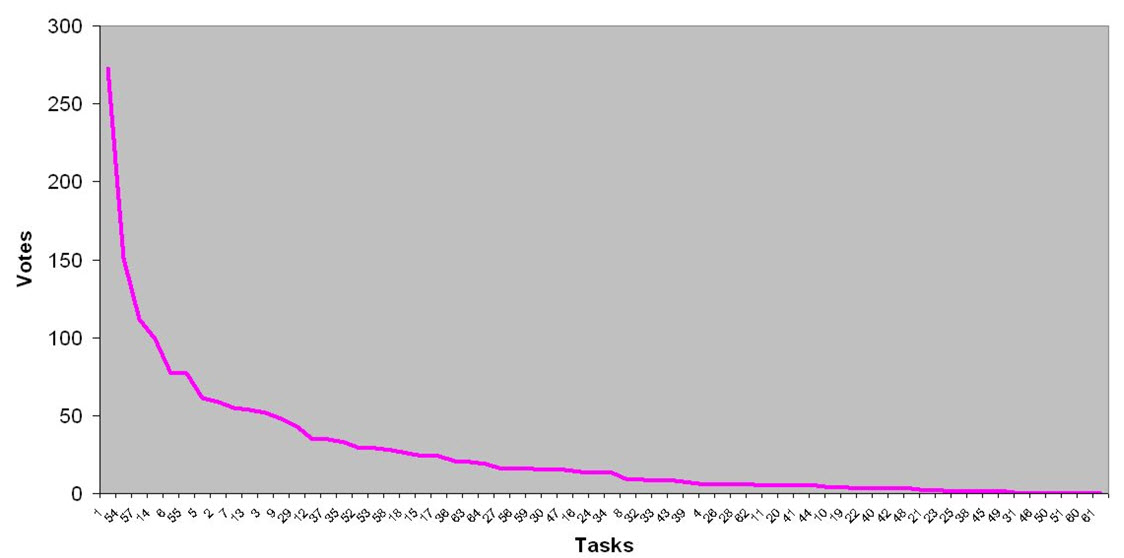
Top tasks for staff using a University website in 2007. Number 1 task – contacting people.
The top task – finding people’s phone and emails – was twice as popular as the second most popular task. And I expect that if we’d asked staff about their top tasks at any point in the University’s 500 year history, getting in touch with colleagues would figure up at the top.
University staff online task survey report (November 2007) – PDF download
And this pattern of a small number of tasks being disproportionately important comes up repeatedly. Here are graphs from a few other website top task surveys conducted in the same way:

Information Services website top tasks

Accommodation Services website top tasks
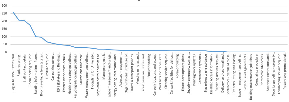
Estates Department website top tasks
Website top content
As you might expect, if there is a small number of tasks significantly more important than the rest, there is always a small number of web pages that are also disproportionately popular. It’s always interesting to compare demand for content against service top tasks as a means to expose opportunities for website enhancement. Of course the top content of a website can be skewed by the site’s structure; content that should be in high demand doesn’t get as many visits as expected because it’s difficult to find, for example.
Here are just a few examples from work recently done by our team to support an enhancement project we’re working on with Student Experience Services.
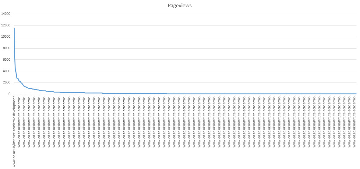
Top website content for the Institute for Academic Development
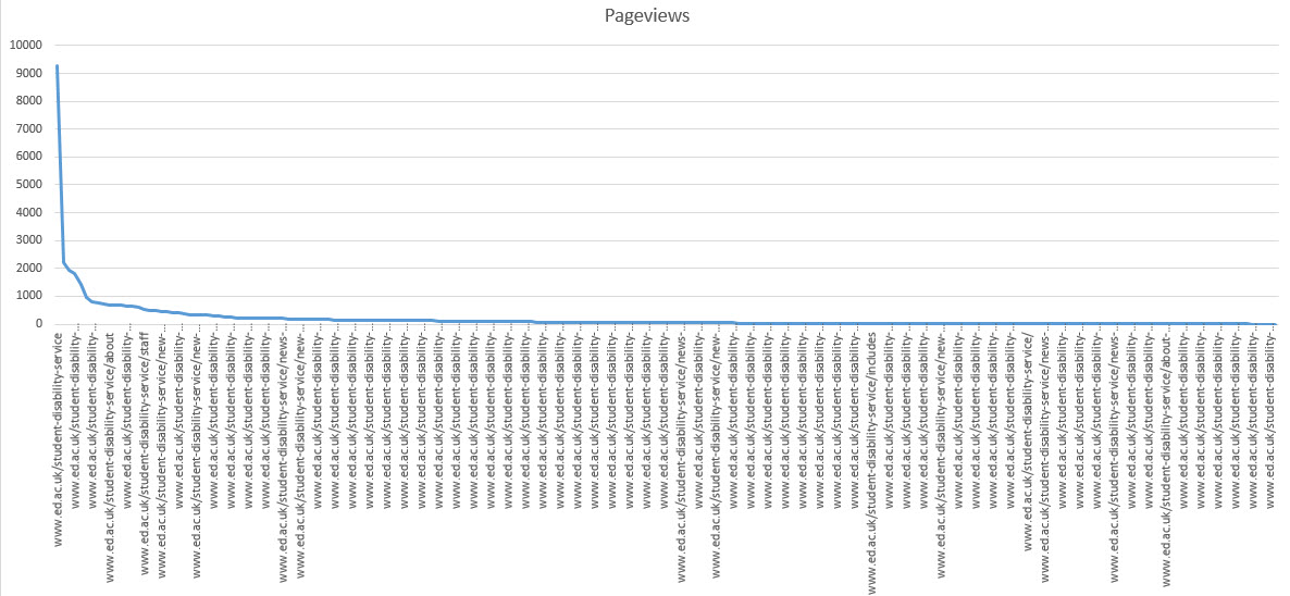
Top website content for Student Disability Service
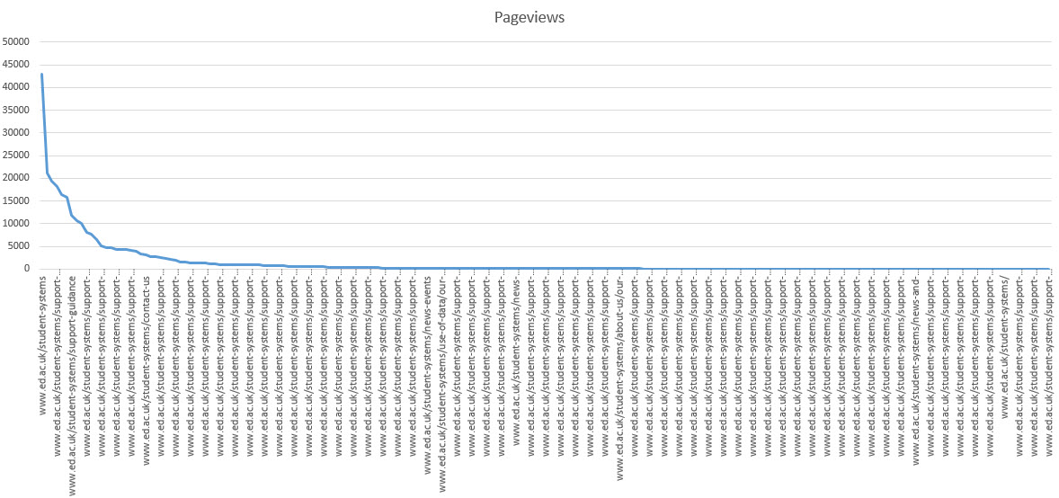
Top website content for Student Systems
Across the 10 business units associated with current student support that we’ve been working with, on average:
- 5% of the pages accounted for half of all page views
- 73% of the pages (in the long tail) attracted only 10% of page views
The message here is clear – and it’s one we hammer every month in our Writing for the Web training – web publishers should cut pages in the long tail that aren’t essential for business objectives, and should focus their attention on ruthlessly optimising the pages that attract the most visits (as it’s here that you’ll see the greatest return on investment of your efforts).
Search terms
By now you’ll hopefully be spotting a pattern. Just one more example relating to website user behaviour – search terms. Guess what? A small number of terms are searched for on your website way more than the rest.
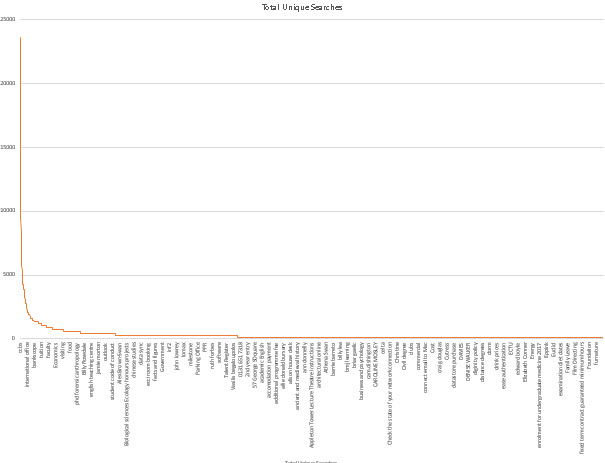
The top 5000 unique search terms for the last 12 months on the University of Edinburgh website
In the past 12 months, we recorded 2,445,745 searches for 10,262 search terms. The graph above shows the top 5000.
The top 153 terms account for 20% of all searches.
You should know what the top search terms are for any website you manage, and regularly check to make sure that the most relevant results appear at the top. We do this regularly on behalf of the University as a whole.
The most visible example of us taking action based on this is the introduction of a MyEd portal login button to every page on the website in 2013 when we observed ‘MyEd’ to be the most commonly used search term.
IA pioneer Lou Rosenfeld wrote an excellent book on the topic called Site Search Analytics, and it’s our key point of reference in our editorial approach to site search management. If you’re interested in a quicker familiarisation with this discipline, I pulled together some excellent resources on my personal blog a few years ago.
Feature prioritisation surveys
If you are familiar with agile development, you will no doubt spot the similarity between top task surveys and poker chip prioritisation (or dot voting). Top task surveys are basically an electronic version.
I used them for years as a means to canvas our Polopoly CMS community about what features they’d like to see developed next. On the CMS user support wiki we have a load of ongoing discussions, sometimes initiated by us, sometimes by users. Every year I would use these topics as a basis for a prioritisation survey.
Here is an example results graphs in which you can broadly see the long neck-long tail pattern despite the smaller sample and smaller number of items. I found this to be a great way of reporting on progress (“you said – we did”) and putting loud voices championing something that didn’t deliver benefit to the majority into perspective
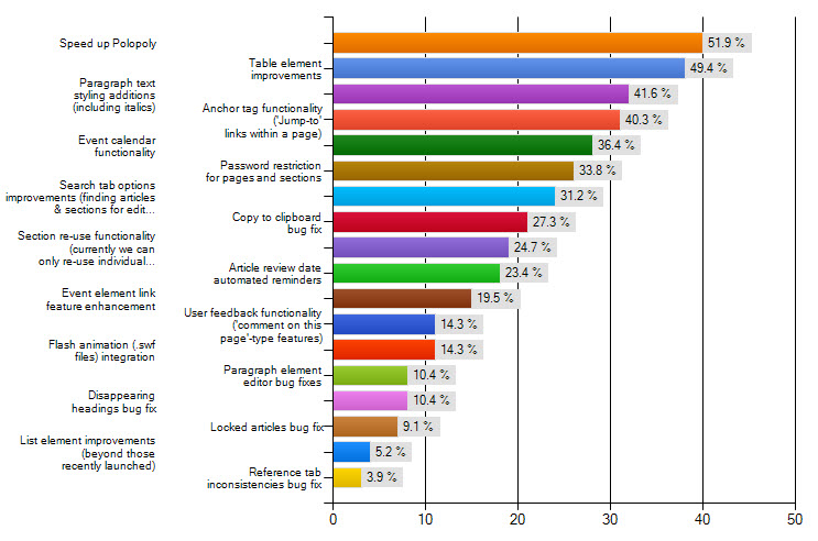
Every year we surveyed the Polopoly CMS user group on areas they wanted us to prioritise for development
.
We also used this approach when asking the CMS user group what features were most important in a new CMS, at the outset of the EdWeb project. By asking some basic questions about CMS usage and skills, we could then produce multiple graphs to reveal what was most important to the techies, to the marketing people, the occasional users etc and this data fed into our personas too. (This data supplemented usability research and focus groups we also held at the time.)
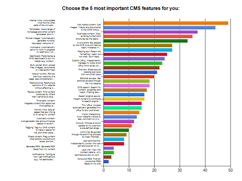
Before embarking on the EdWeb CMS project we surveyed users on essential features
A word of warning about feature prioritisation…
There’s a key difference between the first three examples and this last one. In the first three, we considered what people actually do. In the last, we’re basically asking what they’d like to do. And there’s a flaw here.
People are remarkably poor at predicting the future. They are overly optimistic and typically think they value more features over simplicity. I’m not saying don’t trust what people tell you, but be wary.
If you don’t believe me, or want to know more, read this well referenced article:
UX Myth #21: People can tell you what they want
I also gave a first hand account of this behaviour when I wrote about Lean UX a couple of months back. We had numerous responses to a survey on website search features asking for ‘advanced’ search. Yet when we implemented a dummy feature as a brief experiment, virtually no one (0.003%) used it. We saved a lot of time and effort in this instance by not listening to our user survey.
Lean UX blog post (scroll down to the site search case study)
Uncovering your long neck – how to do it yourself
We run training in Google Analytics every month, the self-directed learning materials are available to download and all University website data is available for all staff. In a few steps you can uncover the long neck and long tail in your website’s content and search terms.
Google Analytics access and guidance for University of Edinburgh staff (EASE login required)
Gerry McGovern’s top task technique is relatively easy to undertake, although there are a few things to keep in mind.
My top tips are to ensure that all tasks are the same level of granularity, and to pay particular attention to the phrasing of each task in the list, following good practice in writing for the web.
How to conduct a top task analysis – article by Jeff Sauro for measuringu.com
What Really Matters: Focusing on Top Tasks – article by Gerry McGovern for alistapart.com
Get help
If you’d like us to run a top task survey for you, or undertake a report on your Google Analytics data get in touch.
15 replies to “Optimising what’s important – Get to know your long neck”