Improving the HR Learning and Development website
The University Website Programme have been working with University HR Services (UHRS) to improve their website and their digital communications more broadly. As part of this project, we helped the Learning and Development team make their section of the HR website easier to use and more manageable for site publishers.
UHRS Learning and Development website
Auditing existing content
We started by looking at the site audit data produced by the site crawler Sitebeam.
Sitebeam is a tool that:
- reports on URLs for all existing pages within a given website
- identifies broken links
- provides ratings for the readability and accessibility of your content
How to request a Sitebeam report for your site
Read about Snapshot, a similar site analysis tool built specially for EdWeb
We fed the information from Sitebeam into the mind-mapping tool MindGenius. We could then use these mind-maps to show UHRS the size of their site, with a clear indication of which sections were larger than others.
Mindmapping to improve your web content (read Duncan Stephen’s blog post)
With over 300 pages in the Learning and Development section, it was clear that we needed to focus on trimming this down to something more manageable.
The audit helped us see where content was unnecessary or out-of-date, and gave everyone on the project an overview of how the site was structured. Three months on, and after a good deal of collaborative work with UHRS staff, we were able to reduce the number of Learning and Development pages from about 300 to under 100.
Using Google Analytics to find out about user needs
Google Analytics data helped us to better understand user behaviour on the site. When we looked at the data, one thing in particular jumped out: the most popular page in the Learning and Development site was their A-Z list of courses.
Search logs also showed that many users reached the Learning and Development site following a search for “courses” and “hr courses”.
With this knowledge, we decided to:
- Move the A-Z list of courses higher up the site hierarchy. This makes it easier to discover and accessible via fewer clicks.
- Put the A-Z in a prominent position on the Learning and Development homepage.
- Rename the A-Z from “Development opportunities” to “Courses and eLearning”.
Learning and Development: Courses and eLearning
Speaking your users’ language
Changing “Development opportunities” to “Courses” is in line with a simple content design principle: wherever possible, call things what your users call them. This optimises your site for search and makes your content easier to read.
A good place to find out what terminology people use is in your search logs. What are your users typing in to the search box of the University website?
For help finding your search logs, see “Creating segments in Google Analytics: Visitors using specific search terms” in the Google Analytics Guidance.
Google Analytics guidance on Website Support wiki (EASE login required).
Populating course listings from the Events booking system
Many of the in-person courses offered by the HR Learning and Development team are listed in the University’s events booking system.
University events booking system
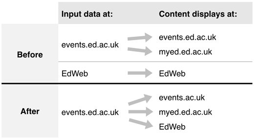
This system was feeding through to events listings in MyEd, but not to the Learning and Development EdWeb site. Instead, manual effort was required within the team to keep their EdWeb site up to date.
We fixed this by publishing a feed from the events booking system directly into EdWeb. The EdWeb site now updates automatically whenever data changes within the events booking system.
Example of a course listing that’s populated from the Events Booking System
How to apply an events feed to your own EdWeb site
Testing the changes
Towards the end of the project, we worked with Learning and Development to run quick usability tests on the new version of their site. This helped us to be confident that improvements had made a difference, and also highlighted some areas that needed further tweaking.
After making improvements to your website, it’s important to keep an eye on what impact the changes have had. Sometimes unexpected new problems appear, and usability tests are a good way of finding where they’re occurring.
Get in touch
If you would like support with your website, get in contact with us:


