
Effective Reflow/Responsiveness Design for more Accessible Websites
What is Reflow?
Reflow is the process of fitting content to the width of a page so that site material remains within the boundaries of the page window when users zoom in to enlarge content. The layout and distance between objects on a page might change with enlargement, but all content on the page remains fully accessible.
A good indication that your site is responsive is when you can magnify a webpage and the pages reformat so that the user only needs to scroll vertically rather than both vertically and horizontally whilst maintaining all of the functionality and visibility of site content.
All active sites must comply with level AA reflow criterion set out by the WCAG organization. Reflow criterion are met when page content can be presented with full functionality and content without needing to scroll two dimensionally for
– Vertical scrolling content at a width equivalent to 320 CSS pixel
– Horizontal scrolling content at a height equivalent to 256 CSS pixels
EdWeb sites and sites that use our design system EdGEL already have this reflow functionality built in.
Essentially, proper responsive web design results in a site with a flexible layout which adjusts to variable screen sizes, meaning that your site is accessible to more users and screen designs (e.g. mobile, laptop, desktop, etc).
Why Reflow Matters
By supporting reflow- or “Responsive Web Design”- we can make our sites increasingly accessible for those who are visually impaired. Enlargement of site content facilitates visual tracking and enhances character and object perception.
In addition to the intrinsic value of increasing accessibility, improving site reflow aids in increasing how user-friendly sites are- potentially expanding user engagement and site traffic.
Designing a Site with Proper Reflow
There are three main components to responsive web design:
- A fluid grid
- Flexible text and media
- CSS media queries
Fluid Grids
Site grids aren’t new to website design. However, fixed width grids of the past prevented the fluidity we see in newer sites that meet responsiveness criteria.
A fluid grid ensures that content is scalable and flexible- site elements adjust to variable screen-widths based on percentages used for consistent spacing and proportion.
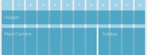
By using a fixed grid, your site will have a consistently high-quality presentation across visual platforms.
Flexible Text & Media
How text is viewed across platforms can be variable, but it should always be readable.
When you structure the content hierarchy within your stylesheet, text and media adjust accordingly within the width of the website layout, making site text legible regardless of device. By using a flexible container within a fluid grid, you can achieve text wrap across platforms- even with an increase in font size.
Flexible images should be able to scale or crop according to differing screen sizes.


Notice how the text and images on the home page of Medium.com adjust to the variable screen sizes that I’m viewing them on (laptop and mobile, respectively) without any loss of information or functionality. This is an example of successful responsiveness.
CSS Media Queries
Flexible layout is powered by CSS media queries, which specify how CSS should be applied based on a device’s breakpoint- a point in a site’s content and design which allows for adjustment to the user.
Media queries facilitate multiple layouts of a design using the same HTML-coded web page.
We recommend using the NoCoffee Vision Simulator plugin for Chrome to simulate page views from different visual perspectives. Additionally, Chrome 83 has released a similarly oriented plugin- right click > Inspect > Settings > Emulate Vision Deficiencies
Further Guidance and Resources for Optimizing Site Reflow
As we move quickly towards the September’s Accessibility legislation deadline, we want to provide tools and in-depth guidance to help you improve the responsiveness of your site. To that end, we are providing in-depth workshops and informational posts centred around high-impact, efficient, and approachable site fixes.
For sites within the EdWeb web estate, we provide a web governance tool called Little Forest (please email Astoria DeTuncq at ddetuncq@exseed.ed.ac.uk for access) to provide accessibility auditing information. With Little Forest, we can audit how accessible your site is in terms of reflow, identifying problem areas to enable more focused improvements.
Additionally, we hosted a Reflow/Responsiveness workshop on June 3rd, in which we delved further into the importance of reflow to accessibility, best practice methods to achieve optimal site reflow, and information on how to use Little Forest site audits to gauge your sites for reflow accessibility. We have uploaded a recording of this workshop to Media Hopper Replay.
1 replies to “Effective Reflow/Responsiveness Design for more Accessible Websites”