
Effective Colour Contrast Design for more Accessible Websites
What is Colour Contrast?
Effective colour contrast means that there is sufficient contrast between text and background for all users, especially those with low contrast sensitivity.
What is classified as sufficient Colour Contrast?
The Web Content Accessibility Guidelines (WCAG) states that normal text and images of text must meet a contrast ratio of at least 4.5:1, and large text (18 point or larger) should have a contrast ratio of at least 3:1.
The minimum contrast ratio of 4.5:1 meets level AA WCAG guidelines, but there is also an “enhanced” ratio of 7:1 which provides a deeper level of colour contrast in line with level AAA WCAG guidelines.
While these ratios may seem overly specific and ostensibly arbitrary, they are designed to most effectively allow more users to access information on websites.
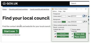
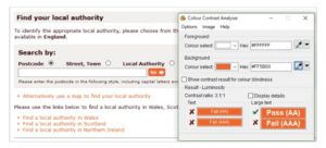
For example, the first site below is a good example of colour contrast, with a ratio of 4.9:1, while the second site has low colour contrast with a ratio of 3.1:1.
How can I better adhere to Colour Contrast guidelines?
The easiest way to meet colour contrast guidelines is by designing your site with colour contrast- and most critically- all users, including those with disabilities in mind.
Critical structural components of your site- like navigational elements, footnote regions, and menus- need to be visible in order to be usable. These components in particular should stand out from other elements of the site for ease of use.
When creating brand colours and palettes, consider colour combinations with high contrast. By providing designers with accessible colour combinations, it will be much easier for them to deliver compliant designs.
Test colour combinations in the design phase before shipping to development. This will prevent unnecessary revisions.
Don’t rely on a visual check for colour contrast, optical illusions are more common than not. Check colour values and calculate contrast ratios.
While black and white provide the highest contrast, this combination can be too extreme for those with dyslexia. Instead, a good balance can be found by using dark grey instead of black.
Are there exceptions to the Colour Contrast guidelines?
These categories are all exceptions:
- Large Text. Large-scale text and images of large-scale text require a lower contrast ratio of at least 3:1.
- Because large text (18pt and larger, or 14pt and larger if bold) is easier to read, the contrast requirement is reduced.
- 18pts maps to 24 pizels and 14 pts to 18.67 pixels.
- Text or images of text that are purely decorative, not visible to anyone, inactive, or are part of an image with significant other visual content have no contrast requirement.
- Text in logos or branding have no contrast requirement.
Further Guidance and Resources for Optimizing Colour Contrast
As we move quickly towards the September’s Accessibility legislation deadline, we want to provide tools and in-depth guidance to help you improve the responsiveness of your site. To that end, we are providing in-depth workshops and informational posts centred around high-impact, efficient, and approachable site fixes.
For sites within the EdWeb web estate, we provide a web governance tool called Little Forest (please email Astoria DeTuncq at ddetuncq@exseed.ed.ac.uk for access) to provide accessibility auditing information. With Little Forest, we can audit how accessible your site is in terms of reflow, identifying problem areas to enable more focused improvements.
Additionally, we hosted a Colour Contrast workshop on June 16th, in which we delved further into the importance of colour contrast to accessibility, best practice methods to achieve sufficient colour contrast, and information on how to use Little Forest site audits to gauge your sites for colour contrast accessibility. We have uploaded a recording of this workshop to Media Hopper Replay. Further, the WebAim colour contrast tool provides an excellent way of testing for compliance.