
What’s in a component? Content considerations for a crucial part of the University Design System
Components are an important part of any Design System, and the Design System we’re building for the University is no exception. Each component can have various pieces of data describing it, its history and its uses, which can be presented in various ways. This piece of work was about exploring the documentation options for components from a content design perspective.
The project to build a University Design System encompasses several interlocking strands of work. From the service perspective these include: identifying roles and responsibilities and defining processes for the system’s operation. Product-focused pieces of work include: defining the structure or information architecture of the Design System, and developing a ‘storefront’ through which people can access and use it.
Read more about the project in the blog by Stratos Filalithis:
The University Design System a journey that has just started
What is a component?
Components (also called molecules) are often described as the building blocks of the user interface (UI) which are assembled together to build digital experiences like web pages and apps. In practical terms, components include things like buttons, tables, headers, footers etc. In a design system, components are often grouped together in collections which are sometimes referred to as libraries (or pattern libraries).
What do people need to know about components?
Stripped back to basics, when someone wishes to use a component in a digital design, they need to be able to access the code which makes it work (likely to include HTML and CSS to render it on an interface, and Javascript to control its behaviour, or make it interactive). Apart from its underlying code, however, they may want to know more before deciding whether a given component is appropriate to include in a planned design.
If they are unfamiliar with a particular component, for example, information about how it works, a preview of what it looks like, examples of it in use, different variations of it and accessibility considerations may all help to make a decision to adopt it for use. If, on the other hand, they know the component well, documentation about how it was developed, including a history of its iterations, may aid the development of new versions and adaptations – which can then be contributed back to the design system for others to use in future.
Identifying user needs through job stories
In good content design, user needs and the tasks they want to complete are the focus for the content. Framing potential audiences and use cases for documentation about components as ‘job stories’ helped to identify what users need to know about components and why:
- When I’m designing an interface I want to know about different components available so I can choose the most appropriate ones.
- When I’m building an interface I want to be able to obtain the code for a component I want to use so I can incorporate it in my build.
- When I’m developing a component, I want to know its history so I can make sure I develop it in a way that builds on previous knowledge.
Good practice in component documentation
Different design systems document components differently, but in general, there are some fields of data (or content layers) which are essential to include, and others which are ‘nice to have’. In the book ‘Expressive Design Systems’, Yesenia Perez-Cruz sets out the following data fields to include in component documentation as a minimum:
- Name and description of component
- Purpose of component
- Example(s) of the component at work (code and design)
These additional data fields are listed as useful to include, if possible:
- When to use and when not to use the component
- Content guidelines (how to write labels and other content for the component)
- Related patterns or components (that fulfil the same or similar purposes)
Accordions: A complex component case study
To ascertain the relative merits of each type of data in the context of a real component, the accordion was chosen as an example. Accordions (also known as ‘stack views’, ‘expanders’ or ‘collapsible/toggle content’/’reveal details component’) come in a variety of forms but all essentially work in the same way – a user taps or clicks a section or bar to reveal the content within that section.
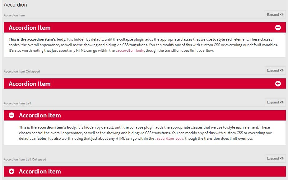
A static image of the accordion component from EdGEL, the University’s Global Experience Language.
We researched accordions in several design systems (including GOV.UK Design System, NHS Digital Service Manual and the Polaris design system used by Shopify), to compare ways of documenting this sort of component in practice. Each of the design systems documented accordions with the minimum data fields (name, description, purpose, examples) but also offered additional fields of data – offering guidance on how to use them in digital designs.
Several included ‘do’s and don’ts’ – for example ‘Do not use accordions to hide error messages or other critical information that requires an immediate action’ (Polaris). Content guidelines formed part of the documentation for accordions in the GOV.UK Design System: ‘Accordions hide content, so the labels [of the sections] need to be clear’. In the documentation for the accordion (called ‘expander’) in the NHS Digital Service Manual there were suggested alternatives given: ‘Test your content without an expander first. It may be better to: simplify and reduce the amount of content, split the content across multiple pages, keep the content on a single page, separated by headings, use a list of links to let users navigate quickly to specific sections of content’.
GOV.UK Design System also included a section on ‘research’, detailing how the accordion had been tested across digital products, the issues found with it and how these were being addressed.
Detailed documentation requires upfront effort and ongoing maintenance
The value of more extensive documentation about components was clear from the accordion case study, however, including content layers like ‘do’s and don’ts’ and editorial guidelines come with a cost, both in terms of content design resource to prepare this content, and in terms of keeping it updated, as the component is continually researched, tested and developed. For mature design systems like GOV.UK, documenting this type of detail is part of the process, but for newer design systems (like the one we are building) the processes need to be well-established before documentation can be finalised, to ensure the content documenting components is both accurate and sustainable. Nathan Curtis illustrates the relationship between documentation detail and cost with a graph in this blog post:
Documenting components: Serve a System’s Audience with Well-Architected Content
Start with what’s known and stay accurate
While mature design systems like the GOV.UK Design System are something to aspire to, we understand that adopting another system’s documentation style is not a fast track to achieving a mature system ourselves. It was reassuring to learn from attending the GOV.UK Design System Day in July that GOV.UK are still working on how they document research about their components, and still experimenting to achieve the right balance of technical and non-technical language in their documentation to cater for the needs of their design system audiences. As we start with what we know, the component documentation in our University Design System will be basic yet accurate. As we continue to develop and implement our processes, however, our documentation will evolve alongside, reflecting what we have discovered and what we still have to learn, and encouraging those who engage with the system to feed into it and help it grow.
2 replies to “What’s in a component? Content considerations for a crucial part of the University Design System”