
Using links and headings to make your content more accessible: What we covered in March’s Content Improvement Club
Content Improvement Club is our regular meetup for web publishers. In our March session, with a focus on accessibility, we explored how effective use of links and headings can make content easier to navigate and use.
Accessible content is effective content
Accessible content is simply effective content. If people cannot access, understand or use what you’ve published, then it isn’t really doing its job. As the amount of online content continues to grow, making sure it works for everyone becomes increasingly important. We also see accessibility as a shared responsibility. Anyone creating or publishing content can make a positive impact.
Small changes can have a big impact
This session focused on practical improvements. Clear link text and well-structured headings help users process information quickly and navigate more efficiently, particularly people using assistive technologies.
These are small changes that do not require technical expertise, but they make a significant difference.
Accessibility and legal compliance
While we focused on practical changes, accessibility is also supported by a legal framework, including the Web Content Accessibility Guidelines (WCAG).
Links and headings are still common accessibility issues
WebAIM’s annual survey shows that many accessibility issues remain widespread, often rooted in how content is written and structured.
Screen Reader User Survey #10 Results (WebAIM)
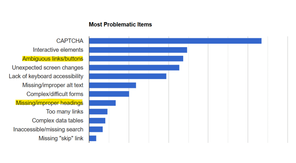
WebAIM survey: Most problematic accessibility items
From the data, links and headings stood out as two practical areas to focus on. They are part of everyday content creation, quick to review and relatively easy to improve.
We have covered these topics before, but we wanted to take some time to focus specifically on links and headings considerations from an accessibility angle.
Designing for screen reader users benefits everyone
Assistive technologies such as screen readers convert content (such as text, buttons, images and other screen elements) into speech or braille. This allows blind or partially sighted users to access the same information as sighted users.
In the session, we focused on how screen reader users experience content. Designing with them in mind has a much wider benefit. What improves content for screen reader users also improves the experience for people using other assistive technologies and often for all users.
Demonstrations using JAWS
To support this, we included demonstrations using JAWS (Job Access With Speech), a screen reader. These showed how content is interpreted by assistive technologies.
These demonstrations are only part of the picture. Screen readers are complex, and people use them in different ways. They do not represent every user experience, but they are a useful way to build understanding.
Making links more accessible
Clear link text helps users:
- predict what will happen when they open a link
- find the content they need more quickly
- avoid opening content that isn’t relevant
Replace raw URLs with meaningful link text
One of the most common issues we see in content is the use of raw URLs (or web addresses) as link text. Raw URLs can create usability and accessibility issues. They are difficult to interpret and screen readers read them character by character, which can be slow, frustrating and unclear.
Clear link text is much easier to understand and navigate, especially for people using assistive technologies. Instead of using a full web address like ‘https://www.ed.ac.uk/’, use meaningful text such as ‘University of Edinburgh’.
We demonstrated how replacing them with descriptive link text improves accessibility by looking at some examples. This included using JAWS recordings to compare how raw URLs and descriptive links are experienced by a screen reader user. Here’s an example from the session:
Raw URL version:
Link text version:
This helped highlight how adding meaningful link text gives users a clearer and more immediate understanding of where a link will take them.
Link text must make sense on its own
Screen reader users often navigate by jumping from link to link or by viewing a list of links on a page. This means link text needs to make sense out of context. It should be clear, predictable and meaningful on its own.
Avoid vague phrases such as ‘Click here’ or ‘More information’. Instead, include key details about where the link will take the user.
Again, we considered some examples to showcase what we meant:
- Vague link text: ‘Click here’
- Improved link text: ‘Click here to book a ticket for the event’
- Best link text: ‘Book tickets for Content Improvement Club (opens in a new tab)’
We also discussed the importance of making each link distinct when linking to different destinations. For example, there may be multiple links to different sets of teaching materials or slides. Instead of using the same generic link text, like ‘Slides’, across the board, you can improve clarity by adding context:
- Vague link text: ‘Slides’
- Improved link text: ‘Lecture slides (Week 1)’
- Best link text: ‘Lecture slides (Week 1): Course introduction’
During the session, we compared how these links appear in a screen reader’s list view. This helped show how important clear link text is when experienced out of context.
Position links on a new line
University style is to place links on a new line, usually below the relevant paragraph, rather than embedding them mid-sentence.
This makes it easier to write link text that works on its own and helps users who navigate from link to link.
Making headings more accessible
Headings do more than break up text visually. They create a structure that helps users understand content and navigate efficiently, particularly those using screen readers.
Do not skip heading levels
Headings are structured in levels, typically from Heading 1 (H1) down to Heading 6 (H6).
Each level should follow a logical order. For example, use:
- H1 for the page title
- H2 for main sections
- H3 for subsections
Skipping levels can make navigation more difficult for screen reader users, who rely on a consistent structure.
We looked at an example from a University page to demonstrate correct heading structure.
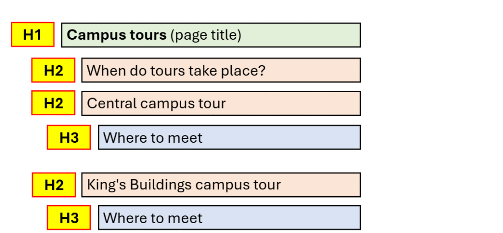
Seeing this in a real life context made it clearer how heading structure organises a page and supports navigation and understanding.
Headings reflect content hierarchy, not style
Headings have visual styles, but they should not be chosen based on appearance alone. Use headings to reflect the structure and importance of content, not to make text look bigger or stand out.
If you need to emphasise content, use alternatives such as bold text or feature boxes rather than misusing heading levels.
A way to check heading levels
During the session, we demonstrated the W3C Heading Checker, which we often use to review headings.
W3C bookmark tool for checking headings
This tool provides a quick way to review page structure and flags any skipped heading levels in its checks. In groups, we used this to quickly assess headings across our own pages, evaluating headings and making suggested improvements.
Guidance on links and headings in the style guide
The UX team has been reviewing and updating the University’s Editorial Style Guide. It includes detailed guidance on links and headings, expanding on the points in this post.
Guidance on links in the editorial style guide
Guidance on headings in the editorial style guide
Our next Content Improvement Club
In our next session, the topic we’re covering is:
Editing that works: nine techniques for improving content
In the session, we’ll practise using a nine-step editing process to improve web content.
Date: Wednesday 22 April 2026
Time: 2pm to 3:30pm
Place: Edinburgh Futures Institute, Room 1.52 (in person only)
Content Improvement Club: 22 April session
How to hear about future sessions
We promote these sessions via our mailing list. If you’re interested, please sign up:
Join the UX and Content Design mailing list (University login required)
Suggest a topic for a future session
We’re keen to continue covering topics that colleagues across the University would find useful. It would be really helpful if you could let us know any ideas you have using this form:
Suggest a topic for Content Improvement Club (University login required)
Other training that we offer
More training is listed on the User Experience Service website: