Collaborating with schools on the design of the postgraduate taught programme page
As part of the future degree finder project, we recently ran a series of collaboration workshops with colleagues from across the University. These workshops helped us identify any potential issues and refine our prototype for the future postgraduate taught programme page.
Goals of the collaboration
The goals of the collaboration were to test our current content model and prototype with our colleagues in the schools and colleges and to address:
- any concerns they have with it (and solutions to address them)
- which attributes will especially benefit them
- any gaps in our model we need to create solutions for
What we did
We asked colleagues to contact us through a form with their content priorities and any concerns they might have about how the current iteration of the design works for them.
We held five collaboration workshops, organised by college and by the themes respondents to the form identified as priorities for them.
At each workshop, I walked the participants through all the attributes in the prototype and gave them time to talk through their content priorities and any concerns they had.
After each workshop, I gathered any actions required or changes we needed to make to the prototype and fed them back to the relevant people in our team.
What we learned
Individual courses
One of the priorities raised by several workshop participants was improving how we present and describe the opportunity to take individual courses. Related to this, we also discussed how we could explain part-time study and the term ‘invoiced at course level’ to users.
After some in-depth discussions around this topic with participants, we felt we still had more work to do to understand this topic before we thought further about how we might change our design to address this.
Calls to action
Concerns were raised in nearly every workshop about placement of the main calls to action, namely the Applying section (the ‘Apply now’ button in particular) and the Open days promotion box.
In the current degree finder, these elements are prominent and located near the top right of the page. In the prototype, these elements are located further down the page.
We based this decision on what we learned from user interviews about where users expect to find this content, as well as our belief that the floating navigation used in the prototype would make this content easy to get to.
Despite this, we felt concerns about this were valid, especially considering that applying and registering for open days are the main calls to action we want to encourage with this content.
Terminology
We also learned that there was some confusion over the term ‘Mode’ in the metadata ‘Key facts’ panel. We use this to indicate whether a programme is delivered on-campus or online (or a mixture of both in some cases).
Some concerns were also raised about the use of the term ‘Industry links’ as a heading in the Careers section. The concerns mainly related to potential misinterpretation of the term ‘industry’ as being related to ‘heavy industry’, and it being too narrow to cover the range of links schools have with the professional world.
What we changed
If the changes needed were simple, we implemented them in the prototype immediately. If we needed to investigate the concerns raised before making a change, we added them to our backlog of questions we want to address with user testing in the coming weeks and months.
- Decided we needed to gain a deeper understanding of the relationship between part-time intermittent study and programmes that are invoiced at course level through further interviews with staff in schools and other relevant teams.
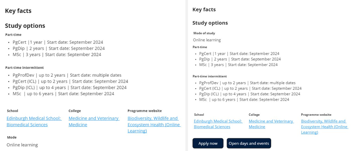
- Added call to action buttons in the metadata panel to jump users to the Open days and Applying sections.
- Changed ‘Mode’ in metadata to ‘Mode of Study’.
- Changed ‘Industry links’ to ‘Professional links’.

Side-by-side comparison of the Metadata panel before (left) and after (right) the collaboration workshops. We added two call to action buttons and changed ‘Mode’ to ‘Mode of study’ and moved it closer to the top of the panel.
What’s next?
After making the changes that arose from the workshops, we did some further usability testing which showed that the changes we made didn’t have a negative impact on the user experience.
This gave us confidence that our design will work for users, and later this year the developers will start work on building it.
You can read more about our work on the future degree finder project on our blog.
Read more about our work on the future degree finder project


