Lessons from conducting a 5-second usability test
In summer 2022, we used a 5-second test to understand what caught a person’s attention and what they could remember after looking at a piece of content for a short time. In this post, I reflect on the lessons my team and I learned conducting this research as part of the fees payment project.
What a 5–second test is
A 5–second test is a type of usability test to assess a single piece of content and gauge what a users’ first impressions of a piece of content are, using some follow-up questions. In short, it’s a quick way to assess if content is conveying the messages it’s meant to.
What we tested
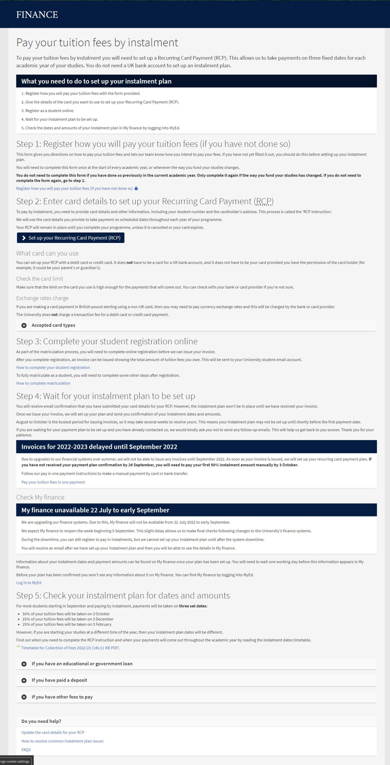
We tested a tuition fees payment option on paying by instalment, which is a single page of detailed instructions on what students need to do if they want to pay their tuition fees this way.

Screenshot of the pay by instalment page with an overview section, all 5 steps to complete the process, service alerts and help text
During our research, we found paying tuition fees by instalment to be a popular payment method and generated the most enquiries, so we prioritised developing new content for this payment option first.
Pay tuition fees by instalment page: see the current content
Features of the design
Some key features of this content design included:
- an overview with all 5 steps to set up an instalment plan
- each step with detailed instructions on what students need to do
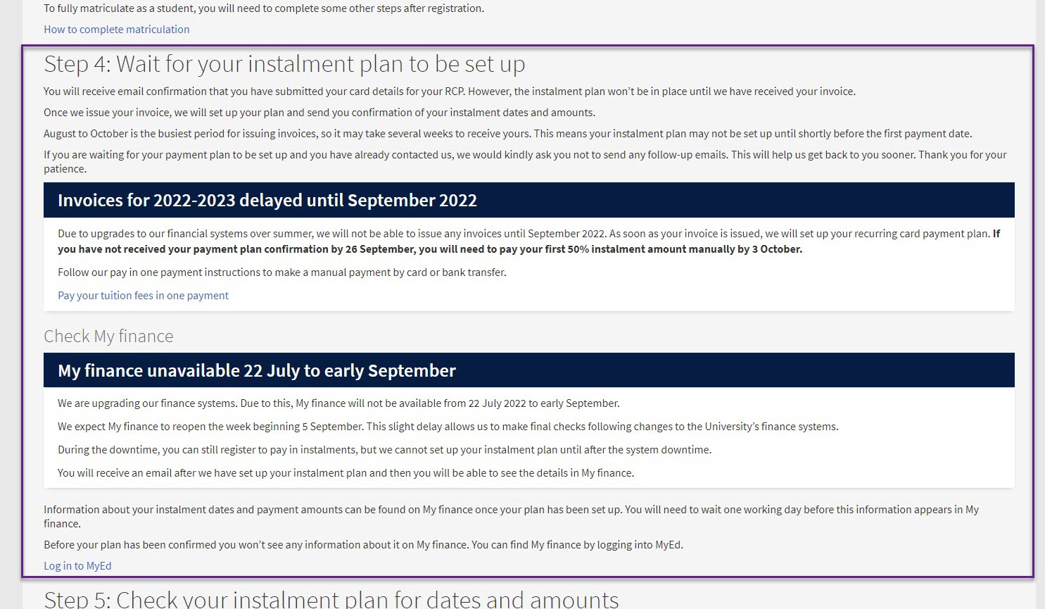
- temporary service alerts to notify students how this will impact the payment process for a short period of time
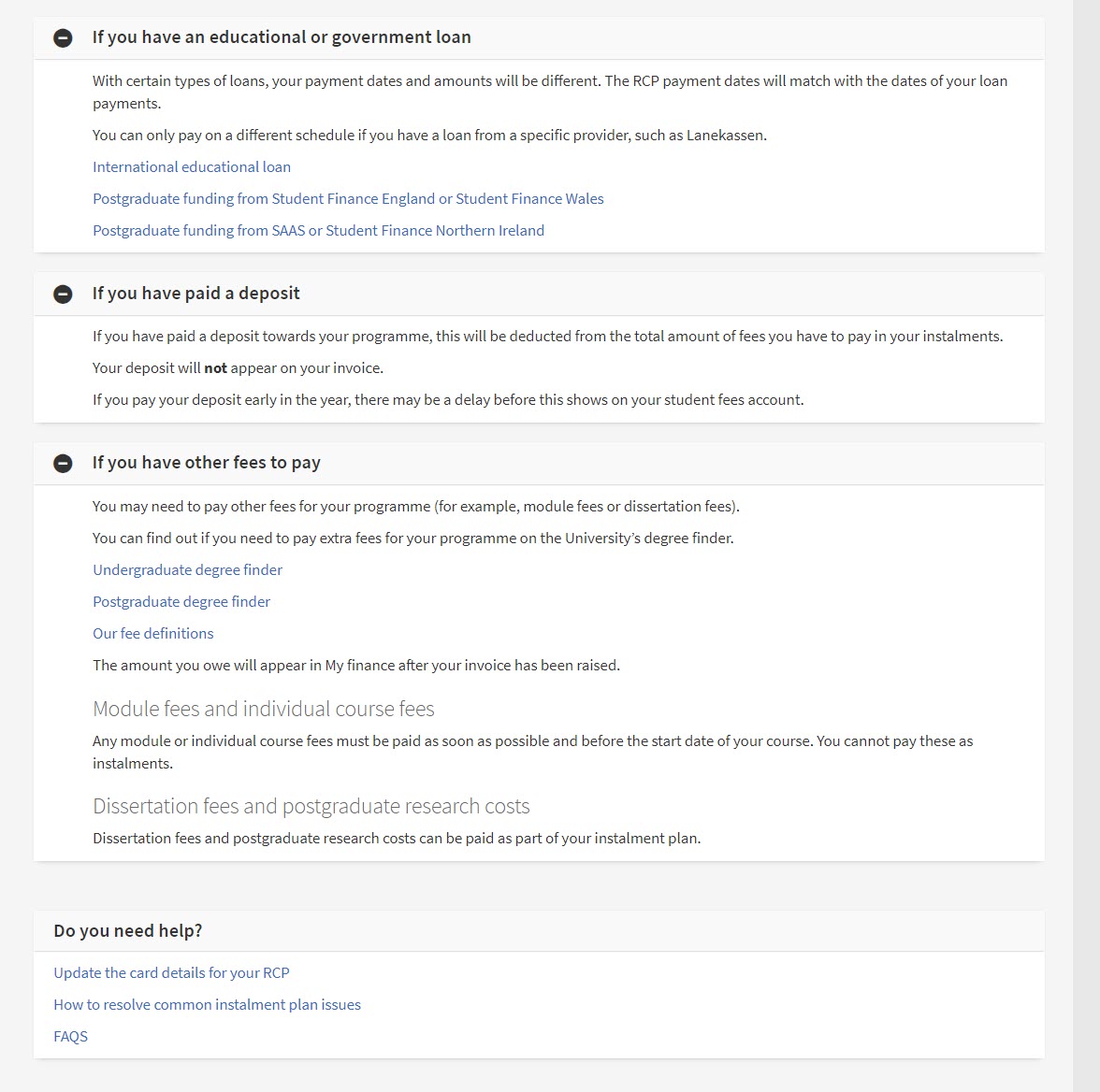
- extra help and information

Screenshot from the pay by instalment web page with temporary service alerts and how this affects students in step 4 of the process
Ultimately, we transformed the content into a series of detailed steps for students to follow.
We needed to explain a complex process in a simple way and provide more help throughout the entire process so students knew what to expect at each stage, and how long each part of the process would take.
It was clear we needed to add more details to the existing content because finer details about the payment process were missing, and this is likely to have been a contributing factor to the volume of enquiries.

Screenshot of the help section on the pay by instalment page
What we did
We tested this piece of content with 5 participants and asked each person to share their screen during the task.
In practice, we let participants look a bit longer than 5 seconds when consuming this content for the first time and we allowed them to scroll a page length. Afterwards we ended the test and asked our follow-up questions.
What we asked during the test
We asked the following questions after we completed the 5-second test:
- Based on what you have seen, who is this information for?
- What do you think is the most important information on the page?
- What does the reader need to do next?
- When can the instalment plan be set up? How do you know this?
Why we used this technique
With limited time available, we wanted a quick way to measure if the template we created would be effective enough to replicate across the rest of the tuition fees payment method pages.
We wanted to know what caught a user’s attention immediately and if they could recognise what the content’s purpose was. We found that all participants could answer that the content was for students who wanted to pay their tuition fees in steps and one person knew there were five steps to complete.
What we learned
5 seconds is not long enough
It was clear from the pilot test that 5 seconds was not long enough. Everyone reads at different speeds and levels of ease.
As such, we had to adapt during testing and find a sweet spot, not too much time and not too little. For instance, we had to be careful how much time to give each person because too much time could distort their first impressions.
A negative effect on participants
Some participants felt like this was a memory test and apologised when they couldn’t answer a follow-up question. As a result, these people felt discouraged and perhaps a little embarrassed because they thought they should know the answer.
Clearly, we don’t want participants to have a negative experience when doing a usability test, so this is something to take into consideration when doing a 5–second test in your research.
What worked well in the content
Despite some negative effects, all participants understood this content was about setting up a payment method for students who want to pay their fees in instalments.
Everyone recalled that the process involves a sequence of steps to follow, even if they couldn’t remember specific details in each step.
What I would do differently next time
Test less content
Firstly, if I were to use 5-second tests in the future, I would make sure we test with less content.
It was clear there was far too much content on the page and this was overwhelming for the participants. I also think it’s important to adapt the length of time for each participant and so potentially renaming this test as a ‘first impressions’ test might help participants to feel more relaxed.
Combine with a usability test
Secondly, I think it would be a good idea to combine this test with a usability test, where we ask a participant to go through a realistic scenario using the website.
By doing so, it would help us to gain a better understanding of a participant’s overall experience of interacting with the content, and not just their first impressions. For example, if someone fails to notice something important then a usability test might give you further insight as to why this might be the case.
Give more context to participants
Finally, if the content is complex, like in this example, then I think it’s important to give some context and background to your participants.
For instance, if you can’t get access to a sample of target users, then you should try to give a realistic and detailed scenario as this will help participants to understand what they are looking for on a page and why.


Thank Freya! In Engineering we are keen to do a usability test once the UG 2025 entry degree finder is published and the tips above are very useful. it would be great to get step-by-step guide on how to do it most effectively.