Feedback on our beta undergraduate degree profile pages
We’ve been using an analytics and feedback tool, Hotjar, on our beta pages of the new undergraduate degree profiles. The insight mirrors what we saw in earlier usability testing, so we’re implementing design changes to address issues.
Background
Since the launch of the beta pages in September we have been using Hotjar, an analytics package, to monitor user interaction with the beta programme pages and to collect feedback.
Previewing the future degree profile: our beta launches
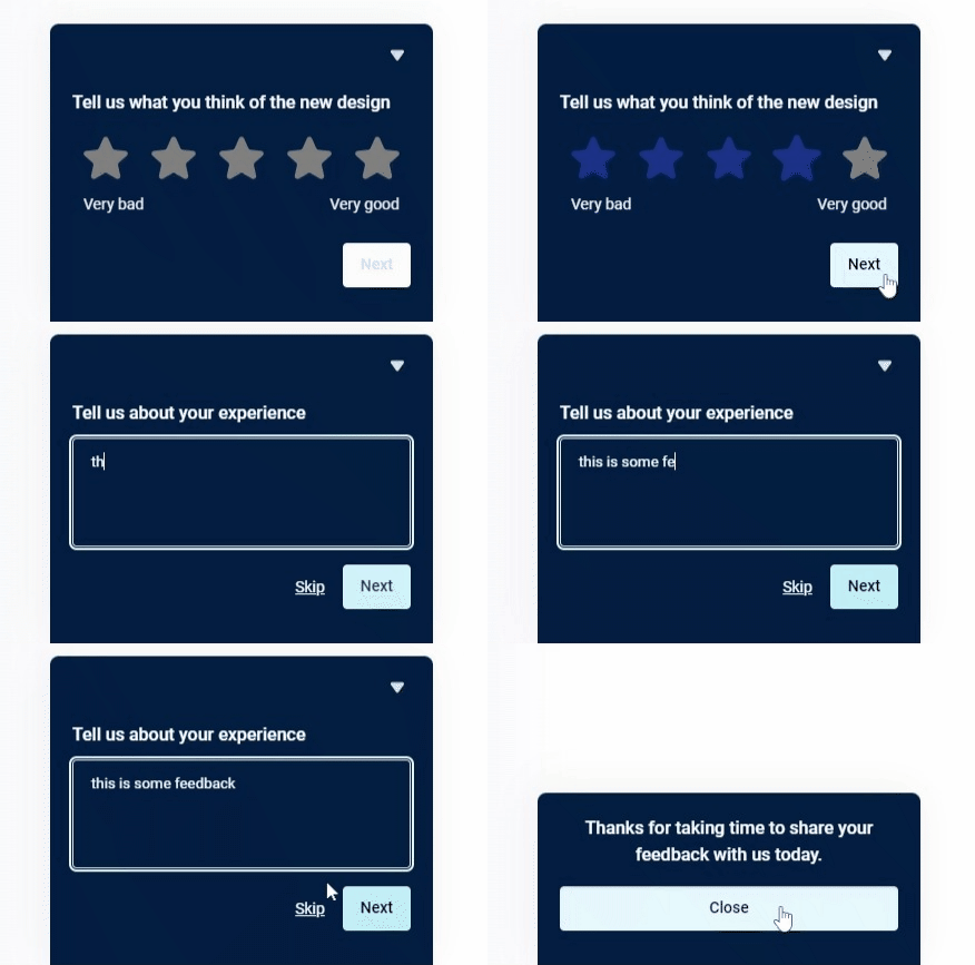
We implemented a feedback mechanism to enable students to rate and comment on their experience and opinion of the new design.
Students can rate the page on a 5-star scale, and if they wish, provide written feedback to explain that rating.

Hotjar feedback widget
The feedback
In the three months since the beta launch, we have received forty-eight ratings on the new design, including eight with written feedback.
The average rating is 3.6 out of 5.
The written comments are a mix of positive comments and constructive criticism.
I’ve included a selection of these comments to give a flavour of what users have had to say:
Desktop users comments
Once I found the page, it was easy to scroll through it. Then I spotted the menu on the right (On this Page), so would use that when returning to the site. Useful that all the information is here, rather than having to move between the website and the degree finder page. Nice range of resources (video, photos, bios etc.)
The page is more readable, and I like the navy
I find the layout confusing and too much information to clearly see what I want
Mobile users comments
Really hard to use on mobile – can’t find any info, the page is way too long and there is no way to get to key stuff. Went back to the old one.
Overwhelming. So much text.
Recurring themes in the comments
While we only have a few written comments compared to the number of ratings, we can still see some recurring themes coming through.
The main themes are:
- The page is too long, with too much text, creating an overwhelming experience.
- The headings don’t stand out enough, making it difficult to find the information you’re looking for.
- The right-hand navigation is helpful, but it can be hard to spot and isn’t conveniently available on mobile once you’ve scrolled past it.
Addressing the issues
The comments and feedback that we have received are consistent with the user research and usability testing we carried out with students at Welcome Week before the release of the beta pages.
So, the feedback isn’t unexpected and it’s reassuring to see the trends persist as the sample size increases. At Welcome Week we were only able to test the page with a handful of students.
Improving the experience and mitigating these issues is challenging because we are working with the University Design System which is maintained by Website and Communications in Information Services and needs to work across the whole site.
But we’re confident that the challenges reported by students here are likely to be experienced by more website users in more contexts.
We’ve designed some relatively subtle changes to subheading style and paragraph spacing which we’ve usability tested and now deployed to our beta web pages. These improvements may not be enough for degree profiles, but they’re a step in the right direction.
With the changes in place, we’re monitoring responses while recommending that the changes be deployed more widely in the University website, while we consider next design steps for degree profiles.
View our beta pages
UPDATE: The beta pages were retired after the UCAS deadline in late January 2024.


