Driving engagement with UniBuddy by starting small and failing fast
We’re using an iterative, human-centred design approach to promote UniBuddy in a way that’s responsive to the needs of prospective students.
There’s no learning without trying lots of ideas and failing lots of times.
Since starting in the Prospective Student Web Content Team (PSWCT), it’s been clear to me that my team is working hard to drive change and instil a user-centric mindset across the University.
We evangelise the benefits of human-centred design by:
- always putting users first
- defining and responding to user needs
- making data-driven decisions
- educating and showcasing success stories
- collaborating, building bridges and making allies
Of course, it’s a struggle when we have so many people across the University creating content and communicating with users in different ways. Our challenge is great, but we fight the good fight.
This being the case, I was excited to get the chance to work with the Student Recruitment and Admissions (SRA) team on the UniBuddy project.
Our goal: To drive traffic and prospective student engagement with UniBuddy.
What is UniBuddy?
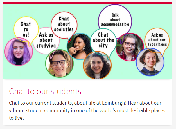
Unibuddy is an application that lets prospective students chat online with current students who are known as “student ambassadors”.
Prospective students can use UniBuddy to:
- learn more about student life at University of Edinburgh
- make informed decisions about their studies
The University can use UniBuddy to:
- better understand prospective student needs
- give prospective students the information they need when they want it
Part 1: the pilot
Back in August 2020 (before I joined the University), the SRA team launched a pilot scheme using UniBuddy to coincide with the University’s clearing programme.
We agreed to help SRA get the UniBuddy service up and running. While they managed the people side of things (i.e. recruiting and managing student ambassadors), we created the undergraduate and postgraduate UniBuddy pages.
Part 2: reaching a wider audience
Following a successful pilot, SRA began a phased rollout of UniBuddy. They requested our team’s assistance again in November 2020 to help UniBuddy reach a wider audience, and I was drafted in to help.
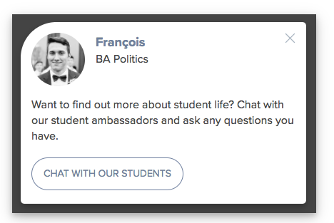
After meeting with SRA, I found they were particularly interested in using UniBuddy’s integrations. These would allow us to add pre-built UniBuddy pop-ups and banners on selected pages (by inserting a snippet of Javascript).

But pop-ups are bad, right?
The Nielsen Norman Group states that “from conducting decades of user research, we know that people dislike pop-ups”. They say users don’t like them because they:
- appear at the wrong time
- interrupt users during critical tasks
- use poor language
- contribute to user disorientation
However, there are ways to remedy some of these issues, such as:
- displaying pop-ups only when they are contextually relevant
- introducing time delays to allow users to engage with the on-page content first
- using less intrusive methods for delivering the content (such as in-content links)
Taking a measured approach
After further discussion with SRA and conversations around the potential pitfalls of pop-ups and other similar promotional activities, we agreed that we should take a measured approach to promoting UniBuddy.
We agreed to:
- conduct a variety of experiments
- make data-driven decisions
- fail fast and learn fast
- scale up what works and kill off what doesn’t
Ultimately, we want to discover the most effective method of promoting UniBuddy. Which method will generate the highest number of quality prospective student interactions?
To find out, there are a few things we need to consider, including:
- the types of links
- the location of links
- the quality of prospective student interactions
Now, let’s dig a little deeper into these:
1) The types of links
We can drive traffic to UniBuddy using two types of links:
- Standard links within the content (using native EdWeb functionality)
- UniBuddy integrations, such as pop-ups
2) The location of links
We can place links on two different types of pages, targeting users at different points in their user journey:
- High-level pages, such as the undergraduate study page
- Low-level/content detail pages, such as programme description pages
3) The quality of interactions
We want to see interactions that will lead to students deciding to study at University of Edinburgh.
For example, there’s no point in driving extra traffic if it leads to a large increase in irrelevant queries or questions on subjects our student ambassadors are not permitted to answer (such as entry requirements). We must find a way to measure the quality of interactions.
Placing our bets
Writing a hypothesis is an opportunity to place a bet on the most likely outcome. However, before writing my hypothesis, I needed to look at the data.
I used Google Analytics to get a list of the highest-traffic pages, which helped me decide where to experiment. I also gained an insight into user behaviour by identifying a direct relationship between traffic and engagement when comparing high-level and low-level pages, e.g.
High and low level pages: traffic vs engagement (in November 2020)
| Level | Page | Unique Page Views | Average Time on Page |
| High level | Undergraduate study | 50,480 | 28 seconds |
| High level | International applicants | 16,185 | 33 seconds |
| Low level | Accommodation | 4,802 | 2 minutes, 57 seconds |
| Low level | BSc Psychology | 5,394 | 2 minutes, 22 seconds |
The data suggests users on high-level pages spent around 30 seconds on the page. It seemed like their reason for being on the page was to quickly find their next step in the journey. So perhaps this isn’t the best audience to target?
Conversely, users on low-level pages were more engaged in the content, spending more than two minutes on the page. Perhaps this points to users being at a more advanced stage in their decision making. Would this make them more likely to engage with UniBuddy?
I don’t have the answers yet, but I feel like I’ve gathered enough insight into user behaviour to make an educated guess.
The hypothesis
Placing Unibuddy links strategically within the content (rather than pop-ups) on lower-level content-detail pages will achieve the highest level of quality interactions with prospective students.
We’ll test this by:
- comparing pop-ups vs in-content links
- comparing high-level and low level page links
We’ll validate our assumptions by measuring:
- clicks into UniBuddy from the test content CTAs
- visitors, Signups and Conversions in the UniBuddy dashboard
- quality of interactions using a tally marks system (recorded by Student Ambassadors)
What’s happening now/next?
The first UniBuddy experiment went live on 11th January on the undergraduate study page.

Once the experiment is complete we will record the analytics and compare with the follow-up experiments.
Will our hypothesis turn out to be correct? Watch this space for the results.
References cited in this blog
Kaley, Anna. 2019. Popups: 10 Problematic Trends and Alternatives. Nielsen Normal Group.


