Web Publishing Platform editorial interface prototype – initial user feedback
Our development team built an initial version of the editorial interface of the new Web Publishing Platform. I took the opportunity to gather some feedback from web publishers across the University and to revisit the results of our initial top tasks survey about priorities for the new platform.
Building an interface with Gin, Drupal’s accessible admin theme
The interface web publishers use to create, edit and publish web content is a very important aspect of the web publishing platform project. Since it was established as one of the core workstreams (or ‘epics’) on our roadmap, work on the editorial interface has happened continuously from sprint to sprint. We have adopted Drupal’s Gin theme to build the interface. Gin is a Drupal admin theme which has been developed with accessibility at the forefront, aligning with guidance laid out in the Web Content Accessibility Guidelines (WCAG) as well as the Authoring Tools Accessibility Guidelines (ATAG).
Read more about the Drupal Gin admin theme in Bruce Darby’s blog ‘We love Gin’
Prototype interface with basic functionality
One of our earliest iterations of the editorial interface was built as a prototype which were able to use to practice basic content publishing and editing tasks. The prototype included the functionality to create generic content pages and landing pages and to add and edit web content like images text and links. It did not contain many of the complex functionalities of the existing EdWeb, however, it had enough for people to experiment with to build web content and provide some feedback.
Sessions structured for feedback, referring to top tasks
I ran sessions of 30-60 minutes with 6 web publishers. The aim of the sessions was to gather feedback on the prototype rather than formally assess the interface for usability, however, I found it helpful to adopt parts of a usability test script for websites developed by Steve Krug (author of well-known usability book ‘Don’t Make Me Think!’). I began the sessions by asking people to spend some time familiarising themselves with the interface, to speak about how they expected to be able to use it. I then asked them to select a generic page and a landing page they had recently built and to use the interface to try to recreate those pages.
To analyse the output from the sessions from a user-centred perspective, I found it helpful to refer to the web publishing priorities identified in the top tasks survey completed by University web publishers.
Access Steve Krug’s usability test script for websites at sensible.com
Read about the web publishing priorities identified in the top tasks survey in Bruce Darby’s blog
First impressions of the Gin interface
The Drupal Gin theme includes a default vertical navigation menu with icons for the various types of action, intended to offer editors faster access to what they need. Our prototype interface included the vertical menu, as well as links to add and edit content positioned centrally. The web publishers quickly made sense of the options in the vertical menu and used it to begin the content creation tasks. Overall, the general reaction to the interface was positive, one person said it looked ‘cleaner’ and ‘more modern’ that what they were used to, and another said they felt it was ‘easier to use’.
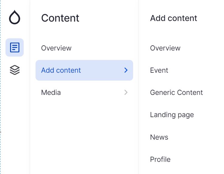
The left hand content menu in the editorial interface prototype
Read more about the development of the Drupal Gin admin theme in Sascha Eggenberger’s blog on Medium
Building and editing generic content pages
Drupal’s generic content type is typically used for single web pages, which are the most abundant type of web pages within EdWeb. The web publishers easily found the option to create generic pages using the interface. A key difference between the prototype interface and existing EdWeb was the arrangement of page content buttons (sometimes known as ‘paragraphs’ within Drupal) which editors could choose to build content.
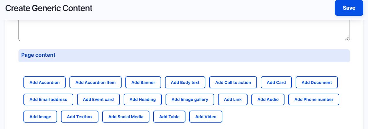
The page content buttons in the editorial interface prototype generic content page
This was a more modular approach to building content than some of the web publishers were used to and how successfully they were able to use it to create content depended on how they interpreted the page content labels. For example, ‘Add Call to action’ was unfamiliar to several as a way to add a button to a page, and some were confused about the difference between ‘Add Textbox’ and ‘Add Bodytext’.
Drawing on their experiences of EdWeb, several publishers were more familiar with using a rich-text editor in the body text field to format headings and links rather than adding headings and links as individual pieces of content. Building pages a piece of content at a time offered more flexibility to re-position content which was attractive to some. Others, however, felt it was a longer way of doing things and found it cumbersome to deal with content in individual sections instead of working within a rich-text editor.
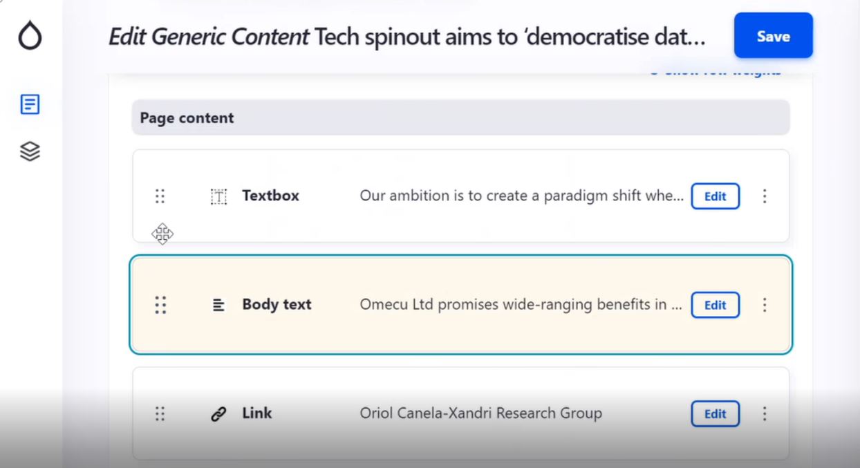
A piece of content (Body text) is highlighted as it is repositioned within the editorial interface prototype
Building landing pages
In EdWeb, landing pages are intended to be entry points to direct users towards specific calls to action. A common use of landing pages is to bring together content from across the web estate under a particular theme – for example, an ‘Open Day’ landing page bringing together content about courses, accommodation and applications so the user is spared the task of navigating to find this themselves once they have ‘landed’ on the page.
Adopting the user interface of the Gin admin theme, our prototype contained several options for populating a landing page – editors could either choose to build up the page by adding in page components individually, or they could pick a predefined layout.
Choosing the layout option generated a grid in which the page components could be created by pressing small blue buttons with plus signs.
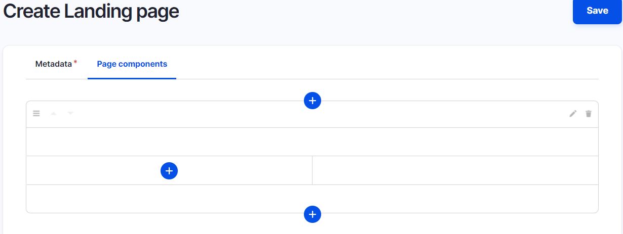
The layout option of the editorial interface prototype
When the ‘plus’ buttons were pressed the page components menu was revealed.
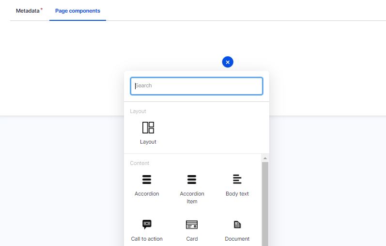
The page components menu of the editorial interface prototype
Experimenting with page components
Selecting one of the page components from the menu brought up a form for editors to complete to define how the component would look and work on the page. Depending on the complexity of the component, the form contained a different number of fields.
For example, the form to add in an email address contained only one field to complete, whereas the form to add a card (a box-shaped component designed to bring several pieces of content together) included more fields to input details like card type, image, title, body text, link, link text, and buttons within the card.
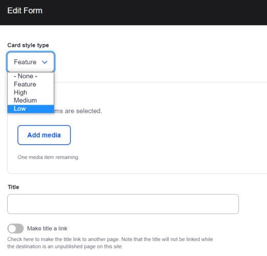
The form to complete to create a card in the editorial interface prototype
As they experimented building pages with the page components, it became clear that the web publishers were unfamiliar with the term ‘card’, they more naturally spoke about ‘boxes’ or ‘widgets’. Some liked the freedom and flexibility of building pages one component at a time, but fed back that this took quite a long time especially if they wanted to create a page made up of lots of complex components like cards.
Experimenting with images
The Gin admin theme presents images in a media library, which can be viewed as a grid or a table. The web publishers liked the grid view as they felt it would help them find images more easily. Acknowledging that they used different types of images on different areas of their site, they felt extra filtering options would help them find images in the media library.
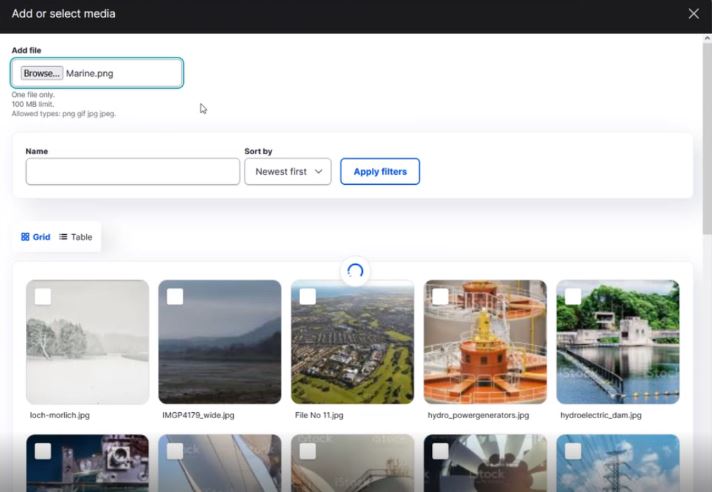
The media library of the editorial interface prototype
The upload facility of the prototype did not include a field to add an image name (in addition to the filename), and several publishers commented they would find this useful. They also had questions about image sizing and dimensions and whether the interface would offer the ability to crop images to fit.
Revisiting top tasks
The prototype interface was an initial iteration, intended for experimentation and practice and it is too early to assess whether it has succeeded in meeting web publishers’ identified priorities. That said, there are some indications that the interface goes some way to meet some of the priorities identified in the top tasks survey, for example – the ability to build landing pages component by component will help enable more flexibility around image positioning and around custom layouts (both in the top 10 tasks), and we hope the visual media library will make working with images better.
Further iterations and testing
Since the sessions I carried out with web publishers we have continued to iterate on the editorial interface. We have taken on board the feedback received from the sessions, as well as feedback from the project team and the Design System team who continue to experiment and test the interface to build out content and sites.
Working closely with our agency partners Manifesto, we have made the following changes so far:
- Improved the rich-text editor available
- Implemented the option to expand all the fields when editing a generic content page to make it easier for editors to pinpoint changes they want to make
- Reviewed the metadata fields associated with images in the media library
- Started investigating options for image cropping within the interface
- Experimented with ways to build menus and link pages together.
As we move through iterations, we’re identifying things that don’t work and addressing these as we go, drawing on and contributing to the wider Drupal community. We’re also continuing to test, and so we will again be reaching out to our web publishing community to ask for their time and expertise to help us develop the best and most user-centred editorial interface we possibly can.
See the editorial interface prototype demo at the Web Publishers Community session in February 2022 [log in required]
1 replies to “Web Publishing Platform editorial interface prototype – initial user feedback”