
Tracking clicks on the University homepage
The web analytics tool Crazy Egg is a great way to track where people are clicking on your website. In this post, I’ll take a look at trends we’ve noticed since we started running Crazy Egg click-tracking studies on the University homepage, and go through the findings from our latest study.
Quick summary of our latest study
What we tracked
We tracked about 20,000 clicks/taps on the University homepage, gathered over a 53-hour period in October 2017. Visits from University IP addresses were filtered out.
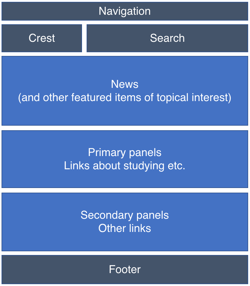
University of Edinburgh homepage
What we found out
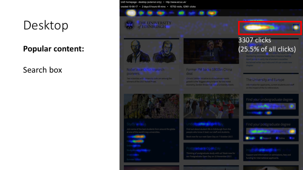
- On the desktop view of the site, 51% of clicks were on two items: 25% on the Study link on the black navigation bar and 26% on the search box.
- The news section of the site got just 5% of clicks (compared with 64% on the header and 19% on the studying panels).
- These findings (people clicking on search, navigation and studying links but not news) are broadly in line with trends over the last 7-8 years.
- With the exception of the MyEd button, links in the footer got very few clicks – even links to major areas of the site such as Accommodation and the Library.
How has the homepage changed over time?
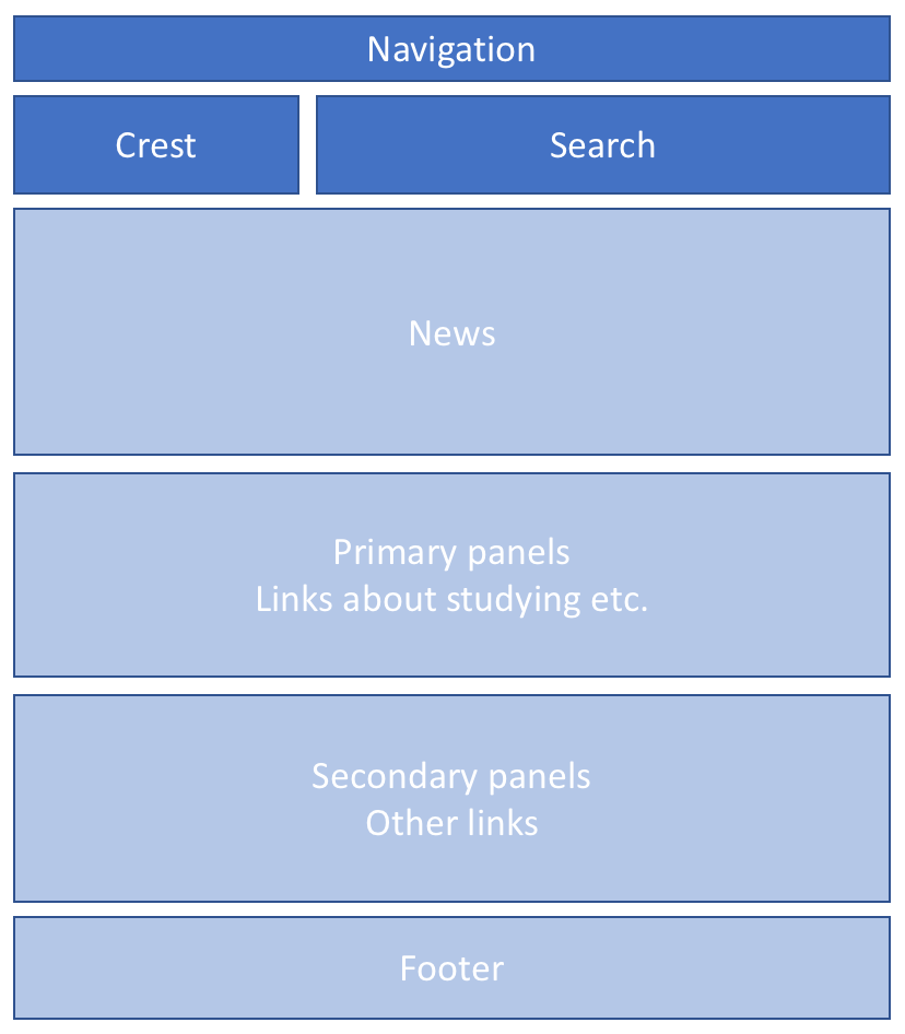
The basic layout of the University homepage has broadly been the same since 2010:
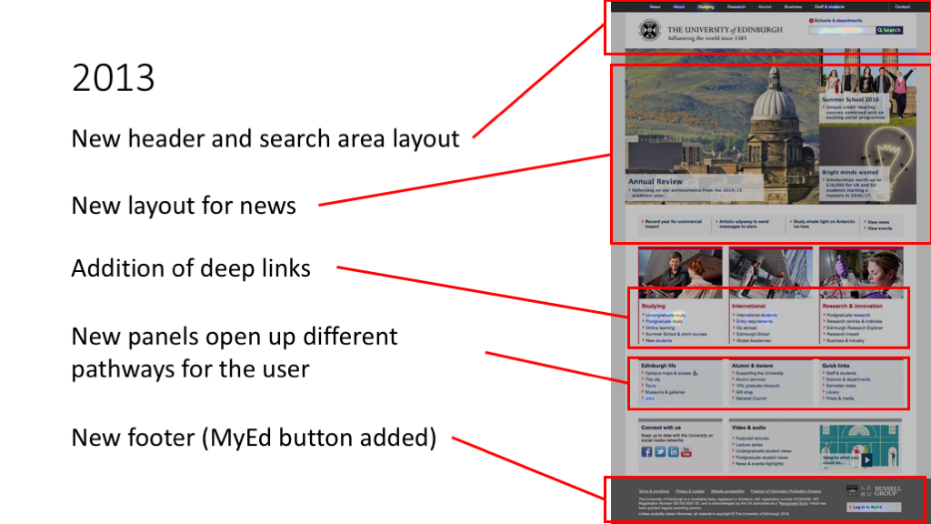
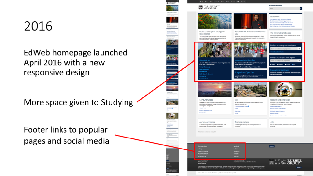
However, there have been three significant redesigns in that time.
(Click images to enlarge):

Aims of this research
What impact have these redesigns had on user behaviour?
In this study, we wanted to find out:
- How users interact with the University homepage
- What behaviour has been consistent over time
- What behaviour has changed over time
Learning more about this helps inform both future homepage design choices and the digital strategy advice we provide to web publishers around the University.
Contextual stats from Google Analytics
Google Analytics data provides context for the main findings in this study.
Data here is from 19/9/2016-19/9/2017; in that period we had 4.3m Unique Page Views of the homepage.
Internal vs external users
First, we wanted to know the split between internal and external audiences (ie current staff and students versus everyone else). There are two ways we can measure this. Both are approximations.
One way is to look at who visits from the University network (EdLAN) versus everyone else:
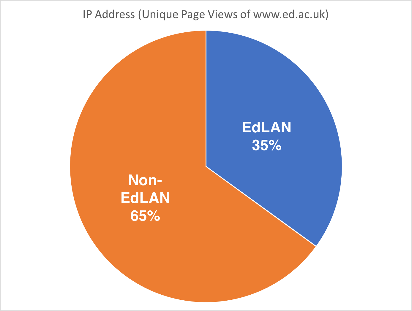
35% of homepage unique page views are from the University network; 65% are from external devices.
This is an approximate way to measure the internal/external split, because we don’t know how many of those Non-EdLAN users are staff and students browsing the web at home (or anywhere else off-campus).
Another way is to use the geographical location of users visiting the homepage:
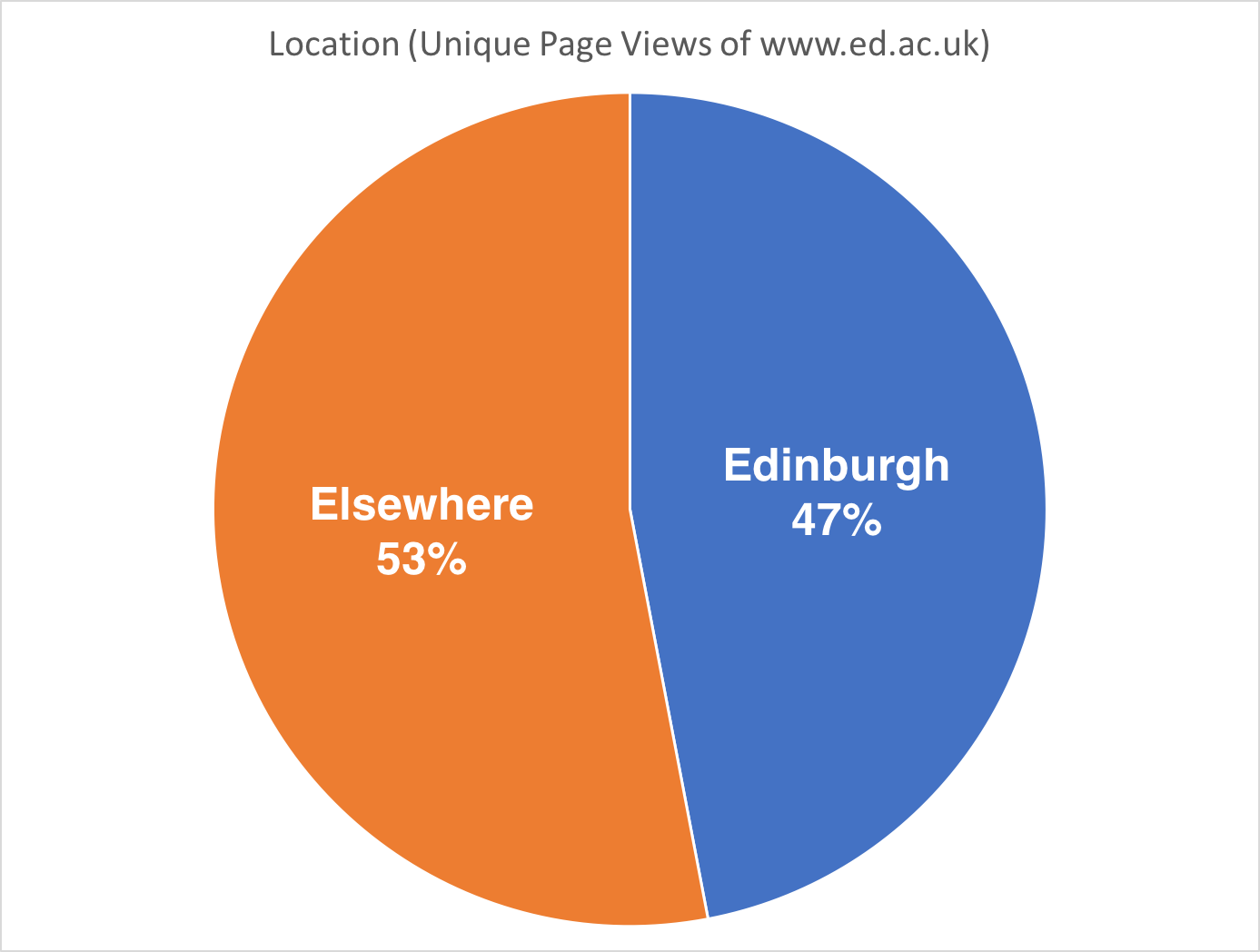
47% of unique homepage views were from devices within the city of Edinburgh; 53% were from elsewhere.
This is approximate too, because not everyone visiting from within the city of Edinburgh is a UoE student or staff member. And obviously, our students and staff don’t all live in Edinburgh.
Even so, we can see that there’s significant use of the homepage by internal audiences.
Devices
It’s also interesting to know which devices homepage visitors are using:
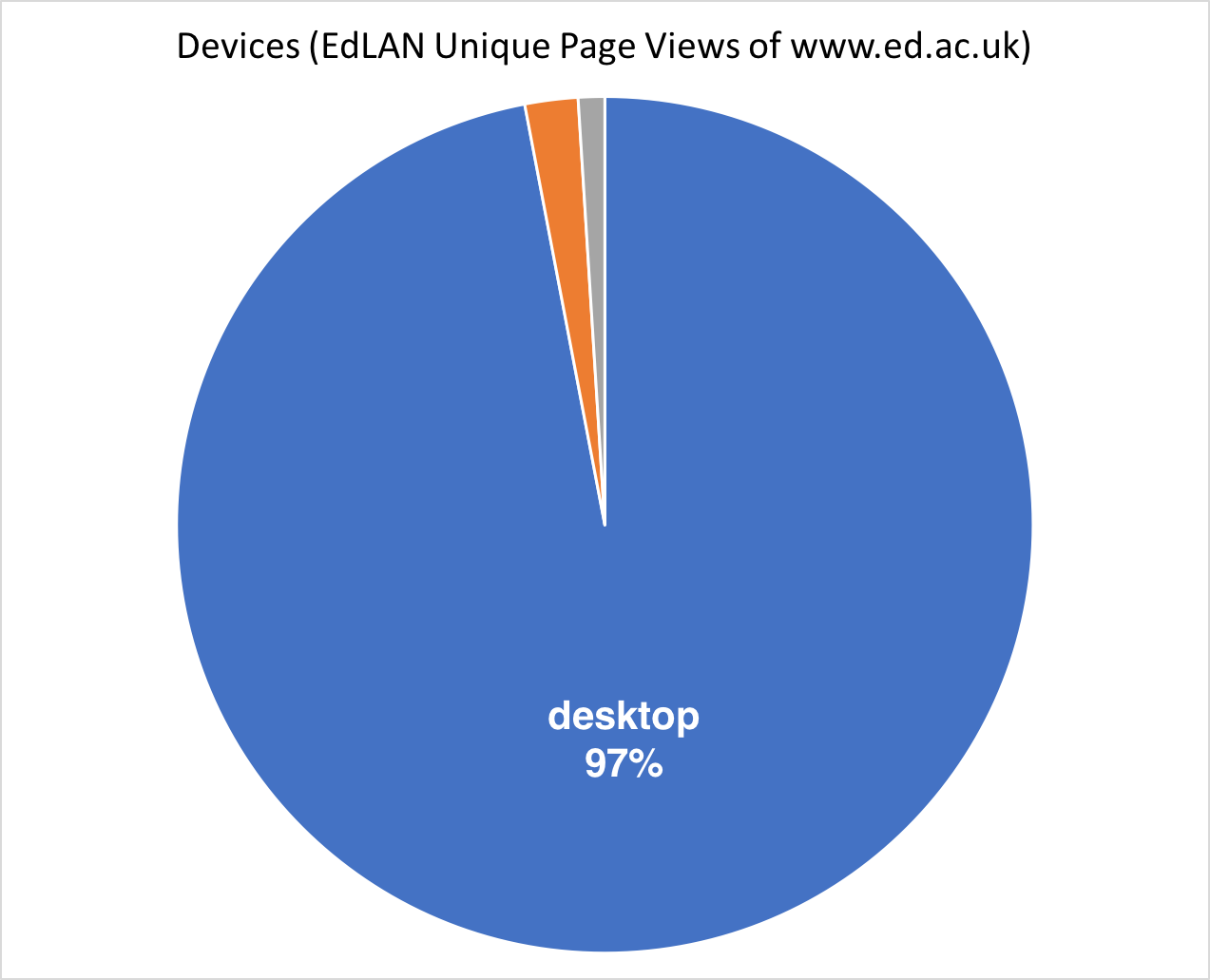
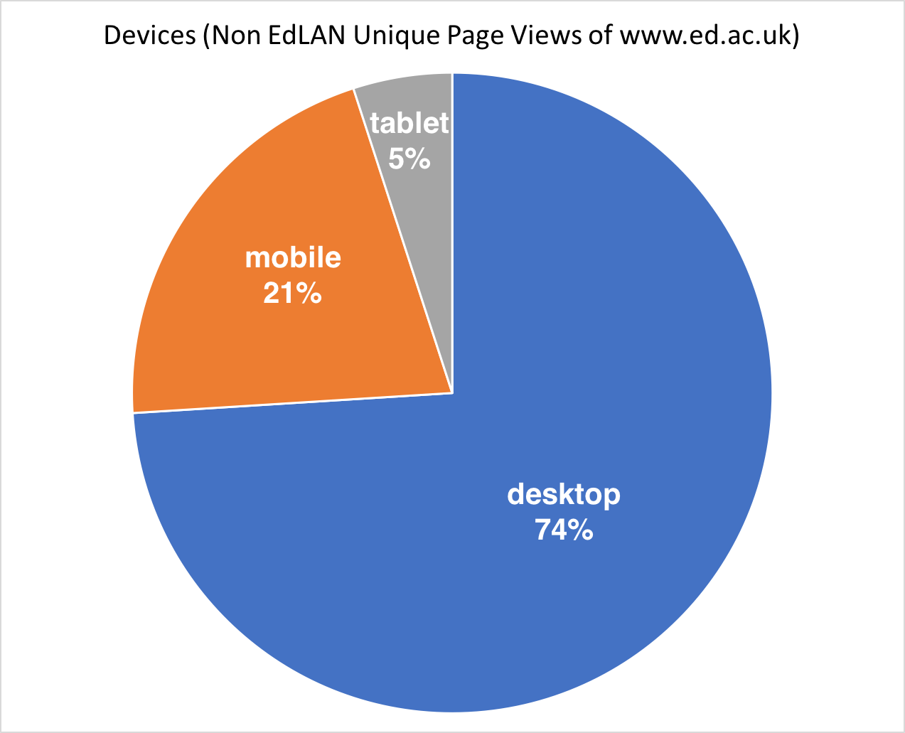
Based on this, the majority of what follows looks at desktop views of the homepage.
Crazy Egg vs Google Analytics
Why use Crazy Egg when you’ve already got Google Analytics? After all, Google Analytics has a lot of benefits:
- It’s already set up on the majority of University web pages
- It’s always running (once it’s been set up)
- It gives you detailed stats on popular content, user journeys, and search terms (among other things)
- It provides sophisticated segmentation to tell us who is doing what, and when they’re doing it
While this is true, Crazy Egg gives us valuable extra clues about the impact of layout design. This is because it tells us where people are clicking on a page. So if you have lots of people clicking on a cluster of links buried at the bottom right of your page, a Crazy Egg heatmap will quickly highlight this.
As an added bonus, the visual presentation of the data (especially the heatmap) is easy for anyone with a stake in the homepage to understand.
Finally, if your homepage has 2 or more links to the same URL – say, Study with us and Studying information, both of which go to http://www.ed.ac.uk/studying – Crazy Egg can tell you which of those links is getting more clicks. Google Analytics doesn’t come with a simple way to do that.
If you’re interested in using Crazy Egg for your site, get in touch.
Crazy Egg findings
For the Crazy Egg click-tracking, we only counted clicks from Non-EdLAN users.
Tracking started on Friday 6th October 2017 and continued for for 57 hours.
| Visits | Clicks | |
|---|---|---|
| Desktop | 15,702 | 12,961 |
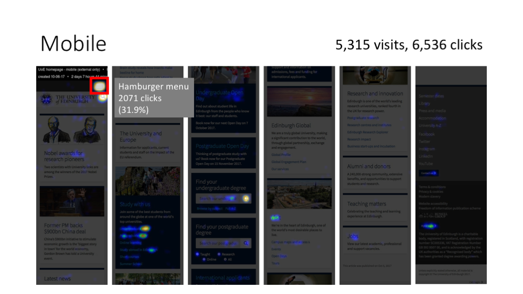
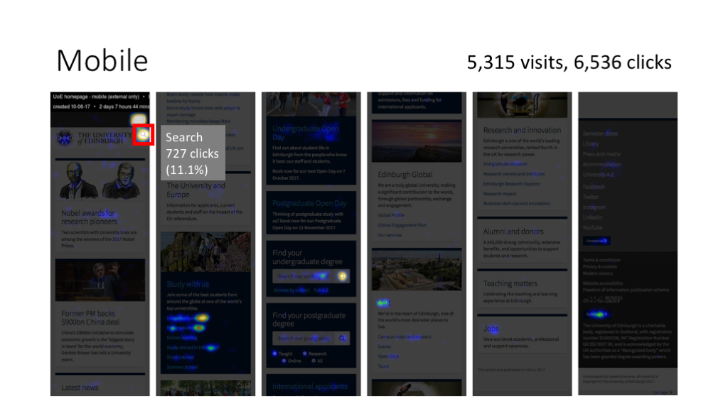
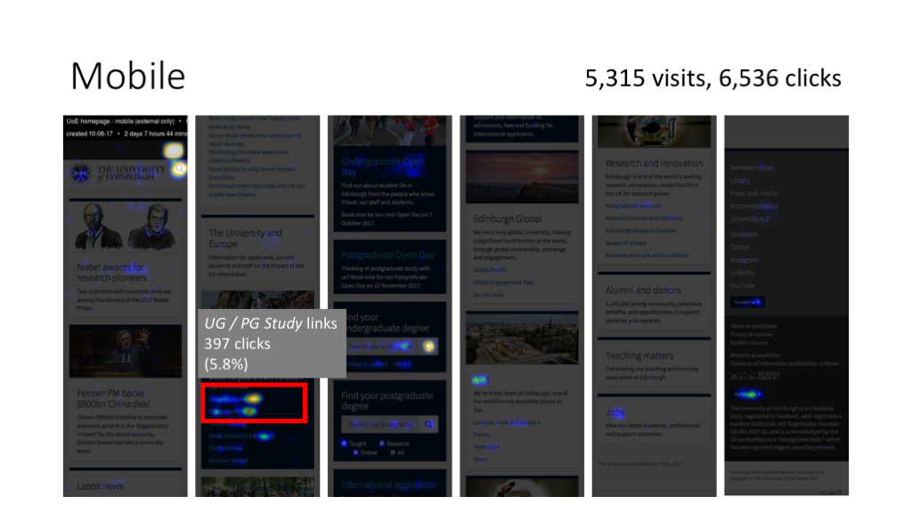
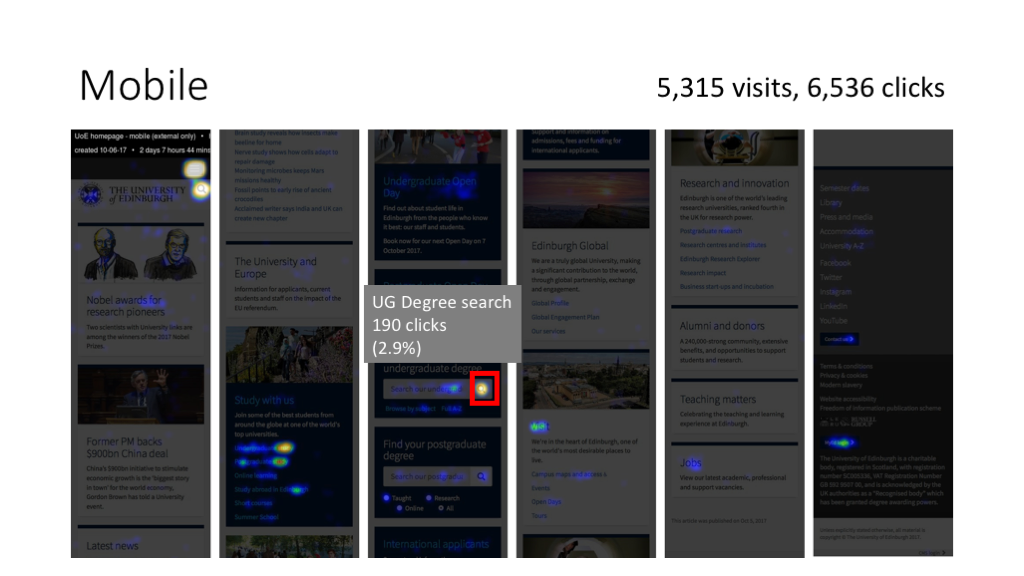
| Mobile | 5,315 | 6,536 |
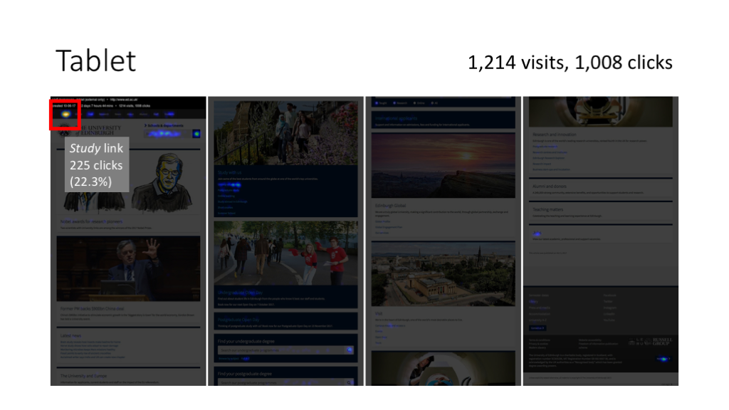
| Tablet | 1,214 | 1,008 |
Click images to enlarge:

Analysis
This analysis looks at the desktop view, since that’s what most users were interacting with.
It also draws on data from previous click-tracking studies on the homepage that the University Website Programme ran between 2010 and 2016. This allows us identify trends over time: what’s changing and what’s staying the same.
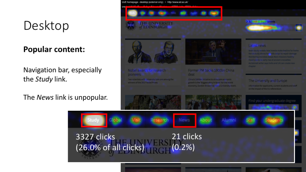
Header
In our 2017 study, 64% of all clicks on the homepage were on items in the header.
More information is available on this slide:
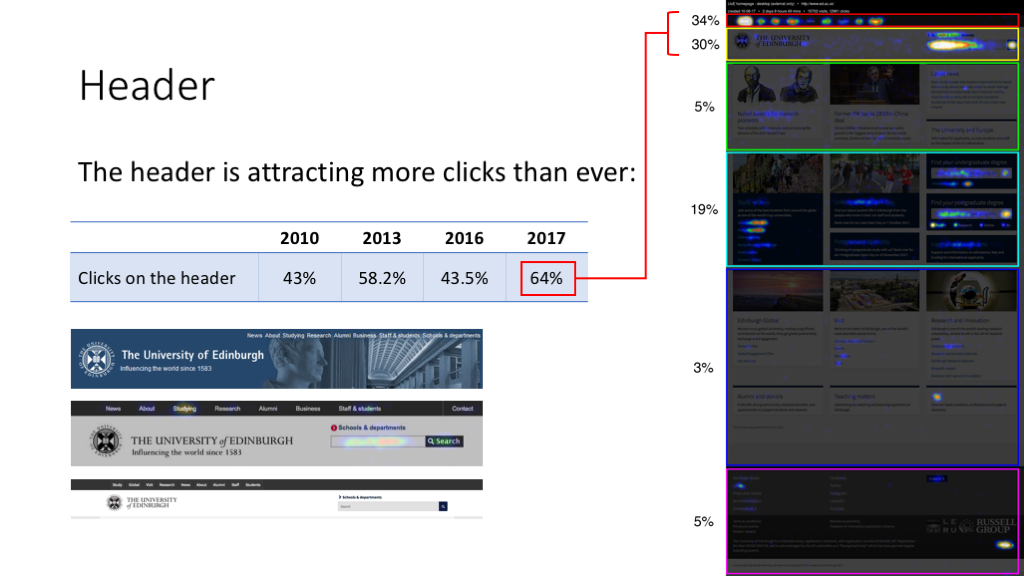
Looking at historic trends, we can see that the header (along with links to do with Studying) has always attracted a high proportion of clicks:
Proportion of clicks on various areas of the homepage (%)
| 2010 | 2013 | 2016 | 2017 | |
|---|---|---|---|---|
| Header links / theme sites | 14.7 | 33.7 | 19.5 | 34 |
| Search | 27.8 | 21.2 | 23.8 | 25.4 |
| Studying (header link + body links) | 33 | 38.6 | 37.3 | 45 |
| Studying (body links only) | 25 | 16.8 | 19.2 | 19 |
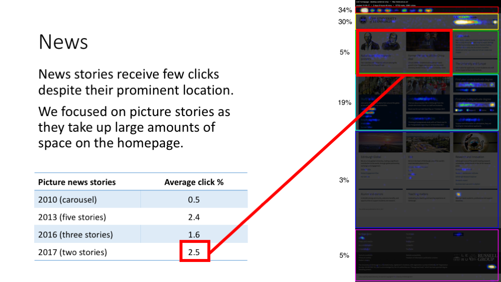
News (and other featured items of topical interest)
The two featured news stories at the time of our study were Nobel awards for research pioneers and Former PM backs $900bn China deal. Together, these two stories got 2.5% of clicks on the homepage. Another 2.5% of clicks were on other news items. Despite their prominent position on the page, a relatively small proportion of homepage users are clicking on these stories.
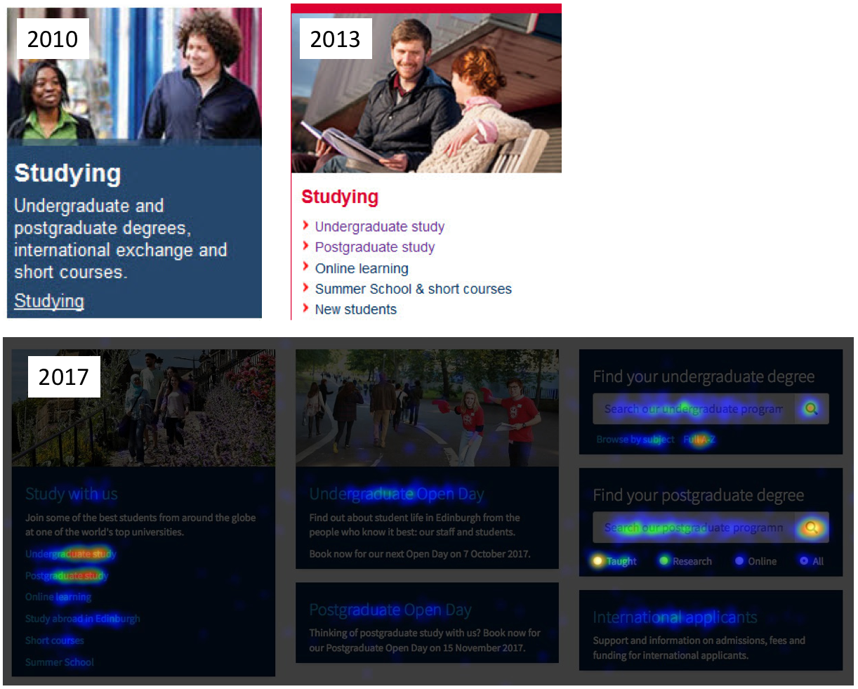
Studying
Since 2010, we’ve seen a proliferation of links targeted at prospective students.
In 2010, there was just one link in the Studying panel (with the link text “Studying”).
By 2013, this panel had grown to include direct links to Undergraduate study, Postgraduate study, Online learning, Summer School & short courses, and New students. A new panel targeting international students had also been created.
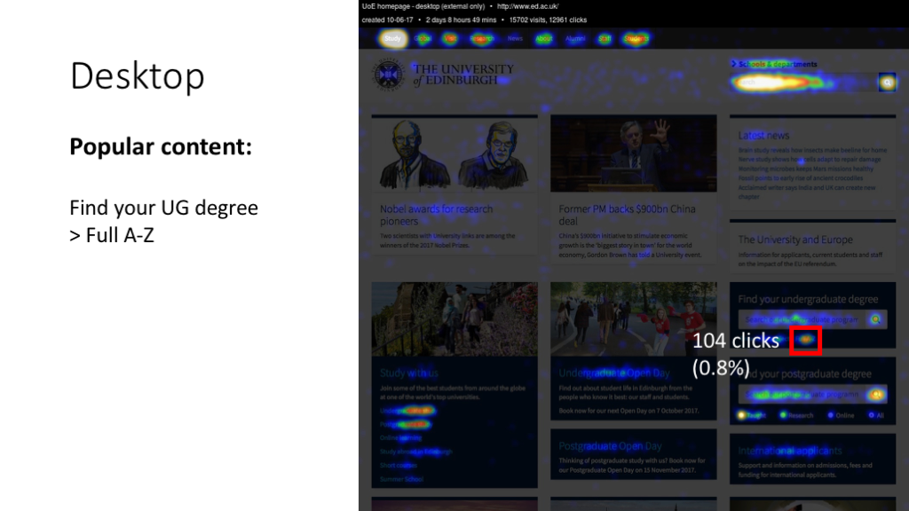
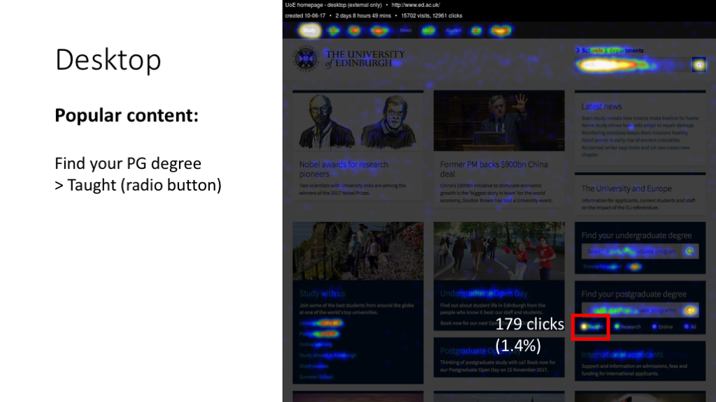
By 2017, there was a new addition to the “Studying” panels: a pair of search boxes for prospective UG and PG students to directly query the Degree Finder.
The evidence from the Crazy Egg tracking is that this Studying section is still getting clicks. 19% of all desktop clicks in our tracking period were on the Studying section of the page.
Quick links
University homepages often include a Quick links section featuring direct links to popular content (Jobs, Campus maps, Semester dates and so on).
2010-2016
In 2010, the UoE homepage had quick links in their own panel.
By 2013, the panel remained, but popular quick links such as Jobs and Campus maps were moved to a new “Edinburgh life” panel. Interestingly, this correlated with a drop in the proportion of people clicking items in the Quick links panel.
| 2010 | 2013 | 2016 | |
|---|---|---|---|
| Clicks on the Quick links box | 14% | 1% | 0.6% |
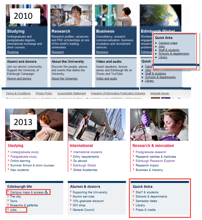
2017
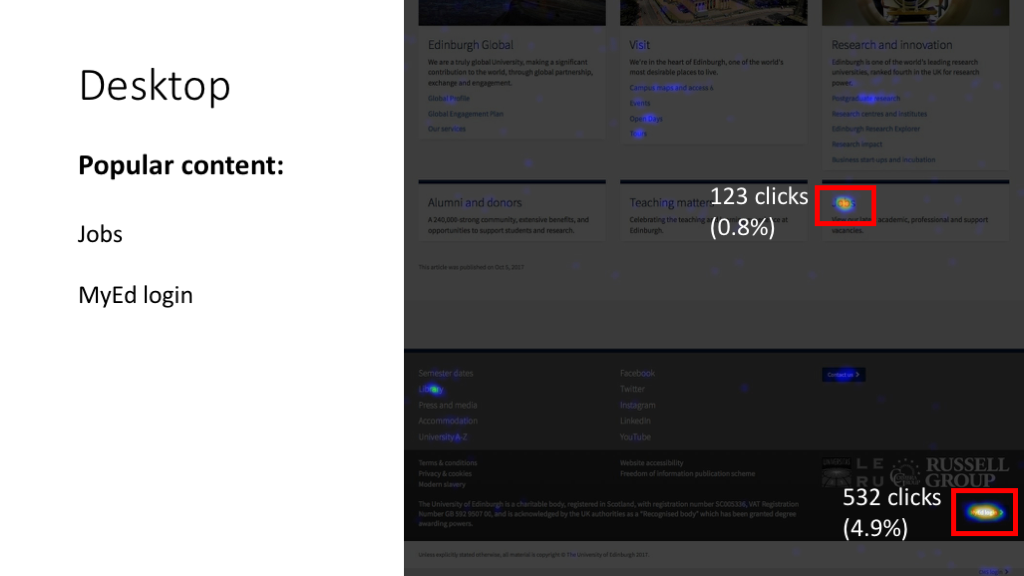
By 2017, the Quick links panel had been dropped entirely. Instead, the Campus maps link was moved to a panel called Visit. Jobs was given a panel of its own. And other quick links like Semester dates were moved to the footer.
What did we find in this study? With the exception of the MyEd button, links in the homepage footer did not get clicks.
This may be due to the timing of the study: a weekend in October.
All the same, the numbers are quite striking:
| Number of clicks (out of 12,390) |
|
|---|---|
| MyEd login | 548 (4.2% of all clicks) |
| Library | 40 (0.3%) |
| Contact us | 37 |
| University A-Z | 13 |
| Accommodation | 9 |
| Semester dates | 8 |
| 3 | |
| 2 | |
| Youtube | 2 |
| Press and media | 0 |
| 0 | |
| 0 |
Summary
Looking at the study as a whole, several things stand out as interesting findings.
The high proportion of clicks on the Search box. Aside from reaffirming the importance of search, this suggests that many users just see the homepage as a search interface.
The consistent user behaviour over time. Since we started running these studies, features like the search box, the global navigation bar and the studying links have always been popular. Likewise, news items have always received relatively few clicks. Persistent user behaviour always worth paying attention to when designing your website. It’s easy to get excited about the new big thing, but often our users are trying to do the same things people were trying to do 10 years ago.
548 homepage interactions (4.2%) involved someone visiting the homepage, scrolling to the bottom, and then clicking the MyEd button. Is this an easy interaction for these people? Are they having a different experience now that the homepage has a new MyEd link above the search box?
The single-digit number of clicks on many of the footer links. It seems like people either aren’t seeing them, or they’re seeing them but don’t want to click them. Would we see similar patterns on other EdWeb sites? If so, what’s the purpose of footer links?
Further questions
One positive consequence of studies like this is that they often challenge your assumptions. This in turn helps you ask better questions about the design of your homepage.
Some examples:
What are the user needs that lie behind the behaviour patterns we’ve observed? We know lots of people click the word “Study” on the global navigation bar. But a study like this doesn’t tell us why they’re clicking that link. What task do they have in mind at that point? Does clicking “Study” take them one step closer to where they want to go?
What implications do these behaviour patterns have for our homepage design? Knowing about user behaviour helps inform design decisions, but it’s not enough on its own. It has to be linked up to an understanding of user needs and the more business-focused purposes of having a website.
What would happen if we…? One major benefit of click-tracking studies is that they get stakeholders thinking about web design in a more evidence-based, user-focused way. This has to be better than making design decisions based on anecdotes and personal taste. A consequence of getting an evidence base together is that stakeholders ask better questions about hypothetical tweaks to the existing design. “We know people are doing ABC. What would happen if we did XYZ?” Forming hypotheses like these is a great way to iterate on your existing website and ultimately make it more effective.
Read more about using hypotheses in web design in Neil’s post on Lean UX
Analyse your site
If you’d like to analyse user behaviour on your site, the University Website Programme can help. We can help you set up Crazy Egg tracking on your site, and advise on how to interpret the results. We also provide consulting to help business areas across the University understand more about their users.