Think of the user: Silos start in primary school
I have a 5 year old starting school in 5 days. In navigating the brave new world of scholarly life, I’m already seeing basic UX mistakes that are mirrored in university culture.
The Scottish schools start back this week, and my daughter is starting school for the first time. It’s emotional and terrifying – and unnecessarily confusing.
Term dates – clear as mud
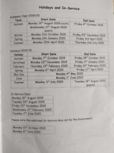
The school sent out a booklet that was supposed to tell us everything we need to know about starting school. I had various issues with it, but the key one was with this table detailing the school holidays:

If you can’t read it, it contains the following information:
Academic Year 2019/20
| Term | Start Date | End Date |
| Autumn | Monday 19th August 2019 (staff) Wednesday 21st August 2019 (pupils) | Friday 4th October 2019 |
| Winter | Monday 21st October 2019 | Friday 20th December 2019 |
| Spring | Monday 6th January 2020 | Friday 3rd April 2020 |
| Summer | Monday 20th April 2020 | Thursday 2nd July 2020 |
Holidays 2019/20
| Holiday | Start Date | End Date |
| Autumn | Monday 7th October 2019 | Friday 18th October 2019 |
| Christmas | Monday 23rd December 2019 | Friday 3rd January 2020 |
| February | Thursday 13th February | Friday 14th February |
| Spring | Monday 6th April 2020 | Friday 17th April 2020 |
| May Day | Monday 4th May 2020 | |
| June | Monday 1st June 2020 | |
| Summer | Monday 3rd July 2020 | Tuesday 18th August 2020 |
In Service Days
| Monday 19th August 2019 |
| Tuesday 20th August 2019 |
| Friday 15th November 2019 |
| Wednesday 12th February 2020 |
| Tuesday 2nd June 2020 |
Please note the additional In Service days set by the Government.
| Monday 21st October 2020 |
| Monday 6th June 2020 |
What does that mean?
A quick usability test for this table:
If I work full time, when do I need to organise childcare for in February?
I can almost guarantee that your initial answer will be wrong.
(The correct answer is 12, 13 and 14 February. I hope.)
Staying user-centric
As a parent, I don’t care why my child is not at school.
What I care about is whether they are not at school.
The problem here is organisation-first thinking.
- Teachers need to know whether they’re in work or not, and if they are in, whether they are teaching.
- Unions need to know what hours are being worked and how the different type of in-service days compare.
- Parents just need to know whether to take their child to school or not.
The council, who cater to all these audiences, saw no reason to tailor the information.
What would be better?
This (or something like it) is the table we actually need:
Holiday dates for 2019/2020
Children start back at school on Wednesday 21 August
The following dates are holidays or in-service days, when your child will not be in school.
| 2019 | |
| Monday 7 to Monday 21 October | 2 weeks and 1 day |
| Friday 15 November | 1 day |
| Monday 23 December to Friday 3 January | 2 weeks |
| 2020 | |
| Wednesday 12 to Friday 14 February | 3 days |
| Monday 6 to Friday 17 April | 2 weeks |
| Monday 4 May | 1 day |
| Monday 1 & Tuesday 2 June | 2 days |
| Monday 6 June | A non-existent day* |
The school year finishes on Thursday 2 July 2020.
* I’ve been flippant here, but the fact is that the leaflet gives the wrong date. This might have been picked up iby someone if the format weren’t so confusing.
14 lines of text instead of 23; 2 columns instead of 3. (I’ve added the second column for absolute clarity – the extra day in the first holiday block is ambiguous. It’s not strictly necessary though.)
Not just primary school
The relevant point to us is: this is still happening at university level.
Time and again when dealing with digital content we’re looking at improving a user journey and hear ‘Oh, but we can’t talk about that – that’s not our department.’ This leads to online journeys that are confusing and fragmented.
And remember what I said about this being ‘emotional and terrifying’? I feel that about my kid spending 6 hours a day half a mile down the road. You can multiply this by ten for the way a student (or their parent) feels about them leaving home for university. Adding an unnecessary cognitive load to that isn’t respectful on our part.
We must get out of these ways of working, and the way to do that is to always put the human user at the heart of everything we do.
A personal deadline
My daughter has 13 years until she could go to university. Dare I hope things could get better by then?
[Bonus UX tip]
[I could have said ‘the schools’ go back at the start of this blog. But we’re an international university, and what I mean is the Scottish schools. I could have said that my daughter starts P1, but, again, that’s a Scottish term. UX is about knowing your audience, and this blog’s audience is international.]


1 replies to “Think of the user: Silos start in primary school ”