Nudge in user experience
Over the summer we have had the wonderful opportunity to work with Annika Sybrandy, our Behavioural Insights (Nudge) Intern. There are lots of parallels between behavioural science and human-centred approaches. Nudge models give us the opportunity to bring an extra level of formality to our approaches.
Annika has previously published two blog posts introducing some major concepts around behavioural science:
Seeing the links between behavioural science and user experience
Working with a behavioural science specialist has brought things full circle for me. My first association with the University of Edinburgh was when I studied economics here for my undergraduate degree.
Wikipedia definition of economics:
Economics (/ˌɛkəˈnɒmɪks/) is the social science that studies the production, distribution, and consumption of goods and services.
Economics focuses on the behaviour and interactions of economic agents…
Economics is a social science. It is primarily about people’s behaviour under conditions of scarcity.
After graduating, my first job was as Web Editor at the University of St Andrews. At first, I didn’t necessarily see the links between my degree and my job.
But I was quickly exposed to books by authors like Steve Krug, who wrote Don’t Make Me Think and Rocket Surgery Made Easy. These are books about usability, and how people behave online.
As my career progressed I began to explore more and more ideas around how people’s behaviour needs to inform our decision-making when managing and running websites and digital services. Books like:
- The Psychology of Everyday Things by Donald Norman
- Lean UX by Jeff Gothelf and Josh Seiden
- Thinking, Fast and Slow by Daniel Kahneman
- Nudge by Richard Thaler and Cass Sunnstein
The final book in that list was the influence for Learning, Teaching and Web creating the Nudge Internship position.
Common approaches between user experience and behavioural science
Affordances
I have recently been using the NHS’s Couch to 5k app to help me return to running after I broke my ankle last year.
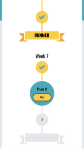
The Couch to 5k programme seems to be influenced by behavioural science and employs lots of little nudges along the way. The app clearly guides you to your next run, with a clear call to action signifying the next step in the programme with a clear button that says “Go”.
From the visual design of the app, it looks like you can’t skip ahead to future runs until you have completed the previous step in the programme.
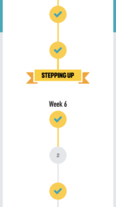
However when I wanted to modify the programme to my own needs, I discovered that future runs, although styled in pale grey to detract you from selecting them, are in fact still selectable.
This is what is meant by affordance in interaction design. Essentially it is about showing users how they can interact with an interface. For example, by signifying that hyperlinks are clickable by underlining them. Or by styling a call to action button that clearly draws people’s attention to what they can do next.
Donald Norman defined an affordance as:
…a relationship between the properties of an object and the capabilities of the agent that determine just how the object could possibly be used.
Affordances — Interaction Design Foundation
Affordances exist in the wider world as well. Have you ever pulled a door handle only to find that it wouldn’t open? Then after struggling for a while, someone else comes along and pushes the door instead, making you feel foolish. We’ve all been there, as victims of Norman doors.
The most striking examples of Norman doors I’ve encountered have been in London. What does it mean?? pic.twitter.com/NqS25iadUd
— Cameron Moll (@cameronmoll) July 10, 2018
These are doors that don’t show you through their design whether to push or pull, or from what side of the door to push, and therefore require a written instruction: “Push” written above a pull handle. The problem being that people don’t read when they are in a hurry (just like on the web).
They are named after Donald Norman who originally wrote about them in the Psychology of Everyday Things.
Norman doors: Don’t know whether to push or pull? Blame design
The Behavioural Insights Team’s East framework
The Behavioural Insights Team, which started out life as the UK government’s Nudge Unit, have developed the East framework as a way of helping people apply behavioural insights.
This says that interventions should be:
- Easy
- Attractive
- Social
- Timely
East: Four simple ways to apply behavioural insights — The Behavioural Insights Team
However, the report also outlines how the East framework “cannot be applied in isolation from a good understanding of the nature and context of the problem”.
This is why we do user research — to truly understand the context of the problem space before charging ahead with solutions that might actually take things in the wrong direction.
The East report sets out four steps to understanding the context. Each of these steps aligns to well-established approaches in user experience.
Step 1: Define the outcome
This is about “establishing clarity of purpose”. What is the behaviour we want to change? How do we measure our success at that? What are our objectives? What does success look like?
Establishing a shared understanding of our answers to these questions is the first step of any successful project. Without it, we risk not knowing what we’re really doing the work for, and we risk having team members pulling in different directions.
This is essentially also the first step in an influential user experience model by Jesse James Garrett, the elements of user experience. It shows us that before considering anything else, we must first establish a strong understanding of user needs and business objectives.
The elements of user experience — Jesse James Garrett (PDF)
In terms of identifying a metric to shift as one of your outcomes, Website and Communications has plenty of auditing an analysis tools that can help.
- Google Analytics
- Snapshot
- Crazy Egg
- Little Forest
If you’d like further information about using these tools, please contact us:
Step 2: Understand the context
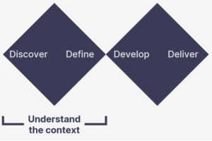
This is about developing “a rich understanding of the experience of service users and providers”.
This is why we do user research: to understand the problem space and find out how we can make the change we desire.
This maps to the first diamond of the popular design process model, the double diamond.
The first diamond (blue in this diagram) is about understanding the problem space. It’s sometimes thought of as helping us understand that we “design the right thing”.
Double diamond (design process model) — Wikipedia
Step 3: Build your intervention
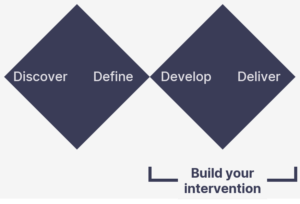
This is where you “generate your behavioural insights. This is likely to be an iterative process that returns to the two steps above”.
This step maps to the second diamond in the double diamond model. Here we are in the solution space, and we are making sure we “design the thing right”.
At this stage it is important to start small, by building prototypes as an experiment we want to learn from. As it is an iterative process, this all aligns very well with agile principles.
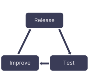
With this approach, every release is an opportunity to test, learn and improve.
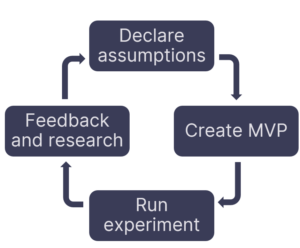
It also reminds me of a diagram from Lean UX written by Jeff Gothelf and Josh Seiden.
This model shows how we should begin by declaring our assumptions, then create a minimum viable product (MVP) to test those assumptions. From there we run an experiment, gather feedback and further research, and begin the cycle again.
Step 4: Test, learn and adapt
This is where that Lean UX loop is completed.
Put your intervention into practice so its effects can be reliably measured… Test the intervention, understand its impact and adapt future approaches accordingly.
Com-B system
Another fascinating behavioural insights model is known as the Com-B system, developed by Susan Michie, Maartje M van Stralen and Robert West:
This says that for a behaviour (B) to happen, people need three things:
- Capability (C)
- Opportunity (O)
- Motivation (M)
Imagine our desired outcome is to help people eat more healthily.
Capability refers to a person’s knowledge, skills or capacity. For example, do they know how to cook a healthy meal?
Opportunity is about aspects external to the person. For example, do they have the time to cook?
Motivation is driven by our conscious reflective processes, or automatic processes like habits. For example, does a person want to change their diet and eat more healthily?
The solution we need to implement depends on where the biggest barrier is among these three areas.
We can also use this model to structure our qualitative interviews with users. After starting an interview with open questions as usual, we can begin to probe for capabilities, opportunities and motivations — then analyse our research to identify them.
An accessibility dimension
The Com-B system has also been used by some public sector organisations to understand universal barriers to accessing services.
Universal barriers to access — Ute Schauberger
There are 11 identified universal barriers. According to Stéphanie Krus, HMRC have used the Com-B model to categorise them:
- Capability
- Interface/interaction capability
- Awareness
- Comprehension
- Opportunity
- Self-confidence
- Emotional state
- Trust
- Enthusiasm
- Motivation
- Time
- Finance
- Access
- Evidence
Removing barriers — Stéphanie Krus
This categorisation can help us understand how to design a interventions that could help people overcome these barriers.
Nudge principles aren’t new to us
It has been fascinating to have the opportunity as the User Experience team to dive into these behavioural science concepts further.
As you can see, the principles aren’t new to us. But behavioural science approaches give us an opportunity to further formalise them, and bring a new level of robustness to our work.
Best of all, it is a reminder of what our work is really about: improving outcomes in people’s lives.
Find out more
I will be presenting in a pre-recorded video covering these ideas in a little more detail at the next Web Publishers Community, on Wednesday 24 August at 3pm.
Book your place at the August Web Publishers Community session (University login required)

