
Why choice architecture cannot be avoided
We all want to believe that we have free will and make our own decisions. This may only be partly true. You may realize that the way options present themselves influences your decisions. You might not realize that a whole science is dedicated to engineering the way to present choices and guide your behavior.
Nudging is a part of behavioral science that prompts people to change their behavior. One of the easiest ways to start incorporating nudges is to give your users a choice. In fact, if you have given your users a choice, you have nudged them.
What is choice architecture?
Choice architecture is the design of choices and exists whether we design it intelligently or not.
It is impossible to give non-ordered options. You cannot give people all their options at once; that is just not how we take in information. There must be a first option they are presented with.
Humans are biased to choose the first option, especially when their cognitive abilities are worn out or they don’t have a strong preference. Even when making important decisions, biases can still influence us.
Bad choice architecture
The US Presidential election in 2000 is an example of poorly designed choice architecture. In some states, the first option on the ballot was randomly assigned per ballot. In these states, the actual votes returned were similar to the prediction. In Florida, the first name on the ballot was the candidate of the governor’s party, and in 2000, that was George Bush. To add further complication, the ballot of Palm Beach County looked like this.
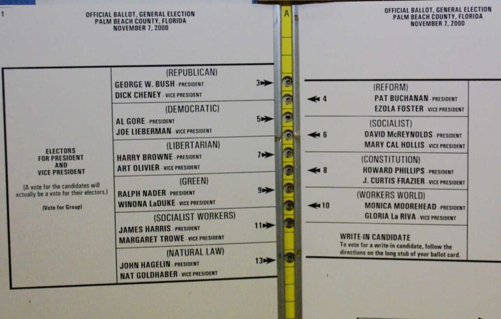
The second name on the punch card was Al Gore, but the second hole to punch was Pat Buchanan. Buchanan ended up with 3000 votes more than was predicted, and Bush won by a margin of 537.
This is an example of poorly designed choice architecture. The voting process was not intuitive. If you wanted to vote for the second name, you had to punch the third hole. With his 537 vote margin, Bush won the whole presidential election.
Lean more about the design of the Palm Beach County ballot
How to be a good choice architect
Well-designed choice architecture selects first choices and default options to maximize the benefit of as many people as possible. One way to do that in the election example would be to randomize which candidate is listed first per ballot. This way, no candidate has an advantage. A fair election benefits the most people.
In the future, when you are designing a choice for your users, keep this in mind. If my users are worn out and more influenced by their cognitive biases, which choice will they make? Hint, it will probably be the first choice or the default option. So it’s best not to make this decision arbitrarily. Think, what option would bring the most benefit to the majority of my users? Is the way people make these decisions intuitive?
Sometimes, giving a default option doesn’t make a lot of sense. For example, when we give prospective students choices of different degrees, it doesn’t make sense to provide them with a default option. Each student has different intentions for how they want to use their degree. They have predispositions for what subjects they enjoy studying and are naturally good at. There are still other ways to design good choice architecture for these decisions.
Here are two other elements to consider when giving choices that can make you a smarter and kinder choice architect.
Choice Overload
Contrary to what most believe, more options when making a choice is not always a good thing. There is a lot of research to show that more choices can overwhelm us. Hence the name of this cognitive bias is choice overload.
Too many jams to choose from
Sheena Iyengar studied how people will respond to a different number of options when sampling jam. Customers encountered one of two jam displays. One gave shoppers a selection of twenty-four jams, and the other display only had six jams.
Although the display with twenty-four different selections initially drew more people in, they had a harder time deciding. There were simply too many choices! It was difficult to be able to compare all of the varieties. Seedless or smooth? Tart or sweet? How do you compare the different fruits and their combination flavours? The process is dizzying.
But the process is dramatically simplified when presented with only six choices. Six different jam types are much easier to compare than twenty-four. People who visited the six jam display chose a jam to buy 30% of the time, while only 3% purchased when choosing between twenty-four options.
Sheena Iyengar’s research on choice architecture
The psychological effects of choice overload
When presented with too many choices, people are more likely to regret their decision. This is because we believe that with so many options, there has to be one that fits our preferences perfectly. When we finally decide from the sea of choices, we can think back on all the other options and dwell on how they might have been the better choice.
From start to finish, when too many choices are involved, the decision-making process is anxiety and stress-producing. There is the stress of making the right decision and trying to keep many pieces of information in your brain at the same time. There is also the tendency to question our decision. Did I choose right? Would I have been happier with the other decision? Why didn’t I choose the other option? People who try to choose the best option instead of the good enough option may even exhibit symptoms of depression.
How to limit choice overload for our users
Overwhelming our users with too many choices is something we want to avoid. Lucky for us, there are ways to improve the choice process. One way is to have users make one decision at a time and focus their attention on their preferences for a specific attribute. Restaurants like Subway do this with sandwich options. Instead of choosing all aspects of your sandwich at once, you choose elements of the sandwich in the order it is made. First, you choose which bread you want, then a protein option, then veggies, and finish with sauces.
This is smart choice architecture. Subway changed one decision with hundreds of options to around five decisions with less than ten options each. The latter is a much more manageable choice to make.
Any time you give your users a choice with tons of options, you can try something similar. Change the choice architecture, so your user picks their preferences for different attributes. This will help them feel less overwhelmed as they make decisions and more confident once they decide.
In general, it’s best to limit the number of options a person must choose from. You are mistaken if you think giving your users more options helps them out. To improve your users’ experience, you want to do the opposite.
If you struggle to make decisions when faced with too many options, I highly recommend reading the Decision Lab’s article on how to change the way you make choices to reduce stress.
Choice Overload – The Decision Lab
Framing effect
Another cognitive bias that affects our decision-making is the framing effect. The way information is presented, or framed, will affect the way we make a decision.
Effective Taglines
Let’s pretend that you are shopping for some cleaning supplies, and you see two options on the shelves. You read the labels to try to get more information. On one label, it says, “Kills 99% of germs” and on the other, “Only 1% of germs survive”.
Which product are you going to choose? Each marketing line communicates the same statistic, 99% of germs will die when you use a cleaner, and 1% will survive. But we don’t like to think about 1% of germs surviving, yuck!
There is a reason you won’t see cleaning products with the “1% of germs will survive” tagline. The framing of statistics can greatly impact how our brains perceive those facts. Marketers know that “Kills 99% of germs” is more palatable to consumers than the other way around. The framing of this information changes our opinion of the product and our decision-making process.
How to use the framing effect to your advantage
In general, we as humans prefer a sure gain to a probable gain, and we prefer a probable loss to a sure loss. And obviously, we prefer a gain to a loss. In the cleaner example, killing germs is a gain, but germs surviving is a loss. So, framing the tag line as “killing germs” emphasises the benefit of the cleaner (gain). Doing so also downplays the negatives of the cleaner(loss).
It is no surprise that emphasising the positives and downplaying the negatives of an idea or product can make it more attractive.
As you are designing web pages, keep the framing effect in mind. When describing an option you would like your users to choose, remember your readers will prefer options that highlight the positives. Additionally, users prefer an easily understood and recalled option over an option presented in a complex manner. It can help to consult with members of your team with marketing experience.
The framing effect – The Decision Lab
Moving forward, keep an eye out for choice architecture in your everyday life. Now that you know what it is, you may begin to recognize how your decisions are being influenced.
Great blog post, some really useful insight!